Victorian Row House: A Designer Reno on A DIY Budget - Part 4
The Second Floor - Before & After
*Edit February 2015*
I've recently learned this former house of mine is currently for sale on MLS and also has been popping up on some other Toronto websites with links back to my blog posts here, citing that this is still my house and that i still live there. Just to clarify - I no longer own or live in this house, I sold this house in December 2008. I want to also mention that because of my blog posts here about my house renovation, that two years after selling it the new owners, (he was fresh out of law school) filed a claim against myself and the Home Inspector for mis-representing the property (after an earlier failed attempt at trying to get money from each of the Broker firms ). After moving in to their very first home the young new lawyer and his new wife were not happy with the lack of sound privacy the row house offerred and claimed the real estate listing failed to disclose what the sound levels were. (??). To make a two year long small claims court story short,,,,,in a settlement hearing a Judge basically said they didn't have a chance, not a chance of winning any type of settlement in court over this,
it wasn't a new build, it was a 100yr old+ row house and their expectations about what they were entitled to were completely unrealistic. Caveat emptor. It took two years of lawyers time to settle that.
*end of edit*
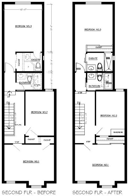
One of the best features about this house was that it had 3 bedrooms plus 2 bathrooms on the second floor, with one of those being an ensuite bathroom. For a house of this size in the city, this is a rare and valuable feature. The second floor was split level with the main bath and back bedroom/ensuite elevated up another 2 steps from the main hallway. The modifications for the second floor included enlarging the existing tiny ensuite bath and creating larger closets. What you can't see on the proposed plan view was that I also added a small linen closet beside the 2 stairs leading to the back bedroom. Linen closets are also rare in these century old city homes. The one we added was small but made great use of the bit of dead space at the top of the stairs. The finished closet measured about 15"deep and was perfect for towels, sheeting and toiletries. I can't find any photos that show it except for the photo at the top of this post, you can see it on the right hand side, thru the railings!
The original plan was to install hardwood throughout the second floor hallway and middle bedroom, but we discovered the subfloor and the upper stairs would have required extensive repair work in order to properly install hardwood so I chose to go with carpet to keep us on schedule and on budget. I selected a warm neutral grey broadloom that had a high recycled content and went the highest grade of underpad for maximum wear and comfort.
I had to source and select a lot of light fixtures for the interior of the house, over 17 in total. Each of the bedrooms had ceiling fixtures as well as the dining room and family room and then there were hallways and bathrooms. I had a very small budget for light fixtures, with the need for so many, it adds up quickly. But lighting is one area where you don't have to spend a lot of money to get a lot of style. Most of the ceiling fixtures I purchase were $120ea or less, and all wall mounted fixtures were less than $55 ea. So with a combination of great finds and one or two splurges, I think lighting is an easy way to add a lot of style and character to a house.
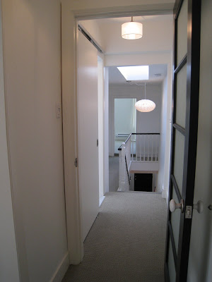
After - View of hallway looking towards the front bedroom and middle bedroom (on left).
I selected this contemporary pendant fixture, from
Morba for over the staircase for a couple of reasons. It was ovesized and dramatic, it was fairly inexpensive and what I loved most was the patterned shadows it cast all over the tall stairwell wall at night time. At the end of the hall,,was the front bedroom......
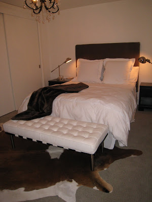
After - Photo of the front bedroom
Before - Photo of Front bedroom after demo and primer.
This is my brother Six and another brother, we call him Two, installing the new closet doors.
I felt it was important that both the front and back bedrooms have large closets, in proportion to their room sizes and in this room I was able to doube the size of the closet by eliminating the small closet in the middle bedroom. I didn't want swing doors on the closet because they would impede the placement of night tables on either side of the bed, so sliding bypass doors were the answer. I'm not a fan of mirrored sliding doors, or those sliding door kits made up of thin panels, instead I prefer to use a sliding door track system by K.N. Crowder. With these track systems you can mount various size doors of your choice as they can ccommodate different thicknesses and weights, the tracks can be either ceiling or wall mounted and are really simple to install. What I really like about these systems is that you don't have to have those unsightly tracks installed in the floor and even with really heavy or really tall doors, these track and hanger systems make the doors glide effortlessly across the track at the touch of a finger. Once you install the doors on the hangers, you can easily level them by a simple adjustment and you can install floor guides at two points in the floor to keep the doors in position. Of course the other reason I use these tracks all the time is because they're reasonably priced, this track and hangers was about $100. I buy standard size (or special order a size) plain, hollow-core slab doors from Home Depot and then add a painted mdf valance to conceal the track. (If you want a wood look you can order slab doors in an unfinished wood veneer too.) For a modern or more industrial look,,,,,I often leave the track exposed, or you can order the aluminum valance from Crowder. Check out this website for specs
K.N. Crowder sliding track hardware, I purchase this product from
Upper Canada Specialty Hardware in Toronto but you can purchase this from practically any retailer who sells door hardware products.
After - View of the front bedroom showing the finished closet doors.
After - Front Bedroom view part-way during the furnishing phase, window coverings and mirror yet to be installed.
After - View of Front Bedroom empty of furnishings. I installed a vintage looking black and crystal chandelier - that was a great find at Canadian Tire. Another vintage touch was the white ceramic knobs on the contemprory black glass doors, I chose these instead of going with a contemporary lever style, and I loved the look.
After - View of Middle bedroom.
I chose to eliminate the existing small closet in the middle bedroom to gain a large double closet in the front bedroom. I decided that an armoire or a wardrobe unit would be sufficient and provide equal or more storage than the old closet without sacrificing much space. It was a small room and would ideally be suitable for a home office, a guest bedroom or a child's room, in any case, not a room that justified the need for a large closet. I installed this contemporary chrome and chrystal chandelier which was a great find at Home Depot, again i think its suitable for a home office or nursery.....
Before - View of the upper hallway looking toward the back of the house. Stippled ceilings, intense gold paint, stained carpet and lots of 80's golden oak.
Before - View of hallway facing front bedroom, after demo. Ceilings skimmed and primer applied on walls and railing.
Before - View of upper hallway from back bedroom looking toward front of the house. Main bathroom door is seen on the left.
After - View of upper hallway from inside back bedroom looking towards front of house.
After - View of the main bathroom, Toto Acquia toilet, ming green marble mosaic floor.
Working with a small budget, I wanted to keep the bathroom clean lined and timeless. I splurged on a ming green marble mosiac floor. For a contemporary look, I prefer the impact of using just one mosaic without a border or mixing it with other tiles. Here it added texture, colour and a feeling of quality because it was solid marble. Because the s.f. was small, it was an affordable splurge. I saved by pairing the mosaic floor tiles with simple white subway tiles on the wall. The tub is one of my favorites, its a great buy for a contemporary looking soaker tub with its simple rectangular profile, this one is made by Crane and is available at Tubs for less than $500, which is at least $200 less than similar tubs by other mfg's. We added a flat panel detail to the front for a classic look. And with a budget so small, installing hooks instead of a towel bar is a substantial savings, besides, kids and men don't use towel bars so hooks are much more practical. In the shower I opted for a just a handheld shower head on a bracket, this is great for bathing kids and for cleaning - and its a less expensive than installing a fixed shower head and a hand held.
Afer - Ikea customized vanity with Caesarstone counter.
We maximized the storage in this small bathroom by installing a vanity that has 2 drawers. I always avoid using cabinets with doors (cupboards) as they just don't provide usable, accessible storage. Because Ikea doesn't have many bathroom vanity options, I took their Akurum kitchen cabinets and customized it to make a vanity. Because the kitchen cabinets are 24"deep, we took about 2.5" off the back of the cabinet which still allowed for the drawer glides and drawer boxes to fit without any alternations to them. I ordered (1) regular full depth, tall drawer (used on the bottom) and (1) 12" deep tall drawer for the middle, this allowed clearance at the back for the plumbing, the top drawer is a fixed drawer front only, no dawer box. Finally we added a full gable on the end and voila - a beautiful vanity with TWO big, self-closing drawers. It worked beautifully and was a super easy project. I topped the vanity with Blizzard colour quartz by
Caesarstone , an undermount sink by Kohler and a beautiful set of contemporary chrome cross style faucets. The entire vanity assembly was about $1,000. This is the only photo I had the captured the light fixture, it was a tubular chrome and glass style, $49 from Home Depot. The pivot mirror was another Home Depot buy, I like to use these in family baths because the tilting feature allows you to aim it lower for the little ones.
After - Main Bathroom
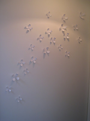
After - Outside the main bathroom, view of door to the back bedroom. Floral wall art by Umbra.
After - Floral Wall Art by Umbra. These little 3D magnetic flowers added some texture and interest to this small hallway area outside the main bathroom also right outside the door to the back bedroom.
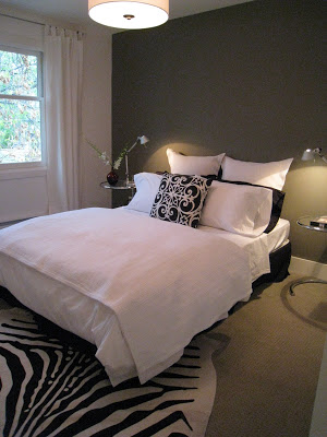
After - Back bedroom with dark grey accent wall, I eventually added three birch framed black and white photos on the wall above the bed, same as the ones hown below. It was the final touch the bed wall needed...
Limited Edition Signed black & white framed photos in birch frames by Ikea. As much I as often use ready made frames, normally I am dead set against buying mass produced artwork at stores like Ikea, but I have to say I couldn't resist these signed b&w photos when I saw them. It was the perfect instant solution for this long blank wall in the back bedroom. Mostly I really like the square shape and the custom look of the extra wide matts, I know I can switch in my own photos later.
After - Back bedroom ensuite.
Before - Back bedroom after demolition.
The greatest change in this ensuite was that we enlarged it, allowing us to fit a good size walk-in shower. After our successful concrete patching in the basement, we decided to make the shower pan floor ourselves. After doing some research on google, we followed this detail for the construction of the shower pan floor. The materials are inexpensive and it was fairly simple to do ourselves.
Cross Section Detail - shower pan floor construction.
Before - This is Six spreading out the first layer of mortar mix (mixed by moi!) for the sub-slope.
After - Ensuite in the back bedroom with cusomized Ikea vanity and new walk-in shower.
Once again I decided to splurge on the floor and the countertop, both bianca cararra marble. On the floor I used a 1" x 1" honed tumbled cararra and continued it thru the shower floor. The main reason I used cararra in this washroom was because I knew I would need solid marble jambs for the shower and most building centres carry 6"w cararra marble jambs in stock. This is a huge savings in time and money, (not having to have them custom made) so, by chosing bianca carara for the floor and counter I knew I could purchase standard instock jambs to match, for a complete custom look. For the walls, again I went with a simple white subway tile, but this time in a 4" x 8".
Bianca Carrara Marble counter top.
The full-width mirror was custom cut to size but was frameless for a clean modern look. We mounted it on 2" blocking so it appeared to float away from the wall - this is a beautiful detail that cost nothing. The light fixtures were a great find at Union Lighting , displayed as ceiling mounted fixtures in the showroom but I thought they would make perfect wall mounted fixtures for above the mirror, at only $54 ea., they were a steal, the square shape and polished chrome give them a high end look. The toilet and vanity used were identical to those used in the main bathroom, but here the carrara marble countertop was used instead of the caesarstone and I also switched the style of the hardware to a linear lip pull.
(Before I end this post I have to mention to please keep in mind this project was first and foremost a renovation project, not a furnishings and decor project, so even though there are furnishings and accessories in the photos, I literally had only spent 2 days moving furniture in and setting the house up before these photos were taken! yikes..)
For more posts on this project, check out
Part 1 ,
Part 2 , and
Part 3 of this Victorian Row House renovation.
Stay tuned for Part 5, the Main Floor Living Room, Entry and Dining Room......
All Photos: Carol Reed

