Victorian Row House: A Designer Reno on A DIY Budget - Part 5
T
h
e
L
i
v
i
n
g
a
n
d
D
i
n
i
n
g
R
m - Before & After
*Edit February 2015*
I've recently learned this former house of mine is currently for sale on MLS and also has been popping up on some other Toronto websites with links back to my blog posts here, citing that this is still my house and that i still live there. Just to clarify - I no longer own or live in this house, I sold this house in December 2008. I want to also mention that because of my blog posts here about my house renovation, that two years after selling it the new owners, (he was fresh out of law school) filed a claim against myself and the Home Inspector for mis-representing the property (after an earlier failed attempt at trying to get money from each of the Broker firms ). After moving in to their very first home the young new lawyer and his new wife were not happy with the lack of sound privacy the row house offerred and claimed the real estate listing failed to disclose what the sound levels were. (??). To make a two year long small claims court story short,,,,,in a settlement hearing a Judge basically said they didn't have a chance, not a chance of winning any type of settlement in court over this,
it wasn't a new build, it was a 100yr old+ row house and their expectations about what they were entitled to were completely unrealistic. Caveat emptor. It took two years of lawyers time to settle that.
*end of edit*
I should start this post by stating that we began this renovation in the spring and as September rolled around I was feeling more and more uneasy about the possibility of moving out of my rental and into this newly renovated home. With the stock market crash and the collapse of major wall street firms, I was left feeling really uncertain and confused about holding on to this piece of real estate. Knowing that if I moved in it was going to be short term anyways, we decided it would be best to sell after completing the renovation, but we would need to do it sooner rather than later. Sooooo,,,, with the plan now to sell,,,,we debated whether to furnish the house or not. And the vote was yes. We spent 2 days moving furniture in from my own home and purchasing some small items to fill in the holes. I was happy with the end result as it was certainly a step above the average 'staged' home,,,,yet, it doesn't reflect how I would have loved to have furnished the home had I planned on living there.
Now here's a few of the before's a bit about some of the material's and details we used.
Before - View of Living Room and Front Entry before closing.
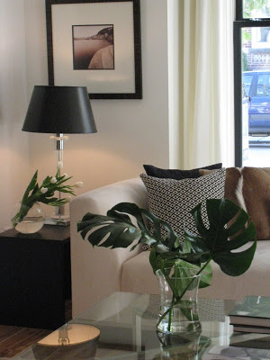
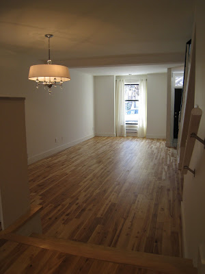
After - View of Living room after new windows, smooth ceilings, floor, trim and paint was completed.
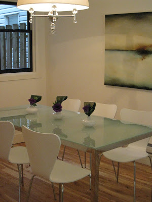
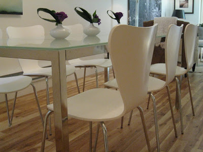
The most compliments we received on the finished house was the new floors. Everyone who walked thru the door, from installers, to friends, to neighbours to the pizza delivery guy,,,,,all commented on how much they loved the floors and wanted to know what they were, where to get them. Personally, I loved the floors too and I had them selected from day 1. They're a natural finish, solid 3/4"th x 3-1/4"w prefinished birch in a loft grade. And they also happen to be the least expensive floors I've ever specified at $1.99 s.f., in stock and on sale! They're from an Ontario based company called
Kultur Flooring who claim to have the most advanced wood flooring mill in North America. One of the things I really like about their product is they are the first mill in North America to mill the whole tree for wood flooring - this allows them to offer a range of wood grades and produce really long boards. Also, for a prefinished floor they have the smallest micro-bevel edge I've seen, giving it more of a site-finished look.
I chose the loft grade because of the character - the variation of colour and the visible knots which reminded me of some of the antique floors I've installed (for a LOT more money), and I think they created a loft like look in the space. They came prefinished in a clear, matt finish. I prefer my wood floors to be natural, not stained, and I like them to be very low sheen like a waxed finish and this floor offerred both of those. This gives them a more relaxed look and is more forgiving to scratches and wear and tear. I think the older they get, the more character they'll develop. What sets them off even more is the all white walls and the black window frames, again creating a contemporary urban soft-loft like look.
Before - View of Dining room before closing.
Before - Living and Dining room after demolition. Newly smoothed ceilings and partial primed walls and railing.
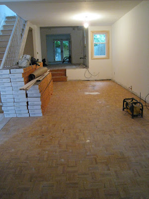
Before - Living and Dining Room just prior to new floors being installed.
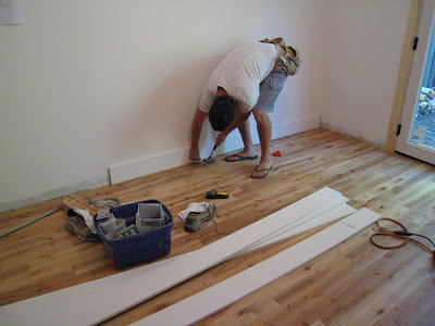
We installed new casings on all the windows and doors and decided to custom cut our own. I was looking for a simple profile, something very clean lined and contemporary looking but there's not much available in stock. So I purchased 1" x 4" select pine and had my handyman run all the boards thru his table saw to create a wide bevelled top edge. Once the saw was set up the process went pretty quickly and the cost was a lot less than factory milled casings. After they were cut, a once over with a palm sander and a primer coat to seal the knots, they were ready for paint. So we ended up with custom casings for about $1.09 linear foot. The biggesst challenge was trying to find a store that had enough lumber in stock!
Before - the first new baseboard being installed on the new hardwood floors. Don't worry,,,1 hour later a super powerful pneumatic nail gun made an appearance.
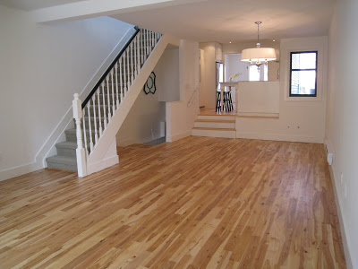
After - View of living room and dining room new windows, ceilings, floors, trim and paint were completed.
I think painting out the old hand rail and spindles made a huge transformation to the staircase, no more 80's golden oak. We cut-off the little curly-que end portion of the old handrail and added a large newel post which i think is more in keeping with the original character of the century house. The hand rail was painted a glossy black but I also think it would have looked just as good with the spindles painted black as well.
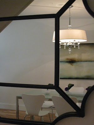
The light fixture in the dining room was a great find at Habitat for Humanity, I'd seen it regularly at lighting showrooms selling for $600, I scooped it up for only $125, brand new in the box. The living room had this oddly placed junction box in the ceiling directly in front of the window, what normally might instead be centred in the middle of the room. I decided to hang a small, modern looking pendant chandelier there suspended over the sofa, with the 9' ceilings it added some sparkle, made the window area look more special but also created a nice visual from the exterior of the house. A bit unexpected but I think it worked really well.
After - the Living Room
Stay tuned for the next post on this Victorian Row House reno where I'll post photos and details about the kitchen and family room!
For earlier posts:
All Photos: Carol Reed


