70's Bungalow: Makes A Modern Impression
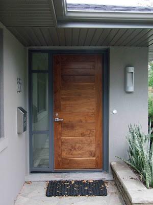
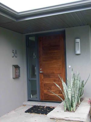
70's Bungalow with new front facade and door (new landscaping still to come!)
As you approach this door,,,,you can almost hear it say "Welcome! Let me introduce you to my stylish homeowners who will so graciously invite you into my warm modern interior......please come in...". Its a far cry from what this front door used to say....
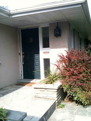
"Come in if you dare". Front Door before.
When I began working on the
70's Bungalow project over a year ago I immediately saw such huge potential for the exterior. What I disliked about the exterior of the house was its horrid fleshy peach coloured stucco (that's an understatement!) and its white vinyl slider windows. What I loved most about the exterior of this house were its lines, it had great long horizontal lines. Everything about these lines screamed modern to me, they were just wanting to be heard.
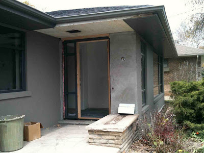
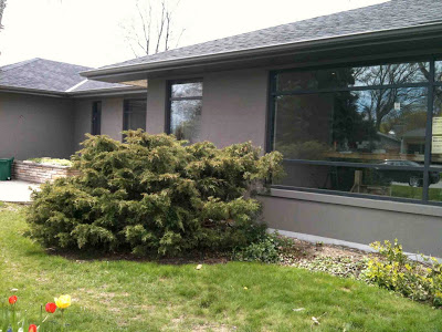
To begin the transformation of the dated exterior the chunky traditional plaster mouldings were removed from around all the windows. Next a new roof, and windows were installed. Then new black aluminum windows were custom designed with an asymmetrical mullion detail. I had the front door and sidelite reversed (from the original positions) so the handle side of the front door wasn't up against the adjacent wall. New lighting locations were roughed-in and finally a new dark grey stucco was applied to the entire exterior and the new eaves and soffits were fit into place.
The new look is monochromatic and distinctly contemporary. I chose a black shingle for the roof and a dark warm grey not only for the facade of the house but for the eaves and the soffits too, I wanted these elements to blend in with the body of the house rather than be in contrast. Not chosing white tones for the aluminum work created this monochromatic effect and emphasizes the expanse and volume of the house, not breaking it up with contrasting trim. What I envisioned as the highlight of the exterior would be the front door. All of this sophisticated grey and black was the perfect setting....
For a beautiful, solid, natural wood door. The wood tones are a striking feature against the grey exterior and gives a strong presence to the entry. Because the door location is a bit unconventional in that it doesn't face the street, (its positioned sideways/perpendicular to the street), it could easily disappear and become very nondistinct. But I didn't want that - I like a house to have a definitive front entry that's distinguishable and also sets the tone for the interior beyond, even if its understated. I talked the homeowners out of both a glass door and a painted door option. I wanted to make sure this new door was in no way mistaken for a window or have the less important look of a side door. Designing a new custom front door wasn't part of my original scope of work but as we discussed all the design details for the windows with the contractor the door design was created on the spot. Oh how I love to hear the words "we can make anything you want, just tell us what you'd like". So I did, and.....they did. To finish it off on a truly collaborative note, the homeowners selected the new light fixture and mailbox. I approved.
After waiting months and months for the new door to be delivered - the homeowners and I unanimously declared it was worth the wait! (the colours are a little off in the photo above). Next year they'll begin the landscaping redesign which will include new stonework for the front entry area and a new cladding treatment for the stone planters. So please ignore all the landscaping (or lack of) in these photos as the grounds have remained unchanged to this date. As for the interior, all construction work has finished up and we are currently working on all the window coverings and artwork.
Previous posts on this project:
All Photos: Carol Reed
