Janice's Bathroom: Before & After Photos
Receiving after photos from E-Design clients is one of the most exciting things I find in my inbox, and the sneak peeks I was seeing of this particular particular bathroom reno had me eagerly wanting to see more. It didn't disappoint, in fact when I did see the finished space I was so impressed with how well Janice and her husband had implemented their design plan that I was longing to see it in person. Since they live in Toronto, last summer while Janice was still on maternity leave I took the opportunity to meet her and the beautiful new bathroom in person. I brought my camera and also a small assortment of flowers, so just a couple of vases and few minutes later I started snapping. The room has wonderful daylight and aside from the fresh blooms, the photos I took below are exactly what the room looked like when I walked in I only wish I could share with you how it felt...it sounds corny or cliche to say 'it was like a breath of fresh air' but it really was like that.
The matt finish of the freestanding tub was one of my favorite things, like honed stone that compels you to touch it, truly gives the tub a modern sculptural quality.

One of the 'bespoke' features of the bathroom was this custom designed and built walnut vanity, its clean contemporary lines, cararra marble counters and vintage style faucets make a classic and elegant statement. The lines of the walnut grain and warm tones of the wood are stunning details on their own, no further embellishment needed.
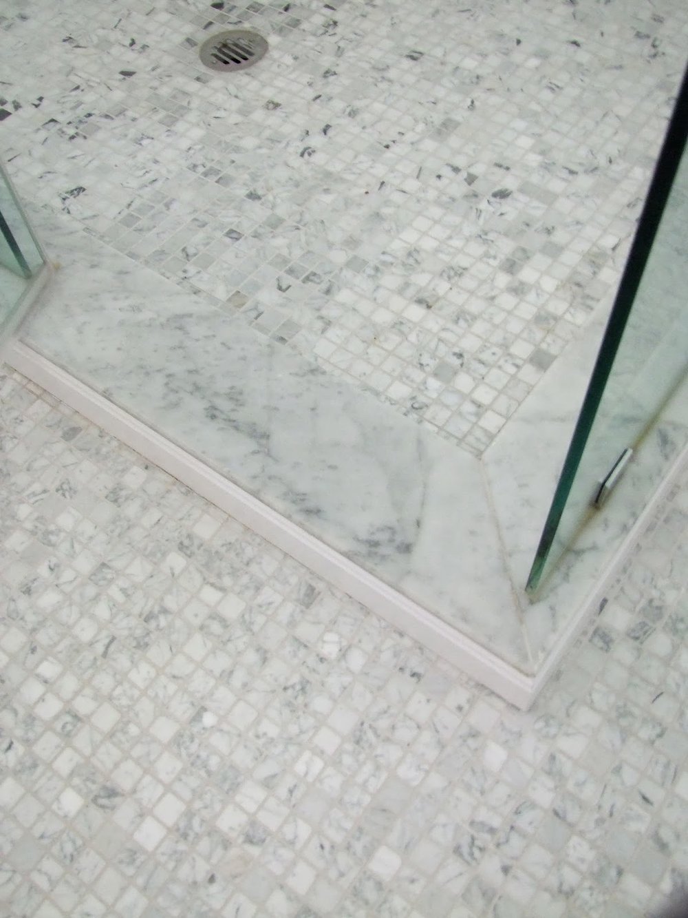
A marble mosaic floor tile of simple small squares has a wonderful textural impact in the space. The simplicity and expanse of little squares gives this timeless material a modern vibe.
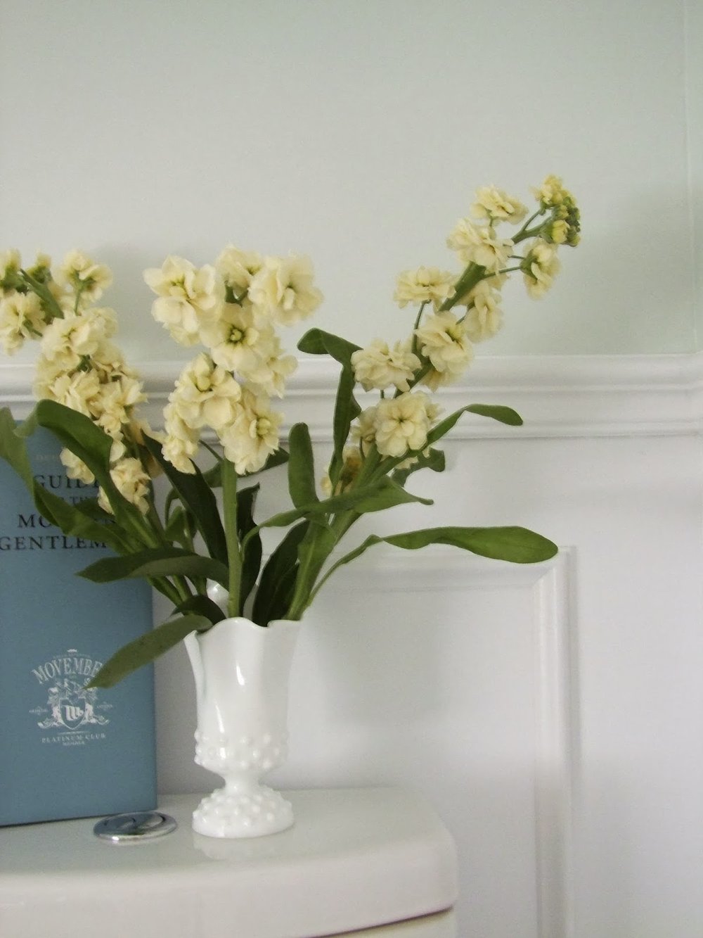
The walls were finished with panel moulding and chair rail. A nod to the historical character of the century old house. I adored Janice's milk glass vase.
A modern chandelier of pear shaped glass makes the room sparkle.
Double sinks and wall sconces. The marble mosaic creates a wonderfully multi-tone effect that adds movement and interest without adding fussy with borders and accent tiles. Janice is still on the hunt for a cart or table and a comfy stool to put beside the tub for bath time, but she has a charming vintage bentwood chair she uses in the meantime (sorry not seen in these pics).
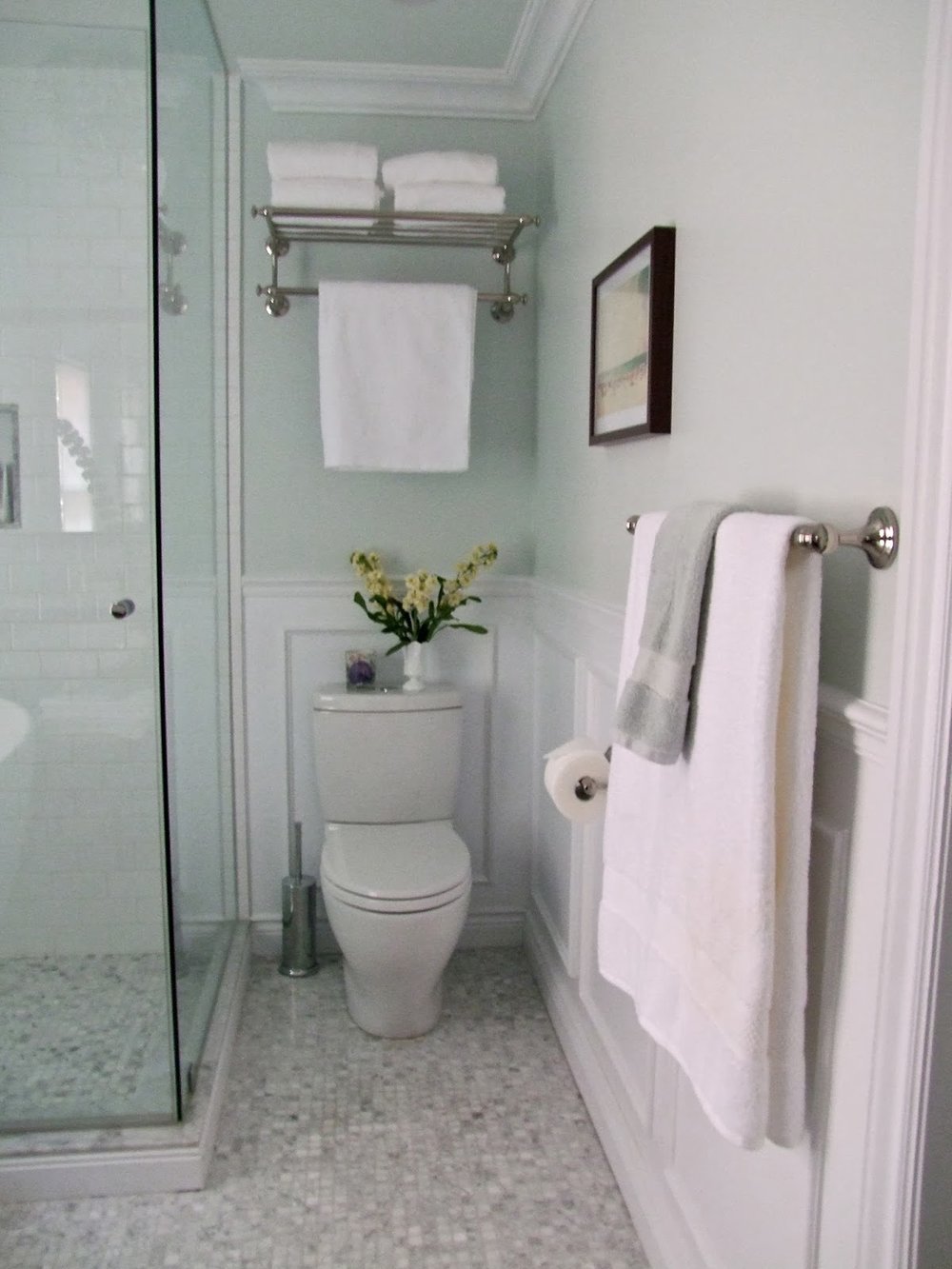
A walk-in glass enclosed shower, with classic white subway tile keeps the space bright and spacious. The modern loo pairs well with the equally clean lines of the soaker tub.
The end result achieved what Janice was hoping to, a classic bathroom that's not too traditional and not too modern but a well balanced mix of both. With a use of quality materials and simple classic details this bathroom will have stylish appeal for many many years to come.
Thank you Janice for welcoming me into your home, even though I felt I knew you already it was such a pleasure to meet you and your adorable Luca in person. xo
For a look at the before and after plans check out my previous post
here.
For more information about E-Design services for your home please check out my E-Design website
www.thedesignshop.ca
Room Design & All Photos by: Carol Reed


