Gail's Kitchen Reno: Post #3- Progress


Its been 3 months of debris and dust.....finally its time for all the new finishes and fixtures!

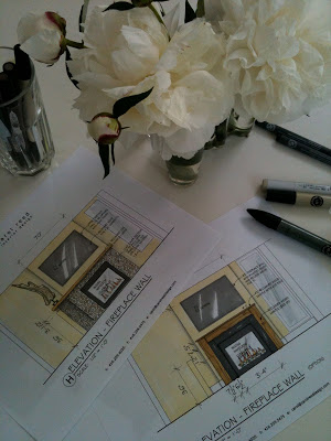
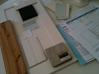
After 3 months of demolition and new construction we're finally getting to all the exciting finishing details at Gails' Kitchen.  Just when it seems like things are moving along at a snail's pace, suddenly you hit a point when everything starts to come together quickly with visible progress every day.  Its like Christmas morning each time I visit the site now!!  While the contractor's been working on the new construction I've been finalizing a few design details like the fireplace surround, ordering light fixtures, sourcing some new stools and finalizing the hardware selections.


A couple of weeks ago we purchased the Ikea cabinets which were delivered next day - EDIT:  for immediate delivery you have to pick the entire order in the warehouse yourself.  Otherwise for large orders you should have them pick the order for you which means allow at least 2 weeks for delivery of the order which comes from their main distribution warehouse.


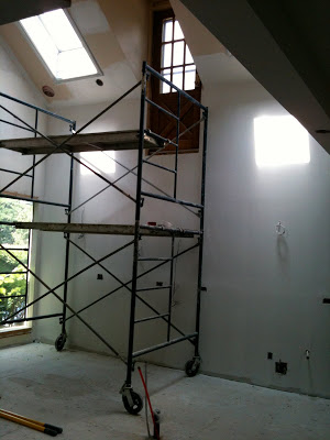
My absolute favorite part of any job is when the primer goes up.  I LOVE to see the new space painted entirely white, in many cases its the only time I get to enjoy the beauty of the whiteness of the space before the clients 'colour' goes up!  Personally I always think the spaces look better in white,,,, but hey,,, its not about what I want because its not my house.


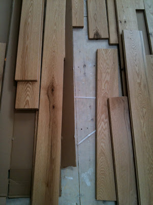
When the hardwood flooring arrived on site I handpicked all the boards.  I specified a character grade wood that has lots of knots but which also means you can get lots of variance in the appearance with some really odd ball pieces thrown in there too.  With this much character in the wood its important that the boards are thoughtfully placed or it could look like a dogs breakfast, so I sort them into 3 piles of bad, good and best.  Instead of tossing out the 'bad' boards I have the installer use them in areas where they won't be visible like under all the kitchen cabinets, under the appliances and under the sofa.


I sampled 7 shades of yellow paint before we could find one that we were happy with.  Yellow has to be one of the trickiest colours of all to get right, it doesn't help that I'm not a yellow person but I appreciate my client's attraction to it.  We applied each of the samples on three different walls and not only did the yellows look drastically different on each wall, the same colour often looked totally different on the same wall.  Looking at all these samples above, except for the two whites the others looked nothing like the paint samples in hand, NOTHING.  From left to right, bottom row we have; BM Creme Brulee, BM Creme Fraiche, BM Affinity Soleil, F&B Cream, F&B House White, BM Cotton Balls, BM Spanish White (LOVE), BM Ivory White (LOVE).  Top row is a second sample of BM Creme Brulee which looks nothing like the sample on the far left.  The homeowner didn't pick either of the ones that would have been my first choice but she's madly crazy in love with the one she did pick!


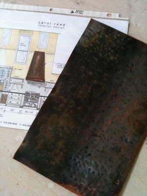
I was so excited a couple of weeks ago to meet the Coppersmith at the house and review samples of antiqued, hammered copper. He'll make the copper patina to our exact liking and then he'll use it to build us a custom hood canopy exactly like my design sketch - I can't wait to see it!!!!


But before the Coppersmith left the building,,,,,I lured him into the family room and pulled out my design sketches for the fireplace and asked him if he could use that same copper to make a surround for the new fireplace.  No problem he said, piece of cake.  Now, that's the kinda response I like to hear!!  So he'll be back to measure for the surround as soon as the gas fireplace box is installed.


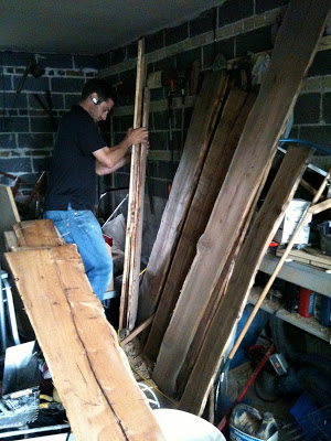
Nothing gets my heart beating faster than found treasure,,, and an enthusiastic contractor. : ))  My clients are currently living in one of their own rental properties during this renovation and in the garage of that house we found stacks of antique wood boards from the previous owner who was a woodworker.  I couldn't believe my eyes when I saw these beauties piled up in the junk pile.  With their live edge and the gorgeous wood grain my mind was realing thinking of all the different ways we could use these.  I sketched up a detail for a sliding barn style door and Tom's going to have these boards made into an oversize door panel, and then,,we'll use the rest to make the mantle for the fireplace.


They started installing the base cabinets on Wednesday....


By Monday we'll be ready for the counters to be templated.  


Meanwhile the cabinet doors and drawer fronts are off getting sprayed a perfect shade of white.  Check out this post for all the details we have planned, and check out this post for step by step process of how I have Ikea cabinets custom sprayed (note this is not a DIY project!).


Stay tuned for more updates over the next 4 weeks as this dramatic kitchen, family room transformation comes to completion. 


All Photos:  Carol Reed

On The Side


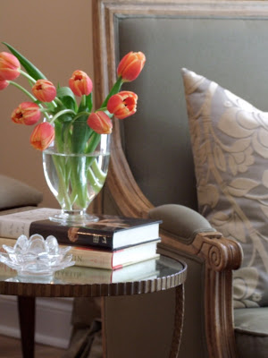
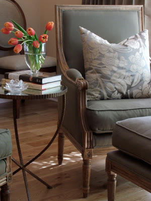
Things are pretty hectic right now with client work and vacation planning so I don't have too much time to spend blogging.....but I just had the urge to post a pretty picture!!  You can see in these photos one of my favorite side tables - I've used it on two different projects in the last year.  It has simple and elegant lines, has a warm patinaed metal finish and best of all its usually in stock..... and not crazy expensive! Its available in two different sizes which can be used singularly or nested.  I particularly love the antiqued mirror top.  Jules accent table by Crate & Barrel.

The photos above are from the living room of the 70's sidesplit I recently furnished for a single mom.  More photos of this room coming soon......


All Photos:  Carol Reed
Art Gallery Inspiration


Last week on Canada Day I made an impromtu visit to the McMichael Gallery in Kleinburg, just north of Toronto.  You can read about the inspiration for this visit here.  I love to visit art galleries of any kind and I'm a particular fan of Canadian art so it was a wonderful way to spend Canada Day afternoon.  This past May marked the 90th anniversary of the Gallery's Group of Seven Collection and to celebrate this, they re-designed the exhibit and rehung pieces from their permanent collection and added some rare pieces from private collections.  The new exhibit is called The Group of Seven: Revelations and Changing Perspectives.  What impressed me most about the gallery on this visit (aside from the masterpieces!) was the wall colours - as you walked from gallery to gallery throughout the exhibit the wall colours changed with each series of collections.  The walls had all been freshly painted just prior to the opening of the exhibit this past May in a wide range of colours from deep rich jewel tones to light watery greens and blues, to neutral taupes.


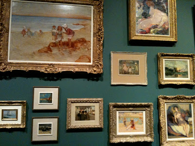
Salon style exhibit of Canadian historical works.

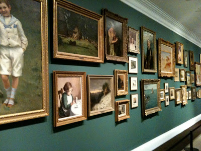
Upon entering the exhibit galleries you're greeted by this powerful and dramatic long wall of 19th century Europoen inspired landscapes and portraits arranged salon style on a deep teal coloured wall.  I've always loved artwork hung in this manner there's something about it that just draws you in and captivates you and even though there's an abundance of art on the wall the individual pieces aren't lost - somehow the mass arrangement makes you want to stop and look at every single one like its part of a story.   In the same manner there might be some pieces that on their own aren't to your liking but when they're hung collectively like this you have an appreciation for all of them.

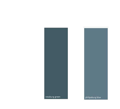
Here's a couple of similar paint colours from Benjamin Moore,,,I'm not crazy for teal because I have not so fond memories of it from the 80's (!!!), these are a slightly bluer version of teal than the wall colour the gallery used.  (I inquired about the paint colours but no one was able to provide them to me on that day and I havn't yet received any follow-up response yet so these are just my own interpretation.)


I often come across articles with tips on how to hang a gallery or salon style wall and I've read all kinds of different 'rules' many of them contradictory, regarding the spacing, the framing and the subject matter.  But the only consistent thing I've noticed about my favorite salon walls is that there really is no rhyme or reason to the hanging.  As I stood back and studied this wall, again I couldn't detect any overall consistent spacing but I did notice there was a definite 'invisible' horizontal border at the top and bottom of the wall which all the painting where hung within (looked to be about a foot below the crown moulding and about 2 feet above the floor).  Also all the pieces were all paintings from the same era and all were in gold toned antique style frames.  So I think these consistencies added to the powerful impact but I could easily envision varying works of art and frames incorporated in this hanging and I think the result would be just as effective.   My two favorite pieces on this wall are seen in the photo above, the beach scene in the top left and the smaller beach scene on the bottom right - romantic summertime images I can imagine in a room full of white linen, nautical stripes, sisal, wicker and painted furniture, they're simply gorgeous and not something most people would typically associate with Canadian art.

I will always be a fan of the traditional rugged landscapes that are symbolic of the Group of Seven's work, but what I really enjoyed about this exhibit were the paintings that are so different and in such contrast from those iconic images.  My favorites included many of the colourful still life flowers and portraits that I would love to design a room around!


Arthur Lismer, Summertime c.1918.  Oil on Canvas.
This painting reminded me of the two beach scenes on the salon wall.   Soft, pastel and beachy.


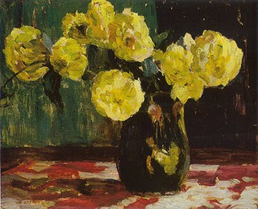
AY Jackson, Dahlias 1913.  Oil on board.
This painting just grabbed my eye, it literally popped off the wall.  The wall it was hanging on was painted in a browny/plum colour similar to below.  

There were a lot of purpley taupes and plum/browns used.  The paint colours don't translate accurately on the computer but looking at the fan deck  Benjamin Moore's Driftwood colour is similar to what the Gallery used based on my memory.   The other two colours are my own picks for a deeper taupe. 


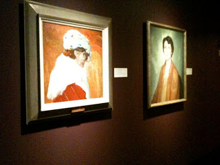
F.H. Varley, Girl in Red c.1920-22.  Oil on Canvas.
Portraits have always been a favorite of mine, the colours of this one are stunning.  This was hung on a purpley/red painted wall similar to the paint colour below.  This would be a gorgeous colour to display artwork in a dining room or cozy den.
Going by memory this colour in person was a purply red but a bit on the brown side.  I managed to get a photo and its looks quite brown in the image below but I remember being more purple than brown.  I selected a few similar colours from Benjamin Moore above.  My least favorite colours are dark purples and burgundies so I don't tend to use a lot of these colours, I have used Amazon Soil and its a very livable earthy purple which was a beautiful backdrop for artwork.


wall colour was more purpley than brown as it appears in this photo.


Edwin Holgate, The Cellist c.1923.  Oil on Canvas.
This was so dramatic hung on the same dark red/purple wall as the portrait above.


J.E.H. MacDonald, Thomson's Rapids, Magnetawan River,  c.1910.  Oil on Paperboard.
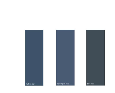
There were a series of landscapes hung on a deep navy blue, one of my favorite wall colours in the gallery.  The look would be similar to these paint colours I've selected below....
Beautiful deep blues from Benjamin Moore any of these would provide a classic backdrop for artwork.


My favorite wall colours in the gallery for displaying the artwork were definitely the deeper richer tones. To my eye these colours made the paintings pop and truly highlighted them.   I'm not one for using these really deep colours throughout an entire house, they can be heavy and moody, but if you have a definitive accent wall or a seperate room they're beautifully suited to dining rooms, library/dens or powder rooms where they can be dramatic and cozy.  


Of course I love the look of classic gallery white walls, but my next personal favorite is a deep grey or black for displaying artwork.  On the second floor where the Inuit art exhibits were there was a beautiful black wall that looked stunning as a backdrop to glass display cases and there was a brighter less brown red.   Benjamin Moore's Black Beauty is a black I've used several times, Kendall Charcoal was my own bedroom colour for years and I loved it (Chelsea Grey is another fave),,,and Northern Fire is an orangey red that I find more cheery and fresh than darker browner reds.


My least favorite colours were the lighter wall colours they used in the gallery ranging from light sky blue, soft watery greens, taupe and mossy green.  I found that the paintings seemed dull and bland when displayed on these colours, maybe because so much of these tones were in the paintings themselves or maybe because the frames were painted in muted tones?  With light coloured and neutral walls I think artwork with lots of white, like black and white photographs with white mats, or white line drawings work really well because they look very crisp on these backgrounds, especially in metal or black frames.


If you haven't visited the gallery before its a great way to spend an afternoon, they have beautiful grounds with lots of picnic tables if you'd like to pack a lunch.  If you're looking for something to do with the kids this summer the gallery offers lots of children's day camp programs and art classes, (including spin art!) the kids can learn something new while having lots of fun and you can take home some masterpieces of your own to hang on the walls!