Tulips & Our Ten Year Old Bathroom Reno

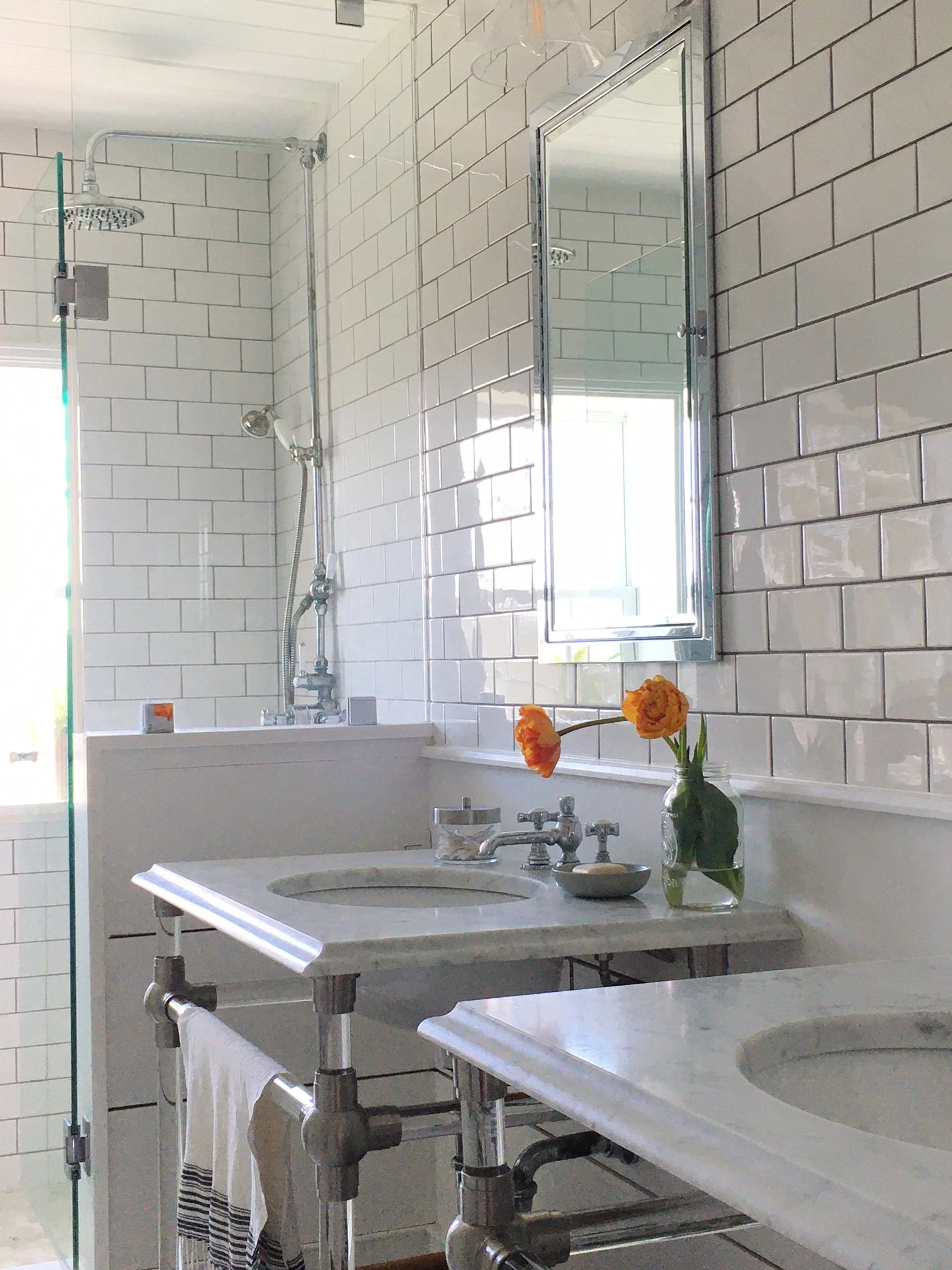
We grew tulips for the first time! And, this May marked 10 years since we completed our upstairs bathroom reno, it was an extensive gut reno, we reconfigured the entire room, created a separate shower, freestanding tub, added a second sink and raised the ceiling.

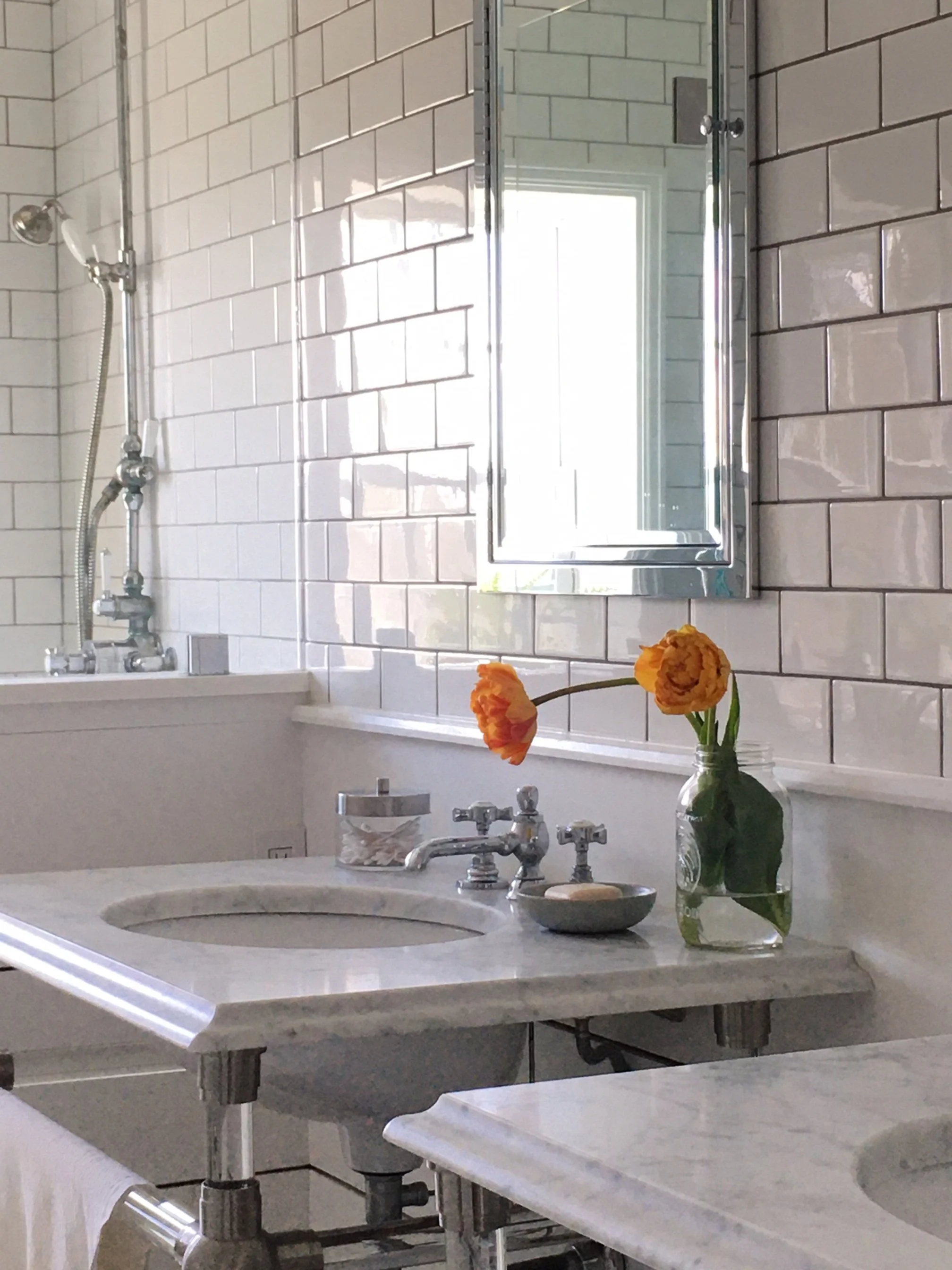
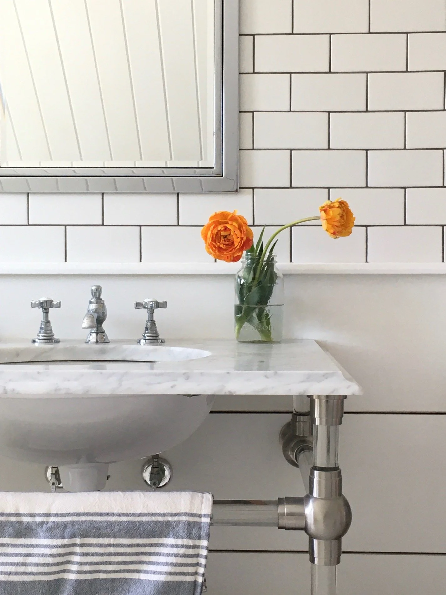
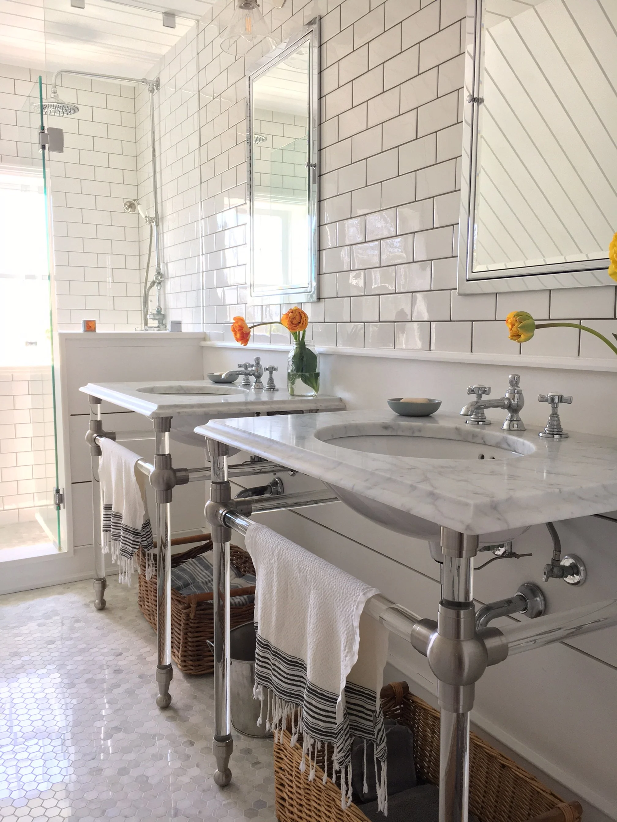
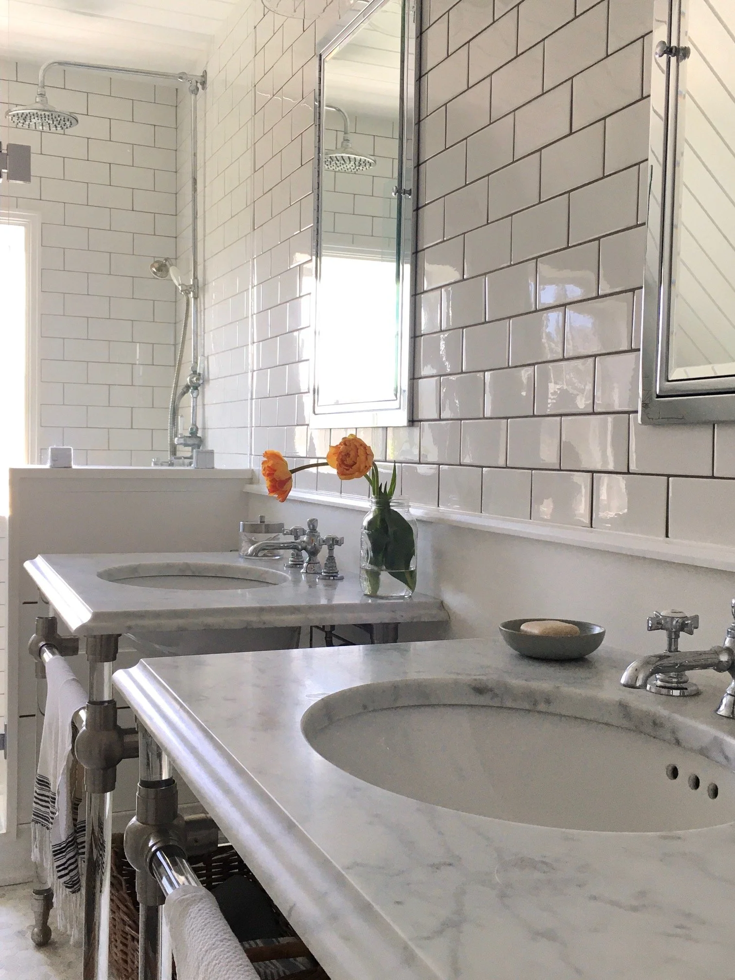
I wanted double pedestal sinks to keep the space looking open and airy, with separate counters so they feel more personal to each user. These are often used by guests so its nice to have your own sink and medicine cabinet. A basket below each sink and the recessed cabinet provide the only storage in the room which suits our needs perfectly.

We are fairly minimalist when it comes to cosmetics and toiletries, I rarely wear makeup here or use a lot of hair tools. As it is now, these wall cabinets are not even half full so its plenty for us. (We also have a second full bathroom and laundry downstairs with a large vanity with loads of space.). The cabinets have fully mirrored interiors including the back of the doors which is great for closeup looks when you need to. An added bonus of the console design is that they’re also super practical towel holders which keeps the walls less cluttered, free of towel rings or bars.

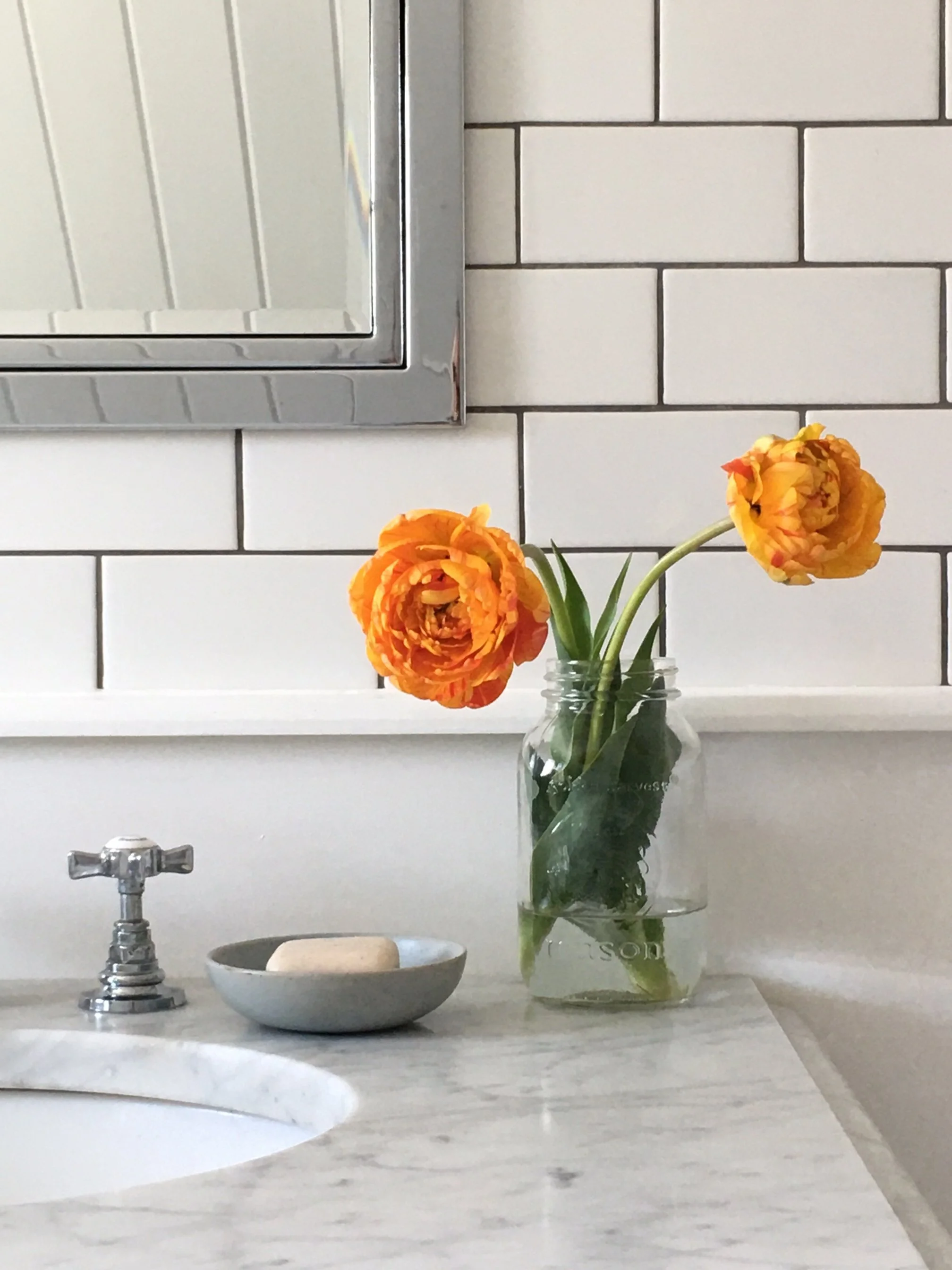
Along with the soap dish, these are my every day products I leave on the counter all the time. I put them in the cabinet for the rest of the photos because I didn’t want to detract from the flowers. Since I always leave them on the counter I like to remove the labels so its a cleaner look. These labels aren’t applied with heavy adhesive so they peel back super easy with zero glue residue, a small little thing that makes me happy. Products that come in simple white black or clear containers also make me very happy.

The window faces south west overlooking a salt marsh and beach. Sunlight floods the room and glistens off all the tiled surfaces. What you can’t see is perhaps the best features of the room, ocean breezes and the smell of salt air and sound of crashing waves drifting when the window is open. On cold days the warm heated floors are heaven on bare feet, this is my absolute favourite new feature in the entire house - these heated floors.

We planted a variety of tulip bulbs which were gifted to us at Thanksgiving, these were the first to bloom, I can’t get over how much they resemble peonies. I didn’t keep the package but I think these are actually a called Double Peony Tulips (Angelique) which I didn’t even know existed, now I’m properly obsessed with them!

The extra wide shiplap, hand formed subway tile and nostalgic style fixtures give the room a vintage style that is timeless. Inside the shower the pony wall has a recessed niche for soaps and shampoos.

Although I selected the wall tile about 6 months before the work began and had it shipped, ready and waiting, I had no such luck with the floor tile. I had something specific in mind and I spent months searching everywhere with no luck. Ultimately despite all my design intentions, how I ended up selecting the floor tile is how most people do it - a few days before the tilers where to arrive I made a trip to Home Depot and picked something off the shelf. I’ve had no regrets chosing this hex marble, I’ve loved this floor from day one and its been the easiest floor to maintain I’ve ever had.

A view of the right side sink, these tulips were a few days behind and actually turned the same colour as the others on the left sink a day or two later. Baskets under each sink hold stacks of extra towels and a hair dryer.

There’s a mix metals, the plumbing fixtures and medicine cabinets are chrome and the consoles have brushed nickel fittings because I liked the darker more industrial look that gives, and there’s some black towel hooks and a black sconce on other walls not seen.

I’ll plan to do a shoot of the whole room sometime this year, its tricky to photograph on a sunny day like this with my limited camera skiils and the position of the window.

10 Years later I still love everything about this bathroom reno and it still looks as fresh and new as it did the day it was finished. The one thing I will be adding to the sink wall is a wall mounted magnifying mirror (prescription i think) because as my eye sight is getting worse, its become challenging to see without glasses on when I need to apply anything around my eyes.

I also posted a short reel of the bathroom case you missed it you can check it out on our Insta page.

@carolreeddesign

House & Home: Hot Take

I love a good Q & A so I was thrilled to participate in Canadian House & Home’s designer Hot Take series to discuss my preferences and predictions. It’s always a special thrill to be represented as an East Coast Designer and sharing my take on Martime Design.

If you subscribe to H&H or have an app reader with back issues you can view the printed version of the Q&A in the August 2022 edition, or anyone can read it anytime online here on the H&H website.

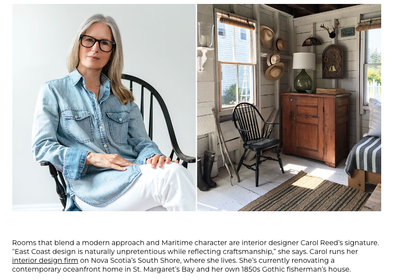
Portrait photo by: Sarah Jewell, Concept Measures | Halifax NS

Room Design & Photo by: Carol Reed

Check out the link above to see the questions and select photos. Below are a couple photos and additional questions from the un-cut version.


Q: Item In Your Home That Most Reflects Your Personality:

A: A coffee table made by my late brother.  Built a few years ago with salvaged boards from our house and an old wood beam we found washed up on shore behind our property, he and another brother helped us lug it home and we built the table that afternoon to use in our guest barn.  It reflects everything I love and value most.

Custom coffee table hand-built by my late brother, from reclaimed wood | Carol Reed Interior Design

Q:  What have you seen or where have you been recently that inspired you, design wise?

A: I haven’t travelled in over two years but i’m inspired daily by the coastal landscape and seaside vernacular around me.  Design wise the new Muir hotel in Halifax is incredibly inspiring. Its a modern luxe interpretation of East Coast design - utilizing local artists and craftsmanship. It exudes maritime tradition but breaks away from all the cliches of what that looks like and reflects a modern aesthetic that is prevailing in new design here.

Muir Hotel Signature King Room, Halifax NS. Interior Design by:Alessandro Munge of Studio Munge | Architecture: Brian MacKay-Lyons of MacKay-Lyons Sweetapple Architects.

I hope you check it out and enjoy my β€˜hot take’ on these topics as much as I enjoyed sharing them. The entire series is great be sure to check out previous and newer Hot Takes of other featured designers!

For even more of this Q&A sign-up for our Subscriber’s Edition (in the sidebar) where I’ll be sharing an extended un-cut version of the interview with my predictions for what’s next in home design and what I’m excited about using in future projects - coming in the Spring 2023 Subscribers Edition.

For more peeks at full-service and virtual service design projects you can follow us on Instagram @carolreeddesign

Family Home Kitchen Makeover

a kitchen makeover for a young growing family

I’m embarking on a bit of catch up with the blog due to an unexpected lapse since my last post - beginning with some updates I’ve posted elsewhere. Starting with a beautiful kitchen makeover for a long time client. We planned an unusually high number of kitchen updates the past couple of years, but this fresh one has made some seriously good progress in its first stage of transformation.

For the owners this new-to-them house represents a move from their first home as newlyweds to family life as busy working parents raising their young family and hosting their extended families. Along with more bedrooms and dedicated home office space, the new house also has an open concept family room and eat in kitchen which they didn’t have in the first house. The kitchen is a hard working kitchen, a hub of daily meals, kids activities and entertaining but also on full view as part of an open concept space so it needs to look great too.

Although the home is not very old we planned cosmetic updates for the whole home including an all new paint palette and upgraded lighting. The kitchen needed a bit more attention to elevate its style and bring the overall aesthetic more in line with a custom build and their own lifestyle.

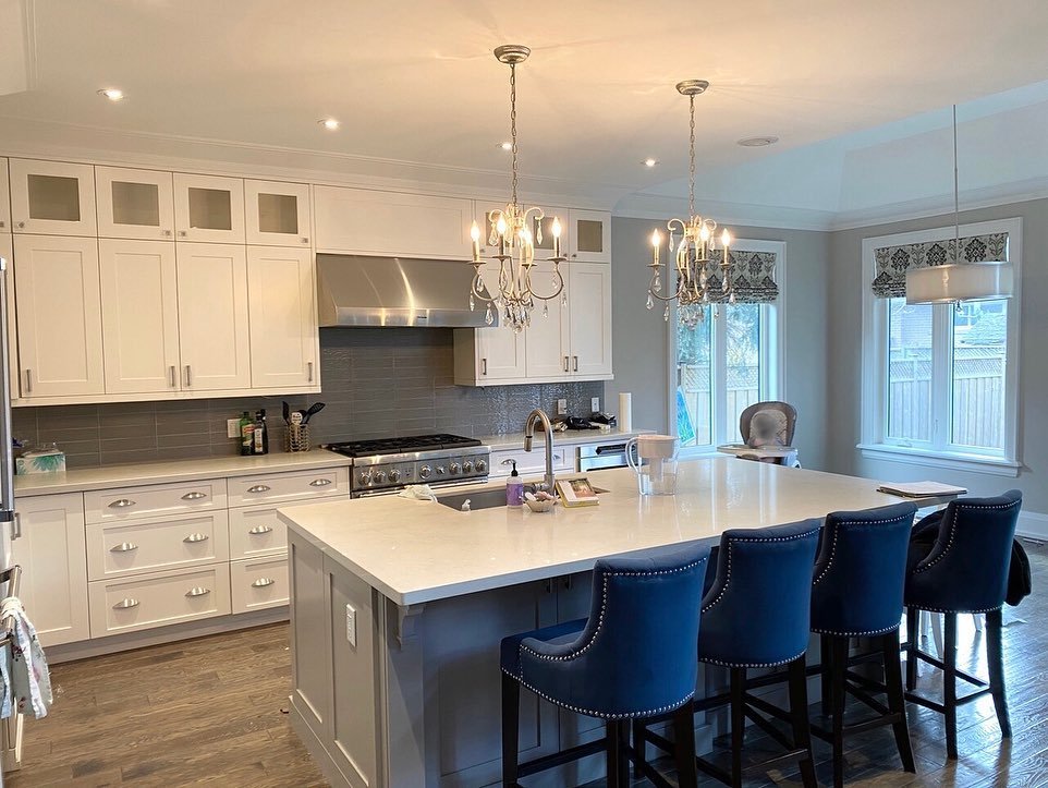
Family Home Kitchen - Before

Without replacing flooring, counters, cabinetry or appliances our aim was to inject the kitchen with a new transitional vibe. First the walls of the open concept space (the kitchen opens to a 2 storey great room) were given a fresh coat of warm white. Next we sourced and selected new hardware, lighting, faucet, new backsplash material, counter stools, and window treatments. Here’s what we envisioned:

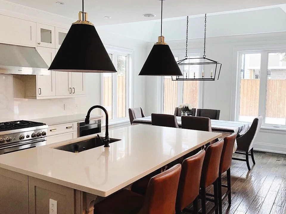
Here’s some in-progress snaps of the space after the fixtures and backsplash install, they ended up going with a quartz slab for the backsplash instead of tile. The next stage will include window treatments and new chairs to replace their former dining room chairs being used in the interim.

Family Home Kitchen - After | Carol Reed Interior Design Inc.

The saddle leather stools and black pendants add striking contrast and a modern edge. Both will be beautiful compliments to the neutral and earthy palette envisioned for the family room. The red kettle, as beloved as it is unfortunately is not going to get along as well with their family room decor - so it’ll make a move to the family cottage where I imagine it will be perfectly charming addition.

Family Home Kitchen - After | Carol Reed Interior Design Inc.

The changes made a significant style impact without the extensive costs, timeline and disruption of replacing the entire kitchen. Nonetheless the updates were still an investment in working with what was there and trusting that the results would make impactful improvements. We sure think its achieved that and more! The owners are beyond thrilled with how much this has transformed a new-to-them-house into a home that they love.