Grant K. Gibson

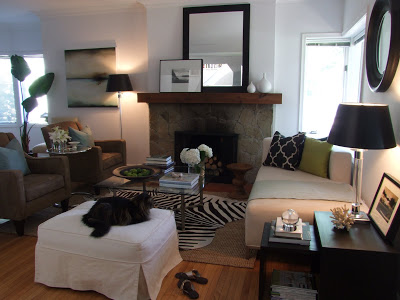
Living Room as seen in San Francisco Magazine

I admit I’m a little late to the party on this topic as it has been almost a week since this news spread throughout the blogosphere last thursday, which was the day that the apartment of the young designer Grant Gibson from SanFrancisco was featured in the NYT’s home section.  Grant is the principal of the boutique design firm, Grant K. Gibson Interior Design which he began 7 years old and now has a staff of 4.  In addition to being a young up and coming designer, Grant is also a blogger and a fantastic amateur photographer, I’m certain his travel photos will be part of a fabulous exhibit one day and make for beautiful books.  As a rule I try not to post subject matter or photos as posted on other blogs, but in this case, I’m going to share the photos of his stunning apartment both from Grants blog and the NYT, instead of just linking to them - this way I can add my comments along with the photos.  But be sure to check out Grant’s website and blog here for more photos and also check out the full article in the NYT here.


Grant’s apartment is a 1 bedroom, 1000 sf unit in a 1920's building and was actually photographed earlier this year and ready to be published in Domino magazine the very month the magazine was shut down.  Heartbreaking as that would be for any designer, I’m sure this feature spread in the NYT last week makes up for that just a little bit!  


As I’ve mentioned before, I’m a fan of all styles of interiors from modern to traditional and every combination in between.  This home is an example of how traditional can be done in a way that’s young and current.  This style is what I would call a collected look, and realistically it may not be for everyone, but I'm always drawn to spaces like these because I have a huge appreciation for how difficult it can be to do this well and make it look casual and current.   You’ll see from the images below that Grant exhibits sophisticated style and taste well beyond his years...what he’s done with this apartment is simply a masterclass in renovating with maximum style at minimal cost.   In the renovating and furnishing of his own apartment, Grant’s expertly demonstrated the art of:

  • displaying collections
  • mixing high and low
  • making any space look beautiful
  • originality
  • smart small space living
  • making the old look now

For all those who wander around antique fairs and flea markets and can’t imagine what people would ever do with this ‘junk’,,,,,and for all those who continuously come home from Home Sense (Home Goods) with bags full of mass produced made in china tchochkas that have no meaning or character and end up never being used,......for all those who have collections of things piled up behind closed doors or stashed in the basement ,,,,for those who think there’s nothing they can do with a rental space to make it look like a stylish home - here’s hoping that the photos below will inspire you!!


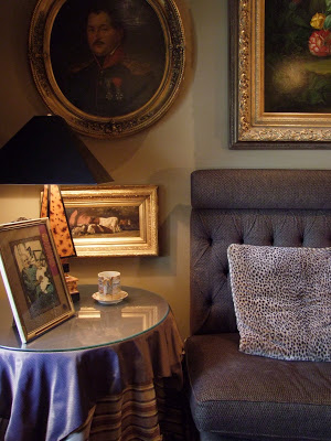
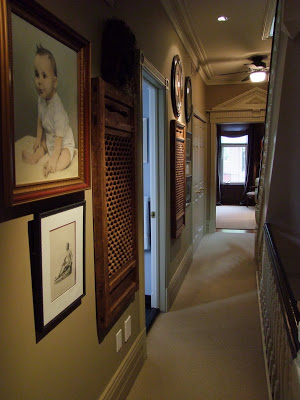
A beautiful vignette.  I'm not positive but this may be one of the portraits Grant purchased for $100....I have to say, it looks like a million bucks.


The banquet was custom built, the skirted table conceals the dog's crate and the bamboo shades are from target.  Camel, white, grey and black, my personal favorite colour pallette.


Williams Sonoma sofa with custom pillows made from Fortuny fabric bought online.  Group of etchings in the display cabinet were great finds for $300 and various portraits displayed in the living room were bought for $100 at antique markets.

The carpet and tray table were hand-me-downs from clients.


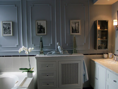
Old chipped yellow tile floor tile was removed and replaced with $1 s.f.  peel and stick black and white tiles.  Bamboo blind is from Target, and the silver trophy makes a unique toilet paper holder.  This small bathroom has loads of style.

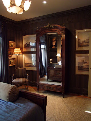
The bedroom was painted F&B's Drawing Room Blue.  Its classic, handsome, warm and inviting looking.  The 4 poster bed was on sale from Pottery Barn Teen for $500 and Grant added a custom upholstered headboard.

Draperies made of simple chocolate linen were given a custom  treatment with a greek key trim, a splurge that gives the room a high end tailored look .

The interior was repainted  with neutral walls providing a perfect backdrop for Grant's collections of drawings, books and sculptures.  The floors were resanded and finished in a rich espresso stain.  All the trim work was painted a Donald Kaufman white and the doors were finished in a high gloss black.  A truly timeless and classic interior base scheme.


Grant K. Gibson sitting in front of a series of architectural prints.  The prints were torn out of books and mounted in inexpensive ready made frames to make a dramatic display in the hallway.  

Congrat’s Grant, you’ve definitely left us wanting more.....


Photos:  First photo from San Francisco Magazine, All other photos by Peter DaSilva for the New York Times.

House Tour - Oakville Showhome

Beautiful 12 x 24 honed limestone floor tiles laid in a herringbone pattern.

This past week a girlfirend and I took some time to visit the Princess Margaret Showhome in Oakville, decorated and furnished by Linda Reeves and the design editors from Canadian House & Home.   We planned our visit for early afternoon and it proved to be good timing as we were able to enjoy viewing all the rooms in the house at a leisurely pace and without a crowd of people following us from room to room, from what i’ve heard the house is drawing lots of attention and streams of visitors from all over.


As someone who loves neutral spaces (for my personal home) the palette of this house was right up my alley.  Natural woods and white walls mixed with lots of linen and greys.  I’ve always lived in all white homes, with the exception of one or two rooms that I love to have done in a dark grey, so I was drawn to the brightness and simplicity of the white throughout the first and second floors of the house.  To me its the perfect timeless backdrop and I find that nothing sets off wood tones and artwork like white, and dark grey.  Although in this house, there wasn’t much artwork present, but you could easily envision how artwork could transform some of the many blank walls.....


Because of all the white, the rustic exposed beams, bleached wood,  and use of linen, I felt the house had a sense of Belgian style to it.   I did manage to get some great photos throughout the tour but for now, I’ll just post these pics of my favorite room in the house which was the master ensuite.   To see more of the house I highly recommend the drive to Oakville to see it all for yourself in person - its for a great cause so while you’re there be sure to buy a ticket and a chance to win this lovely home - it takes just one ticket to win.  Good luck!


The large spacious double walk-in shower is to the left of the chair, complete with dormer ceiling and window.  The entire shower, walls and ceiling were tiled in a 1x2 mosiac grid of the same honed limestone that was used on the floor.


I believe the vanity was white oak, unfinished or waxed perhaps.  The wall is clad in the same mosaic 1 x 2 limestone that continues into the walk-in shower.  The oil rubbed bronze knobs relate well to the light fixtures and emphsizes that understated casual elegance.


As stated on the CH&H website, "The Princess Margaret Oakville Showhome is the grand prize in The Welcome Home Sweepstakes for Cancer Research, built from the ground up by Lynda Reeves and her H&H team, with architectural designer Ray Murakami and custom home builder PCM Inc."   For more info and showhome hours visit here.

Fireplace Facelift - Thin Stone Veneer

Fireplace Facelift Sketch by Carol Reed Interior Design for thedesignshop.ca


As soon as I can feel the slightest chill in the air, I can't help but want to cuddle up in front of my fireplace with a blanket and a good book (or shelter mag!).   Enjoying the warmth and ambience of a fireplace is one of the reasons I look forward to the winter months ahead.  Living in Canada, I've always felt that a house just isn't a home without a fireplace, aside from the fact its an obvious focal point in any room, I love the character, warmth and mood a fireplace brings to space.  But this character.....has to jive with the rest of the house.   So its no wonder that fireplace facelifts are one of the most common design challenges I work on.


One of my favorite products for recladding an old outdated fireplace is a thin stone veneer panel product distributed by Erthcoverings in Canada.  I prefer the 3D slate or ledgestone series and have specified them for a variety of different installations over the past several years.  These are natural stone panels made up of multiple thin linear pieces of stone ranging from 3/4”th to 1-1/2”th which are adhered together to form 6” x 24” panels.   These panels of stone (made up of slate, quartzite, limestone, basalt) are made from 100% recycled post industrial waste and are thinner and lighter than using solid stone and much more eco friendly and natural looking than man made synthetic faux stone.  


The panels can be installed over any substrate and are installed fairly simply in the same manner as stone tiles, they even offer pre-made 90 degree corner pieces to wrap around corners seamlessly.   Its a versatile product that can be used inside or out and is suitable for cladding the exterior of buildings or interior installations especially great in spaces where you want to bring the outdoors in.  It retails typically for $12s.f. and up so a 6‘wide by 8’ high fireplace would cost you less than $1,000 in material.


The sketch above, and concept board below is a sample of an e-design fireplace facelift I designed for a client back in July where i recommended using these thin stone panels. The homeowners painted their existing 80’s brick fireplace out when they moved into the house earlier this year and wanted me to help them with some ideas on how they can update it.  This fireplace and its seating area are off to the side of the main living spaces in between the living room and dining room.  Utilizing a pair of existing leather chairs, I suggested adding a hide carpet, an ottoman some small tree stump tables and funky metal reading lights to compliment the updated fireplace.


Digital Concept board by Carol Reed Interior Design Inc. for thedesignshop.ca
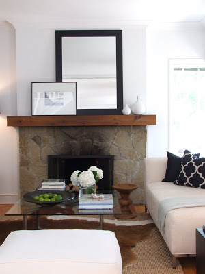
Below are before and after photos of a fireplace facelift I designed about 3 years ago.   The existing fireplace and adjacent wall (which continues beyond what's visible in the photo) and colum were faced in brick, but we chose to add thin stone veneer only to the face of the fireplace and then paint-out the rest of the brick, including the hearth which was done in a tone that blended in with the new stone panels. 

Brick Fireplace Before


Brick Fireplace After - clad in thin stone veneer

The results you can see, were quite dramatic and the fact that we painted out some of the brick didn't detract from the impact of the stone cladding.   The small recessed nook to the right of the fireplace was customized with floating shelves and the brick wall of behind it was paintd out in a dark eggplant colour.

Below are photo examples of various types of installations using this product.  All of these images are from the Erthcoverings website.

The stone wall in this dining room continues thru to the exterior.


Again, in this family room the stone continues thru to the exterior.


Exterior cladding on a contemporary home.


Close-up detail of the stone's texture.

I'm drawn to this product because i think its an effective way to bring an organic and natural element into your space,,, in a modern way.  Because of its linear composition, to me the stone has a very west coast feel that evokes a bit of a retro style in its similarity to the angel stone of the 60’s 70’s.  


My tips for a ledgestone fireplace facelift:

  1. Go all the way - on fireplaces this product looks best from floor to ceiling to really maximize the effect of the horizontal lines of the stone and emphasize that west coast mid-century modern look.
  2. Return it - wrap the stone into the fireplace opening.  if its a gas fireplace unit, recess the fireplace box back from the face of the fireplace.
  3. Keep it clean - Use with clean face style gas fireplace units for a true masonry look or use with modern linear multiple flame burners for an super contemporary chic west coast style.
  4. Its not for every house - this stone looks best in rustic modern, modern eco-zen like spaces, modern country, contemporary spaces, and mid-century era style houses.  If your house is laden with lots of traditional mouldings, cornices, chair rails, panel moulding and formal antiques....this look is not for you.
  5. Light it up - highlight the texture and colours of the stone with lighting.
  6. Tone it down - avoid using lots of bold patterned fabrics in the same space, the texture and multi-toned colour of the stone is very dominant on its own.
  7. Don't clash  - avoid mixing this stone with other heavily veined or patterned flooring.
  8. Opposites Attract  - contrast the heavy textured rough stone with some shiny nickel and clear lucite or glass accent pieces to keep things from looking too rustic.
  9. Enhance it - you can apply (by brush, or sponge) a matte finish stone enhancer on to deepen the colours of the stone
  10. Take it outside....if there’s an opportunity to incorporate some of the stone on the exterior of the house it will reinforce the idea that the stone is part of the structure of the home and integrated into the architecture. If you can actually continue the stone from the fp right thru to the exterior it will really blur the line between inside and out.


For custom tailored design ideas on updating your fireplace for the coming winter season, check out the fireplace facelift e-design service at the design shop.


Disclaimer:  I have no affiliation or partnership with any mfg or product that I endorse on this blog nor do I ever receive any compensation for promoting any product or service on this blog, other than my own design services.  Anything that I write about here or specify for client projects are products I recommend based solely on my preference for their performance, quality, value, or style as well as my personal experience with them.


Photos:   1 thru 4 Carol Reed, 6 thru 8 Erthcoverings