Happy Holidays 2012


Angus & Company
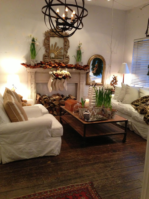
If I could wish for any living room from Santa right now it would be this one!  Sadly this image is NOT my living room - ours is currently an empty shell of a structure (post demolition state) and we are still making do in our temporary living quarters in the back of the house. There is barely room for two of us, two cats and our basic essentials let alone a Christmas tree or any holiday decor.  Due to these circumstances and my work schedule I accepted the fact that Christmas of 2012 will go down as being our Christmas that never was.  It was a significant one none the less, being our first Christmas in our home in Nova Scotia, the fist Christmas we haven't been with family or hosted a Christmas dinner, and the first Christmas without my mom.  But I'm not going to dwell or be disappointed or sad - we're just celebrating in smaller ways, grateful for all we do have and,,, I'm continuing to work round the clock on a project deadline.  Inside, secretly, making lists and plans for next Christmas.

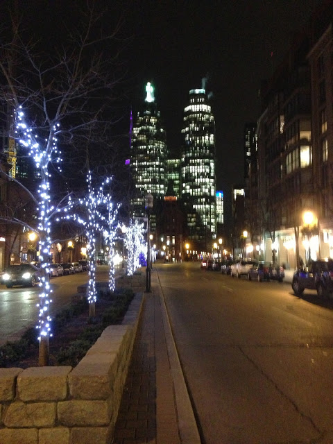
The holidays always have a way of suddenly arriving and making me feel so unprepared.  In true form just days before Christmas I was still in Toronto for meetings and sourcing for a cottage project I'm working on.  Toronto seemed to be in full holiday mode and I was completely oblivious to it up until that point, hadn't given it a moments thought.  Now that I was there I couldn't get enough of it, I love the sights of the city all decked up for the holidays.  I soaked it all in knowing that back at home on the east coast ......not a creature was stirring...


It was especially sweet to visit one of my absolute favorite shops in Toronto, Angus & Company, to do some sourcing.  I've said before that if there was any shop in Toronto I could just move in to it would be this one.  When I walk thru this shop I find it intoxicating, it just hits all the right notes for me and resonates with my personal taste.  To be able to see the shop dressed up for the season was uplifting and motivating knowing what I can look forward to in my own home next year.  The simple use of seasonal greens, white flowers and candles epitomizes my idea of beautiful holiday decor.   I just wanted to plop down, put my feet up and sip some eggnog.


Angus & Company
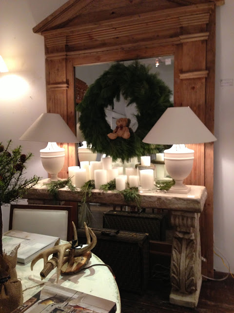
A faux fur throw is one of my must have cold weather accessories.  If you want to add instant luxurious coziness to a room,,,throw one of these over a chair, sofa, or bed.  I own two different ones and am actually sad to put them away when the warmer temps arrive.  Aside from the paper whites, candles and furry blanket,,,,my favourite touch is the teddy bear sitting in the evergreen wreath!

Angus & Company
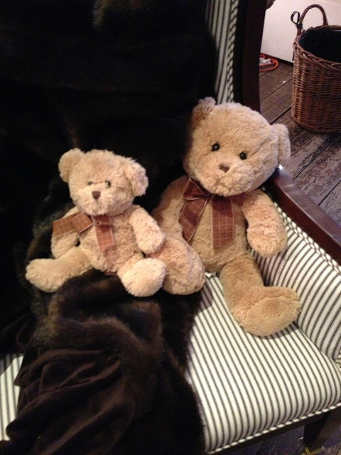
Simple, seasonal, perfect.  The teddy bears were perched everywhere - I think they're nostalgic and joyful for any age.  Now this vignette did it for me, I had to have a pair of these bears.


Angus & Company
I simply couldn't leave without taking both of these guys with me.  They were my carry-on baggage for my flight back to Halifax (they even got a big smile out of the security screener).  


Whether this holiday season was full of old traditions, new traditions or transitions....I wish you peace, joy and good health in the new year to come!

Cheers,


Carol

Looking Up


Our house renovations have been progressing at a snail's pace, read, not progressing at all.  The time has come to make some changes on that front and get some new energy on this project!  On the bright side,,things are looking up, at least on the outside.  We were lucky to enjoy some warm autumn temps throughout November and we managed to get a new roof installed.  Selecting the actual roof shingles was something I angsted over for weeks and even though I was pretty discouraged by the options available to chose from, I'm completely thrilled with our final choice.

I've always considered a cedar shake roof the dream roof choice, its natural texture and patina are my idea of the quintessential roofing material especially for an East Coast character home.  Is there anything more classic and timeless?  I didn't however, consider a cedar shake roof as a viable option for our house for several reasons, but I did want to find something that evoked that same character.  After viewing what was available at the local building centres and spending weeks driving around looking up at roofs everywhere I went, I realized that finding a shingle I liked (other than cedar shake) wasn't going to be easy, or fun.

There are some amazing alternate and eco friendly shake alternatives that I found but they proved to be more than 3X the upfront cost of an architectural asphalt shingle.  Needless to say, with an entire interior reno still ahead of me, furniture, landscaping,,,,and a future barn conversion I wasn't compelled to splurge and bust the budget on this very first reno decision.  The roof is one of, if not the most important protective element of the home and a prominent aesthetic feature so its certainly not where I wanted to scimp either.  I was determined though not to pick something simply because I hated it the least but at one point it was looking that way....


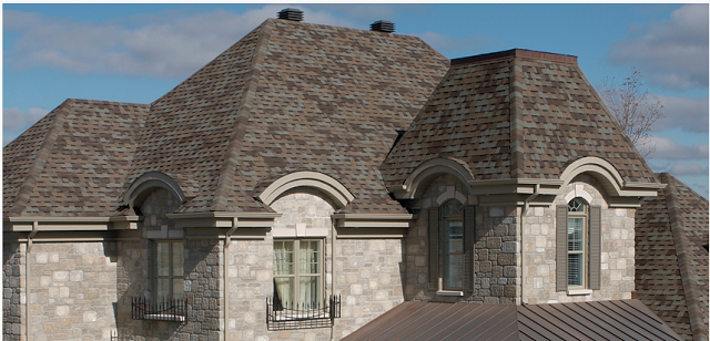
Have you shopped for roof shingles lately? Around these parts these are predominantly what you'll find in the architectural asphalt shingle category (above) and they just weren't appealing to me.  I'm not fond of the high contrasting multi-tones which look very 'patchwork' and unnatural to me and I really wasn't a fan of the heavy black line that was common on many - meant to simulate shadow lines and create the illusion of depth but I felt it just looked very faux even from a distance.


This is an example of the patchwork effect I felt many of the architectural shingles looked like. : /   Often you may not realize by looking at the display board how multi-coloured and contrasting the overall effect will be.  I drove around and looked at local installations of specific shingles so I could see the effect in person and it was always surprising how much different they looked from the sample and how much their appearance changed depending on the slope of the roof, time of day and colour of the house itself.


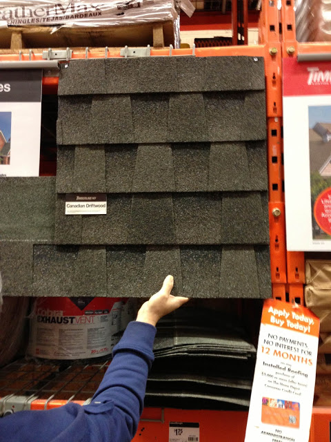
I was looking for a very warm medium dark grey with subtle tone variations, easier said than found. Until I came across this one (above) on line which looked like it ticked all the boxes so we headed to Halifax to check them out in person.  Of course the display sample looked quite different from the current stock on the shelves (common) so we bought several sheets and brought them home...something I highly recommend doing.


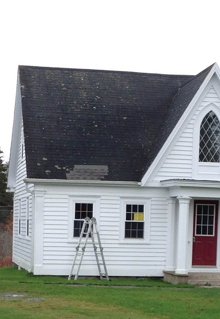
We tried them out on the back of the house, and looked at them at different times of the day....


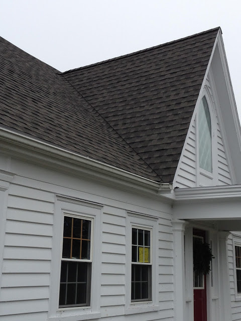
And we tried them out on the front of the house.  Decison made.  Timberline's HD Canadian Driftwood was our pick.


Early on in the installation, our first glimpse of what a larger area of these shingles would look like....


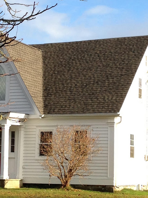
The front of the house now complete and we were really happy with the texture and colour.  It doesn't look "patchworky", the subtle tones of grey look more as if they are naturally weathered as opposed to multi-coloured or simulated.


As the sun was setting you can see how the sunlight effects the colour and shadows at various times of the day.....


You can really see the textural effect the architectural shingles add to the roof.  Its certainly not a substitute for cedar shake but I think the tones and dimension of these have that natural look to them that I was seeking.


And dusted with an early morning frost,,,if you squint your eyes,,they almost, almost might be mistaken for cedar shake.  ; )  Good choice.

But the best part of all is,  NOW we can move forward with the rest of the house renos!!!


All Photos by:  Carol Reed


Special Delivery: MMD


Illustration by Michelle Morelan

In this electronic era of emails is there anything more exciting than opening up your "real life" mail box to find a package inside with beautifully handscripted writing on it,,,,,,the type of writing that can only belong to an artist or craftsperson - the sight of that alone makes your heart race thinking about what could possibly be inside!


Custom stationary of Michelle Morelan Design

I immediately recognized the writing of my friend, the uber taltented Vancouver based designer/illustrator/artist Michelle Morelan.  (You may also know her from her popular blog A Schematic Life).  I felt like a kid at Christmas as I opened up this surprise package.  Before I tell you more about the contents, I have to share the opening up of the package with you because it was a treat in itself.  The packaging was a perfect example of someone who lives by the credo of good design, in all the details.  The stationary was worthy of its own moment of appreciation.

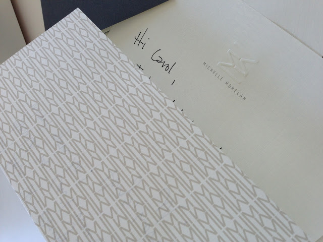
Inside the postage envelope was a handwritten letter on a beautiful piece of folded custom letterhead, the back of the paper was a patterned monogram logo print, unfolded, the inside was an off-white linen texture with embossed monogram logo on the top.  Exquisite.  In addition to that was an envelope in the same off-white linen paper.  As if the exterior of the linen envelope with embossed logo and modern grey font wasn't beautiful enough, opening it up revealed the inside of the envelope was lined in the patterned monogram print too.  A really lovely detail!

This monogram print was on the back of the letter head and inside of the envelope.

Inside this envelope was a card, on heavy grey stock.  Partially folded over one blank side for personal messages, and exposing a large tone on tone logo print on the other.


Embossed card with logo print.

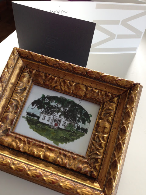
After I finished swooning over Michelle's gorgeous stationary, and being moved by her hand written words,,,,i choked up completely when I unwrapped this very special gift from Michelle, a little something for my new home on the East Coast.


My new old house, illustration by Michelle Morelan.

Its an illustration of my new old house on the East Coast, drawn by Michelle of course, and mounted in a vintage frame that she found at a local flea market - I'm crazy about the frame! She remembered me telling her one time I had some artwork in antique gold frames.  The fact that she's a special friend and one of the most talented architectural illustrators of our time,,,,makes me feel so lucky - its now one of my most favorite things and I'll cherish it always.  It'll have a special place in my home somewhere near my desk to remind me of this talented woman I admire and inspire me to sketch more.  : )


Thank you Michelle with all my heart.  From the east coast to the west coast - xoxo.


Also, kudos to the talented team at the multi-disciplinary design firm Meade Design Group who designed Michelle's cards/stationary (and website design).  Beautifully done.


All Photos by:  Carol Reed