Garden Inspiration


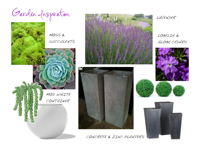
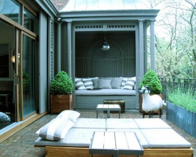
At this time of year most of us are busy reviving our gardens and our exterior spaces, setting the scene for outdoor lounging and entertaining.  Or at least we should be,,,I havn't actually done a thing with our outdoor spaces or the garden yet, they've been sadly neglected while I've been soaking up inspiration in NYC (seriously, have not even been to the garden centre once).  I had a chance to visit the Kips Bay Showhouse last Thursday and with gardening on my mind I was struck by the backyard landscaping and the planter arrangements on the upper terraces.  I absolutely love creating planter arrangements, for me its like a mini landscape design project with instant gratification.  Before I hit the garden centre I do like to have some conceptual idea for my planters, the image above is loosely what I have in mind - largely inspired by what I saw last week and my love for lavender.   Whatever design direction you want to take outside there's unlimited options when it comes to containers and planting species - your planters can literally set the mood your after thru the style, colour pallette, scale and textures incorporated.  I'm going for organic and flowy paired with modern geometric shapes and a colour scheme of greens and purple.


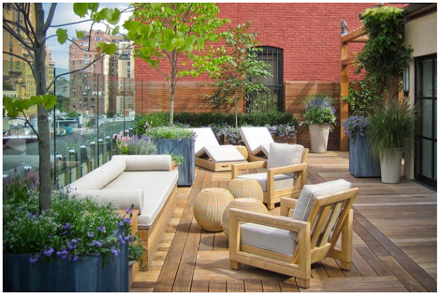
Both of the fourth floor terraces of the Kips Bay showhouse were designed by Robert Stillen and Gunn Landscape Artchitects and were punctuated with modern plantings in a minimal style.  
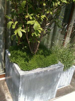
These planters above were just outside the lounge space by Brad Ford, a pair of these flanked either side of the terrace doors.  I loved the vibrant green moss around the base of the tree (I think its a type of  lilac tree) and my favorite is the lavender in the smaller planter next to it.  The scent is heavenly as you go in and out the door and the long wispy stems have such an organic, flowy look to them.  I've always wanted to have lavender plantings and this year I think I'm goint to give it a try!


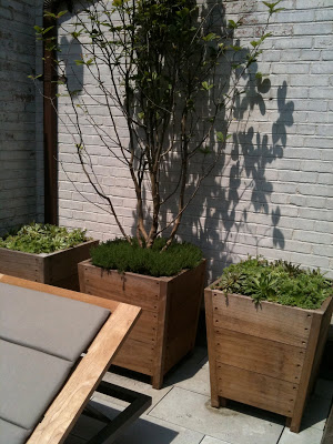
This trio of planters dressed up the painted brick wall in a niche behind some loungers. The low growing succulents are all about texture and planted in a pair of simple weathered wood boxes they created a modern composition.


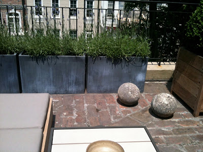
On the other side of the fourth floor was a second terrace just outside the lounge designed by Robert Stillen. This time the weathered wood planters were filled with geometric boxwood  and another row of low wide zinc planters were filled with lavender (not the greatest photo).


Terrace design by Robert Stillen and Gunn Landscape Architects


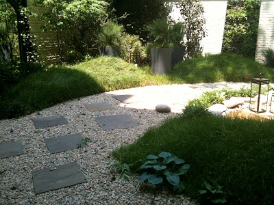
Back on the ground floor I was fascinated with the mounds of molded earth in the backyard.  They were covered in long wispy grass which reminded me of the rolling grassy hills along the beaches of the east coast.  With large planters and lanterns set right in the long 'rolling' grass it really created a natural looking setting.


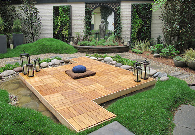
A large mirror on the centre of the back wall created the illusion of another room beyond, the mirror was flanked with large live wall panels planted with herbs and lettuces.  Despite the fact the wispy rolling grass reminds me of the east coast, the garden design was inspired by the Chinese wallpaper in the adjacent Dining Room.  The garden is titled Wu Wei which means 'going with the flow'.  Backyard design by Greener by Design.


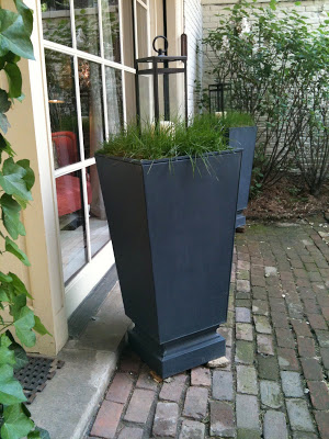
I loved the simplicity of these planters and how practical they would be in locations that are challenging to maintain flowers.  What could be simpler than topping a container with a large lantern set in a bed of wispy grass.  


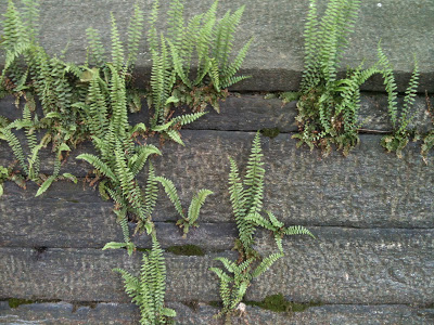
Live walls are one of the latest things in gardening this year but the photo above is a great example of a natural live wall I spotted in Central Park.  The old stone walls throughout the park had these ferns growing up out of them and I thought the effect was just so beautiful!  I don't think I'll be attempting any version of a live wall at my home this year but its definitely something I'll keep in mind for future hardscaping.


If like me you're still looking for some outdoor garden inspiration you must check out some more work by Gunn Landscape Architects for some stunning city terraces and lush country gardens.  These are some of the most gorgeous outdoor settings I've ever seen, from modern and chic to traditional and lush.

Upper West Side Terrace by Gunn Landscape Architects

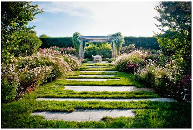
Bridgehampton garden by Gunn Landscape Architects


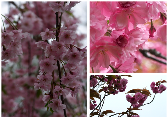
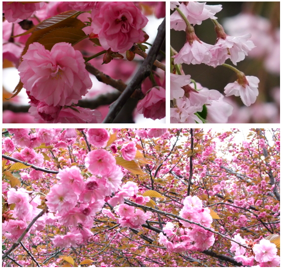
Cherry Blossoms


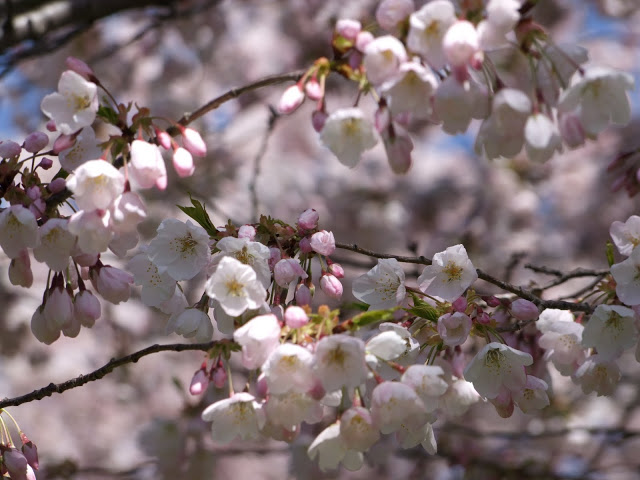
When I see the cherry blossoms in bloom I'm simply in awe of how utterly beautiful they are, its intoxicating.  They're the most perfect shades of pink I've ever seen and the silhouette of clusters of blooms on these long narrow branches is so sculptural. The only thing more beautiful than seeing these trees in person, is bringing some of their beauty indoors.  To have fresh cuttings of cherry blossoms adorning a table top or mantle is a rare luxury,,,,,so for the brief time they are in bloom I tried to capture as many of them with my camera as I could, its the next best thing.  

When it comes to interiors, I'll be the first to admit I'm not a fan of pink walls or floral patterned fabrics, if it suits a clients needs of course I work with it,,,but in my own home its not something you're likely ever to see. This makes me stop and contemplate why I love everything about these blooms that I can't get enough of them.  Looking at these images I know its simply the natural beauty that I'm drawn to,,,its pink, and its floral but its all natural, its the way I appreciate them the most.  I think this is also true of how most men feel about pink and flowers,,,,,,,men do love flowers and gardening, in fact it was almost all men I spotted photographing the cherry blossoms along side me, but the chances of them agreeing to cherry blossom wallpaper or pink upholstery,,well,,,that's a different story altogether. 


After exploring with my camera I notice that all the varying shades of pink are a natural signature, the contrast of the blooms against the rustic branches are so striking, I'm drawn to the combination of small buds and full blossoms, and I think that the bronze coloured leaves are a perfectly odd pairing with pink.  It makes me want to frame some of these photos in antique brass frames. What else I find so irresistable about the cherry blossoms is that they're so temporary,,,one day the branches are bare and the next day an explosion of pink ,,,,, that lasts only for about a week.  Perhaps if they bloomed like this all the time we wouldn't appreciate them as much?
   
Its hard not to love this colour in nature, in sunsets, in flowers, in strawberries and treats, its uplifting and cheery and romantic and magical, and undeniably pretty,,,,,but its a hard colour to live with indoors especially in large doses - it can so easily come off as tacky or juvenille looking.  Using it inside takes a lot of consideration and I think we can take some tips from the cherry blossoms; the slightest hint of pink is all you need to evoke these senses (it doesn't take much tint for something to read as pink), gradiating tones of pink will look sophisticated and mixing textures of pink will add depth.  Real flowers in vases or depicted in artwork or photography will give a natural looking boost of pink to any room and pairing pink with more masculine materials and colours will give it an edge.  For your own mini explosion of uplifting pink everyday, try painting or papering the inside of a drawer, cabinet or closet in pink and just try not to smile everytime you open it.

If you havn't had a chance to experience their beauty up close yet this season, get out for a walk and see if you can't find some late bloomers in your neighborhood (and don't forget your camera!).

Speaking of neighborhoods.....I'm in New York City this week, exploring a few of those. : )  You can follow me on twitter for updates!


All Photos:  Carol Reed

70's Bungalow: Progress 3


Finishing details are taking place at the 70's Bungalow project.  It's truly my favorite part of the process seeing all the custom elements being perfectly fit into place and witnessing the entire house transform as fresh paint is applied and new millwork is installed.   Its the custom details and thoughtfully coordinated specifications that distinguish a well designed home from your average Developer's build or DIY renovation.  Only with hands-on involvement and the direct supervision of an Interior Designer is this quality of detail possible on a project.  Just having the plans or the ideas for specific design details is not enough,,,,,,communicating directly with the fabricators and installers throughout the process is critical in order for it to come together properly and effeciently.  With this interior nearing completion,  I've been on site almost daily giving instruction and direction as the finishing details are coordinated amongst several different trades and installers, if just one element is wrong its a domino effect of very expensive mistakes.    


A custom double sink, floating vanity with matched horizontal veneers was installed in the master ensuite.  The faucets will be wall mounted into a calaccatta slab backsplash which disappears up behind a custom floating full height mirror with sconces mounted on top of the mirror.  The desired effect is all about simple, clean modern lines but the amount of coordination required to get all these elements perfectly aligned and installed is anything but simple.  For this one vanity I had to meet with the rough carpenter, the plumber, the electrician, the cabinet maker, the cabinet installer, the marble supplier and the glazing contractor, each separately and on different visits.   The junction boxes for the sconces have been moved twice, the vanity re-installed once.  Finger's crossed the rest of it goes smoothly


Slabs of calaccatta were selected for the countertop and shower jambs to try and match the large calaccatta floor tiles.  This beautiful section of the slab was specifically chosen for the soap niche in she shower and you can see how perfectly the fabricator matched the veining, its like a piece of art.


We had the large floor tiles cut down to small 2" x 2" tiles for the shower floor so we would have consistency in the marble colouration and veining.  Freshly painted walls await towel bars and artwork...


The custom vanity in the guest bathroom awaits its new Caesarstone countertop and undermount sink.  The walls and trim are ready for paint.


The kitchen cabinetry with beautifully matched select veneers has been perfectly fit into place.  


Counter depth appliances with custom front panels create a truly integrated look.


Crisp white paint is applied in all the common areas and living spaces.


There's simply no other wall colour that I react stronger to than Cloud White, it takes my breath away every single time, every single house I see it in, its eatheral.  The newly painted interior was the turning point in the transformation, instantly the spaces looked fresh and modern and sophisticated all at the same time.


Invisible hinges and automatic light switches are meticulously routered into the front closet door jambs.


Flat cut walnut veneer gives a beautiful furniture quality to the closet doors, the wood grain is simply stunning I'm almost afraid to put handles on them...


The rest of the interior doors have been installed and painted and the pair of rolling doors are almost ready to go up (on the left).


This stainless steel rolling track hardware has been a mini project all on its own but the master trim carpenter has patiently figured it all out with a little help from me and a few espressos.


Non-custom cabinetry was installed in the laundry room, the new counter, stainless steel backsplash and sink will be installed next week.  (That's a blue protective film on top of the door fronts right now).  Although the cabinetry units themselves were ready-made, the installation details are fairly customized, I worked one on one with the installer to explain how every component was to be cut/installed.


The only other non-custom piece of cabinetry in the house is the Powder Room vanity, a freestanding unit with a furniture look. The walls have now been painted the sconces are up and the mirror is ready to be hung.  Almost ready for guests....


The exterior of the house is undergoing a dramatic transformation. In addition to a new roof, the old windows and chunky mouldings have been replaced with modern aluminum windows. The entire house has received a new smoother stucco finish in a deep warm grey (not as brown as it looks in this photo).


New soffits and eaves being installed and finally the temporary front door will soon be replaced with a gorgeous custom wood door - its arrival will signify the complete modern transformation of this dated facade.


Next week its all about the eye candy: marble counters, backsplashes, stylish faucets and stunning light fixtures.  I can hardly wait.... 


For previous posts about this project including the before pictures, design plans and sketches, check out the links below:


All Photos:  Carol Reed