Design Book: The Devol Kitchen

FAVOURITE BOOKS: The deVOL Kitchen

English country kitchens like Devol Kitchens and Plain English were inspiraiton for me back in 2012 when I designed my own kitchen in our 1850’s East Coast home. Clients are also often forwarding me their pins and screen grabs of deVol Kitchens as style references for their kitchen renos too, and not just in heritage or century homes.

The deVOL Kitchen company recently releaed a book documenting the philosophy of the founders and the evolution of their now iconic line of kitchen cabinetry and fittings. I was gifted the book for Christmas (thanks Santa!!) and have spent many hours this past winter, every chance I could, cozied up by the fire devouring its pages.

The deVOL design style is one rooted in craftsmanship and utilitarian function inspired by the unfitted kitchen furniture of the Victorian and Georgian period. Cabinetry that is built with furniture quality details constructed in a simple shaker style and dressed in historical colours makes it equally suitable in a rural country home or a graceful Georgian row house.

Minimal ornamentation, simple details and natural materials give the style longevity and the ability to mix well with other elements to change up its personality.

In the book each of the three deVOL partners expressed various philosophies about kitchen design that truly resonated with me. Their views about design, the perfect kitchen and timeless craftsmanship are ones that I share their perspective on.

Paul O’Leary: On the perfect kitchen - “Here is my perfect kitchen. … the room should be at the back of the house, which would ideally be south facing. A southeast-facing window would let in great light in the morning for a breakfast table, a south-facing window would be ideal for the kitchen sink and a southwest-facing wall would be perfect for some french doors out to the garden.”

We definitely share the same vision of a perfect kitchen. Mine has always been one with morning light for a cup of coffee, late day sun, a view above the sink and a walk-out to a garden. More than the kitchen finishes or fixtures, the kitchen’s location in the house (in regards to natural light, views, and its flow with adjacent spaces) has always been the most important factor to me - if that’s off it will never be your ‘perfect’ kitchen no matter how much effort you put into improving it. Similarly, if the kitchen has an ideal location even if you don’t love the finishes and fittings its location and views can still feel bright and inviting and a space you enjoy spending time in. Getting this right is the crucial first step.

Robin McLellan: On Craft - “I am particularly interested in functional objects that are there to fulfil a purpose but are nonetheless beautifully designed and made”.

I’ve long believed the little things, things like a flush floor vent, or light switch or hand forged hook that are not meant to be focal points or make grand statements, but its the thoughtful and beautifully designed mundane things that often bring you the greatest pleasures in a home.

Helen Parker: On Style - “I strive for an aesthetic that looks uncontrived and casually thrown together, even if the reality is quite different.”

I couldn’t chose just one quote from Helen Parker that resonated with me because everything she expressed stongly aligned with my own views and approach to interiors, from working the potential of existing spaces, to avoiding trends, and using antiques - her take on style just happened to be a short one to share. I’m still far from finished reading the book but I’ve read most all of her sections and can’t wait to read the rest.

I’ve added it to my growing collection of favourite design books here, where you can also learn more about the book.

Until next post, you can follow us here…

Facebook, Instagram & Pinterest

Springing Forward

simple & timeless spring style: my favourite online finds

This week brings the arrival of spring and I for one am so ready for some green! Our transition to green on the East Coast is much slower than parts west so while I’m eagerly looking forward to a change of season, its my the least favourite weather-wise. My mind is craving GREEN and spring blooms but it requires a lot of patience here while we first endure the dreariest of weather..

At this time of year a natural urge to refresh and revitalize our surroundings can take hold of us. Spring isn't just a change of season outdoors; it's an invitation to bring that fresh energy inside. I’m a firm believer that incorporating elements of nature into our homes can help boost our mental well-being and our spirits. By introducing pops of spring colour, lighter textures, and touches that evoke nature and its re-awakening, we can create spaces that feel uplifting and optimistic. Greens happen to be my go-to colour for interior accents but not just because its my personal favourite colour. The reason is because green is so prevalent in nature you can never go wrong with it, never, it works with every colour scheme, and includes a broad range of tones.

Whether you’re craving spring colour as much as I am or are just a bunny lover - here are some simple ways to add a touch of spring to your decor, along with some of my favourite online finds to inspire your seasonal refresh!

  1. Coloured Taper Candles: These were also on my holiday decor list, I use coloured tapered candles in every season, I just use differrent colours. Skip the basic white, go for a mix of different greens, or purples or whatever colours speak of spring to you.

  2. Iron Bunny Head Wall Hook: A wall hook in the shape of a bunny head is a perfect way to add some whimsy and keep things organized with a touch of style.

  3. Hand forged brass Candle Holders: Mis-matched and various heights will instantly make a grouping of coloured tapers more interesting. Find a holder that suits your style. I like the handmade look and brass patina of these. Obsidian series by Creative Co-op.

  4. Faux Forsythia Branches: Spring is the ultimate branch decor season, whether with leaves or blooms. If you don’t have access to clippings of the real thing or a market that sells them, artificial are the next best thing. Quality can vary greatly depending on price, and viewing distance impacts how real or faux they look. Find what works for you. Widely available from Pottery Barn to dollar store to Amazon.

  5. Large Vessel: If you don’t have a large vessel , approx 12”H, for seasonal branches put one on your radar. This will be a staple pieces you’ll use all year long. Chose a style that suits your decor, I love a rustic pottery piece, including mixed with modern elements but there are so many modern vessel options too. For branches, I prefer a non-glass vessel as the branches make the water turn murky fairly quickly, an opaque vessel conceals that.

  6. Customized Door Mat: Hands down my favourite new find. I prefer a natural fibre door mat but inherently over time they will weather, fade, and eventually need replacing. Nothing freshens up your entryway like a new door mat. This Canadian supplier can customize your door mat with a phrase, an emblem, log, or a monogram, with a border or without. I’m crazy for the simple single letter monogram option and plan to order one when my current mat needs replacing. Also I think this would make a fantastic, personalized gift.

  7. Linen Pillows: Eventually we always need to replace old bedding but even in between, the absolute simplest way to change up the vibe in your bedroom or a guest bedroom is just to add a single accent pillow or a pair of new shams. A stone washed linen pillow cover in contrasting spring green against plain white, natural linen, or whatever colour bedding you have will instantly impact the room with a fresh look. I always find great linen options on Esty. I also adore these ones on Etsy with the frayed edge.

  8. Table Cloth: The unspoken hero to creating a beautiful table for family gatherings is the humble table cloth, used to conceal mismatched tables or bring cohesion to a mis-matched array of place settings. A table cloth can pull it all together. A gingham pattern is a timeless classic, it works with any other pattern, and of course in green it truly sings spring.

  9. Brass Bunny Head: I just love this, i can’t explain why. Intended as wall decor you could use it as a hook to hang market bags, hats, aprons, or to hang a spring wreath around its neck. The Haggmispel rabbit head From Ikea.

  10. Scalloped Edge Basket: Nothing says spring and Easter like baskets and honestly woven baskets are just a staple decor piece in my home or client spaces. Scalloped edged woven items are having a moment,,, they’re everywhere lately tho a scalloped edge is a traditional detail the wicker take on it is fresh and relaxed. Update a powder room or kitchen, or entry way, with a woven scalloped edge accessory and you’ll be right in style. This one is by Two’s Company.

  11. Linen Napkins: Stone washed linen napkins means ironing is optional. This spring green version will add a seasonal lift to your day to day table top and your spring celebrations alike. Because green goes with everything, you’ll also be able to mix and match these with ease for those times you need more than 4 or 8, or just to create a more layered look. Linen Napkins by Eight Owls, 100% French Flax stone washed pure linen.


Everything I’ve shown above, plus more, is compiled in a collection called Spring Forward 2024 on my Amazon page which you can find here. If you’re anti-Amazom, that’s cool too (many of us in rural Canada rely on it even for essentials) you can find any of these things at other retailers, locally or online.


Disclaimer: The custom storefront feature on Amazon is available to affiliates, as an Affiliate we must disclose that “As an Amazon affiliate we may earn fees from qualifying sales, at no cost to you”.

I enjoy using the features of the storefront to organize/save product links in one place and be able to easily share them publicly. My intention is to inspire, and to share things that I would recommend. based on my experience, along with the link where you can find more info if you’re interested. Its really all about the links, the item links are ultimately what everyone is looking for and this is simplest way to share them.

Happy Spring! Until next post, you can find us here…

Facebook, Instagram & Pinterest

New Project: Modern Aerie

first impressions

Stepping in the front door of a house you instantly get an impression of the home’s style and character along with a sense of what the rest of the spaces may look like and an indication of the owner’s personal taste. The goal with our Modern Aerie reno project is to update the interiors of the 35 year old home to align with its contemporary architecture and the owners evolved taste for modern design and contemporary art. From the front door through the entire interior.

The home is a contemporary architect-designed bungalow with elevated and sweeping ocean views, nestled in a mature wooded and lushly landscaped lot. With its low lines, sloping roofs and weathered shingle shake exterior it looks perfectly in harmony with its dramatic coastal setting.  As you arrive at the home’s entrance you’re greeted by a statement front door, a more recent addition - a modern oversized wood slab panel with full length stainless pull, a juxtaposition of clean modernity against the weathered coastal character. But when you step inside, that modern impression doesn’t continue throughout - not yet. The interior has mostly remained in its original state, not fully in synch with the architecture or the clients taste for modern design and decor - think earth toned walls, colonial railings and doors, raised panel cabinetry and traditional fireplace. From the front door, to the collection of MCM furnishings and accessories throughout, it was clear what the intent of the renovation would be.

ABOUT TIMING

There’s often a prolonged period of time between when we finish designing a project to when it begins construction, generally this is about a year unless you’re fortunate enough to somehow get into a contractor’s or builders’ schedule sooner.  Beginning to end, the process of both designing new interiors and having them built is a long  one (this one, from initial meeting to completion of construction will total 2 years). I know the majority of home owners embarking on reno’s or new builds have unrealistic expectations of starting construction work in 3 to 6 months - including starting and completing the design planning.  In reality you’d need to triple or quadruple that timeline whether it’s just a kitchen overhaul or whole home reno.

This project is a perfect example of one where the logistics of the process dictated when it would happen (the ideal scenario), there wasn’t a start or completion date in mind but rather it was a realization that their dream of an entirely reimagined interior was never going to happen unless they took the first step in planning what exactly that renovation was going to involve and look like. And that’s where I came in. For this whole home reno we spent the next 9-10 months designing and planning the renovation, which was a comfortable pace for the homeowners to contemplate proposed designs as well as factor in their work and travel schedule.  Not to mention working around my schedule as well as downtime for summer and Christmas holidays

All of the planning wrapped up a year ago and then we immediately began reaching out to potential kitchen suppliers and general contractors, eventually engaging both in early 2023 and securing this project in their schedules. Today we’re now 2 months into the work on site and are scheduled to wrap up by the end of May, exactly 2 years from the date of our initial design meeting.

PLAN AHEAD

Could the process have been faster, yes and no. So much depends on both a client’s schedule as well as a contractors. We were lucky to have secured a local contractor who could get to this project in just under a year, others had quoted start dates 2 and 3 years out. Additionally with whole home renos, owners/occupants need to move out, so finding temporary accommodations and emptying all the rooms is a project in itself. Its nothing less than a big disruption to your life so on top of factoring in a ‘move-out’ with your work and family commitments you need to cater to the contractor’s timing and plan everything around that.

THE VISION

The vision for the renovation and objectives were clear from the onset, which was simply to update and transform the interior to be in harmony with the architecture and the owners design preferences which had grown progressively more modern over the years.

It was a given that the kitchen and main bathroom would be completely updated with all new finishes and fixtures. For the rest of the home, the interior room layout overall wouldn’t change, with one exception but which would be a dramatic one. We removed a long partition wall and french doors that confined and separated a large living room from the kitchen and lounge area and replaced the traditional fireplace that was on that wall with a sleek, linear 3 sided unit. Lastly, all new wall finishes, doors, light fixtures and refinishing the existing wood floors will transform the interior to light, bright and distinctly modern.

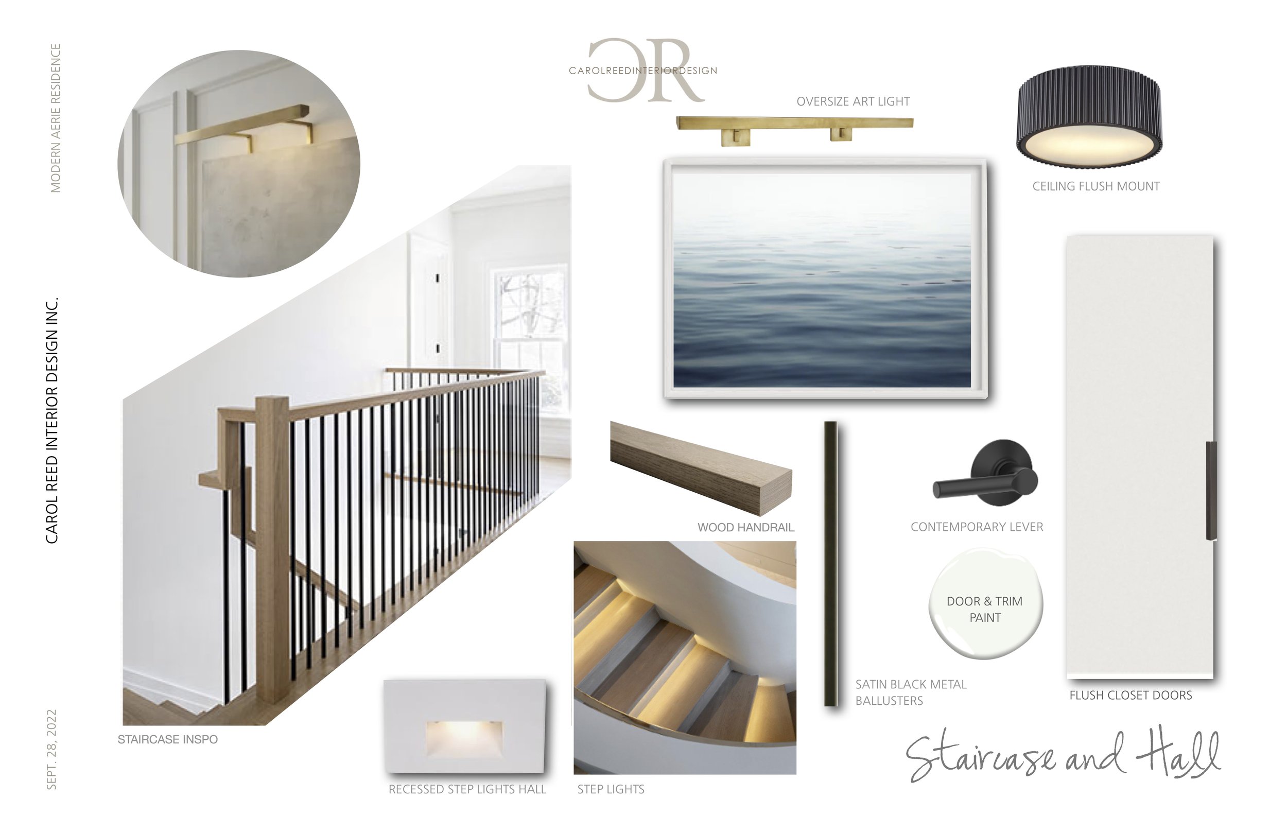
Design Concept for Entry and Hall | Carol Reed Interior Design Inc.

The new look is quite a dramatic change but yet very much in harmony with the home’s architecture and the owner’s personal style which has evolved over the years since they first built the home. The concept above illustrates the palette and style of the new finishes and fittings throughout Lots of white, natural wood, black accents and modern lighting. A large piece of contemporary artwork on a double height wall will be a feature piece in the entry (art shown above is a placeholder).

Here’s a look at the new feature fireplace in progress and together with the above concept for the entry and hall you’ll get a sense of what’s to come.  

The flooring has been patched where the old wall was removed and the tone of the new raw wood is similar to what the new floor finish will look like. The elevated fireplace unit is a stunner at over five feet long with frameless 3 sided glass. If you look close, you’ll see the glass. The unit took a crew of 6 guys to move and set into place.

Work on site is steadily moving along with lots of daily progress now. Follow along on our Insta stories for more updates on this project and others we’re working on over the winter and spring.

Until next post, you can find us here…

Facebook, Instagram & Pinterest