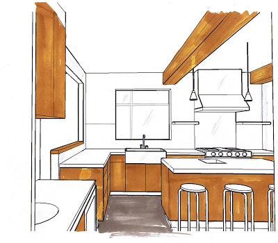
A rough 3D sketch helps clients decide how to deal with unexpected changes
Despite how much preplanning and investigation is done prior to embarking on a renovation, you don't really get a true picture of the extent of new work required until after the demolition phase. Often after the demo you'll discover structural or mechanical elements that need to be worked around or beefed up. Quick decisions have to be made on how to deal with these obstacles without adversly effecting the design, the budget or the schedule, but it can be difficult for clients to visualize how the proposed changes will look. The quickest way to help them make their decisions is by showing them photos of similar situations or in many cases, I quickly draw up a rough 3D sketch to illustrate a point.
In this case, I was working with a client on a kitchen renovation and after the demolition it was determined more support was required for the floor above and new beams needed to be added across the kitchen ceiling. We didn't have much flexibility in where they could be placed which meant they weren't necessarily going to be equally spaced or centered within the room. There was no space above the ceiling to install these and the homeowners didn't want to lower the entire ceiling, so,,,, since the beams were going to be visible, we had to decide how to finish them.
My clients wanted to clad them in antique wood (as the new kitchen cabinets were being custom made from antique hemlock) to create a beamed wood ceiling effect, but I was recommending we just drywall them and paint them out white. The house itself is a century home but the interior has been renovated in a very pared back modern style with lots of vintage mid-century modern furniture. The house throughout is white with old wood floors. The new kitchen design was what i would call a modern-industrial style, a combination of wood, concrete and stainless steel with simple clean lines.
My suggestion on how to treat the new beams was to just ignore them. The best way to not draw attention to something - is to make it blend in. They weren't completely convinced and thought it might be a good opportunity to add more interest to the kitchen by making the beams a feature. So I did these sketches to illustrate how the contrast of the wood on the ceiling would look.

The view from the hallway as you enter the kitchen.
As these sketches illustrate, cladding the beams in wood does two things - it creates high contrast with the white ceiling, and visually it brings the ceiling down. In my opinion, this detracts from the impact of the understated, cabinetry free wall we had intentionally planned.


View from the Dining Room
The view from the dining room is a good example of how the wood beams make the ceiling appear lower. Often people will angst over obstacles like this and worry and stress about how to deal with it, and its easy to waste a lot of time and effort trying to recreate the wheel in attempts to disguise it or over-design it.
When I'm faced with these obstacles, I deal with them in one of two ways:
1. Make a feature out of it. Only do this if you can integrate this into the overall design so it looks like it was always planned to be there, it should enhance the rooms design concept not detract from it. The size, the placement, the way its finished should not look out of place with all the other elements in the room.
2. Understate it, make it blend in, make it disappear. It may not be perfect, but it is holding the roof up,, providing you heat or supplying you with water so its better than not having it at all! If you look closely at magazine photos in your piles of inspiration rooms, you can spot obstacles treated like this in most rooms if you look for them, but because the room is so fabulous you never even notice it.
On this project the final decision was made to understate the beams by painting them out the same as the ceiling. As I promised them, in the end, when the kitchen was all complete they would blend in, become unaware of them and wonder why they were ever concerned about them in the first place. I'll post more drawings and photos of this incredible kitchen reno in future posts...


