I started a fun new project at the beginning of December that's kept me so busy I havn’t had a chance to post about it until now. I was hired by a bachelor client to completely furnish and outfit (with all the essentials),,,,,an entire condo from scratch. The condo itself is 2 years old but has never been lived in - it was just purchased this past November by my client, Brian. For him its a chance to start fresh and move into a brand new home completely tailored to his needs, reflecting his personality and lifestyle. For me,,,,,well, I've been given the challenge of furnishing this entire condo for him in just 2 months with a budget of $20k.
The only items the budget excludes is design fees and........the flat screen tv's. While its not a huge budget, its one I think a lot of people can relate to - but it gets eaten up pretty fast so every dollar has to be planned for maximum value. At this point things are well under way and over the past few weeks I've sourced, purchased and ordered many of the main pieces. In the upcoming weeks I'll be racing against the clock to get everything else purchased, delivered and in place for February 1st.
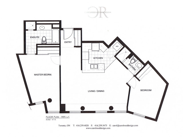
THE CONDO is a 2 bed, 2 bath unit measuring approximately 1000 s.f.. Its appointed with fairly generic builder's finishes, the kitchen has upgraded granite counters and stainless steel appliances, but the rest of the condo is pretty standard. I like that the walls are all white and that there's lots of natural light. But you might also notice,,,the unit is made up of many odd angles, a common theme in new buildings which unfortunately makes for a lot of unusable space.
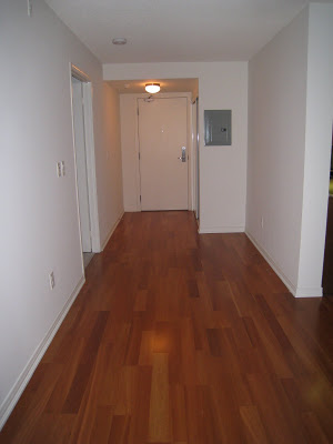
View of Front Entry
View of Living Room Area from Dining area.
Master Ensuite
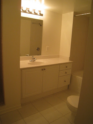
Guest Bath
THE PLAN: For this initial move-in phase, we're not planning any new construction or on replacing any existing finishes. We will be replacing light fixtures, faucets and cabinet hardware, other than that,,,,the budget is entirely all for furnishings and accessories. The living room has to accommodate a large (very large) flat panel tv and the second bedroom has to accommodate a desk and a sofa bed. Based on that criteria I prepared several furniture layouts for Brian's review before we settled on the furniture layout below. Somethings may be slightly changed or tweeked along the way but this is the direction we're headed.

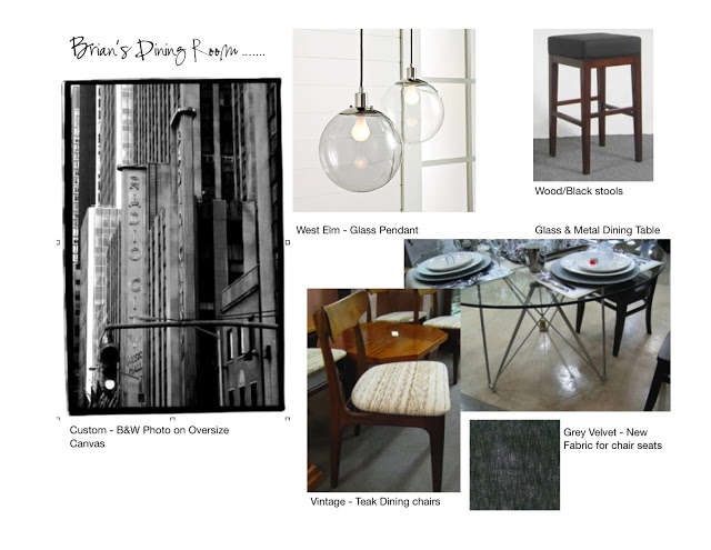
With the furniture plan agreed upon I set about sourcing and selecting items that would work together and create the kind of vintage modern style we were looking for. We don't have the budget or timeline to do much, if any, custom work so with the exception of one or two pieces already on order, everything else I purchase for Brian needs to be in-stock or readily available. This is when it becomes a real hallenge to create spaces that are unique and not 'catalogue' looking. In the weeks ahead I'll post about each of the individual rooms,,,,,the before pics, the concept plan and after photos. In the meantime, here's a sneak peak of the design concept for the dining area.
