One of the most exciting parts about E-Design projects is when I receive those long awaited 'after' photos from clients. Handing a project off to someone else to takeover fills you with lots of anticipation (and anxiety!). A couple of months ago I received one of those Christmas like emails from an e-design client who had just completed her newly renovated bathroom. It was soo exciting to hear from her as I knew she had proceeded full-on with the renovations following my design plans so I couldn't wait to see the results. To check out a few of her 'after' photos along with some of the before pics and my design plans for the space, you can go here.
When I saw the first after photos of the space, I was speechless,,,you really had to see the befores, this transformation was dramatic but the fact that she implemented the entire renovation so successfully from my E-Design plans was such a thrill for me. She and her family had lived in the house for 25 years and had never taken on any renovations or upgrades, until now they had only dreamed about them ...so she was brought to tears when she saw the finished bathroom for the first time. Since the house was located in Toronto I couldn't resist the opportunity to visit in person and take some of my own photos, so a couple of weeks ago I arranged to meet this client face to face and see her home in person for the first time. Camera and flowers in hand of course!
Its hard to describe what it felt like to walk into this space, because its like I had already been there - its surreal to see what had been a very vivid image in my head for so long, now right there in front of me, yet I hadn't been part of the physical transformation process. I hadn't seen it evolve so this visit was a role reversal, it was the designer experiencing the 'reveal' not the homeowner. The fact that someone else who I'd never met had so literally brought the vision that was in my head to reality was overwhelming. And as corny as it sounds, the space itself,,,really was breathtaking, I actually gasped, the photos truly don't do it justice. If I could only capture that 'feeling' on camera or find the words to convey it.....
The house is a heritage home so the goal was to give the space some classic traditional character but with a contemporary edge. But it was most important that the space wasn't done in cool greys or blues or too white. There were splurges, saves, and great buys. The floor was the definitely one of the splurges. A basketweave mosaic marble, simply laid with no borders or inlays. Classic and timeless. I loved the varying shades of warm greys.
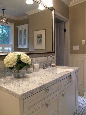
The old brick chimney wall was clad in drywall and surface applied panel moulding was added to create a wainscotting effect around the entire bathroom. Simple crown moulding and baseboards complete the trimwork.
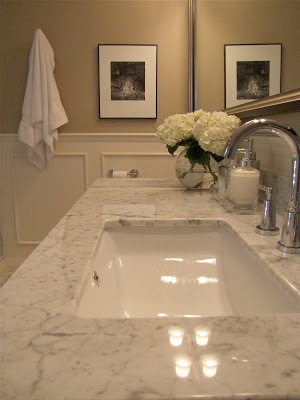
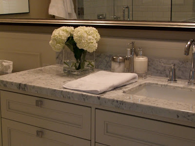
Another splurge, a custom designed vanity with plenty of deep drawers provides tons of room for each family member to conveniently stash all their products. The sink was offset to maximize the counterspace.
The biggest objective for the redesign was to create a separate tub and shower. It was intentional that all the plumbing fixtures have simple clean lines and be contemporary. I think this works well in an otherwise traditional space and keeps it from looking dated. You can see the plumbing fixtures have rectilinear lines. One decision the homeowner made was opting for an undermount sink as opposed to a sink that had a 3" lip around it the same as the tub....but I think this option works just as well especially because of the shape. I normally provide 2 options when making selections for a client and either one is meant to work equally well.
I think its important to point out that aside from the fresh hydrangeas on the vanity (its all I could find - why is there no selection of fresh flowers in June???) and the potted orchid on the tub deck (my gift),,,,this is exactly the way the bathroom looked when I arrived that day. I was impressed how well her artwork fit in.
This moravian star fixture from Home Depot was a great 'save' and one of her favorite things in the bathroom. You'll also notice in some of the shots the ceiling is painted a soft pale blue. A beautiful detail that I often do in bathrooms.
One of the key finds was this sleek soaker tub by Duravit, and surpisingly it was a great buy too at less than $700. Because the existing window was so low to the floor this tub with its low profile fit perfectly without having to make any alterations to the window. Its clean lines are gorgeous looking and the homeowners all rave how comfortable it is, even the men!
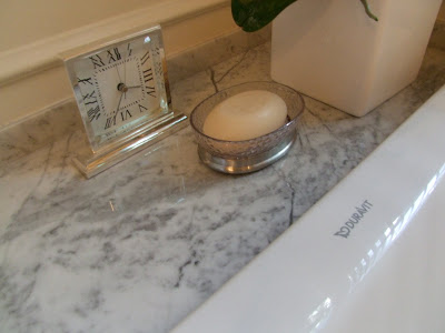
The front of the tub was paneled with the same moulding detail as the walls and finished off with a simple shoemould at the bottom. The marble tub deck and vanity counter were finished with a rectilinear profile to maintain that contemporary edge.
On the inside of the shower, on the back of the half wall is a built-in soap niche which contains all the products and keeps them out of view. Hooks are a must in any bathroom that's used by men or children, they simply won't use towels bars!
When I design showerstalls I always specify solid slab thresholds and jambs. One of the reasons I often use carrerra marble in bathrooms is because you can find ready-made marble jambs instock at any building centre in one of two materials, carrerra and jura beige. If you go with one of these it means you save the expense and time of having to get jambs custom fabricated from some other material. I prefer classic carrarra so I'll chose counters and tiles that will work with that. Then, splurge on a frameless glass shower enclosure.
The rectangular lines continue in the shower fittings, and the classic white subway tile (another 'save') was installed with a light grey grout to add more character. In general the minimal use of tile in the room is a big cost savings. I love the sparkle of polished chrome fixtures, and they'll also cost you a lot less than polished nickel.
A luxurious rainshower head.
The rectangular shape is continued on the vanity drawer fronts and hardware.
This is the view standing in the doorway....
I hope you can see why I was so excited to share these after photos. I'm thrilled that my client is happy, in fact she tells me "its the most beautiful bathroom I've ever been in" and its been such a joy to use. How amazing is it that its had such a positive and uplifting effect on her and her family's everday living!
Next she's going to tackle her 25 year old kitchen which she plans to overhaul next summer. I'm about halfway thru the design planning for it and I can tell you its going to be as dramatic of a change as the bathroom was.....
If you have a space that your planning on renovating but don't have any design plans, check out the E-Design services available on my e-design site thedesignshop where you can also see more of this bathroom redesign project in the Gallery.
All Photos: Carol Reed


