Day 2 of my trip to NYC included a visit to the 38th annual Kips Bay Showhouse, as luck would have it we arrived in the city just in time for the final day of the event. The 5 storey, single family townhouse is located on a beautiful tree lined street in the Upper East Side of Manhattan just one block from Central Park. Its currently for sale with an asking price of $28M. Before the renovations for the showhouse took place, the house was previously divided into 2 separate dwellings, and I think even prior to that it had once been divided up into multiple apartments, this place is huge!
Even with an elevator, I think the current layout of the house would be challenging for the lifestyles of today's modern family living. The kitchen was on the main level but the living room and dining room were on the second floor and the third floor consisted of 4 very small bedrooms. So even with a price tag of $28M, I think most prospective buyers would need to consider some remodeling....
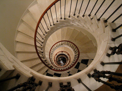
The 5 storey circular staircase was a favorite of mine even though it made me pretty dizzy and I nearly fainted every time I looked straight up or down the centre of it (I don't like heights!), check out the photo at the top of this post, my palms were sweating when I took that one. The walls were adorned with framed black & white images. If you concentred enough on not being dizzy,,,,you couldn't help but feel glamorous as you made your way up or down this staircase.
Michelle patiently waiting for me as I'm obsessed with taking photos of it....
Staircase decorated by Rod Winterrowd Inc.
The living room on the second floor was a show stopper! The colour of the walls was magnificent (Benjamin Moore's, Blue Suede Shoes) it showcases everything in the room like a jewel box. The space was glamorous but tailored + classic at the same time, every corner and every surface was soo beautifully styled. The lighting.....was perfection.
The flamestitch pattern carpet was simply stunning. The collection of artwork gives the room soul, and you can see the art just pops on that wall colour.
I think I was so drawn to this room because it reminded me of the colour pallette I used for the Sico shoot I designed for House & Home a couple of months ago here. Whenever I use a bold colour as the main colour in a colour scheme (particularly walls) I love to pair it with lots of black and white and natural wood tones then add in an accent colour. This room is an example of that same concept. Notice that except for the centre ottoman,,,,,all the furnishings in the room are white or black. You could change the wall colour without having to change a single other thing in the room and have both a completely different colour scheme with a new look.
Room design and carpet design by Sherrill Canet Interiors Ltd.
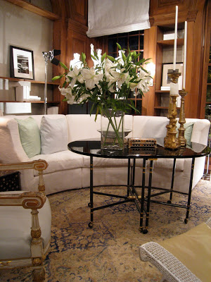
I admit the highlight of the showhouse and my entire trip to NYC was experiencing this room - to just sit in this space and take it all in, *in person*. I wasn't disappointed, there's nothing I didn't love about it. Its classic Vicente Wolf. I'm a huge fan and admirer of his interiors and his books, I gush.
The entry into the Library designed by Vicente Wolf.
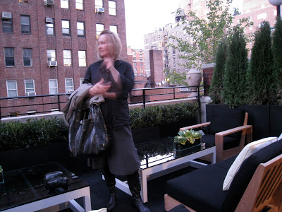
The next favorite space for both Michelle and myself was the top floor of the townhouse, it was designed as a media lounge space with adjoining spa room (complete with his/her massage tables) and a walkout to this luxurious rooftop deck that was so elegant looking furnished in teak and black and white. Yes, again me raving about black and white with wood! I especially adore black with natural greenery.
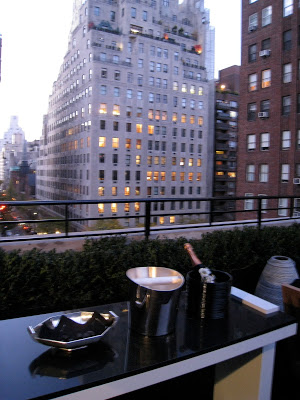
Michelle and I were tempted to pop the cork on this champagne and just kick back....seriously, I don't think anyone would have noticed we had this deck all to ourselves. : )
The jawdropping view.....
The entire top floor and rooftop deck was designed by Jennifer Post Design Inc.
As I mentioned the house is for sale, the broker for the property has a wonderful on-line listing where you can view more images as well as the floor plans, check them out here. (Note that the floor plans on the listing don't represent the layouts of the rooms designed by the designers for the Showhouse event.) Photography wasn't allowed during the showhouse tour but many of the volunteers were gracious enough to permit it when asked. Thank you! Below are a few more photos of some of my favorite rooms, these photos (except for the shower close-up) are from the realtor's listing and are much better quality than what I was able to take with my phone camera.
Another look at that rooftop deck.
This bathroom was STUNNING!
"Bubble Bath", Bathroom design by Coffinier Ku Design.
I snapped a close up of the shower tile detail to show a client,,,this is the same limestone tile I specified for their guest bathroom a while back so I was thrilled to show them an installation that used the same tile. This tile is also used on the floor throughout the bathroom in a larger 12 x 24 but not so visible in the previous photo.
The library by Vicente Wolf. (the wood panelling was all existing).
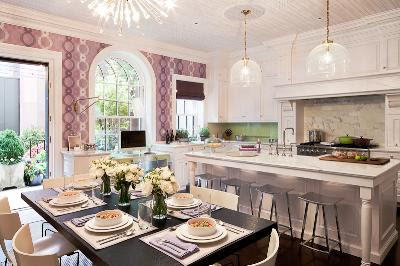
The kitchen cabinetry was existing too but I believe they were all refinished, the room was a great example of what I call modern traditional. The architecture and all the built-ins are traditional in detail but the furnishings and decor are modern (my favorite combination) this is how you keep traditional looking fresh and current. The counters and backsplash were calacutta marble, the ceiling and walls were papered in modern graphic wallpapers.
The photo above shows two of this rooms highlights (for me anyways!) the vintage modern fixture over the table and the artpiece over the fireplace, a photo depicting black ink drops falling on water.
(the above image, its a photo of a photo).
Kitchen Design by Eve Robinson Associates Inc.
I hope you enjoyed my personal highlights of the Show House, if you're EVER in NYC during this event its a must see and you'll be supporting such a wonderul cause!! All proceeds from the Show House benefit the Kips Bay Boys & Girl's Club.
Photo Credits
Images 1, 3, 4 thru 13, 16 - Carol Reed
Images 2, 14, 15, 17, 18 - Corcoran Real Estate
Image 19 - original photo by Peter Margonelli for Eve Robinson Assoc.
