THE DILEMMA: TO REFINISH OR REPLACE KITCHEN CABINETS
Updating an existing kitchen without extensively reworking the space or replacing everything can be more challenging and rewarding for a designer than gutting and starting a space from scratch. Deciding on when its worthwhile to invest in refinishing the old kitchen cabinets versus replacing with new is a common dilemma with new owners of resale homes.
For this client, as I do with so many clients who face this dilemma, I assessed their big picture vision, and advised them on the advantages and disadvantage of whether to refinish the cabinets or replace with new. There are many factors to consider when making this decision, each situation and circumstance are unique as are personal priorities and budgets.
This contemporary ocean front home on Cape Breton Island will eventually be their full-time home in retirement. For these style savvy owners, the entire interior was finished in a look that was a bit too traditional and formal for them (think swag drapery, ornate chandeliers, tuscan columns, muddy colours). The casual lifestyle, the rural coastal setting and simple architecture warranted a lighter and more relaxed vibe on the inside. I was brought onboard to advise them on some gentle cosmetic updates to homes interior. The main goal was to maximize and enhance the views out over the beautiful blue Atlantic where it meets the Northumberland Straight.
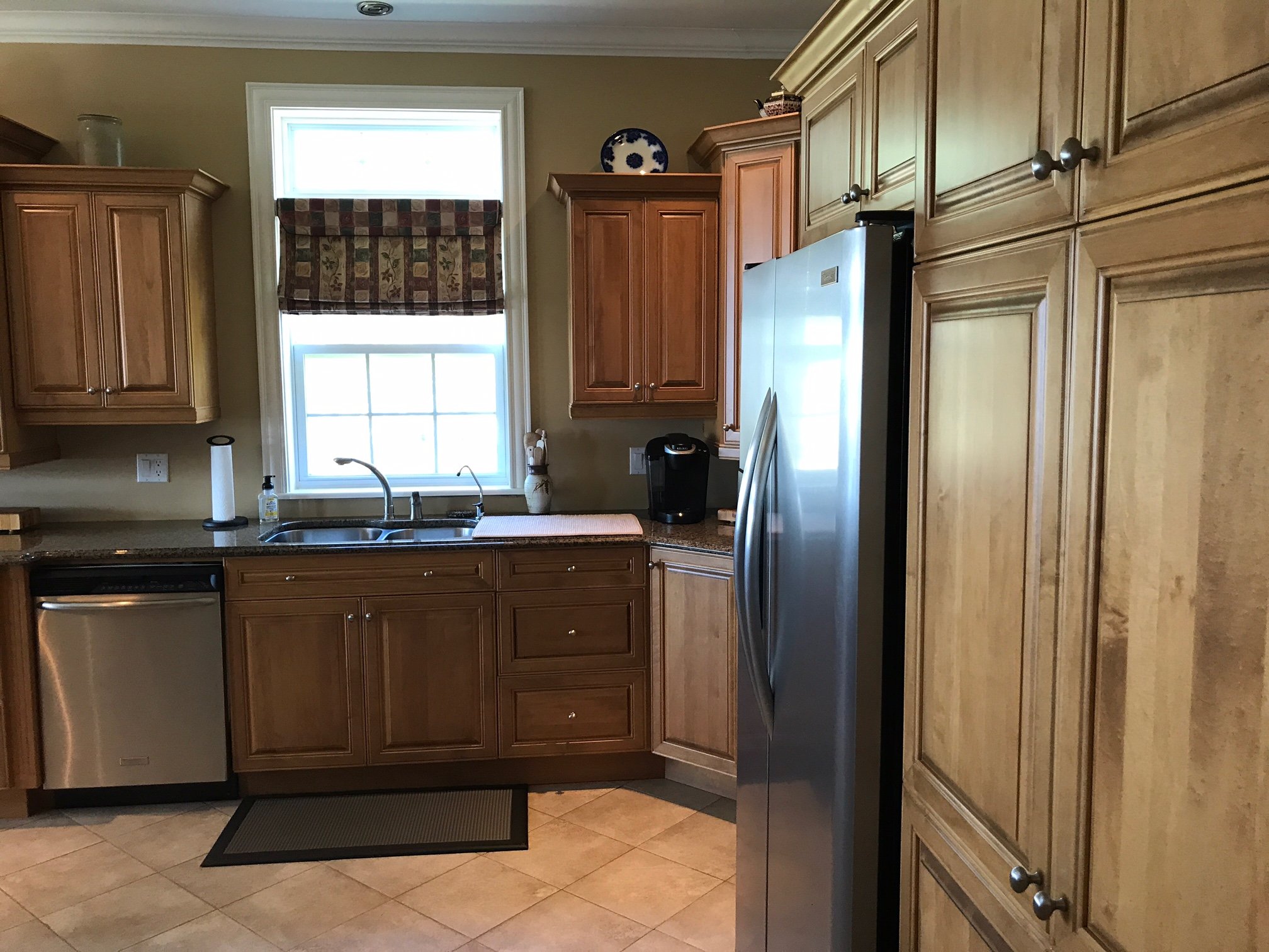
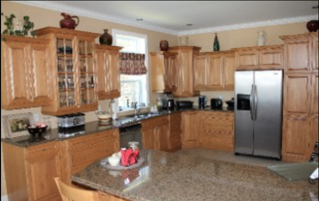
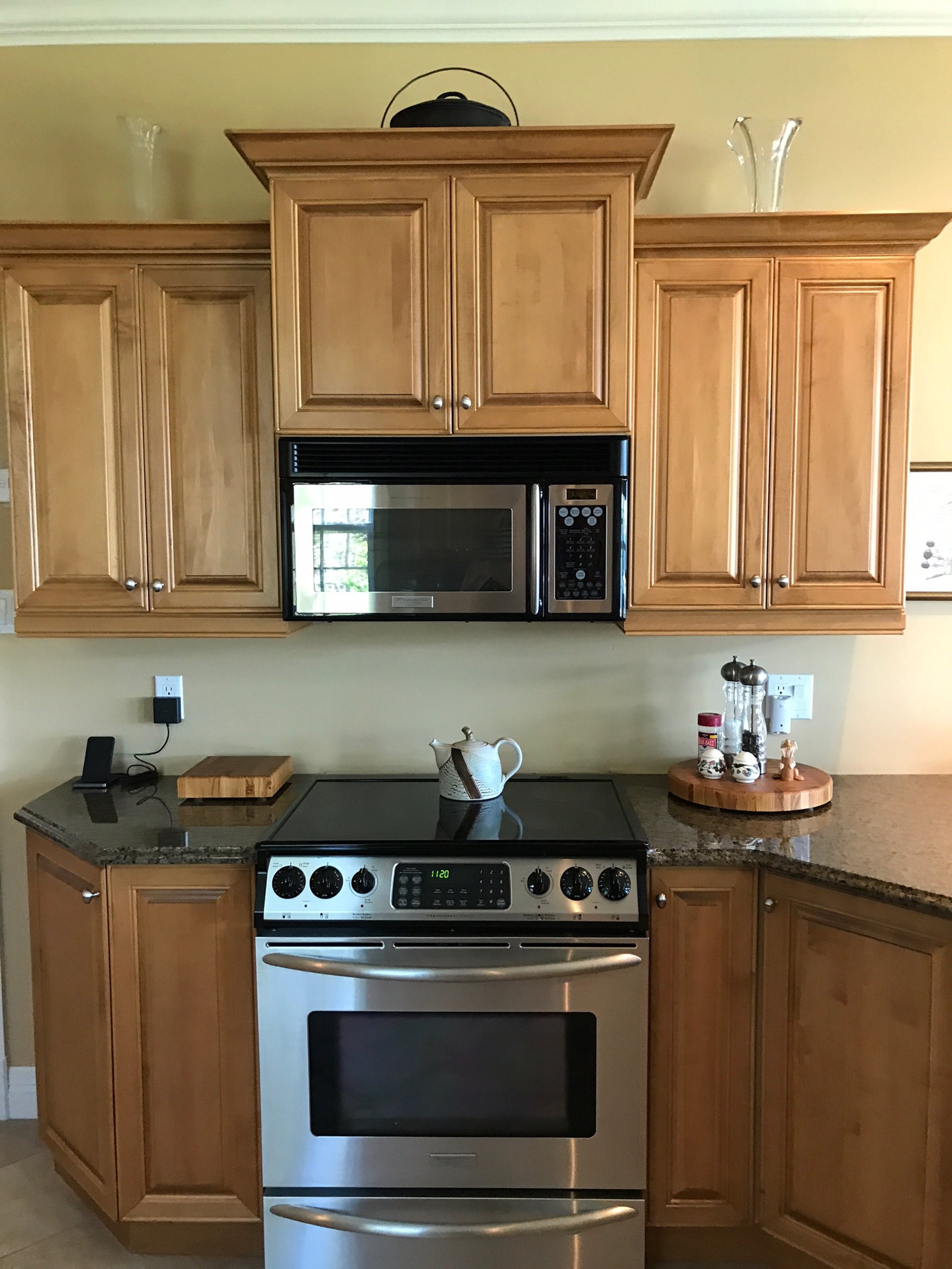
The cabinetry was a dilemma for them, it was in excellent condition and the maple cabinets were of great quality, but they didn’t love this look. I found the wall cabinet configuration a bit odd, with its varying heights and some positioned extra low to the counter, additionally there was no backsplash. The overall layout is maybe not perfect for everyone but works for them so they had no desire to change that aspect of it. The large eat-in kitchen had 12” tile flooring throughout which posed another dilemma, while they didn’t hate the tile it certainly wouldn’t have been their choice, and the same tile was used elsewhere in the house. What makes this a potentially big job to change out is there’s in floor heating, which creates challenges and additional costs.
Ultimately it was decided to keep the tile flooring, keep the appliances, but refinish the cabinets and replace the counter and sink and add new light fixtures as well as well as a backsplash. Since the cabinets were being painted, I recommended reconfiguring a few of the wall cabinets so the heights were aligned, eliminating the low hanging cabinets and replace a couple of cabinets with open shelving. For the appliances I had suggested replacing the over the range microwave with a range hood and if possible a prep sink in the corner of the peninsula. There was potential to improve the appliance situation even further, including replacing the range with double ovens and adding a cooktop to the area left of the sink. After planning began they did decide to replace all the appliances with newer models but maintained the same configuration.
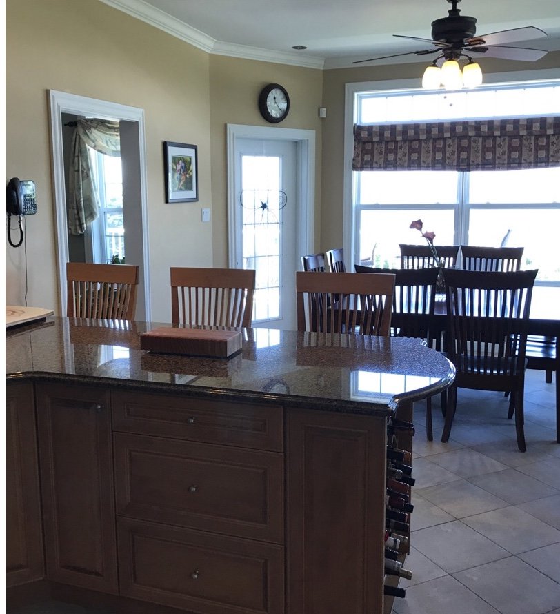
Kitchen Before - view of peninsula and entry to Living Room on the left.
Another subtle change was to enlarge the opening from the living room into the kitchen, you can see that doorway on the left just beyond the peninsula.
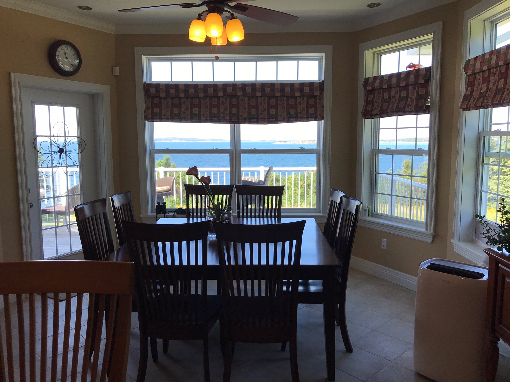
Kitchen Before - ocean front views
The room has large windows with expansive views of the ocean and so maximizing that view and updating the colour scheme to reflect the coastal palette was a priority for the clients, and they both had asked if I could incorporate a turquoise tile. They also wanted to enlarge the opening from the kitchen into the adjoining living room (see photos above).
Here’s the concept we created and the local contractor and cabinet refinisher got to work.
One factor that solidified the decision to paint the existing cabinets was that there was a local cabinet refinisher who does excellent work and was available to do the job. We met on-site a couple of months later when the work got underway and we finalized all the new paint colours for the home’s interior and the kitchen cabinets.
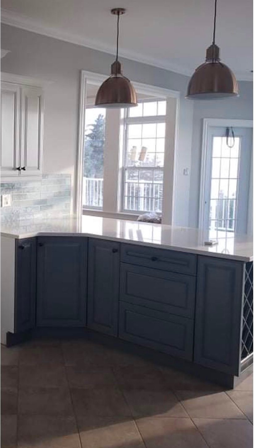
Kitchen makeover in progress.
A progress pic showing the newly painted cabinets and countertops and pendant lighting installed. Wiating on wall shelves, new glass doors (made by the cabinet refinisher!) and the new appliances.
Ordering of fixtures started in later winter, work commenced in the spring of 2021 through til early summer. The goal was to have everything completed before the owners arrived to spend the summer there but as spring approached the province went into various stages of lock-down again, materials and products were in short supply but because of so much pre-planning things moved ahead on-site without much delay.
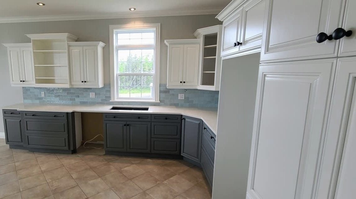
Kitchen makeover in progress.
At this point they were also waiting on two custom wood shelves to be made, the wood was on back order. and the tile was supposed to continue up higher behind the shelving but the stock was limited.
Kitchen makeover in progress.
This angle shows the enlarged entry into the living room from the kitchen. I love how this perspective shows the views and how the colours in the kitchen mimic that same palette. White clouds, grey skies, blue skies, marine seas and every range in between. The pendant lighting is a tad high, as this was a topic of debate - I prefer them lower but the owners were concerned about obstructing views and wanted them as high as possible. the compromise is there’s extra cord and rod stems so either of the fixtures can be suspended lower at any time in future.
Kitchen makeover in progress.
The western exposure floods the kitchen with sunlight. The greys and blues in the kitchen, like the sky and sea, are always changing with the light. The brass pendant lights and new brass faucet relate to the warm tones in the floor and are a nice contrast to the blueish grey and turquoise.
Kitchen makeover in progress - new wider opening to living room.
A close-up of the new larger entry into the living room which also received new windows expanding the Living room’s ocean views from wall to wall.
The wall cabinets now have the same consistent spacing from the underside of the cabinets to the counter and the bulky corner ‘garage’ was removed giving them much more useable counter space.
Although these photos reflect the kitchen updates in progress you can already see the significant impact the changes have made on the overall aesthetics and function. Lastly, also note the floor tile has been elevated with all the new finishes in the room - it doesn’t look drab or bring the space down, it just looks fresh and neutral. I have always loved the character of terracotta tile and this tile evokes that same natural clay character and in fact is resembles the red sandy shores of nearby regions.
This winter we’ve just wrapped up planning new furnishings and accessories, and hopefully everything arrives before this summer season. Patience is a must when dealing with 16 week lead times for non-custom retail goods. If all goes well we hope to return sometime after the delivery with more photo updates.

