Vacation Home

Coastal Estate - Foyer Hall

A FOYER HALL FOR THE BIRDS

Continuing the ‘catch-up’ tour of our rural Coastal Estate project from a couple of years ago we’re sharing a peak of the foyer hall in the main house. The space was is a huge thoroughfare on the ground floor centred between the front entry vestibule, the main living areas and the master suite, not to mention the staircase to upper and lower levels. As an expansive empty space with terracotta tile floor it was bit of an echo chamber and not very welcoming. Like the other rooms, we were tasked with furnishing it in relatively short time frame and in an elegant but relaxed country style.

Foyer Hall Table with antique crocks, Room Design & photo by: Carol Reed Interior Design Inc.

Foyer Hall Table with antique crocks, Room Design & photo by: Carol Reed Interior Design Inc.

To maintain flow, the space didn’t require a lot of furnishings and the main goal was to not dedicate a large chunk of the overall furniture budget to this area but still it needed to look inviting and not empty and stark The key pieces we planned on sourcing initially were a centre hall table, a bench, an arm chair or two, lighting and some wall art since there were a couple of large expanses of blank wall space. There was an oddly placed column right in the middle of the foyer which definitely compromised the ideal placement of a centre table but we worked around it, literally, and made the best of it.

Foyer with centre hall table and vintage bird print gallery. Room Design and Photo by: Carol Reed Interior Design Inc.

Foyer with centre hall table and vintage bird print gallery. Room Design and Photo by: Carol Reed Interior Design Inc.

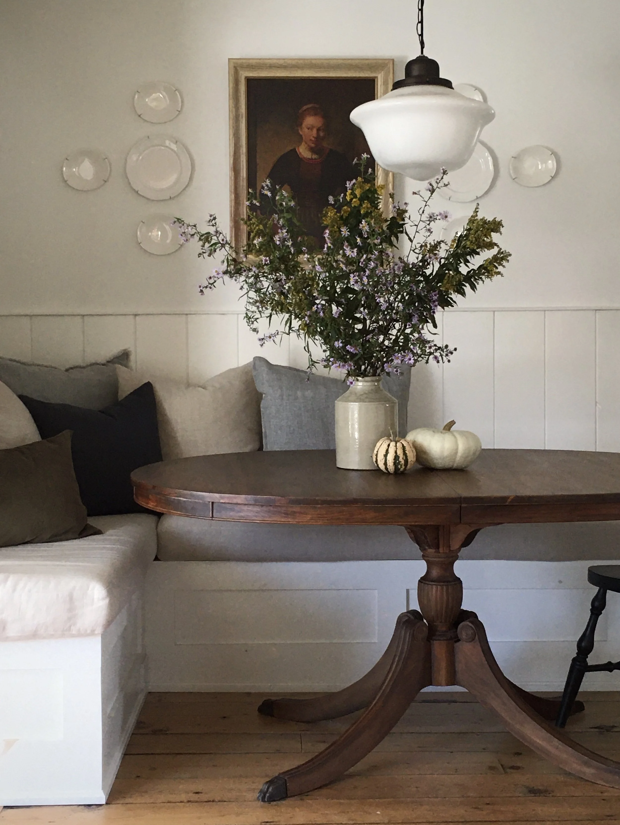
I found a vintage oak pedestal table at a second hand shop and had it reconditioned. It came with 2 leaves should they ever want to expand it for a party or whatever, it expands to a large oval. The intent of the table was for it to be a place to display various treasures picked up on nature walks through their wooded trails and along the shoreline, and of course for seasonal branches or flowers foraged from the property.

Foyer Hall Table with antique crocks and vintage bird illustration book. Room Design and Photo by: Carol Reed Interior Design Inc.

Foyer Hall Table with antique crocks and vintage bird illustration book. Room Design and Photo by: Carol Reed Interior Design Inc.

There was a large expanse of wall behind the table which needed some art. Due to the sheer size I envisioned a collection of something hung gallery style to fill up the wall. Going In this direction with wall art would continue on a concept I had already begun. In the living room we did a collection of framed botanicals (ferns), in a guest bedroom we did a series of Atlantic fish prints, and so here I decide to look for a series related to birds. The homeowners are huge nature lovers with a fascination and love for all creatures including birds, in fact the property is within a bird sanctuary. Since they’re from Europe and the overarching concept for the house’s decor was to reflect local craft, culture and history, so since there were always binoculars on the window sill here,,,I decided the foyer needed a Nova Scotia bird gallery.

I began my search where I always do, at vintage and antique shops because of course, vintage is always better. ; ) My research led me to a book by Robie W. Tufts which is a compilation of illustrations of native Nova Scotia birds, there are 41 plates in total. Each plate is numbered with a descriptive legend of each species depicted. I hunted down a dealer near Peggy’s Cove that had two copies and bought them both, one was in good condition and the second was missing the dust jacket.

Mock-Up of framed vintage bird prints. Design by Carol Reed Interior Design Inc.

Mock-Up of framed vintage bird prints. Design by Carol Reed Interior Design Inc.

I selected 12 plates from the book and created a mock-up of how I proposed to frame them up, this initial concept included dark black/green mats and thin medium wood frames. The homeowners opted for the second choice of doing grey matts and then we found a dozen ready made weathered oak frames in stock and away we went, carefully removing 12 plates from the book and having them framed.

Foyer Hall Table with antique crocks, vintage bird book, shed antler and foraged branches. Room Design and Photo by: Carol Reed Interior Design Inc.

Foyer Hall Table with antique crocks, vintage bird book, shed antler and foraged branches. Room Design and Photo by: Carol Reed Interior Design Inc.

The ‘donor’ book is on the bookshelf in their library and the full in-tact version is kept on the table so if you’re looking at the bird prints its handy to reference the book on the table to read about the bird, or quickly lookup a bird spotted on a walk or out the window. I think out of the entire house this one installation is my personal favourite because although its decorative its relevance to the property and Nova Scotia is so fitting. When their kids and grands visited form the Netherlands this was a big hit, not only is it a beautiful display, its fun and educational!

Foyer Hall table with antique crocks, foraged flowers and bird prints. Room Design and Photo by: Carol Reed Interior Design Inc.

Foyer Hall table with antique crocks, foraged flowers and bird prints. Room Design and Photo by: Carol Reed Interior Design Inc.

Foraged branches and wild flowers in an antique crock, a shed antler from an vintage shop.

Antique ladder back chair. Room Design and Photo by: Carol Reed Interior Design Inc.

Antique ladder back chair. Room Design and Photo by: Carol Reed Interior Design Inc.

This very very old antique shaker rocking chair sourced in Halifax (and surprisingly comfortable) sits beside a window overlooking the treed property - a pair of binoculars normally sit on the window ledge for bird or wildlife sightings….

Foyer Hall Table with Antique Crocks. Room Design and Photo by: Carol Reed Interior Design Inc.

Foyer Hall Table with Antique Crocks. Room Design and Photo by: Carol Reed Interior Design Inc.

New lantern style wall sconces were installed and they flank a pair of french doors into the living room. Early in the project I started collecting antique crocks and jugs for accessories and so various groupings are displayed in the kitchen, on the living room mantle and also on the foyer table. (I’m properly obsessed with the glaze and colour of crockery and have my own growing collection at home.)

Foyer Hall Bench, Room Design & Photo by Carol Reed Interior Design Inc.

Foyer Hall Bench, Room Design & Photo by Carol Reed Interior Design Inc.

Opposite the bird gallery wall and on the other side of the centre table is a bench that sits just inside the entry vestibule. Here we’ve placed an antique church pew bench - this took months to find but eventually we decided on this one from a dealer in Chester for its simple design and the size was just right. A rustic mirror and iron hooks with a collection of hats finish off this corner. No coastal house entryway is complete without a selection of Hats at the ready not just for decor - you always always need a hat in these parts so we put together a small collection to get them started.

Foyer Hall Table, Room Design and Photo by Carol Reed Interior Design Inc.

Foyer Hall Table, Room Design and Photo by Carol Reed Interior Design Inc.

Foyer Hall Table Top by Carol Reed Interior Design Inc.

Foyer Hall Table Top by Carol Reed Interior Design Inc.

On subsequent visits the table top is displaying a small rock collection…

Foyer Hall Design & Photo by: Carol Reed Interior Design Inc.

Foyer Hall Design & Photo by: Carol Reed Interior Design Inc.

This bench area is a handy spot to display hats and beach bags and for the owners or their house guests to grab one as they head out. Eventually the idea is to just keep adding hooks all around the mirror as the collection grows. Disclaimer, the mounted antlers are vintage and just one of about half a dozen I picked-up from a dealer, this pair was used for the photo shoot only while installing the hooks but the homeowners are not proponents of hunting and the property is home to a LOT of deer, so these didn’t stay! But we were still on the ‘hunt’ for wood or metal antler shaped hooks.

Coastal Estate - Kitchen Dining Nook

A Kitchen Dining Nook - Not Just For Breakfast

Over the course of two recent summers I had the enormous job of furnishing and outfitting an entire residence from top to bottom for its new European owners who purchased the traditional shingle style house as their seasonal holiday home. Located in a remote coastal setting on the South Shore of Nova Scotia the 7 bedroom main house and guest quarters are situated overlooking the water surrounded by many acres of woodland. The project didn’t involve any renovation or remodelling design work on my part, not even paint colours (!) my task of furnishing and outfitting the home mandated working with the existing spaces as is, and completing it all as quickly as possible so it could be used without prolonged delay. This post takes a peak at the finished Kitchen Dining Nook.

Coastal Estate Dining Nook, Room Design and Photo by: Carol Reed Interior Design Inc.

Coastal Estate Dining Nook, Room Design and Photo by: Carol Reed Interior Design Inc.

The dining nook in the expansive eat-in kitchen is situated in front of a bay of windows and glass doors with elevated views over the sloping property to the coastal water ways. To the right of this dining area is a classic white kitchen with black counters configured around a centre island and with a peninsula that separates the kitchen from dining area. The kitchen area features terracotta tile flooring, an alcove with a wood stove and an adjoining laundry and pantry with separate entrance from a rear parking area.

Although my scope of work didn’t include designing the kitchen or any of the interior build, I did recommend painting out the very glossy and very orange knotty pine ceiling which instantly made the space significantly brighter and lighter looking.

Coastal Estate - Kitchen Ceiling Detail, Room Design and photo by: Carol Reed Interior Design Inc.

Coastal Estate - Kitchen Ceiling Detail, Room Design and photo by: Carol Reed Interior Design Inc.

Once the ceiling was painted out we added a classic ring chandelier in an oil rubbed bronze and simple shaded arm sconces on the existing wall junction boxes. The chandelier lends a bit of nautical vibe without getting themey and the dark metal is a nod to the rugged rural surroundings.

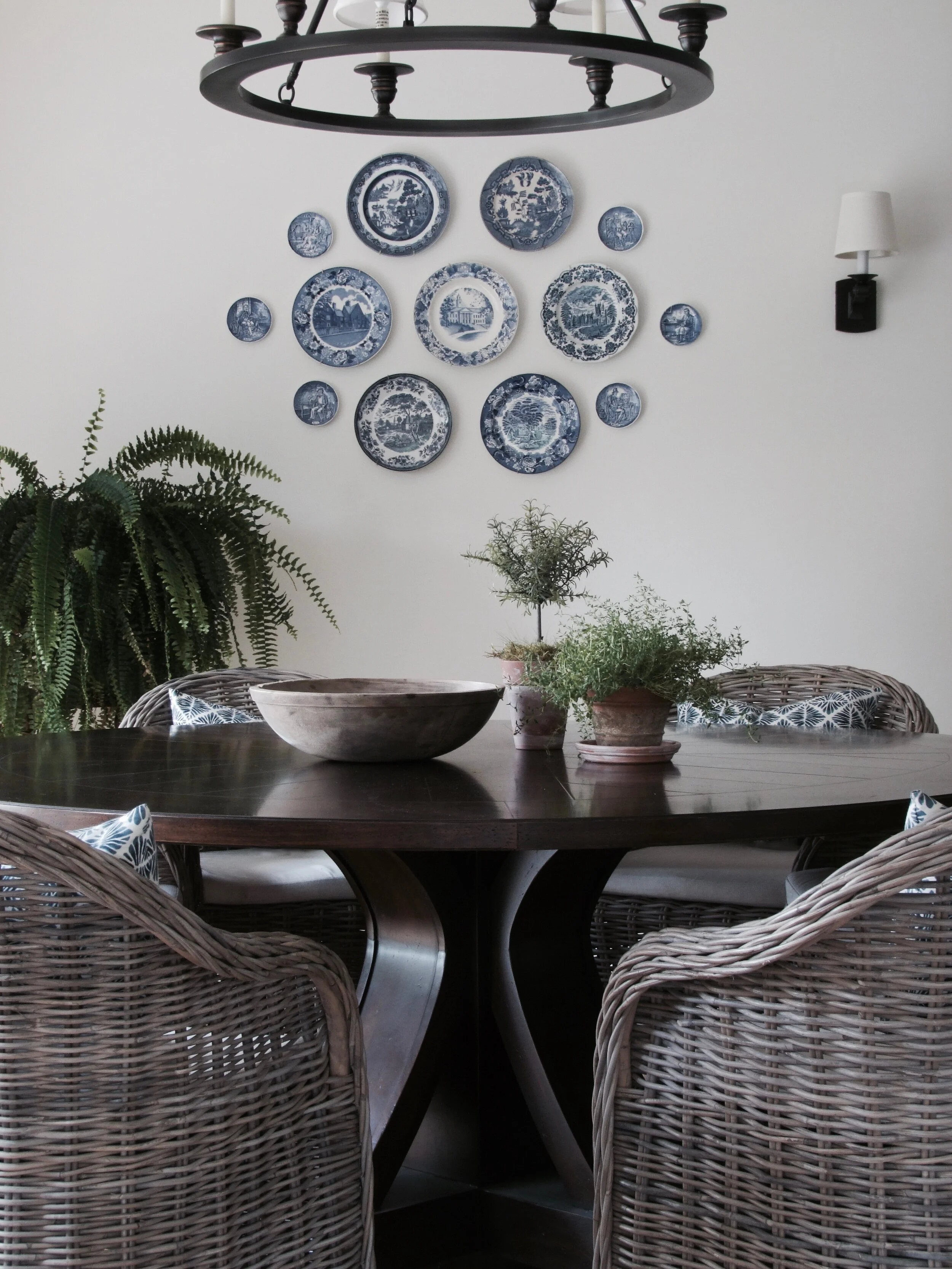
The main criteria for the dining space was for it to serve as an informal dining room (is there any other kind of dining in a vacation home!) to sit at least 10 people for occasional large family visits but also be cozy enough for two on a daily basis. I immediately set out in search of an extra large round pedestal table table which would fill the space proportionately, create wonderful flow going in out to the deck, and transition from 2 to 10 comfortably. Several inspiration spaces that we referenced had wicker or rattan chairs which really evoked a relaxed cottage setting so I set out to find a lounge’y style version that were sized for dining height.

CarolReedDesign-CoastalRetreat-Kitchen-P1.jpg

The large diameter table top and roomy arm chairs allow the homeowners to sit lounge style, side by side for any meal of the day while enjoying the scenic views (and to spread out their various international newspaper print subscriptions). For large family meals the circular arrangement of arm chairs is ideal to gather around and linger for hours if you like, with plenty of space to add in 4 or 5 side chairs when needed. I had custom back pillows made for the chairs in a cheery blue and white ekat style print which I also used for a roman shade over the kitchen sink window.

CarolReedInteriorDesign-CoastalRetreat-Kitchen-L2.jpg

Although there was an entire wall of windows/doors, the nook area had a rather large wall area to deal with. This would normally be a perfect spot for a hutch or sideboard but because there was a long peninsula behind the table and the kitchen has ample storage there was no need for more storage. Not to mention the house also has large separate dining and living rooms with a sideboard, bookcases with loads of storage space. With a small budget for wall art I decide to pick-up on a blue and white theme and create a collage of plates to occupy the wall space - a super inexpensive but impactful decor element. What inspired this was a few small blue & white plates that the homeowner had picked up on their touring around the South Shore. So over the course of the project I began picking up vintage blue & whites whenever I could. The collage is installed in a way that easily allows for more plates to be added at any time and i think that’s such a fun and interesting way to grow a collection over time and display your found treasures for everyone to see.

Coastal Estate - Vintage Blue & White Plate Collage, Room Design & Photo by: Carol Reed Interior Design Inc.

Coastal Estate - Vintage Blue & White Plate Collage, Room Design & Photo by: Carol Reed Interior Design Inc.

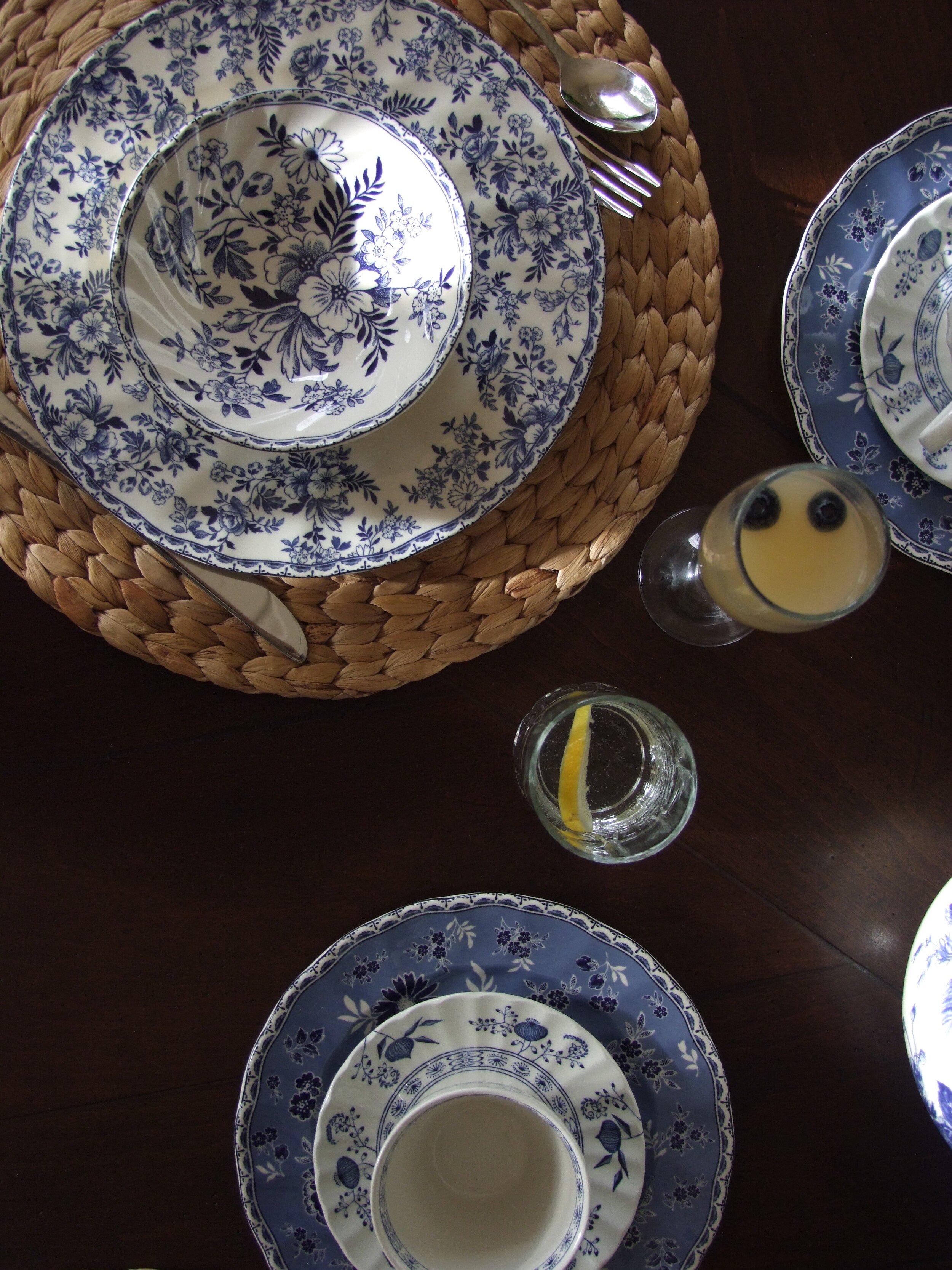
In addition to furnishing the space I was also tasked with outfitting the kitchen and dining area with all the essentials including; small appliances, cookware, serve ware, dishes, cutlery, glassware, trays,,, absolutely everything you would need to turn-key, and be ready prepare meals for a house full of guests. Early on in my sourcing I came across a charming set of Johnson and Johnson’s “Devon’s Cottage” dishware at Home Sense and immediately snapped it up. Not only was I drawn to the classic palette but I particularly loved that this collection is comprised of a mix-match pattern and it had proper tea cups and saucers (on my client’s must have list!).

Coastal Estate Table Top, Room Design and Photo By: Carol Reed Interior Design Inc.

Coastal Estate Table Top, Room Design and Photo By: Carol Reed Interior Design Inc.

I’m thrilled to say I wasn’t the only one who was crazy about this dish pattern, the homeowner’s who are of dutch heritage and have a primary residence in Amsterdam, were delightfully surprised with my find as they explained to me one of their daughters has this same set which they had always admired. Its a small world as they say!

In the next post I’ll share all the details on the table top pieces I selected and how I set the table for a family brunch!

Bedroom Design: Mixing Old & New

Mastering the Mix of Old & New: Furnishing A Rural Coastal Vacation Home

Recently I had the enormous job of furnishing and outfitting an entire residence from top to bottom for its new European owners who purchased the traditional shingle style house as their seasonal holiday home. Located in a remote coastal setting on the South Shore of Nova Scotia the 7 bedroom main house and guest quarters are situated overlooking the water surrounded by many acres of woodland. The project didn’t involve any renovation or remodelling work on my end, not even paint colours (!) my task of furnishing and outfitting the home mandated working with the existing spaces as is, and completing it all in as quickly as possible so it could be used by the family without prolonged delay. This post takes a peak into the Master Bedroom.

Room Design & Photo By: Carol Reed Interior Design Inc.

Room Design & Photo By: Carol Reed Interior Design Inc.

SOURCING & HUNTING

Furnishing a home in its entirety is both an extremely exciting and challenging task under normal circumstances, however when you factor in a rural location that’s a 4 hour drive to anything other than a Walmart or hardware store the logistical challenges suddenly dominate the process. Local sources are few and very far between in such a remote location so when the cost of delivery can often exceed the cost of an item, and where returns or exchanges just aren’t a feasible option, the job becomes an entirely different ‘sport’ than it would be in an urban area, one that requires a lot of endurance. Minimizing the amount of hours and distance spent driving, consolidating shipments and co-ordinating receiving at one locale (first leg of the journey) so deliveries could be made in bulk (the second leg of the journey) was a necessity, and easier said than done. (I should note this took place before the Ikea store opened in Halifax, so even “popping” in to Ikea (4 hour return trip) for go-to essentials wasn’t even an option).

Room Design & Photo by: Carol Reed Interior Design Inc.

Room Design & Photo by: Carol Reed Interior Design Inc.

I never like the concept of furnishing a room with all new everything, let alone a whole house. As with every space I design my approach for this project was to create a mix of old and new, contemporary and traditional. In this case with so much space to furnish, “old’ would play a key role in my strategy to meet timelines and budget, and source locally, while also delivering quality pieces with uniqueness and character. My clients were also determined that nothing need be custom or special order. Considering its setting and use, practicality and simple timeless style was the goal, while striving for an air of country elegance and maritime charm.

Here’s a look at some of the finds that made the room unique.

Room Design & Photo by: Carol Reed Interior Design Inc.

Room Design & Photo by: Carol Reed Interior Design Inc.

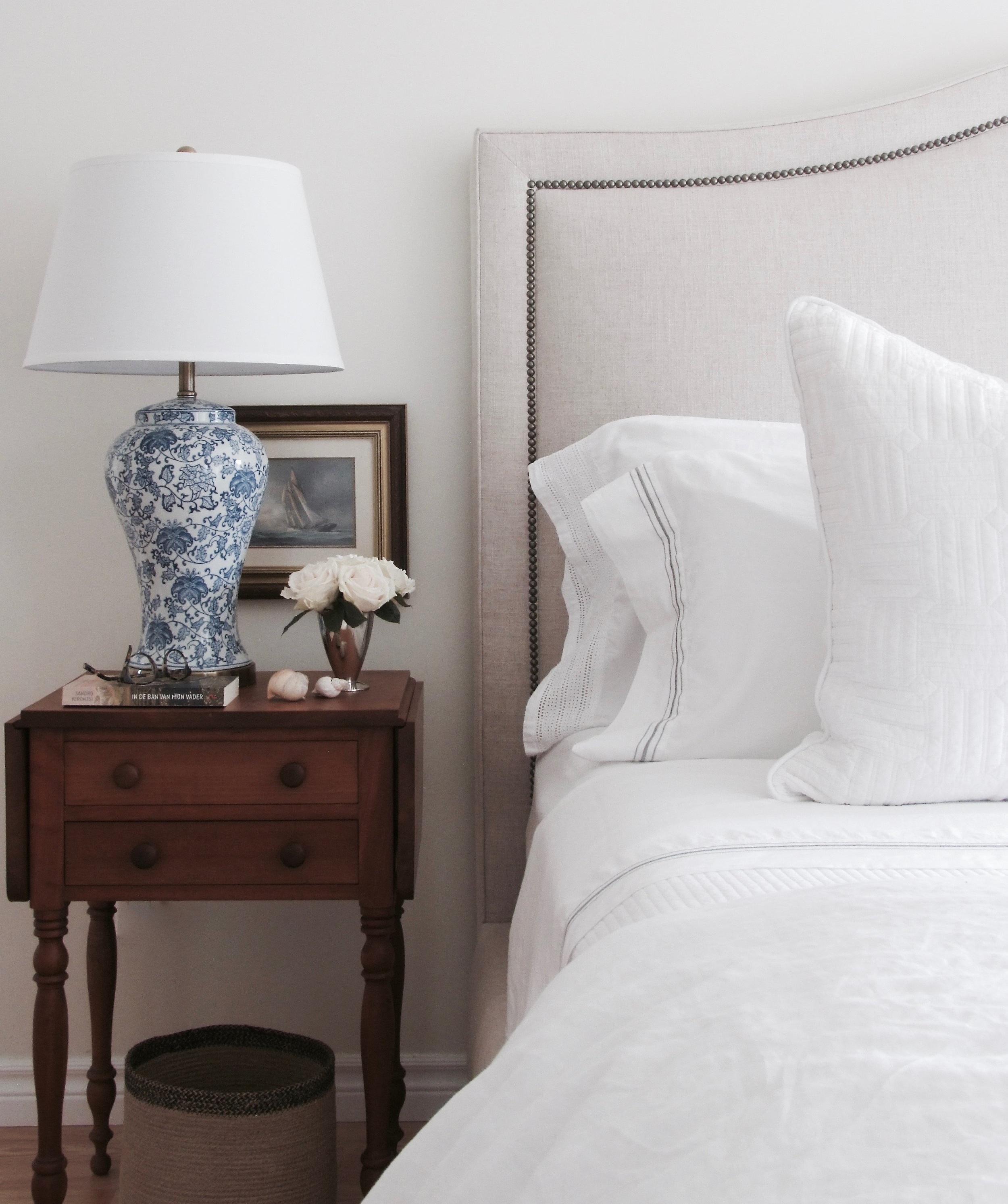
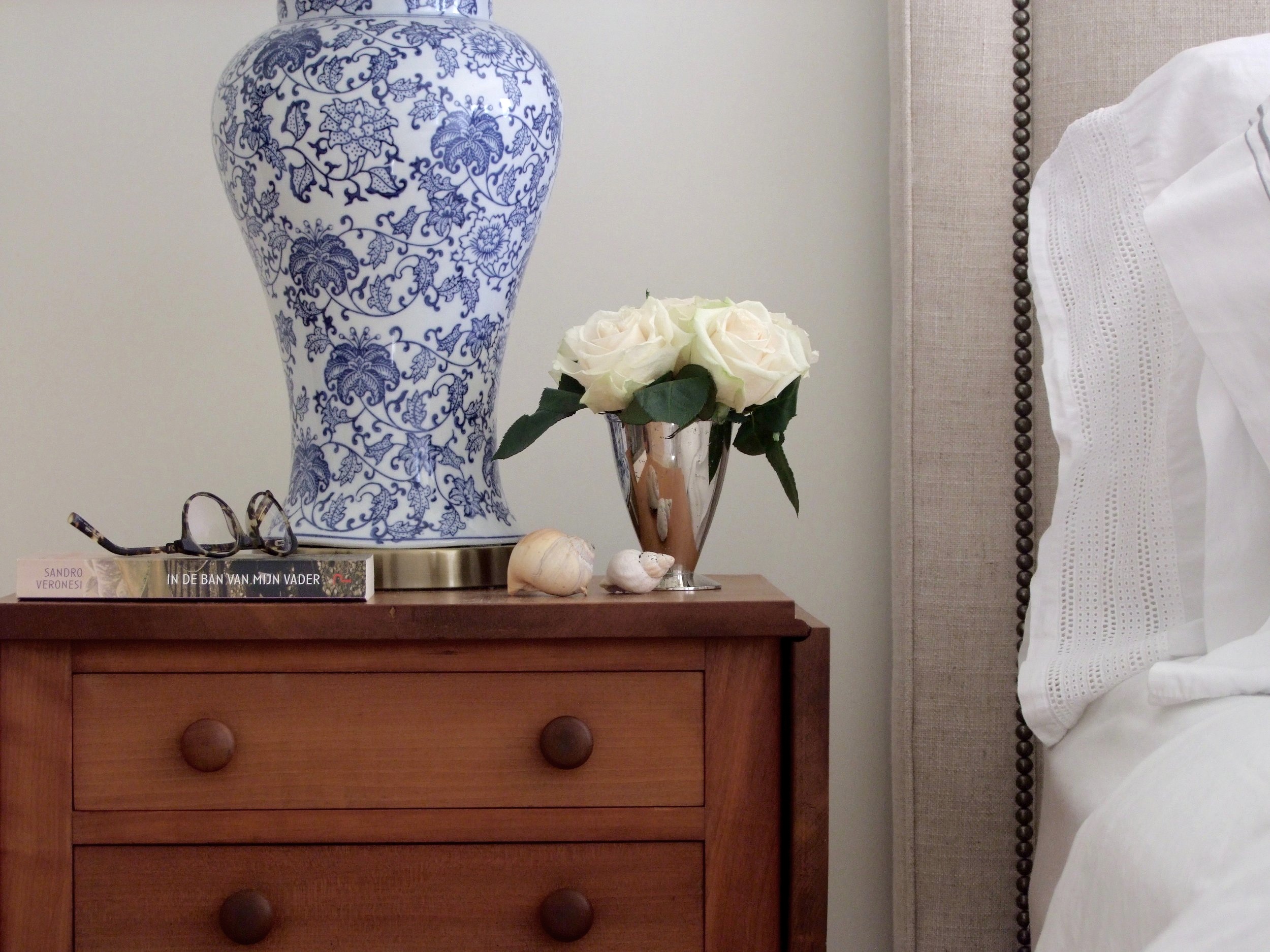
One of the first pieces I found for the room were a pair of late 19th century walnut side tables, with simple turned legs, flip tops and 2 drawers. I instantly though they’d be perfect bedside tables. At the time I found them they had a shiny eurathane coating on them in a darker stain so I had them stripped and left in their natural colour with an oil finish. The patina and of the wood is rich and warm, simply beautiful especially next to crisp white linens.

Room Design & Photo by: Carol Reed Interior Design Inc.

Room Design & Photo by: Carol Reed Interior Design Inc.

The next key piece I found was a stunning Nova Scotia antique pine dresser, again late 19th century, in perfect condition with a gorgeous patina. This Master bedroom has a large walk-in closet so having this chest of drawers in the bedroom would serve as a wonderful accent piece that could house bedding, or personal items and provide some surface space for watches, eye glasses etc.

With the key casegoods found I completed the rest of the space with new finds like the contemporary style slipcovered chair beside the dresser (above), bed, and a one of a kind wool area rug. I selected this hand-knotted wool Oushak style rug with a wonderful combination of muted greens, blue and terracotta on a light taupe background.

Room Design & Photo by: Carol Reed Interior Design Inc.

Room Design & Photo by: Carol Reed Interior Design Inc.

Although I outfitted the bed with white stone-washed linen the owners can easily mix it up and layer in coloured sheets, quilts or pillows from the palette of colours in the rug. I also planned the bedding from other bedrooms in the house so that any of it can be mixed and matched if desired.

Room Design & Photo by: Carol Reed Interior Design Inc.

Room Design & Photo by: Carol Reed Interior Design Inc.

I love to pair antique casegoods and tables with contemporary pieces especially upholstery, again, similar to the simple lines of the chair beside the dresser I selected a contemporary bed frame to sit between the antique bedside tables.

Room Design & Photo By: Carol Reed Interior Design Inc.

Room Design & Photo By: Carol Reed Interior Design Inc.

A view of the upholstered bed with the antique side tables and area rug during the installation of accessories (artwork & mirror hanging in progress). The bed is upholstered in an oatmeal coloured natural linen contrasted with with aged brass nail head detail and low block feet in a dark walnut. The texture of the linen and the dark metal detail give the bed a more relaxed informal vibe suited to the setting. The juxtaposition of the contemporary bed next to the antique tables is what gives these old pieces modern day style.

DSCF8458.jpg

ACCESSORIES

From the onset of the project I was continually sourcing antique and vintage accessories, mirrors and wall art. Over the course of two seasons I amassed a large collection of various things in anticipation of adding finishing touches to all the rooms. After all the key pieces were installed in this room it was time to add the accessories and hang the wall art. It was important to me that not all the accessories be “new”, but for them to look like they’ve been collected over time.

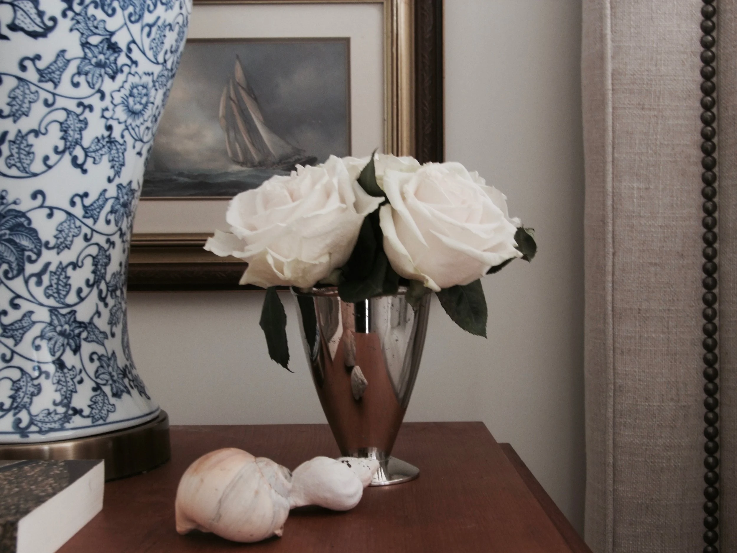
A favourite accessory I found was this framed vintage print of the Bluenose which couldn’t have been a more perfect accent for this room - the iconic schooner is a nod to Nova Scotia’s maritime history and the husband is a sailor and schooner owner himself. It’s a very subtle nautical touch without going all themey. The couple are also of Dutch heritage with their primary residence in Amsterdam and so inherently she has a deep fondness for blue & white porcelain. These classic blue & white foral lamps with antique brass base just seemed the perfect reflection of her taste and effortlessly just compliment everything else in the entire room. The sea shells I picked up on a nearby beach, which I’m sure are only the first of many found treasures that will make their way into the house. Its rare to come back from a hike or beach walk without a souvenir in hand.

Room Design & Photo by: Carol Reed Interior Design Inc.

Room Design & Photo by: Carol Reed Interior Design Inc.

When it came time to accessorize the room I had no intentional plan, I simply pulled from all the things I had been collecting over the months and placing them together seemed to work with a natural ease. Everything on the dresser, except the wicker tray and small blue porcelain bowl are vintage or antique including; an arch top mahogany framed mirror with original glass highlights the pine dresser, its flanked by a pair of vintage, professionally framed black and white photo’s of the Cape Breton coast, (found as is I love everything about them with their aged gold frames and blue/grey mattes) a framed print of blue/white birds on a branch (vintage), an antique small blue and white ming vase filled with grocery store roses - because none of the rose bushes I planted in my garden were not blooming : (, and an antique crock filled with wild flowers foraged from the side of the road.

Room Design & Photo by: Carol Reed Interior Design Inc.

Room Design & Photo by: Carol Reed Interior Design Inc.

During my hunting I purchased numerous single antique windsor chairs for the house and at various stages of the project they found their way into different spaces, this one lived beside the dresser before the slipcovered arm chair arrived but both pieces can be moved around in the room. Not shown on the one side of the room is a wing back chair and a small antique gate leg table and articulating floor lamp - piled with unhung artwork and pillows, at the time these photos were taken, hence there are none……

Room Design & Photo by: Carol Reed Interior Design Inc.

Room Design & Photo by: Carol Reed Interior Design Inc.

DSCF8520.jpg

A final view of the other side of the bed with the bird print hung in place…

Room Design & Photo by: Carol Reed Interior Design Inc.

Room Design & Photo by: Carol Reed Interior Design Inc.

For this initial phase of furnishing the entire house, in short order, to get it functional and comfortable I’m beyond happy with the results. The groundwork is in place with room to add personal touches and grow collections as life unfolds in the house. In future, if I were taking it to the next level, I’d love to see panelling or wallpaper added to the walls along with mixing in some more textiles (accent pillows and drapery panels) perhaps from their native South Africa and Netherlands. As I alway say, a room is never done, only done for now. ; )