floor plan: reconfiguring THE SECOND FLOOR
I first began working on the redesign of this century home for an e-design client a few years ago, beginning with designing a new open concept main floor kitchen. The homeowners are a young active family of 3 with a big picture goal of a whole home renovation and are approaching the re-design of the home with a lot of preparation, initially working with an architect to draft up floor plans to reflect their general wish list. From there, they reached out to me to review and assess their proposed plans and develop the interior design further. With the new plan for the main floor now detailed to completion, we recently took on the task of assessing the second floor.
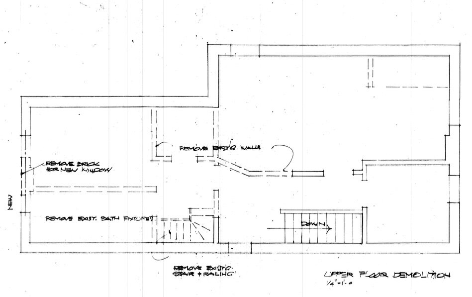
Here’s a look at the existing floor plan, along with the initial concept they had drawn up for the second floor reno. The current layout is 2 + bedroom and 1 bath, the “+ bedroom” being an oddly small room originally referred to as a ‘carriage room’ in the old days. They’re awkwardly too small to use for a bedroom (and don’t meet minimum code dimensions for a bedroom) and not quite large enough to function as much else other than a tiny office or storage. You’ll notice that even in the client’s proposed plan the room hadn’t been utilized for a new purpose. (note the secondary back staircase was already planned to be removed for the main floor kitchen reno.)
When I assessed their plans I saw some missed opportunity to add more value to their reno investment - the small carriage room wasn’t being utilized for a new purpose and I saw this a valuable space. I can appreciate the desire to maintain the feature of a 3rd bedroom but this space wasn’t functional for that by modern day standards and by maintaining it, it was preventing them from adding more functional upgrades like a second bathroom and bigger closets. Typically the incentive for renovating these homes is to increase the number of bathrooms and closets where ever possible.
What I liked about their plan was the large master bedroom at the back of the house, and its walk-in closet, but what was lacking by today’s standards for a newly built or renovated home was a master ensuite, although I could see there was definitely potential to add one. My viewpoint on this was that I didn’t see any added value in keeping the tiny carriage room, but if they could create an ensuite in addition to the main hall bathroom and a larger second bedroom they’d not only be adding value and function but greatly enhancing their day to day enjoyment of their rooms.
I immediately explored the potential to add that ensuite to the master. Above is a quick block plan of just one way that could be possible . Although this was perhaps the most straightforward approach from a layout perspective, we didn’t develop this any further, instead we opted for a more efficient approach of keeping the two bathrooms back to back (which would also stack them above the power room below.)
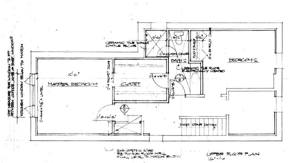
Below is a look at the final before and after plan for the second floor.
The new plan keeps the master bedroom at the front of the house where it currently is (not shown on plan the intent is for the window to be enlarged to match a new larger window on the main floor below) and it enjoys a 4 piece ensuite and separate walk-in closet. Their son now gets a more spacious bedroom, for a queen or twin beds along with a full wall of buitin storage. The hall bath is compact but doesn’t lack anything, it has a 36” vanity and full size tub/shower combo. The hallway is nicely proportioned and is spacious enough to accommodate some furniture pieces which is a wonderful bonus that always makes a hallway live larger than it is.
Now that the floor plan was finalized we moved on to designing the master ensuite. Here’s a look at some of the inspiration images my client had collected on Pinterest which provides some insight to her style objectives.
Inspiration images are quite different than mood boards which are typically more abstract in imagery. The method of curating room images is incredibly helpful for e-design clients to communicate to me what they like in terms of style, colour palette, and architectural features. From these I can comprehend their design language and spot consistencies in what they’re drawn to. In this case, it was simple, clean lines, modern, white, light natural wood tones, touches of black and a hint of mid-century modern. A floating, double vanity was top of her wish list.
This is one option we presented for the vanity, designed to float on a wall of warm-white glazed tiles that add a distinct texture. The floating vanity was configured using standard Ikea Sektion sizes +/-” so this would give them the flexibility of having it either fully custom made or going with an off the shelf solution and adding custom drawer fronts only in a light wood tone with shelves to match.
Material Samples for Master Ensuite | Carol Reed Interior Design Inc.
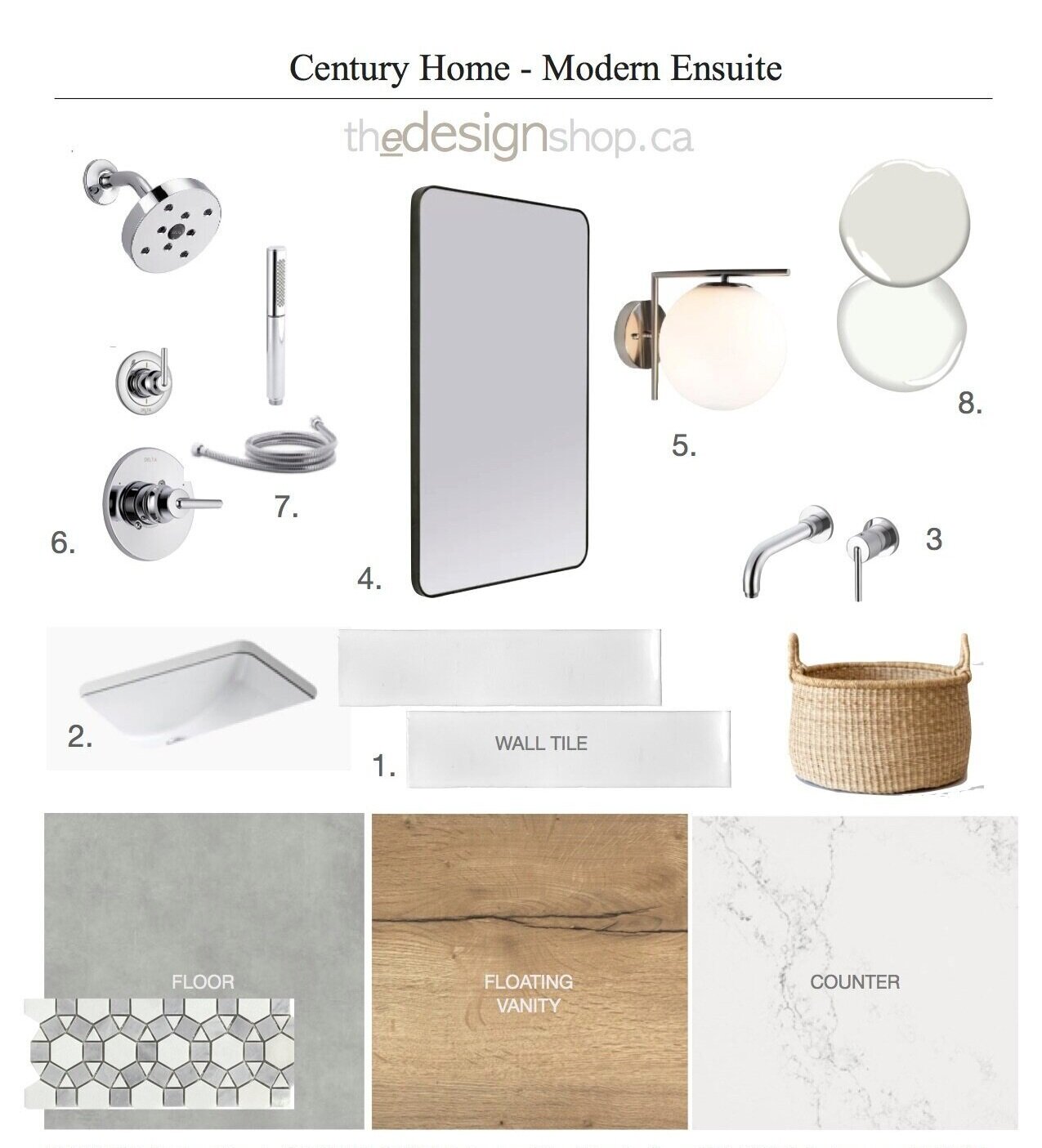
Sample materials for the ensuite design included a mix of glazed wall tile, large format porcelain floor tile, white and grey marble slabs, and a grey and white geometric marble mosaic in the shower.
There’s always a unique solution for every space as each homeowner’s requirements are different. The concept above is a preliminary version of the final concept that was delivered to our client.
One of my key pieces of advice for bathroom reno’s, particularly if you’re not working with a designer, is to avoid trendy tiles, or attempting to create a complex tile scheme - use restraint, stick with finishes in timeless neutral palettes, use natural materials (or their man-made look-a-likes) that have interesting textures and classic patterns installed with consideration as to how each enhances and elevates the other. There’s plenty of space to inject your personality into the room with light fixtures, artwork and accessories, these can be changed up anytime without demolition.
If you need help with a challenging floor plan, check our E-Design services on thedesignshop.ca
For more peeks at full-service and e-service design projects you can follow us on Instagram @carolreeddesign


