70's Sidesplit

Master Retreat: 70's Sidesplit


Since the end of August I've started on so many new projects, a few of which I'll be working on over the next 6 months to a year - and will tell you more about them in future posts.  Since before the end of August I've wrapped up a lot of projects so I'd like to get some of these after pics off my plate so to speak before I move on to posting about the more recent stuff I'm working on.   The 70's suburban sidesplit I furnished for a single mom and her daughter was completed earlier this year, for me it was the first time I took on a project that didn't involve any renovating whatsoever - that had all been done before I came on board.  You can read more about the background story of this project here, and see after photos of the Daughter's room here and the Guest Bedroom here.

Like the other bedrooms in the house the master bedroom was on the small side but typical for a sideplit, it had a small walk-in closet and a tiny 3 pc ensuite and no redeeming architectural features at all.  It had brand new hardwood floors and a fresh paint job when I first 'met' this room.  My task was the same for this space as it was for the entire house, furnish it from top to bottom from scratch and have it completed and move-in ready in less than 3 months.  Although she invested in a designer, her spending budget was modest so every splurge would need to be balanced with a few great finds. 


The Before: this is what the room looked like the first day I saw it, the painters were just finishing up (talk about bad timing!).  Once again I would have to work with ICI's Bavarian Cream. : /   My client has a love for all things feminine and glamourous and traditional and elegant and french inspired and she wanted her new room to be all those things, but she's also young, professional and stylish so it had to be done in a way that looked modern and fresh (and by modern I mean current).


The After:  I had a custom diamond tufted headboard and end of bed bench made, added an elegant crystal chandelier, a luxurious wool area carpet and glamorous mirrored chests on either side of the bed.  The ruffled bed skirt, damask duvet cover and shams are from Au Lit.


Ready-made lined cream linen drapes with inverted pleat top and full length sheers dress up the not so fabulous looking window.  I found an antique walnut dressing table with 4 big drawers and after contemplating several options for new chairs, my client found this antique chair stored in her mother's basement, it belonged to her much loved aunt.  I thought it worked perfectly with the vanity and loved the fact that it had sentimental value.  This chair and one pair of antique lamps were the only things that my client brought with her into this house.  She does plan on reupholstering the seat or adding a slipcovered seat with 3/4 skirt.  The etched mirror accessories are vintage from Chatelet Home.  The knobs on the vanity were replaced with crystal ones since this pic was taken.


I had originally purchased a potted orchid for the dressing table but by the time I had returned and taken most of these photos,,,,all the potted orchids in the house had died, she's now replaced them with artificial.  This is a bad Iphone pic, for some reason I have no decent after photos of this area of the room,,,I think its because from every angle I tried to shoot it I was getting a bad reflection in the mirror.. 


When it comes to designing spaces or furnishing a room, I'm most particular about lighting more than anything.  Sometimes its to my detrement because I can get really hung up on finding something that I feel works just right,,,,,,,style, size, function,,,if its not just right,,the entire room falls short.  These lamps are one of my favorites and are from Crate & Barrel.  I like the simple form of the base and the drum shade which adds a modern touch to the space, it has a subtle crackle glaze, the soft curves and silk shade are so elegant.  I think their simplicity pairs well with the traditional crystal chandelier. It was near impossible to find a pair of these in stock but after much begging, pleading and phoning I did manage to score a pair at the 11th hour.


The wool area carpet had a traditional feel to it, it had a taupey cream coloured border with a grey/blue main field.  The end of bed bench wasn't ready in time for move-in (the day this shot was taken) but was delivered only a couple of weeks later....


Diamond pique lace edged coverlet & euro shams, and lace edged pillow cases were great finds from HomeSense as was the sunburst mirror.


The bench was delivered a couple weeks after move-in...


When I delivered the bench I also brought along one more finishing touch (which is now my most favorite thing in the room), a cream coloured velvet pillow with feather trim.  My client was completely in love with her new room already and this little find sent her over the moon. : )
Feather pillow, HomeSense.


Even though everything in this room is new to my client except her aunts chair, I'm happy that all things in the room aren't brand new - it was important for me to mix in a few antique pieces so the end result is a mix of new and old, splurges and saves, ready-made and custom made, feminine and tailored,,,,, but best of all I think we achieved traditional without looking dated.


All Photos:  Carol Reed


Guest Bedroom: 70's Sidesplit

Earlier this year I completed a project for a single mom and her young daughter which involved furnishing an entire house for them from scratch in only 3 months and on a tight budget.  This was a departure for me as far as projects go because there was actually no renovation work involved at all, not even a paint job.  To see some of the 'before', 'during' and 'preliminary after' photos of the project you can check out some earlier posts 

here

and

here

.  You can also have a look at some after photos of the little girl's bedroom

here

.

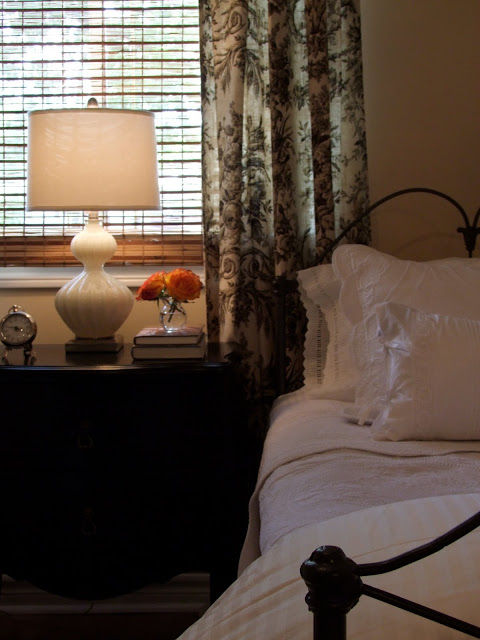
My favourite room in this house was the guest bedroom, which seems to always be the case with me! Since this particular clients has a love of all things french country, I had envisioned a simple, understated french inspired room.  The total spending budget for the room was only $3,500 excluding the mattresses and design/procurment fees - it was the smallest budget of all the rooms. (

note: reality of small budgets like this is that design fees can often be as much or more than what you spend in the room

).  Because I didn't have much time for sourcing this also meant no time for refurbishing, refinishing or reupholstering - I had to be fast and resourceful with ready to use finds.  I also had to work with the paint colour she had already chosen for the room, ICI's Bavarian Cream.   I wasn't a fan of this colour choice at all, in fact I have a strong aversion to any colour that resembles peach and these walls definitely read peach.  Since repainting wasn't an option my approach was to play it down and ignore it.  I avoided putting anything in this room that had more of this colour,,,or enhanced this colour in any way - I find the best way to do that is with black and white.  This classic b&w scheme did such a fantastic job of neutralizing the peachiness of the wall colour that my client thought I had repainted the walls.    
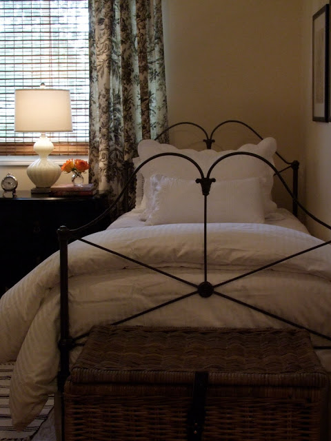
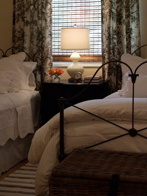
I started my sourcing by searching for a pair of antique iron twin beds, not an easy task.  Its challenging to find a pair of

anything

and even harder to find a pair of antique anything.  A short road trip to one of the largest antique iron bed suppliers in Canada scored me this stunning pair of twins which I blogged about in an earlier post

here

.

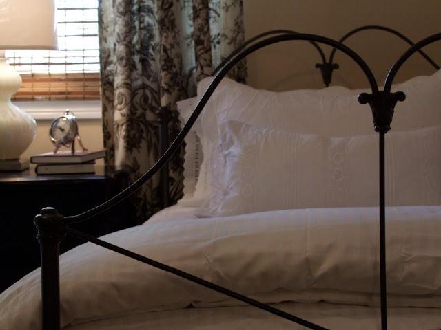
At $600 each they were definitely the splurge for the room but worth every penny. They had been restored and modified to suit modern day mattress sizes so they were ready to use.  Seasonal hypo-allergenic duvets and egyptian cotton tone on tone striped duvet covers from Bed Bath & Beyond are folded back at the ends of the beds.  I tried to find duvet covers in a twin size that had a bit of black stitching or banding,,,but no luck.
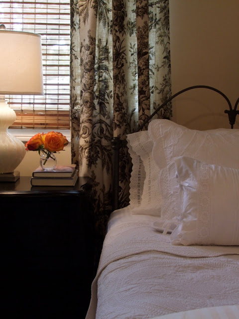
A couple of days after buying the beds I was in the right place at the right time when i came across a pair of twin matalesse bed sets at

Elte

that were on clearance and were perfect for the antique beds and the budget.  On top of this I layered a lace trimmed pillow case from Pottery Barn, and a lace-up accent pillow from HomeSense to each bed.
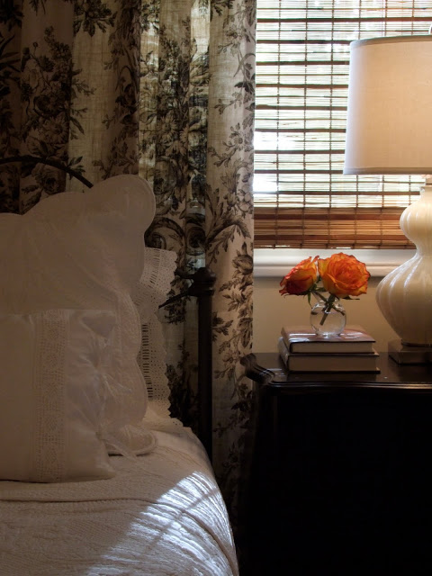
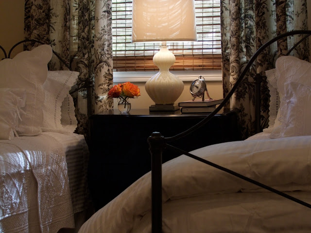
  I found a pair of ready-made gorgeous black and white toile style drapery panels from

Invu

and scored a black chest of drawers and milky glass gourd lamp from HomeSense. What doesn't show in the photos is the antique brass tear drop style pulls I added to the chest - so pretty!!
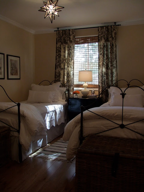
A moravian star fixture (from Home Depot) was definitely the highlight of the room.  Wicker trunks from Ikea are placed at the foot of each bed.  The framed prints on the wall are in keeping with the french theme, they're copies of handwritten 'travel memoires' from Paris.
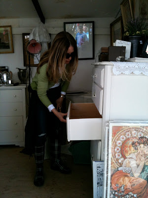
The only thing missing from the room on move-in day was a dresser.  I wanted an old painted dresser and though not expensive these things can take some luck to find so I held off until the spring antique season arrived.  A couple of months later and on my first trip of the season I found a vintage dresser at the

Aberfoyle Antique Market

. The size was perfect, it was only 17.5" deep and had 5 drawers so it worked perfectly with the room and the budget, it was a steal!
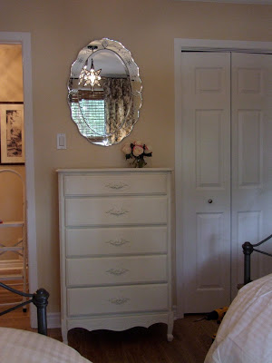
I added a vintage style oval mirror from Home Depot (handyman was there to hang it) and on the wall to the right of this photo is a series of decorative black iron hooks.  
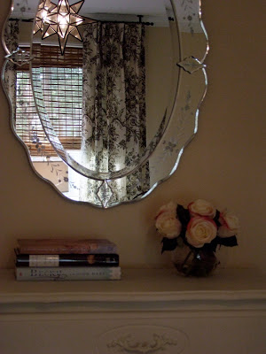
Overall I loved the way the room came together - its luxuriously comfortable and beautiful.... and on full view everytime you walk up the stairs in this house, so inviting you actually want to just stop and stare at it!  My client and her daughter love the room so much they've had sleepovers in there themselves several times....

All Photos:  Carol Reed

On The Side


Things are pretty hectic right now with client work and vacation planning so I don't have too much time to spend blogging.....but I just had the urge to post a pretty picture!!  You can see in these photos one of my favorite side tables - I've used it on two different projects in the last year.  It has simple and elegant lines, has a warm patinaed metal finish and best of all its usually in stock..... and not crazy expensive! Its available in two different sizes which can be used singularly or nested.  I particularly love the antiqued mirror top.  Jules accent table by Crate & Barrel.

The photos above are from the living room of the 70's sidesplit I recently furnished for a single mom.  More photos of this room coming soon......


All Photos:  Carol Reed