Black and White

Grey Scale: Powder Room


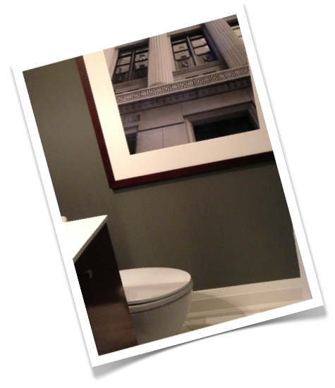
Clients powder room in various stages of progress.


I was sorting through room photos of past projects and came across these images of a powder room from a recent renovation, the 70's Bungalow project.  It dawned on me that I hadn't ever posted any photos of this room before, probably because its just such a difficult room to capture without a wide angle lens.  Like the entire house this room underwent a complete gut so we started with a clean slate - dark grey slate in fact which I chose as a wall colour for the small room.  


Small rooms are the perfect spaces to play up drama and scale - whether its a large print wallpaper, deep paint colour or graphic floor pattern, going bold will have lots of impact and kick the wow factor up a notch for your guests when they excuse themselves to powder their noses. It makes the entire experience a little more special.  : )    The drama in this little room doesn't come from the colour, its neutral in that sense but the walls are deep and dark and quite a departure from the rest of the home's all white modern interior.  The large calacatta marble floor tiles have beautiful dramatic veining.   


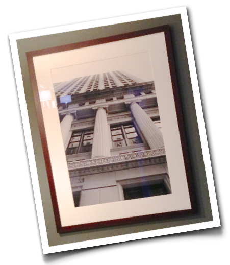
A bevelled tray mirror adds some elegant sparkle to the dark room but the floor to ceiling bare grey wall was crying out for a piece of artwork and I wanted large scale.   What I had completely forgotten about until I came across these room photos the other day was that we had one of my own photographs framed and hung on the wall.   For this room it was an affordable alternative to what would have needed to be a very large  original piece (or a smaller pair) of art.  I sent my file to Elevator Digital and once again, Kevin worked his magic on it to make sure when it was enlarged that the image quality was maintained and then the print was beautifully matted and framed.

The photo chosen was from a series I took of buildings on Wall Street when I was in NYC two summers ago. The homeowners have both travelled to NY for business over the years and now have a son who lives in Manhattan, they're pretty fond of the city and were quite taken with many of my architectural photos.   Its hard to tell from this not so great snapshot but the size of the framed piece is over 3' wide and over 4' tall.  Its not actually a black and white image but the colours are all monochromatic greys that it reads that way.  My favorite thing about this photo is the perspective,  its so dynamic that it brings an amazing sense of depth to the room. 


There's been lots of finishing touches and a massive landscaping overhaul happening at this house over the past year so they'll be more after photos coming soon.


Room Design and all Photos By:  Carol Reed


Black & White Stripes


Its no secret I love black and white and every imaginable shade of grey.  But I love black and white the most when they're used together in a graphic pattern such as a geometric or stripe. For years, Its something I've been working into most of the spaces I design and its shown no limits to how versatile it can be.   A graphic black and white pattern is the perfect way to add a modern hit of interest to a neutral coloured space, or a space that doesn't have a lot of prints/pattern (although it plays nice with other patterns too).  When I use a bold colour in a room, my favorite approach is to offset that bold colour with black and white, it think it keeps colourful schemes looking fresh and current and to my eye prevents them from looking too heavy.  And...if I'm ever forced to work with a colour that's not so desireable (say, peach, or sea foam or hunter green for example!) I'll add black and white to the space, if I want a modern edge, I'll do it in a graphic pattern.   In a traditional space a stylized black and white botanical print or herringbone check adds a fresh twitst and for a classic preppy look a banded stripe of black or white is timeless.  Without a doubt the black and white stripes found in nature are my favorite - no matter what style the room, a zebra pattern always add a bit of edge, i could easily use this pattern in every space I design and never tire of it.  I just picked up this zebra print carpet for a clients dressing room.

A look thru a few batches of photos uploaded recently from my Iphone indicate I've been on a black and white buying spree lately.  while I think its a perfect combo any time of the year there's something about spring that perfectly suits the crisp high contrast of geometric black & white.


This black and white stripe, cropped sweater jacket was irresistable (styled like a blazer but fits more like a sweater).  I scooped this up at Joe Fresh a few weeks ago and know it'll be a staple this spring and summer! (Btw, Joe Fresh will soon be opening its first international location this spring in NYC).

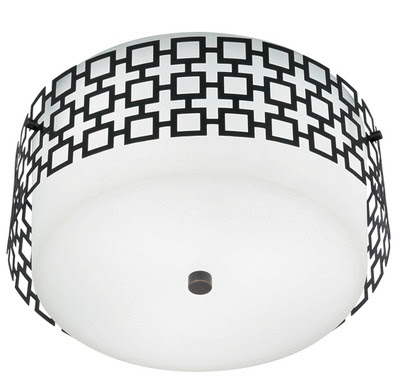
The Parker flush mount fixture by Jonathan Adler for Robert Abbey.  I first specified this fixture 3 years ago and i've used it many times since. Its available in several finishes but my favotire is the bronze which really shows off the grid work, I just ordered a few more....


Some preliminary scouting for a project I'll be working on in Naples Florida later this year.  I'm loving the idea of pairing this chair with bold yellow accents and colourful modern artwork. Chair from Elte.


If you havn't been to Ikea recently, you better hurry if you're in the market for outdoor furniture or accessories.  Their 2011 summer collection has just landed in the stores and stuff is selling fast.  I'm crazy for these black and white striped outdoor pillows and scooped up a pair for only $20 ea, including insert.


Speaking of pillows, I had some of this fabric left over from a project from last year and I just pulled it out to have some more pillows made, I'm just as crazy for this now as I was when I first saw it.  I've always been a fan of chevron but its the oversize scale of this one that I really love!


Since spring hasn't even arrived yet, I'm sure this won't be the end of my black and white buying spree. If you're looking for a way to add a fresh new update to your indoor or outdoor living spaces for the new season - try a hit of graphic black and white, and I promise you'll be a fan too.


All Photos:  Carol Reed