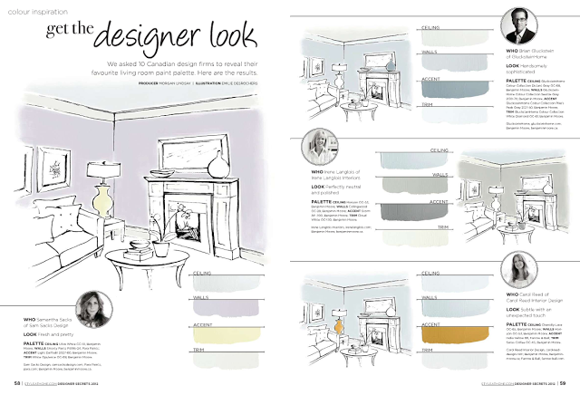
I was thrilled to be asked by Style at Home to share a favorite living room paint palette for their readers to be featured in a special Designer's Secret's issue, on stands now (and on-line at Zinio). The requirements were to provide them with a four colour paint palette to include a ceiling colour, wall colour, trim colour and accent colour. You can see the first page of the feature below were my palette is shown.
Style at Home - Designer Secrets 2012, Page 59
A favorite palette of mine instantly came to mind, its based on Benjamin Moore's, Horizon OC-53. It's not a palette I've just pulled out the air, its a palette I've used time and time again over the past 7 years - if I had to name a 'go to' colour that wasn't white, Horizon would be it for me. Its the palest silvery blue that reads differently in every space, its as light as a white so it highlights architectural mouldings and showcases artwork like a white and it pairs beautifully with all wood tones. I've sampled it with dozens of other greys and off-whites and its almost always the unanimous choice. I've used it in client's living rooms, dining rooms, bedrooms, bathrooms, and ceilings, in both traditional and contemporary spaces, urban and country. The feature on p.59 illustrates one of my favorite trim/ceiling/accent paint combos with Horizon OC-53. (not to be mistaken with Horizon Gray, a different colour completely).
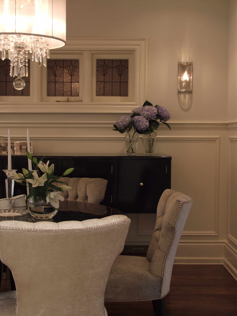
Below is my own breakdown of the colours and why I chose them, along with a photo of a client's living room and dining room painted in these paint colours (minus the accent colour). The house is a grand old Edwardian in mid-town Toronto, home to a young family of 4. If I had to describe this palette, I would say it exudes SIMPLICITY & ELEGANCE.
WALLS:
Benjamin Moore
Horizon OC-53
This pale silver grey is my favorite alternative to white walls but with all the same attributes - its simplicity compliments wood tones, highlights furniture silhouettes and enhances other colours. I first used it about 7 years ago and its been a go to paint colour for me ever since, it works in any room. Its undertone has just a whisper of blue so this grey reads clean and sophisticated, never drab.
TRIM:
Benjamin Moore
Swiss Coffee OC-45
A warm off-white that has an aged looked to it and is perfect for architectural mouldings in a traditional space. Paired with HOrizon this tinged white trim work gives a room timeless and elegant character. (pair with a white trim for a contemporary space).
CEILING:
Benjamin Moore
Chantilly Lace OC-65
A very neutral clean white, a good balance with the mix of cool wall paint and warm trim paint. It provides a nice crisp definition against the antique white mouldings. In a contemporary space, use this for the trim too!
ACCENT:
Farrow & Ball
India Yellow #66
What I love about Horizon is you can go any direction for an accent colour. My favorite with it is a deep ochre yellow, its inviting and chic paired with pale blue/grey, use it on the backs of a bookcase, upholstery on a statement chair, silk pillows, ceramic lamps or on the walls of an adjoining room.
Wall Colour: Horizon OC-53, Trim Colour: Swiss Coffee OC-45
Room Design and Photo by: Carol Reed (2007)
Upper Wall Colour: Horizon OC-53, Wainscoting and Trim: Swiss Coffee OC-45
Room Design and Photo by: Carol Reed (2007)


