Home Office

Its Reveal Time: A Home Office


Style at Home March 2012,  Photo: Donna Griffith

This home office was part of a whole home renovation project I designed and project managed back in 2008-09 for my sister-in-law Kara.  It seems like an eternity ago since the construction was completed and she moved in, but its taken a couple of years to turn it into a 'home' with furnishings and artwork. While the entire home, including a gorgeous rooftop deck, were photographed by Style at Home Magazine last year for upcoming issues, I was so thrilled to open up the current issue and see her home office featured in the Organizing Workspaces story "Hard at Work". 

The office occupies one of the 3 bedrooms in a multi-level, mid-town condo and was chosen as the office over the other spare bedroom for its eastern exposure with bright  morning sunlight - she's an early bird! I added a new frosted glass panel door to the room so when she has out of town guests (frequent occurance) she can close the office door for privacy and sunlight can still filter into the hallway.


Style at Home March 2012, Photo: Donna Griffith


The antique ash barnboard floors and hide carpet are a nod to Kara's past, having grown-up on a farm she has a strong affection for all things country - a photo of her childhood prize winning pig has a special place on her desktop, complete with ribbon!  I prefer modern furniture or contemporary spaces when paired with a little bit of rustic or 'country' element, and this room does just that.  The random width floor boards were finished on site and received a low sheen clear coat to showcase the wood's natural character with all its knots, nail holes and bug tracks.  With a wall of shelving fitted with woven storage boxes, a full height filing cabinet and double closet with essential organizers (not seen in photos) so the office provides loads of storage and an expansive work surface for the high volume of paper work that's handled here. 

Its no co-incidence the office is filled with lots of orange accents, its one of the corporate colours of the company Kara works for so she's has been using orange for work related accessories for over 10 years.  Its a colour I've always associated with her  - she always has something on her or in her bag that's orange.


Thank you Margot, Jessica, Donna and the rest of the Style at Home team for your beautiful work on this feature!  I am a devoted fan of the magazine and I'm honoured that you chose to include this space on your pages.

: )


A few more After Photos..

Below are a few more after photos not from the magazine shoot but from my portfolio files that give you a glimpses of some other details in the office.

On the wall opposite the desk, a row of modern wall clocks have their orange hands set to the various time zones of family and friends around the world, including one for Kara's Muskoka cottage, permanently set to 'bar's open'.   She's a whiz at board games, this metal ledge holds letters from a vintage family scrabble set which spell out the city name for each clock.


One of my favorite items in the room is Kara's very first childhood desk - it occupies a special place in the corner beside her 'adult desk' and I've used it to stack magazines and hold book bags.   I love the visual tale of these two desks side by side,,,its a testament to the power of learning and dreaming big.  They truly represent the past and present of this successful woman's journey of accomplishments.


Artwork by:  Alanna Cavanagh

I have admired the whimsical illustrations of Toronto artist Alanna Cavanagh for some time, so I was really excited when one day Kara sent me photos of several pieces she had brought home from a gallery to try and decide which to buy and where it could go.  I thought their vintage inspired take on typography and fashion were a perfect fit for her office.  I loved each one of them, and so did Kara which made the decision easy - she kept them all.  That was a couple of years ago, and today I can tell you she loves these pieces as much now (if not more) as the day she brought them home.   


I'm looking forward to seeing the rest of this home on the pages of Style at Home coming up soon!!


A Family Home Office


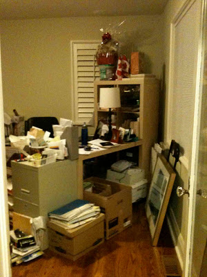
Many months ago just before the end of 2010, a past client of mine contacted me about finishing one of the remaining 'original' rooms in their otherwise fully renovated cape cod style house.  This room was the Library or Home Office and it occupies a very prominent space in the home at the front of the house directly off the front entry.   The parents are both successful professionals with their own practices/business and have two young girls.  This room needed to function as a home office for both parents and space where both girls could work on school projects with mom or dad.   It was a tall order!   Home offices have similar needs to address as kitchens,,,lots of worksurface, storage, organization, ergonomics, and the ability to accommodate equipment and work gadgets.   Here's a look at what one corner of the space currently looks like - its obvious that nothing is working here.
  

Existing space

The solution to a space like this is built-ins.  Built-in cabinetry that maximizes the vertical space available and accommodates specific types of storage needs.   I designed 3 walls of full height built-in cabinetry for this room to provide worksurfaces and accommodate lockable file storage, computer equipment, supplies, binders and a book collection.   To soften all this built-in cabinetry I decided to add a custom made free standing table desk, an area carpet and some patterned fabric to give the room a more relaxed homey look and make it feel less 'officey'.   All these months later, the cabinetry is now nearing completion, the custom table desk and fabric treatments are being made, and installation is scheduled for sometime in September.

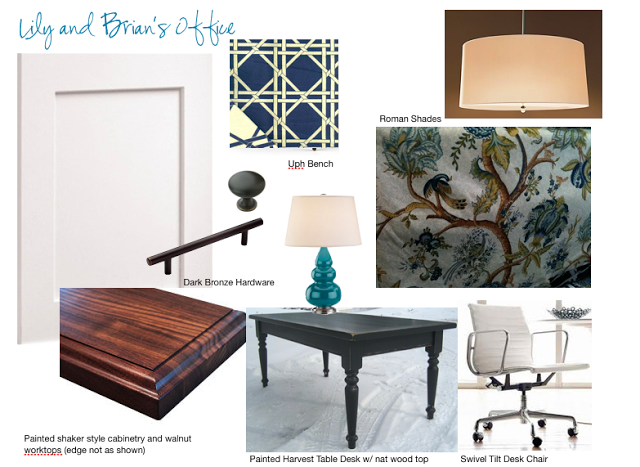
The concept board above is a look at some of the key pieces selected for the room early on in the planning process - in addition to these pieces an area carpet, upholstered arm chair, wall art and desk lamps will be sourced for the room over  the next few weeks.    Below is a floor plan of the proposed new layout with built-ins.


I presented at least 4 different layout options for them and this was the winning plan.  The table desk could easily accommodate mom and one or two of the girls working on a project.  There's additional knee space on the side return, loads of file storage, a wall of bookshelves, a separate area for printer/fax/copier, supplies and stereo equipment.  Dad has his own separate work space complete with a loads of upper cabinet space for all his paper work.


The room's two windows will get new fabric roman shades with a wide gros grain ribbon border (along the edge as opposed to inset as in the sketch above).  A custom upholstered stool will tuck under the knee space of the long wall of built-ins and can be pulled up to Mom's or Dad's desk when needed.


The fabrics for the roman shades and upholstered stool shown above right and the cabinetry finish is on the left.  The base of the table desk will be painted in a dark navy blue/green.


I first saw this fabric about a year ago, I photographed it and ordered a sample for future use.  Well it didn't take long for this project to come along and I knew instantly it would be a great fit for this space and suit the classic casual vibe of this client's home.  A pattern that's not too over the top flowery, it's very branchy and leafy and has the odd bird in there too.   The existing paint colour of the office is a pale warm yellow/green that's also found in this print.


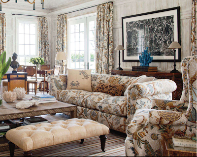
I was thrilled when I spotted this room in the July/August issue of Veranda Magazine with the same or similar fabric.  I love the impact it has when used on all the upholstery and drapery.  I'm not certain its the exact same fabric, the colour way is slightly different with a gold/tan background as opposed to the blue/grey background of the fabric I selected but its so similar its hard to tell the difference.  I also noticed that they brought in a hit of tourquoise in the accessories just as I did with the gourd lamps,,,and I think its a fun compliment to this fabric choice.


With the new school year fast approaching this new home office will be ready just in time to help this busy family tackle all their work and school projects with ease.   I'll post some after photos this coming fall and show you how it all comes together.  


Photos 1 thru 6:  Carol Reed
Photo 7:   Veranda Magazine


Brian's Condo - Guest Bedroom


Its been a crazy week of deliveries and installations at Brian's condo and with today, February 1st, being our deadline we are about 90% complete, and I'm happy to say we also seem to be reasonably on-budget.  A few pieces of artwork to be hung, small accessories and finding the right nightables are left on the 'to do' list.

One of the areas of the condo that we deligated the least amount of the budget to was the second bedroom.  Brian's intent was for this to be used as a home office space for occasional business related work but mainly for personal use and home finances etc.   A small file cabinet and printer would be stored in the closet directly beside the desk.  In addition to a desk area he would need to accommodate an overnight guest every once in a while but he didn't want to dedicate the space for a bed so we opted for a sofa bed which would allow him to enjoy the room on a day to day basis with a comfy sofa for reading.  The room is quite irregularly shaped so there wasn't too many options on where the desk or sofa bed could go.

The first image above is the design concept for the room which illustrates all the key pieces I sourced.  I opted for a simple work horse style desk with metal frame legs and glass top - this keeps the space open looking and definitely is keeping in style with our "vintage-modern with a touch of industrial" look.  I chose the black nickel saw horse desk from West Elm, the price was right and it was in stock!  

The next big 'splurge' for the room was for a desk chair.  I actually had found a sled base chrome and leather chair at a consignment shop for just $100 but Brian really wanted a chair that swivelled.  I was a bit torn on this one with the budget,,,,my own opion of desk chairs is that you might as well either go - super cheap $29.99,,,,or go for the best which are super expensive.  Everything else seems to fall in the 400-700 dollar range, they look better than the 29.99 cheapies but aren't that much better in quality, in my opinion.  During my 10+ years of experience in commercial design I've spec'd thousands of contract quality desk chairs and know them all.  At the retail level, what you mainly see in the home furnishing shops are knock offs and I'd just rather get the real thing - it will last you forever.   Having said all that, I did happen to stumble across a rather sweet deal on a floor model of one of those knock-off versions that made the decision for us - cash'n carry,,,I took it with me. 

Since Brian is starting from scratch he doesn't have a collection of artwork nor do we have room in the budget for Picasso's,,,,,,so the next best thing to original art is your own photography.  Brian had some old photos from past travels and I took the negatives to Elevator Digital where Kevin truly worked some digital magic on them.  He scanned the neg's at super high resolution, cleaned up the digital images and made large b&w prints for me which I put into ready made frames.  Certainly this isn't a cheap process as these are really the best quality images we could get from old negatives but its an affordable and personalized solution to starting a collection.  Below are low res scans of what we started with, a photo of the Grand Canyon taken from a helicopter and a photo taken at Pebble Beach golf course.  


Above is a mock-up I sent Kevin of what I wanted to do with the photos.  I like that both the images had similarities, a horizon with winding roads amongst peaks and valleys and I think they translated well to black & white - I picked them up on Saturday and I absolutely love the way they turned out!!


The last key item was the sofa bed - it was kind of a no-brainer to go with the Ikea Ektorp model, we splurged on the sofa in the living room so we had to 'save' on this one.  The style and size would work and the slipcovers make it versatile and practical for him.  Best of all,,,,its in stock and ready for delivery.   Over the past couple of weeks the rest of the room has been filled in with some great vintage finds and  some handsome window coverings - this spare room is really turning into one of my favorite spaces.  Here's a sneak peak at what it looked like yesterday when the window coverings were being installed.....


For before photos, floor plan and previous posts on Brian's Condo project: