Kitchen Renovation

Kitchen Renovation: 18th Century Dutch Colonial

Design Plans & Concept for the kitchen renovation of a heritage home on the South Shore of Nova Scotia.

Kitchen Concept by: Carol Reed Interior Design Inc. www.carolreeddesign.com

Kitchen Concept by: Carol Reed Interior Design Inc. www.carolreeddesign.com

Without a doubt one of the most appealing aspects of designing projects in Nova Scotia is the opportunity to work on some of the oldest homes in the Country.  Its exciting not just to see this heritage preserved but seeing it adapted and juxtaposed with modern day living.  This rural, oceanside dutch colonial dates back to 1784 and has maintained all of its original character and features for more than two centuries, its significance holds heritage designation.   Nestled on a grassy treed lot, it sits prominently at the end of a large harbour with stunning views of the ever changing ocean and sky.

CREED Blog - Dutch Colonial Kitchen Renovation, Shelburne Nova Scotia www.carolreeddesign.com

CREED Blog - Dutch Colonial Kitchen Renovation, Shelburne Nova Scotia www.carolreeddesign.com

The scope of this project involves renovating the current kitchen and adjacent pantry.   The original 18th century kitchen was in the cellar and has likely been out of use for the past century or more.  The current 'modern day' kitchen is on the main floor at the rear of the house but consists of nothing more than a double sided island in the middle of the room (the sink on one side, the range on the other) and two closets.  Not surprising the top priority for the new owner of the house was to put in a new kitchen.   

The room is a large rectangle with some common but difficult challenges to work around; a wall of windows with low sills, 3 doorways, and a brick chimney stack - not a lot of wall space to work with.   With a concept for the design already envisioned, the next step was coming up with the new layout.  

Rear view, the door on the left leads directly into the kitchen.CREED Blog - Dutch Colonial Kitchen Renovation www.carolreeddesign.com

Rear view, the door on the left leads directly into the kitchen.

CREED Blog - Dutch Colonial Kitchen Renovation www.carolreeddesign.com

Kitchen Design by: Carol Reed Interior Design Inc.www.carolreeddesign.com

Kitchen Design by: Carol Reed Interior Design Inc.

www.carolreeddesign.com

The initial proposed plan (above) involved removing a brick chimney that imposed approximately 2 feet into the room (previously serving an old fireplace) and is located exactly where we wanted to put the new range.  After much deliberation however, the final version of the plan (not shown) now incorporates the chimney stack staying as is, so the range wall has been reconfigured from what you see above but maintains the same design concept.  More importantly, the homeowner is equally as thrilled (as am I) with how the alternate solution worked out.  In addition to the main kitchen the adjacent separate panty/servery will be maintained but with all new cabinetry and finishes - the only mandate being a recently purchased fridge had to stay.  The panty is situated between the kitchen and dining room, with an entrance into each. 

Kitchen Concept by: Carol Reed Interior Design Inc.www.carolreeddesign.com

Kitchen Concept by: Carol Reed Interior Design Inc.

www.carolreeddesign.com

The concept for the finishes and fixtures for the main kitchen area (above) reflects the simplicity of the aesthetic - the new kitchen will be very plain, and very english with hand crafted quality.   The floors will be the original wood floor boards, we'll be exposing the original hand hewn wood ceiling beams, the cabinetry will be custom made, flush inset with a hand painted finish.  The existing original large mouldings will be replicated in new.  The sconces and stools are a nod to the colonial style of the house.  The range wall features a large hearth style range canopy complete with mantle which also does a stellar job of concealing the old brick chimney.  

Finishes & Fixtures Presentation Meeting - December 2017.Kitchen Concept by:  Carol Reed Interior Design Inc.   www.carolreeddesign.com

Finishes & Fixtures Presentation Meeting - December 2017.

Kitchen Concept by: Carol Reed Interior Design Inc. www.carolreeddesign.com

Demolition started this week and I'm looking forward to seeing what's discovered when the bare bones of this 18th century charmer are revealed. 

Karen's Kitchen: Canadian Living

Karen in her new kitchen with her chicken Cuddles.  Photo by, Donna Grffith

At long last, 

welcome to Karen's kitchen!  Words cannot describe how excited and proud I am to see Karen's kitchen renovation featured in the currrent issue of Canadian Living!  If you follow Karen's wildly popular blog,

The Art of Doing Stuff

, you've no doubt read her

updates

about the more than year long renovation and seen some

sneak peeks

along the way.   Not only have Karen and I been twitter and blogging friends for several years, I'm honoured to say she's also an E-Design client of mine.  I was fortunate to work with Karen on her kitchen design from the initial planning stages of the project and helped guide her through the inevitable and various design dilemmas along the way.  Karen had a great vision right from the very start along with some very challenging space issues - with her great sense of style, her resourcefulness, her diy skills,,,,and a little help from me ; ), I think the the transformation is nothing short of spectacular.  Its truly satisfying to see a plan and a vision come to life but to hear how much she loves, loves, loves, her new kitchen is the most rewarding part of all. 

Canadian Living, October 2014

Not only does Karen look stunning posing with Cuddles in her new kitchen (that dress!), but she wrote the feature too.  I hope you'll enjoy reading the full story and all the before and afters along with sources in the current issue of Canadian Living, on stands now or you can purchase the digital version thru Zinio.  You won't be disappointed.

You can read more about the planning phase of the kitchen, including the before and after floor plan, optional layout plans and the design requirements,,,in an earlier post I wrote last year,

here.

For more info on my E-Design services for kitchens or bathrooms 

please check out my e-design website

www.thedesignshop.ca

The Art of Planning: Karen's Kitchen


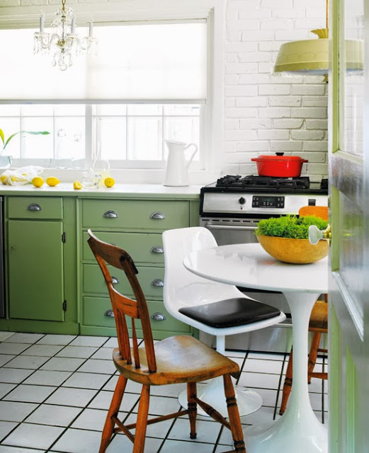
Photo by Donna Griffith, for Style at Home


You may remember last  year I prepared some design sketches for my cyber friend Karen’s chicken coop gates.   If you’re a fan of the Art of Doing Stuff blog, like I am,,,you know Karen doesn’t often need help with anything because she’s a master at figuring how to do stuff herself.  She has a wonderful character style house and over the years she’s done many home improvements and decor projects inside and out.  Not your average homeowner diy's,,,,Karen has an impressive archive of magazine quality 'afters', in fact the inside of her house and her backyard have both been featured in Style at Home magazine which you can admire here and here.

Clearly Karen doesn't need any help in the decor or handyman departments but one of the few things she hasn’t tackled is the house's original 1940‘s kitchen.  She's pretty attached to the old kitchen and its easy to understand why - it oozes an authentic nostalgic charm that’s hard to replace (top photo).  Even the editors at Style at Home couldn't resist photographing and featuring it just the way it is.  Yah, even the "before" picture of Karen's kitchen is magazine worthy. ; )  Inevitably the time has come to replace it and Karen knows enough to know this in’t something she wanted to tackle on her own because the consequences of making mistakes or oversights are daunting, and expensive.  So this is where I came in.  Karen hired me thru my  e-design services to work on the new kitchen plans.  As far as finishes and appliances went she knew what she wanted but what she was struggling with was how to fit all of the new elements together.  She needed a plan.  


ASSESSING...
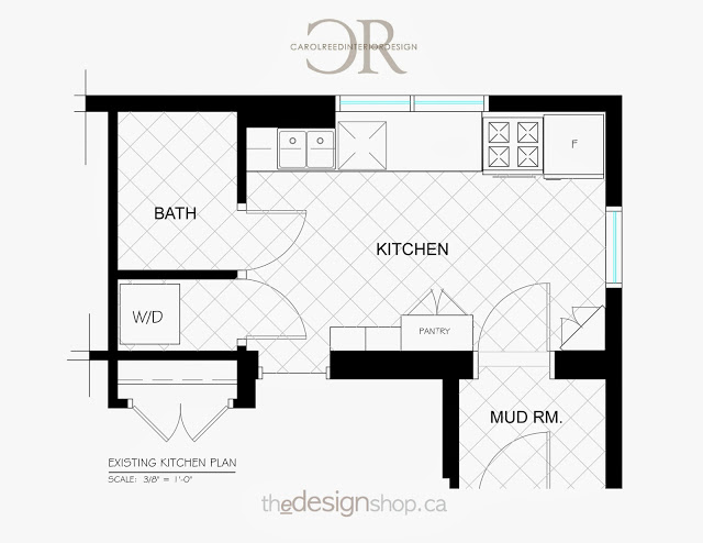
The first step I take is to review the existing space to assess what's working and what isn't.  The whats not working about her current kitchen might be obvious, but its not all bad.  There are aspects of this kitchen layout that Karen enjoys, particularly the huge expanse of uninterrupted counter space between the sink and range....and having a kitchen table and chairs. To be frank the shortcomings of the kitchen were easy to find solutions for but doing so and maintaining those elements that she loved was truly the challenge.  That and accommodating all of the other things on her wish list.


THE DESIGN BRIEF...
- 'not cookie cutter'
- no new construction
- non-custom cabinets
- more storage
- a range hood
- a glass door fridge
- a furniture style pantry
- a stand alone butcher block table
- a place to sit
- a fixed budget
- did I say 'not cookie cutter'..

Knowing that we couldn’t alter the bathroom, laundry room, mudroom or doorways,,,,,I recognized the biggest obstacle in Karen’s kitchen was the counter height window on the end wall.  It’s location was a prime spot for a range and hood, or a fridge,,,or wall cabinets.  Ideally it needed to be moved to best utilize the space. Unfortunately the window was fairly new and had involved re-stucco’ing the exterior of the house.  The option of moving it or changing it now was not in the budget so it was staying.  Had we not been able to find a workable layout that Karen loved, I would have suggested she hold off until her budget allowed to move the window because it would open up so much more layout potential. 


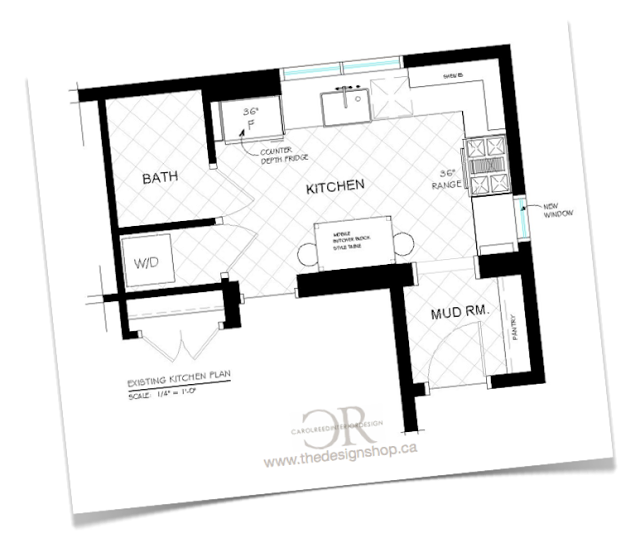
This is an example of how we could have utilized the wall had we moved the window. We quickly eliminated this option (and variations of it) for budget reasons and moved on.


Even though this layout doesn't appear to be drastically different than the existing, the changes are significant enough that with new, more efficient cabinetry and appliances it would be a big improvement.  This option ticked all the boxes including a 36" range.  It was the front runner,,,,,until,,,, Karen came home with an antique butcher block island that she couldn't resist and that meant a change in plans.  But I've seen and completely approved,,,it's a beauty worth changing things up for.


THE AFTER PLAN....
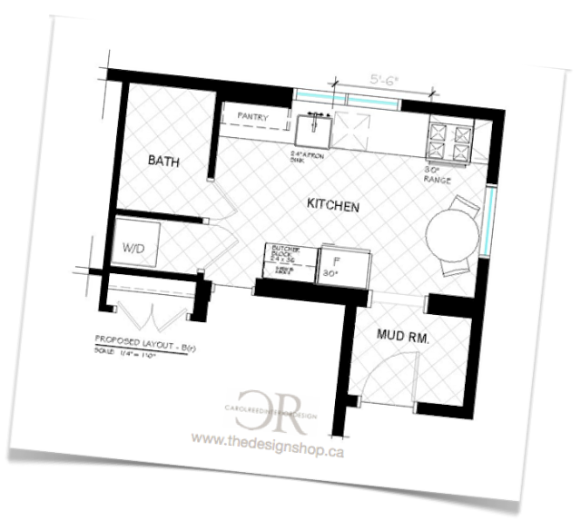
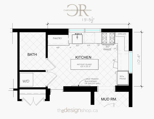
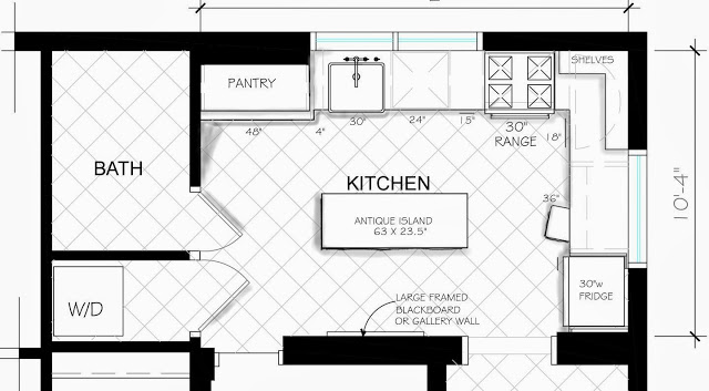
After exploring more than a dozen layout options we arrived at a final plan that Karen loves (shown above).   You can read Karen's first post about her kitchen reno plans here .......and you'll notice she received no shortage of opinions and suggestions from readers too. ; )   I'm confident in saying they can rest assured that the planning process was extremely thorough and not a single possible option was overlooked.  : )  (We are aware the fridge overlaps the window a tad in this layout but this is the worst case scenario and we're prepared for how to deal with it.  The fridge she's hoping to get is narrower than this but we're planning for the larger option just in case).

True to her vision “not cookie cutter” would be the design mandate and concept for Karen’s new kitchen.  This applies to the layout too. There are a LOT of kitchen design standards, rules of thumb and conventional layouts with their regulated work triangles - well this plan doesn’t necessarily follow all those rules.  And that's perfectly ok.  I can say from experience that the clients who do a lot of serious cooking are the ones who's kitchens stray from generic design standards the most because they have much more specific needs, usually simpler.

When I approach a kitchen plan from scratch I use spacing standards only as a starting point (which also is an instant way to gauge if your footprint is considered tight or generous).  From there I determine how and where adjustments can be made to suit the space and the users specific needs.  There's nothing wrong with conventional layout standards but they simply don’t always fit or work for every situation, that doesn't mean you can't still have a kitchen that's functional - it just means you need more adaptable solutions (while maintaining safety and functionality of course).


In addition to the floor plan I also worked out all of the wall elevations which detail Karen's new cabinetry and will facilitate getting it ordered.  The task of pulling this entire plan together is now in her very capable hands and I can't wait to see it all come together.   Karen has done some savvy networking to co-ordinate a few great collaborations and sponsors for this project.  The design layout reflects the products and publication opportunities that are anticipated thru the collaborations as well as some of Karen’s unique finds so it promises to be an interesting and beautiful transformation story for all parties involved.

You can follow the kitchen reno progress over at The Art of Doing Stuff and I'll post updates here as it starts coming together!