Home Design Project: Contemporary New Build
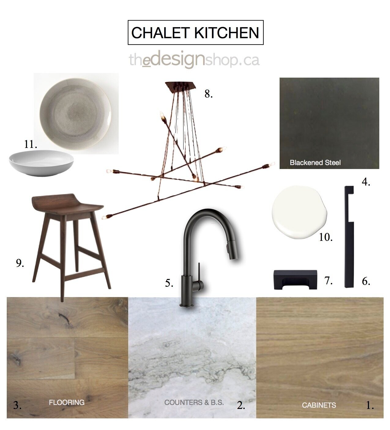
For my clients who I first worked with about 10 years earlier, this new custom-built house would be a major lifestyle change as they relocated from their city home to a rural small town popular for its boating, golfing and skiing. The project took over a year and half to complete from the time I came on board to move in. During that time I designed the interior from a base plan created by the architect, developing all the interior details including the kitchen and bathroom design, ceiling plan, lighting and staircase. I recently received some post move-in photo’s from the client and thought I’d share the kitchen design from concept to completion. Here’s a version of the kitchen concept for the finishes and fixtures.
E-Design: Kitchen Concept for Modern Ski Chalet. | Design: TheDesignShop.ca by Carol Reed Interior Design
The kitchen was custom made so I had the opportunity to design it completely from scratch. Here’s a look at what the preliminary kitchen plan from the Architect looked like when I came on board, and then the final kitchen design.
Kitchen Plan Before
The kitchen is located in a great room and is open concept with a dining area and large living space all anchored by a floor to ceiling stone fireplace surrouned by floor to ceiling windows with tree top views. The kitchen is positioned on an inside corner but sits below a tall vaulted ceiling with clerestory windows that floods the space with light.
Kitchen Plan - Final
Kitchen Design by: Carol Reed Interior Design Inc. www.carolreeddesign.com
Kitchen Layout
One of the biggest changes was to the pantry, we opted to add a counter in between two tall cabinets and include a wine fridge so the area can also be used as a servery. An additional tall pantry cabinet is adjacent to the range to keep daily essentials in reach. An oversize island provides ample prep space and seating on two sides.. The orientation of the main sink in the island allows the cook(s) of the house to be facing their guests and the scenic views while prepping or cleaning up. A secondary sink beside the range is convenient when two or more people are cooking and is super handy for filling and emptying pots.
The most unique aspect about this L-Shaped kitchen is the way the corner is designed, which was derived from centering the range between a pair of tall cabinetry columns, with one column being in the corner mirroring the column on the opposite side of the range. Because this was being custom built I was able to design the corner cabinetry to utilize all the corner space. Below the counter the full corner is accessed with a ‘magic corner’ unit which has a swivel pull-out function. At the counter the column becomes an appliance garage with a flip-up/retracting door and above that the upper cabinet space is divided into two compartments, one accessible through the adjacent wall cabinet and the other by a narrow pull-out.
Elevation - Kitchen Range and Hood Canopy
Kitchen Design By: Carol Reed Interior Design Inc. www.carolreeddesign.com
Kitchen Details: Elevations
The range hood typically becomes a key design element in a kitchen as its a great opportunity to make a style statement by either underplaying it or highlighting it. A key feature of this concept was to create a sleek architectural millwork element out of the range wall to conceal the exhaust system so both it and the fridge are panelled for more of a furniture look. The hood canopy is integrated with upper cabinets , all at a flush, equal depth and to be faced with blackened steel to contrast the white oak and light stone. Continuing the stone slab counter up the wall to the underside of the hood enhances the sleek lines and showcases the organic veins and colours of the natural stone.
Elevation - Front of Kitchen Island
With the main sink located in the island it also houses the dishwasher, recycling bins, cleaning supplies, a microwave and container storage. A cantilevered deep overhang provides lots of knee space for counter seating and the extra wide counter means there’s lots of prep and clean up space without imposing on the seating areas.
Elevation - Back of Kitchen Island
Kitchen Design by: Carol Reed Interior Design Inc. www.carolreeddesign.com
The back of the island is only partially cantilevered with a full cabinet on one end (left) and knee space overhang extending to the right of it. An ultra modern sleek suspension pendant illuminates the island without detracting from the dynamic ceiling or clean lines of the kitchen cabinetry.
Kitchen Concept - Materials & Fixtures
Design by: Carol Reed Interior Design Inc. www.carolreeddesign.com
Kitchen Fixtures & finishes
After the floor plan was finalized I pulled together all the fixtures and finishes. The dominant finishes throughout the house were natural white plaster walls, white oak floors and black windows. The focus in the kitchen was to continue the light natural materials with more wood and stone accented by contrasting dark metal.
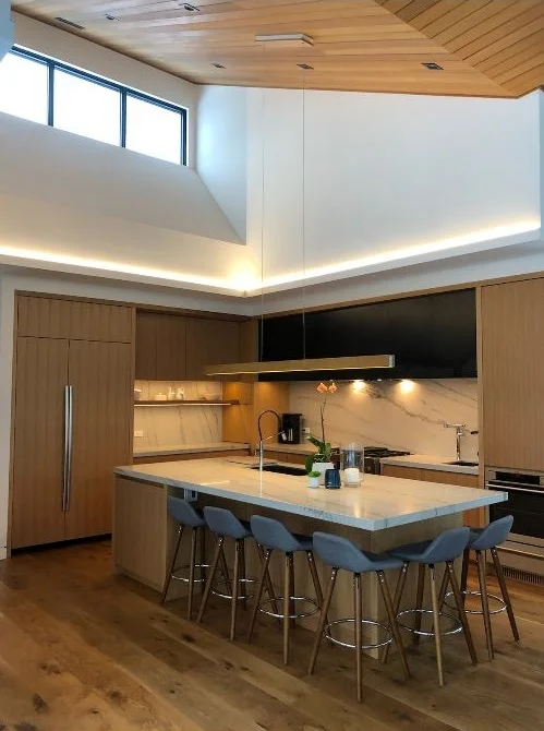
Kitchen Post Move-in
Kitchen Design By: Carol Reed Interior Design Inc. www.carolreeddesign.com
Here’s a view looking towards the kitchen (from the pantry side) shortly after move-in, sent to me by my clients ( they won’t typically need this many stool for daily use but they can easily seat up to six when they entertain) . A second oven was added and built into the column to the right of the range.
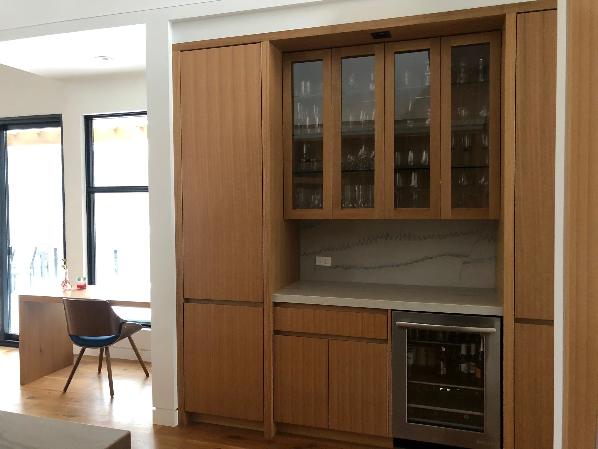
Kitchen Desk, Pantry & Servery
Room Design By: Carol Reed Interior Design Inc. www.carolreeddesign.com
A glimpse of the pantry and servery area. To the left, a desk floats in front of the floor to ceiling windows beside the walk-out to the deck. Although these are not professional photos seeing the servery un-styled like this gives you an idea of just how simply and easily it can be accessorized for any occassion. A perfect place to show-off some seasonal foilage and florals or a local piece of pottery.
Kitchen Ceiling Detail
Kitchen Design By: Carol Reed Interior Design Inc. www.carolreeddesign.com
The vaulted ceiling was clad in cedar boards, it took weeks of sampling to get the stain colour right.
A huge thank you to wonderful clients for sharing the post move-in photos and for their dedication in implementing the design plans. Having worked on this project remotely its been incredibly exciting to see it all come together over the course of almost 2 years from concept plan to completed space.


