Upload

Upload: March 2011


Its time for a bit of a catch-up post as its been a few months since I've done an "Upload" on the blog so I'm gonna try and get back on track.  I've dumped thousands of photos off my Iphone during that time.  This is a brief recap of my favorites and most relevant from job site visits to showroom sourcing to things around my studio or anything else that's caught my Eye.   If you follow me on twitter I post pics to my twitter account from my phone all the time, so some of these you may recognize.  Starting with the photo above of a floor lamp I couldn't resist.  I came across it a new store on Queen East called Mad, way back in early December.  It was intended for my own home but it now seems destined for a client's unless I can find something else (grrrr).  But first,,,off to be replated in chrome.


The dining room in my "Modern Love" project received its vintage danish rosewood sideboard and its utterly stunning, like it was made for the room.  We're now awaiting installation of the chandeliers, sconces and a starburst mirror, which happens next week.


Artist: Tom Reeves

When first time homeowner clients have large houses with what seems like endless amounts of wall space to adorn, I'm often left with no choice but to seek alternatives to original art and custom framing - as much as that's always my preference, its not always feasible for every piece.  For one space in a clients house I needed a really large oversize piece of art,  at this scale an original work just wasn't in the budget.  I went to PI Fine Art,  a gallery that offers both original art, reproduction prints and custom framing where I found this large limited edition giclee on canvas, mounted on masonite backing.  Its not cheap by any means, but its much more affordable than an original and represents the abstract style of art the homeowner is drawn to.  My client absolutely loved it from the scouting shots I sent him, now its been delivered, hung, and looks gorgeous!   


I've taken at least a dozen shots of this sconce, proposed for two different projects now, and clients keep saying no.  I don't know why? I really love it.  I've used the chandelier version before, stunning in a bathroom, but I've yet to use the sconce. 


I'm a bit crazy for these vinyl Italian shopping bags at L'Atelier. They'd make a great gift bag filled with gourmet kitchen essentials!


My go to for ready-made draperies, Invu, never disappoints.  I've bought at least 6 pairs in the past couple of months.  I like that they always have a large selection of both classic neutrals and prints in stock, offer two lengths of fully lined drapes, various header styles, they can sew panels together for you or hem if needed and ,,,,they sell all their ready-made drapery fabrics by the yard too. All in one stop, with limited time and budgets you can't beat this, its the next best thing to custom.  I just used the ones above in a clients dining room.


 I've snapped a photo several different times of this black and white botanical print at Invu. It has a hand drawn feel to me.   I have absolutely no particular use for it at the moment, but wish I did.


I love the combination of clean lines with natural texture on these woven dining chairs.  Shelter Furniture.


About once a month my best girlfriends and I usually gather for a girl's night in.  There's four of us, and we're all designers who each love to cook (and eat!).  I always start the evening with good intentions of taking photos because believe me, these ladies ALWAYS impress me with their food and entertaining style  - but I get so distracted with eating and drinking I end up without many photos!  I did manage to capture this incredible baby spinach salad my girlfriend made that had roasted figs, prescuitto, pine nuts, marscapone cheese and drizzled with a balsamic reduction.  It was fantastic!!! This was followed by the BEST home-made gnocchi and sauce I've ever had in my life, followed by a gorgeous baked fish in a pouch.  She's Italian and I've learned most everything I know about cooking and entertaining from her.  My favorite thing in the world is enjoying evenings like these with my girlfriends, I'm lucky to have done this a lot lately! : )


I've been searching for sputniks for various clients lately, I prefer vintage ones but havn't had much luck. I did come across  a selection of somewhat unique ones that were custom made for the movie Hairspray, filmed here in Toronto with John Travolta some years ago.  Not exactly vintage but a cool find none the less.


I use swing arm lamps in almost every space I design, they're super practical especially when you don't have a lot of table space or need flexible lighting positions or, have kids prone to knocking lamps off tables!  Plus they always look cool with their hinged and moveable arms, I love anything mechanical.  I first specified this one back in 2006 and am still using it today in clients homes, it appeals to me now as much as it did 5 years ago.  A pair of these will be used in my 'Modern Love' project's family room.


I'm a bit obsessed with Antique brass light fixtures and hardware, this fixtures a beauty I hadn't seen before so I couldn't resist snapping it for future reference.


I am captivated by the beauty of winter but last week we were officially 3 days into Spring and enduring one of the biggest snow storms of the winter.  I look back at this photo I took on a job site before or during the Christmas holidays and I can't help but feel its been the loooooongest, winter,  ever.  Months later, winter has turned to spring yet the view still looks the same.


Inspecting and tagging batches of stone tile in the supplier's warehouse.  One of the many unforseen and often underestimated factors of designing kitchens and bathrooms (or anything else with natural stone products) is the incredible amount of additional time it requires to sample and approve the material.  Because there's so much variation between what you see on the display board in the showroom, and the sample pieces given to you and what's in stock at the warehouse, the inspecting and approving of the material can be a lengthy and time consuming process. If you're lucky the supplier you're working with has a batch or slab that meets your approval and is in stock when you need it.  If not,,start all over again searching other supplier's warehouses to inspect their lots. Then with tile, once you finally get it on site,,,,the designer needs to supervise a dry layout, and cross your fingers everything is good and you don't need more material.........


During a blustery winter day it was a pleasure shopping for fireplaces, I'm mad about these these modern wood stoves by Morso and dream of owning one, keeping it going all day long with an iron kettle on top always ready for a cup of hot green tea - heaven!  End of March and I'm still dreaming I had one.


My favorite spectrum of tinted greys.  The range of undertones here is so varied, to me there is nothing boring or plain about grey, I use tinted greys to suggest a colour rather than going literal with a colour.  Many of these tones will be used in the 70's bungalow I'm currently working on.


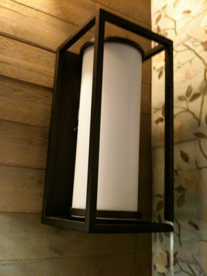
I've concluded that there's a huge void of contemporary exterior light fixtures available on the market.  For some reason, if you're looking for anything other than heritage anitque style, the only other  choices seem to be Arts & Craft style or uber Modern.  This one above is one of the most 'transitional' ones I've been able to find,,,,,the search continues.


Have I mentioned I have a thing for bowls?  This vintage teak bowl tempted me, and I've vowed if its still there the next time I visit the shop, its a sign that I need to take it home. : )


During a search for a shag rug for a family room I discovered there were a LOT of shag rugs out there that just didn't meet the basic criteria.  Softness was key, no shedding was key, as was the ability to vacuum (not rake).  Most of the wool ones were suprisingly rough to the touch and others had large chunky strands that weren't vacumable and were just rather odd to walk on.  The long shags in the photo above are the current rage, I'm seeing them everywhere but I wasn't loving their 100% polyester content.  Although they offerred the most gorgeous texture (like long flowing grass) and were soft, the colour ways weren't working with the space I needed it for and am concerned about not only vacuuming but static buildup....(?)


I've photographed this head vase about a dozen times.  I just love it.  


This is truly what my vehicle looks like on any given day.  In fact this was a loaner car, my new car arrived a couple of weeks ago but its not as big as the loaner car was,,,,or my previous car.  The good news is my days are shorter because the car fills up quicker!  Getting a new car with smaller cargo space is a self-imposed method of reminding myself everyday that I am NOT a delivery service - 'Delivery Guy' needs to be added to my speed dial asap.


And the winning shag carpet was deep and plush and ultra soft.  Made of two tone varying width strands its a 100% nylon specialy treated to be extra soft and its non-shedding as well as easy to vacuum. 


Another girl's night in,,,,,this time an Egyptian smorgasborg.  My girlfriend even had hand carved wood camels on the table brought back from a trip to Egypt a few years ago.  I cleaned my plate and had seconds and thirds,,,,it was that good.  If your vegetarian, you'll love the wide assortment of vegetable dishes and their incredible flavours.


There's probably nothing I angst over on a project more than lighting,,,I'm particular about finding fixtures that make just the right style statement for a space and have some originality to them.  I'm insanely crazy for mid century Italian inspired fixtures however my clients don't always share my love and appreciation for them.   I try and 'enlighten' them nonetheless by showing them some beautifully unique finds but this one above, wasn't winning any of them over (I'm both amazed and disappointed they don't trust how beautiful this would be in a finished space).   I wanted it immediately when I saw it and even though none of my current clients opted for it I went back to buy it anyways.  But of course it was gone.  Did I mention I saw it for sale in another showroom for 6x the price. Grrrrr...


We went on an antiques roadtrip on Family Day,,,I came across one of the largest set of dishes I've ever seen, there were more than 12 settings which filled up this entire cabinet.  I've been on the hunt for a set of antique or vintage china for myself and finding quantities of more than 4 or 6 settings is challenging.  This casual set wasn't what I was looking for but I wished I had a client for them - they were bright sunny yellow but the colour didn't show well on my camera at all.  


Do you like this light fixture? I actually really like it.  But I find the price tag of $13,000 a bit baffling (no pun intended) particularly in a showroom that also sells $34.99 and $99 fixtures, the price point just seemed so out of place.


So now I realize this was a ridiculously long post which could have been split up into at least a dozen individual posts!!  I'm determined to start posting less, more frequently. : /    Next up will be some progress photos from the 70's bungalow redesign.


All Photos:  Carol Reed


Upload: November 7, 2010


Oh yes, Autumn is definintely my most favorite time of the year....but unfortunately as you can see the lack of blog posts is result of this love affair I have with the fall season and all its distractions - the changing colours,,,the incredible harvest of food, wine and birthday celebrations to enjoy.  Selfishly, I've opted for drives in the country, dinner parties with friends or an afternoon of making soups instead of blogging. : ) Not that I've had much leisure time to indulge in all of this fall fair,,,,,because I've been working 7 days a week, it seems impossible sometimes to find that work/life balance.  My Iphone's been burning thru its battery life every day as I photograph all the items I've been recording for various projects so I think I'm waaaay overdue for an Upload post!  This upload contains a selection images dumped off my phone over the past 6 or 8 weeks, I've eliminated a few hundred of the pics I had taken of tile and plumbing fixtures to spare you the repetitiveness (yes, I've been designing a lot of bathrooms and kitchens lately!).  Below are a few highlights such as,,,,,great finds at the big box stores,,,,whats new in the world of tile,,,,,and a sneak peaks into a couple of special parties.....


Bringing the outdoors in, this outdoor light fixture was a steal and a great choice for a modern rustic bathroom I was redesigning in a chink log cabin, the homeowners liked it so much they bought enough to use in all 3 washrooms.  Light fixture from Union Lighting.  


I make a point to regularly check out what's available in the big box stores like Home Depot, Lowes and Rona.  Often I can find the same or similar items to what I've seen in specialty showrooms - so don't ever exclude the big box stores if you're trying to create a designer look,  its not where you buy it but how you use it.  Sometimes I find things I havn't seen anywhere else and the bonus is the items are low priced and in-stock.  Check out these great finds, which all happen to be stainless.......


This simple rectangular stainless steel mirror is a favorite of mine, it would work perfectly in any of the bathrooms I'm redesigning in the modern rustic log home.  Its only $64 at Home Depot but Lowes has a similar version too.


I selected this rectangular mosaic stainless steel tile from Lowes for a client's laundry room backsplash.


This is a great oversize single stainless steel sink by Elkay that's perfect for small kitchens, it maximizes counterspace and its tight radius corners give you a chef style sink that accommodates large pots and pans.  Available at Home Depot and only $329.


Ohhh I love when a custom sewing order is ready - these custom pillows were made for a client using a gorgeous collection fabrics designed by Tom Felicia for Kravet.


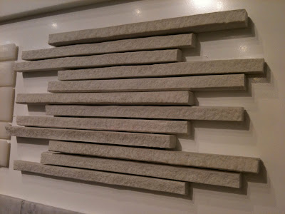
There's not much that beats the beauty of natural stone tile, but...I have to admit its truly amazing what's being done these days with porcelain tile - the effects being created with texture, graphics, metalics and lazer cutting technology make these man made tiles not only hard to resist but hard to identify next to the real thing.


This one had me fooled,,,when I first saw this I thought it was a natural split face quartz tile, but its actually a porcelain.  Its super thin long lines and variation in thickness create a stunning textural surface.


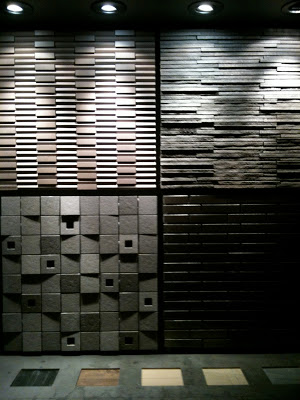
This is a perfect example of why I think lighting is the most important aspect of any well designed space, you can see the effect the accent lighting has on the tiled surfaces above.  Without the lighting the texture of the tile would be completely lost, have no relevance.  The tile shown in the top right is the same tile shown in the previous photo (above) but in the black version.


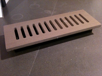
You can even have floor vents custom cut from your floor tile.


Always a must stop,,,the flower shops at Avenue Rd and Davenport didn't disappoint on Thanksgiving weekend....


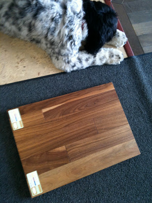
This is Max,,he's the showroom greeter and he totally approved the solid walnut hardwood I selected for the 70's bungalow redesign. : )  Its 3-1/4" wide, prefinished with a low sheen cashmere clear coat which makes it look like its been waxed - super elegant.  When I specify wood floors I always chose natural woods (no stain) with an ultra low-lustre finish,,,,to me the beauty of wood floors is the natural character of the wood itself.


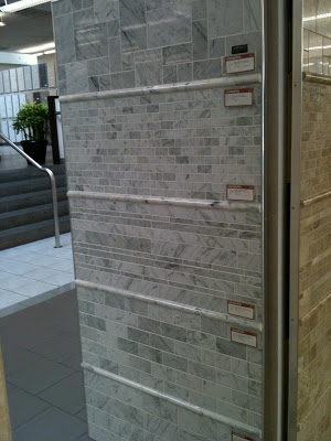
One of the best deals out there is this selection of cararra tiles by Olympia Tile,,a timeless classic, they offer a great selection of sizes and all but one of these are less than $10 s.f.  Olympia supplies many retailers too so you can also find some of these at your local big box building centre or tile retailer.


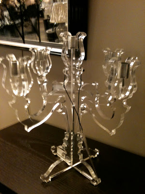
A modern candelabra I'm contemplating for a client...


I think I love fall planters more than summertime ones,,,,this one proves that a hit of black always makes anything better!


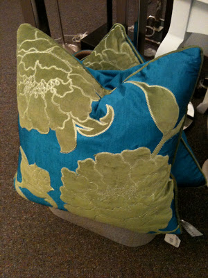
I often stop and take note when I come across ready-made pillows, I think they represent one of the 'best buys' you can make.  Not only can a couple of these instantly transform the look of a room, buying them ready-made can literally save you hundreds of dollars and loads of time.   These feather filled silk pillows with velvet appliques were less than $60 each, if you've ever had custom pillows made, you'll understand what a great deal this is!!!  To have even a basic single fabric pillow made thru a designer will cost you in the hundreds of dollars....


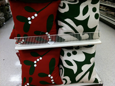
Of course I was completely crazy for these felt pillows I came across at Home Sense - only $29.99, they had such an amazing hand-made quality about them and they were so modern at the same time.  If only red wasn't such a bossy colour..... : /


These green version were gorgeous too!


My client Gail hosted a wonderful Kitchen 'Kick-off' party where she invited the entire design and construction team along with all her friends to celebrate the completion of her new kitchen and family room.  It was such an amazing night - her friends were blown away at the transformation and Gail, well, she was in her element!!


As a home chef, Gail was in her glory cooking up a feast in her new kitchen and entertaining over 50 guests.....


This is a peak into the kitchen from the back deck during the late hours of the party,,,,I'll save the real 'after' photos for another post in the new year.  From now until then I know I won't have a chance to get any alone time with that kitchen, is party central now!!


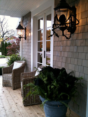
Last week I had a chance to visit the Princess Margaret Show Home design by Linda Reeves and the team at Canadian House & Home.  The house was all decked out for Halloween,,,,,


There was an East Coast style to the architecture of the house which is hard not to love,,,,,although I took a lot of photos throughout the house, for now I'll just share a glimpse with you of three of my favorite rooms in the house.  The house will be featured in the magazine in the new year (probably the April issue) so I'll hold back the rest of my pics until after their own photos have been published. 


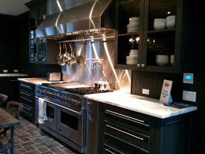
I know some visitors were not too fond of the all dark grey kitchen,,,but I LOVED it.  The counters in particular were my absolute favorite element of the entire house.   I inquired about the finish but there was some uncertainty, I think they were 'leathered' calaccatta marble but I'm investigating further.....


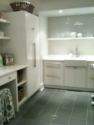
The laundry room was HUGE,,,,,this shot represents only half of it,,,imagine the image above completely mirrored and that's the size of the entire room.  The counter at the opposite end of the room housed the washer and dryer as opposed to the sink seen at this end.  This laundry room (despite its size) actually reminded me a lot of the laundry room I designed for my Victorian row house renovation where I used the same floor tile paired with white beadboard panelling on the walls....


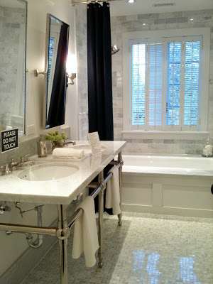
This shared, 2nd floor hall bathroom of the show home has all the classic elements I love!  


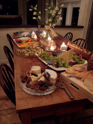
A girlfriend and I both have birthdays in October so another friend hosted a birthday dinner party for a group of the girls,,,,,we hung out around her island and laughed and drank and ate,,,while she cooked the most incredible meal for us....


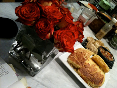
Homemade roasted eggplant salsa and cornbread...


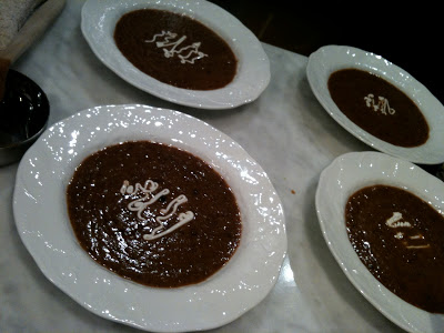
We started with the most incredible black bean soup....(still waiting for the recipe!!) and then.... I stopped taking photos,,,ha ha.  Oh boy, it was a good time!!  I am so blessed to have such amazing girl friends, as I always say, to cook for someone is an expression of love!


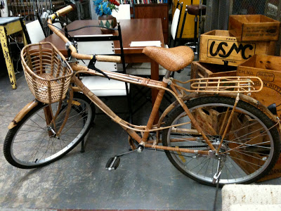
A bamboo bike at a vintage store...


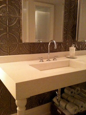
If you ever have a chance to visit this restaurant you'll see a great example of modern farmhouse interior style at Oliver & Bonacini's restaurant in Oakville.  The washrooms were especially gorgeous with the tin panelled walls and modern white sink consoles.  The entire washroom was a simple combination of white, cararra marble, and tin panelled feature wall with polished chrome hardware.


I'm off to New York City this week where I'll be meeting up and staying with Vancouver Designer/Artist Michelle Morelan from A schematic Life blog.  We have plans to tour the Kips Bay Show house and visit Moma among a loooong list of other designer destinations,,,,,,, not to mention we have dinner plans with Patricia of PVE Design next Saturday night (so excited to meet her!).  I don't plan on not having any time to blog during this trip (I'm not even bringing my laptop!) but you can follow my twitter updates for news on what Michelle and I are up to in NYC.


Upload: September 6th


The new look of Restoration Hardware Toronto.


Its been a couple of months since I posted an Upload,,,,with things so hectic before going away on vacation at the end of July I didn't have an opportunity to do one of these before we hit the road and then since returning I've been swamped trying to get caught.  I've dumped hundreds of photos off my Iphone in the meantime, here's a random look at what I've been up to including; some job site photos,,some great finds, some new finds, some things that insprired and some things that just made me smile.


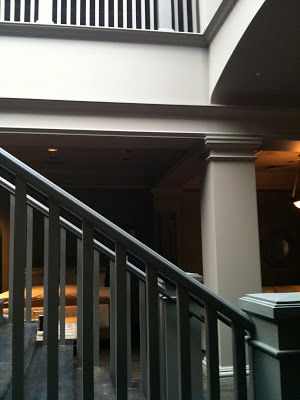
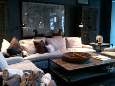
 I popped into RH last week with a client and we stopped immediately in our tracks right inside the door, took a look around and asked if they were open?  It was really dark inside even though it was the middle of the day, but yes of course they were open but with a entirely new look!  The Toronto showroom had just undergone a complete overhaul, every inch of the store had been painted a dark warm grey, Restoration Hardware's Slate.  You'll notice in the top photo they painted out all the mouldings and railings to create a monochromatic look - I love this treatment, it gives a contemporary feel to traditional mouldings and is particulary ideal for creating a gallery look.  In fact, its a gallery look they were going for.  Gone are the soap displays, paint displays and various nick-nacks and toys, even the hardware is contained and artfully displayed behind glass.  They were still busy setting up displays and awaiting delivery and installation of lighting so in the meantime the store is pretty dark.


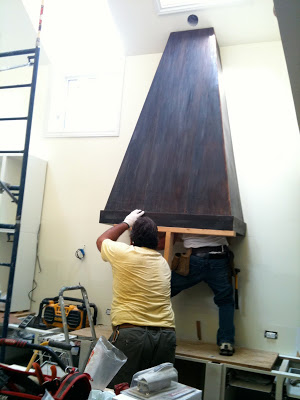
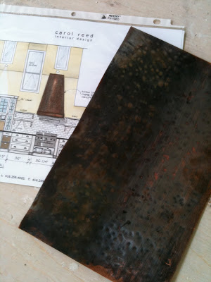
From an idea in my head more than 6 months ago,,,,, to a sample I approved in July,,, 


To installation day a few weeks later.......


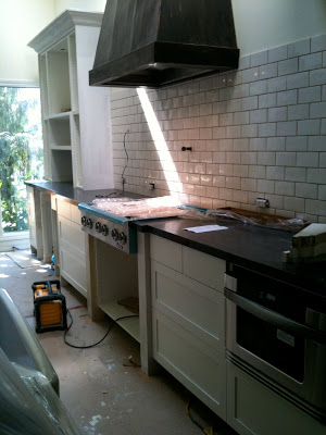
In addition to the custom copper hood, the counters and backsplash were installed in Gail's kitchen while I was away on holidays.  All the finishing touches are happening this week so Gail can finally, finally, move in. : )


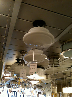
Sourcing some lighting for Gail's mudroom.  I've never met a schoolhouse fixture I didn't love..


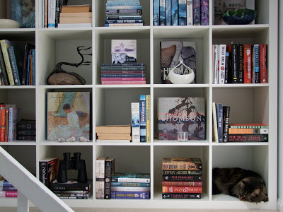
A puurrrrfectly styled bookcase ; )


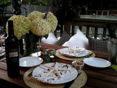
Halfway thru setting the table on the back deck as his highness keeps an eye for squirrels.  My new 'Soho' outdoor pillows from Tonic Living seen on the bench.


New exterior lighting for the urban rooftop deck project. Clean and modern looking it reminds me of the lanterns we're accessorizing with.  Fixture from Sescolite.


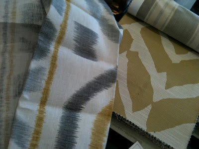
In addition to white and dark grey sunbrella pillows, we're having a few non-outdoor fabric pillows made for the rooftop deck which will be brought out for entertaining.  I selected these fabrics from Thom Filicia's collection for Kravet - large scale, graphic, gorgeous!


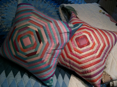
Speaking of graphic pillows...I was crazy for these quilted pillows that I saw on the East Coast, although you can't get more traditional that quilting - these geometric patterns have a modern feel to me, I'd love to see them in a clean contemporary space.  They weren't made locally however, they were imported from Thailand which tells me this is a look we'll be seeing a lot of.    


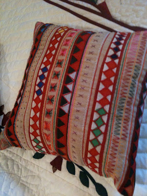
And these,,,,,folksy looking pillows, I regret not picking up a few of each!


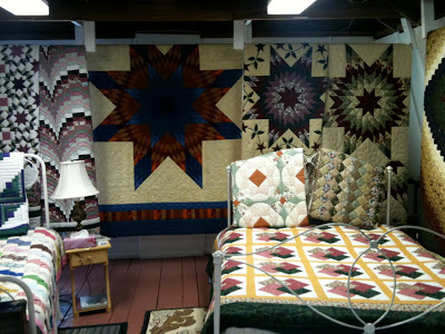
I looked at lots of quilts when I was away but still didn't find 'the one' that I had to have.  Unlike most of what you come across in many of the touristy stores in Nova Scotia, the quilts in this shop were all locally made by hand and cost thousands of dollars each.


On our trip we ate these almost every day - they were local Indian Point mussels from Mahone Bay and were the best mussels I've ever eaten.  I make them at home all the time but I'd never had them like this before.  Every where we ordered them they were served the same way, steamed (usually in garlic and wine) and served with a side of melted butter and lemon.  Sooo good, I'll be making them this way at home now!


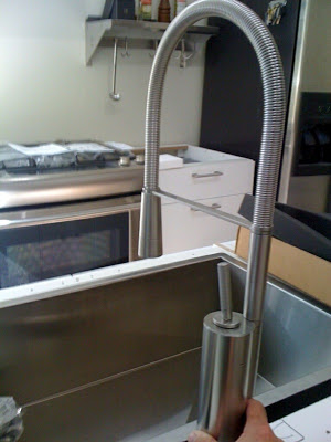
I helped a family member select a new faucet for his kitchen reno.....


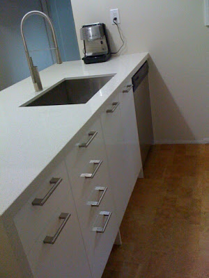
It works beautifully with the custom sink I had made for him earlier this summer and was just in time for the new counters to be installed.......almost done.  Sigh. : )


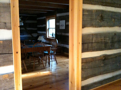
I headed north on a little road trip to survey this chink log home.  I'm re-designing its kitchen, 3 bathrooms, a lower level games room and,  cover your ears if you're a wood lover,,,we'll be painting out a LOT of knotty pine and giving this rustic home a modern edge.


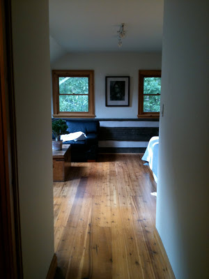
The interior was a little slice of heaven for me, white, grey, and caramel wood tones, it just doesn't get any better than that for me.  A view into the master bedroom on the second floor, the chink logs are visible around the lower section of all the perimeter walls.  The plank floor boards are gorgeous and look stunning with the weathered grey logs.  To the immediate left is an ensuite which will get an overhaul.


A few irresistables at Angus & Company, (perhaps my favorite shop in TO) talk about wanting one of each...., yes please I'm so looking forward to fall!


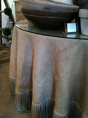
Oversize bowls, fringe,,,,,seagrass.  sigh.


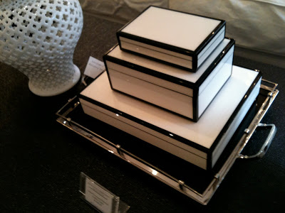
I'm wild for b&w accessories these, lacquered boxes look great in any room.


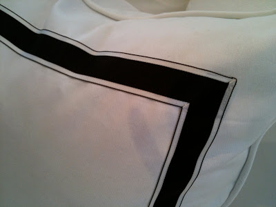
B&W pillow detail.


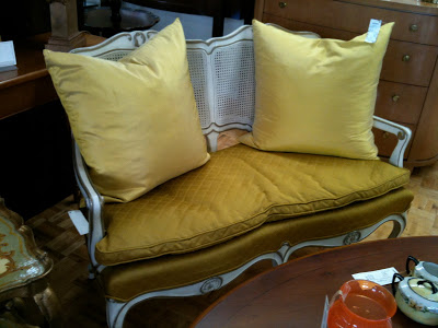
I've been craving hits of yellow since my trip out east,,,I found these silk pillows at a consignment shop the other day and I just might have to buy them for myself.  In fact they're much brighter than they appear in this photo, in person they're a vibrant canary yellow - I think they'd make any room sing.


All Photos:  Carol Reed