Vintage Furniture

Modern Love: Dining Room Progress 1


'Modern Love' is a current project I'm working on that involves furnishing a rather large sub-urban house for a busy young couple who love modern furniture.  The process actually started a few years ago when he was still a bachelor and a new first time homeowner.  I worked with him on updating all the interior finishes and purchasing some key furniture pieces.  Flash forward a couple of years to today and.....,,,well,,,,, the house still looks the same as where we left off - but his bachelors days are over!  He now has a fiance and they are brand new parents to a beautiful baby girl.  Early this past summer we met  to pick up where we left off and begin the process of actually completing the mostly still empty spaces.  I'll be filling in all the holes and focusing on all the finishing details that will make their house a comfortable and stylish family home -  all the things he thought they (he) would get around to doing themselves but.....never did.

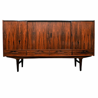
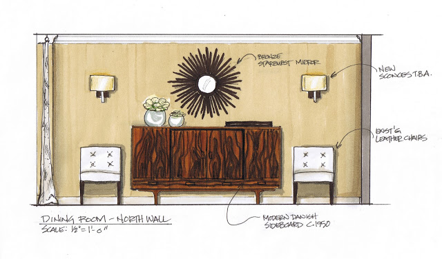
Since the only furniture pieces they do own are the new pieces we bought for him a few years ago,,I want to now incorporate some vintage pieces and some artwork into the mix as well as bring a more family style vibe to the house.  Its so exciting for me to envision all the wonderful gatherings they'll enjoy in this house with family and friends and how these spaces that I'm creating will be the backdrop to their life and all their special memories.  With this inspiration, I've been busy sourcing for many different rooms but the dining room seems to be coming together first. This is a glimpse at the progress we've made thus far which should give you a taste for what's to come in the other rooms!  My absolute favorite piece I've found so far in all my sourcing is this 1950's Danish sideboard which will be the star of the dining room. 


It was truly LOVE at first sight. I had scoured the city and beyond for a vintage, danish modern sideboard in excellent condition, but without much luck. So the second I walked into the shop and saw this rosewood beauty my heart started to race, and I knew the search was over. Secretly I had wished to find one in walnut or rosewood but expected only to find teak, so seeing this before my eyes was literally what I had been envisioning,,,, like I'd seen it before.


The simple lines of danish modern pieces will always appeal to me for many reasons, with these designs its all about the form rather than decorative details,,their refined proportions make a statement on their own and I love how the tapered legs are so graceful.  But mainly, these pieces with their simple lines and lack of decorative detail are really all about the wood,,,,,,the beauty of these pieces is the wood itself, each one with its unique grain pattern and natural colouration.  The rosewood used to make this piece is an example of how stunning the natural beauty of wood can be, all you need to do is let it be the star.


.  


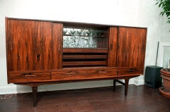
The cabinet is made of rosewood with four lower drawers and 4 sliding doors on tall tapered legs.  At 44" high it won't be lost behind the dining table or chairs so it will be quite visible.  Again what I love most is the dramatic pattern of the wood grain and the beautiful warm tones.  Did I mention a few of the upholstered pieces already in the house are a spicy orange leather! 


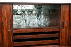
The deal closer was the centre area which opens up to reveal a bar with etched mirror back panel, an upper shelf and 2 interior drawers.  So decandent!


The new/vintage sideboard will be placed on a wall opposite a large ebony rectangular dining table and white leather tufted chairs (existing), the cabinet will be flanked by extra side chairs and a pair of new sconces.  For the wallspace over the sideboard I've found a bronze starburst mirror that I think pairs perfectly with the modern style of the cabinet and balances out all the square lines in the room.  I've also found a pair of gorgeous chandeliers for over the long table and new drapery panels for the rooms bay window.


Since making these key finds the rest of the dining room pieces are falling into place beautifully and I can't wait to share more progress pics with you as it all comes together.


Photographer: Mark Burstyn


The studio of photographer Mark Burstyn (Iphone photo by me).


I had the pleasure of meeting the very talented Toronto photographer Mark Burstyn this week while working together on a project (I'll tell you more about that in a future post).  With over 20 years of experience Mark has an impressive client list and a stunning portfolio of food, interiors, exteriors and product photography.   Although I'm completely captivated by his images, I was totally smitten with his bright loft studio and the way it was so stylishly outfitted.  It was flooded with natural daylight and had all the comforts of home, designed to accommodate every need of his varied clients.

Upon entering the loft I was crazy for this little vignette seen in the photo above.  I rarely meet a vintage chair I don't love, and this one was no exception, its simple retro lines upholstered in robins egg blue made quite a statement paired with the framed b&w photo. The powder room was located to the right of the chair and the inside of the bathroom was painted this same cheery shade of blue, it just made you smile when you walked in.  (Sorry I didn't take more pictures!)


The studio's kitchen area.

I couldn't resist sharing this photo with you of the studio's kitchen and dining area - its a complete working kitchen with full size appliances and outfitted with all the necessities, Mark keeps it fully stocked with lots of goodies, you can't help but feel a little spoiled when you're there. : )   The kitchen is by Ikea, including the furniture but I thought it was a really good example of a non-customized Ikea kitchen,,there are no extra bells and whistles like custom fabricated counters or custom paint finishes or gables or brackets.  The kitchen itself is spacious with a huge island, double height cabinets and loads of storage space.  The lower cabs are stainless, the uppers are glass with aluminum trim, the countertops solid oak, (steel + wood + glass +white). The lighting was well planned with nothing overlooked, I can imagine how beautifully lit this would be in the evening.  Its simple, utilitarian looking and super functional - it perfectly suits this raw loft space.   Of course my favorite part of the entire kitchen,,,,,,are Mark's framed photographs.

I'm always repeating that it doesn't matter how expensive or inexpensive the things in your space are, that's not what defines good design or good taste.  When you're in a well appointed space (every need has been though of) that's highly functional, pleasing to the eye and is filled with wonderful light, you feel a level of comfort and ease that's hard to depict in a photo.  In other words your experience in the space is enhanced - I believe that's ultimately what everyone wants to achieve in their own homes.

If you're craving a dose of stylish inspiration this long weekend, pour yourself a cup of hot tea, and have a browse thru Mark's gorgeous portfolio here - I'm sure you'll recognize some of his work.  Enjoy!


Chair Photo:  Carol Reed
Kitchen Photo:  Mark Burstyn

Brian's Condo - Dining Room Update


The design concept for the dining room was created earlier in December and all the items except for the light fixture were sourced and purchased before the holidays (record timing!).  Its a small space which can't accommodate a lot of furniture so the the budget allocated for this area was tiny but yet I still wanted it to have big style.   Now I have to admit the dining area is not a space that's of much importance to Brian, he's not intending to throw dinner parties or be doing a lot of entertaining, nonetheless, some sort of table and chair configuration would be practical for the occassional dinner guest or weekday meal.  The fact that the LR and DR is one open space means that the dining table will have a perfect view of the large screen wall mounted tv in the LR - this feature seems to have heightened Brian's interest in the dining room design!  Now that I had his interest, I suggested that the best value and style for the money would be to find some vintage chairs and mix them with a simple modern glass table, this is a great solution for both small spaces and small budgets but the best part is it adds some originality and authenticity to the room.

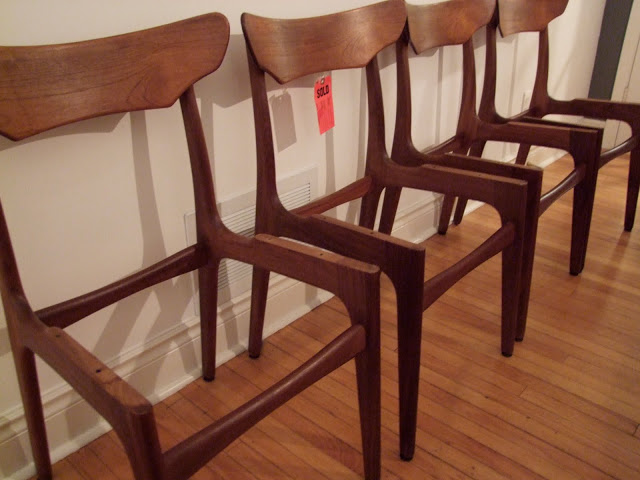
My biggest find was scoring a set of 4 danish modern dining chairs the Sunday before Christmas.  The chairs had just arrived in the shop less than an hour before I stopped in and as soon as I laid eyes on them, I had to have them and they were bought on the spot (sorry to the guy who had been on a wait list for a year, but he was of the country for 3 weeks and I was there with cash in hand!).  Two days earlier I had found an amazing deal on an interesting chrome and glass table that was just the size we needed and in-stock, so suddenly with this set of chairs now purchased the dining room was just about done and we didn't have to special order any of it - another great advantage to buying vintage pieces.

This past Thursday was a big delivery day at the condo project with several key pieces arriving.  In addition to the mattress set, the sofa, the front hall bench, a credenza and the dining table,,,,,I also had to deliver the newly recovered vintage teak dining chairs....which was not so easy.  I'm crazy for these chairs and I grew quite attached to them over the past couple of weeks, honestly I didn't want to give them up, it was like suffering thru a bit of separation anxiety!


The chairs were in absolutely perfect condition, the wood is beautiful and the lines of the chair are so organic and sculptural looking.  For only $100 a chair, I don't think you can beat the quality and design.  With some new fabric on the seats, they'd take on a new modern look.  I picked out a charcoal coloured vevlet that I think is a beautiful compliment to the caramel wood tones.


An indication that the chairs were all made at the same time by the same mfg is the wood grain, on these chairs you can see the same knot in the wood, in the exact same place on each chair.  This also speaks to the quality of the pieces.


Here you can see the continuous wood grain on all the chair backs and not a single exposed fastener or screw anywhere on the chair.


The underside of the chair had a muslin type backing on and when it was removed we found the original mfg's label.


I was thrilled to see the Schionning & Elgaard for Randers label.  These chairs would have been made sometime between 1957 and 1960.


Thursday evening at Brian's condo,,,,,not quite ready for dinner.

As I mentioned above, quite a few furniture items were delivered on Thursday including the dining table.  Unfortunately, I didn't hire delivery AND installation for the table thinking that it would be a fairly simple DIY project for the new homeowner!!  So when Brian arrived we opened up the box and pulled out the instructions, anxious to whip this thing together and see the new table and chairs complete.  Immediately we were both relieved to see that no tools were required, because he doesn't own any!  A dozen fasteners and an allen key were all that was required so we sat down and attempted to piece it together..........every which way we could imagine,,,nothing worked, after 2 hours of frustration, we gave up.  The instructions were useless, there were only 3 steps (ha!) but step 1 looked like a diagram of the solar system with no explanation.  Trying to figure out the base configuration (which kind of resembles the eiffel tower) was like trying to figure out a rubic's cube.  I started to understand why the table had been on sale and concluded at that point that even if it had been free,,,,,It wasn't worth the price.  We agreed to call it quits for the day,,,,,but Brian vows to return on the weekend to try and figure it out.  I hope he brings beer.


Test strip of digital print on canvas.

Since there's no room for a sideboard or console in the dining area I wanted to do something special on the wall to give the space some impact,,,so it wouldn't just be a table and 4 chairs in front of a blank wall.  Original paintings or artwork of a substantial size is out of our budget range so I opted for original photography in this case.  While its not cheap, it is less expensive than a large painted canvas and offers unlimited subject matter of your choice and can even be from your own photo collection.   For this space I'm having a black & white image of a city scene enlarged and printed on a huge canvas, this will provide a great backdrop for both the dining and living area and create a modern urban vibe.  A photographic scene like this at this scale adds a lot of depth and creates a great 'view'.   I sent a photo to Kevin at Elevator Digital and he's printing it on archival quality canvas and wrapping it around a stretcher frame.   I stopped in yesterday to approve a test strip - it looks incredible, I can't WAIT to see this when its ready next week.


West Elm Globe Pendant

The last element of the dining room that remains outstanding is the light fixture.  I LOVE this simple globe pendant from West Elm and think its perfect for Brian's place.  Its not overwhelming and it has a bit of an industrial feel to it, especially when a filament style bulb is used - perfect for the modern vintage style we're after.  Unfortunately, everyone else must love this fixture too because West Elm in Toronto is completely out of stock on these and they're on back-order until March.  Uuugghh.  Despite my sulking, pouting, and just plain old begging,,,,they wouldn't even sell me one of their 2 floor displays.  So now I REALLY want this fixture but its going to require some creative resourcefulness.  The West Elm on-line shopping site doesn't ship to canada, not even to the West Elm store here.  I'm currently attempting to purchase it thru that site anyway as I have a US address I can have it shipped to, however,,,,,I'm getting stonewalled in the process.  Even though I have a US ship to address, they can't process the order on-line unless you have a US billing address, in which case you have to call their 1-888 customer service no. to place the order.  No problem I thought,,,,,this will all work out perfectly,,,,,,,until I tried calling the 1-888 number which doesn't work if you live outside of the US.???  The quest continues......

Stay tuned for posts on the front entry and bedroom design concepts and progress coming soon.

For the floor plan and first post on this Condo project go here.


All Photos:   Carol Reed