August Sourcebook:


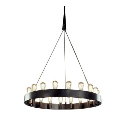
Rico Espinet Chandelier by Robert Abbey


Every month I search high and low, on-line, in-store, and off the street for products and materials for my client's projects.   I make hundreds of carefully considered recommendations over the course of a month, some months its more furniture based sourcing some months its more building materials and hardware - it all just depends on my current projects.   Of course not all the options I source over the month actually make the cut.  But here’s a peek of just some of the winning picks that I’ve specified or purchased this past month,,,,,these are things my clients have purchased, things that I’ve specified for clients and things i’ve purchased for my own use.

These items are in random order and are from more than one project.  Unfortunately you'll have to wait patiently for the 'After' photos to see just how these pieces were pulled together and where they'll soon call home.

I had my eye on the chandelier pictured above for some time, wishing I'd have the opportunity to specify it for a project.  And this month I did!   I absolutely love that it has a bit of a vintage industrial feel to it, with its historical filament bulbs and sleek wire suspension instead of chain, its a modern take on the traditional ring chandelier.    Its a perfect way to bring a bit of edgey style to more traditional furniture pieces.   When I look at it I can't help but envision this fixture adorned with some simple fresh evergreen at christmas. 


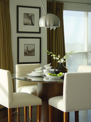
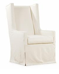
Host Chair by Lee Industries

There's several reasons why a pair of these chairs were selected as host chairs for a clients dining room table, I love the understated lines of this modern wing back - it definitely makes a stylish impact.  But the fact that this chair comes with an optional slipcover means its practical for a family with young children and it gives you the flexibility of two different looks.


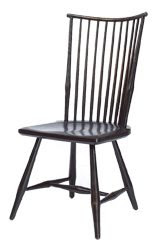
Rod Back Windosor Chair by The Windsor Workshop
Made right here in Canada and worth every penny.  These beautifully crafted chairs will be enjoyed by my clients for a lifetime and then handed down to their children to enjoy for another.   Truly the antiques of our tomorrow.  You won't find a more comfortable chair, the formed seat and contoured edges make this more comfortable than almost any upholstered chair I've sat in and the way the dramatic curved back cocoons you feels simply luxurious.  I'm having these ones finished in a custom, lightly distressed paint colour like the sample above.

Ankara Area Carpet by Restoration Hardware
A classic looking pattern in an an appealing palette of olive greens, silver sage, red and cream.  I like the fact its 100% wool so its all natural, hypo-allergenic, extremely durable and naturally stain resistant.   Its also on sale right now.


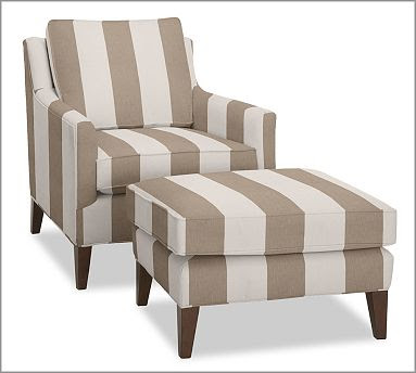
A pair of custom made upholstered chairs and ottomans, similar to these.  I'm having them upholstered in a wide kakhi/taupe stripe indoor outdoor fabric.


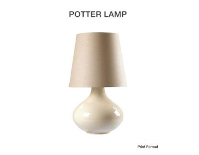
Potter Lamp by Mitchell Gold.  
A handcrafted look and a large scale!  Available at Elte.


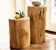
Stump tables by Pottery Barn.   
I particularly like mixing these organic tables with contemporary clean lined pieces especially metal and glass.  Great multifunctional tables in three sizes you can move around an use as stools or side tables.


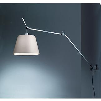
Tolomeo Mega Wall Lamp by Artemide and available at DWR. 
  Sleek, super functional and a modern classic.  I love to use these in unexpected places.


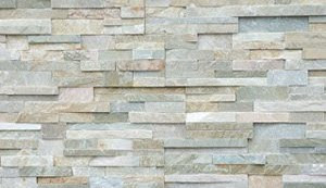
Thin veneer stacked stone panels by Erth Coverings.  
Natural stone, variation of light warm colours, and can be used indoors and out.  This month I've specified it as a new cladding for an outdated fireplace.  Its dramatic texture will add high impact and the linear cut adds a modern organic feel.
 

Natural hide carpet from Elte.
I'm crazy about animal prints and hides.  Placed assymetrical or off centre, I find the irregular shape makes them suitable for use in oddly shaped furniture groupings or in small spaces where I find sometimes a rectangular carpet chops a space up or makes it feel boxed in, their irregular shape just flows better.

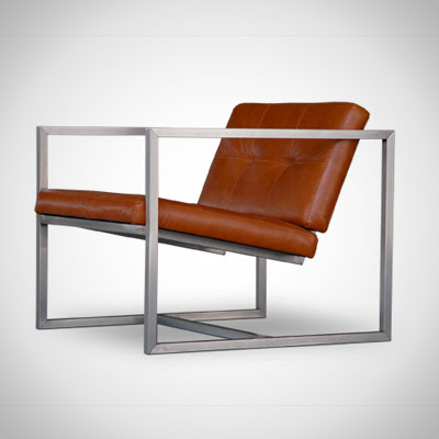
Delano Chair by Toronto based Gus Design Group available at Style Garage.
Canadian designed and made in Canada.  A stainless steel frame and tufted leather modern lounge chair in unlimited custom upholstery options but offered in several standard leather colours for $950.  A modest price for a leather lounge chair with such high end style. 


Neo Bunching Table by Crate & Barrel.
Cube shaped tables are a great option for first time homeowners or anyone starting from scratch.  I like that this simple geometric cube can grow with you, start out by using a pair of them as coffee tables, then they could be moved to either end of a sofa as end tables,,,,or on either side of a bed.   

Beautifully Simple


When I arrived one day at a clients house back in June, (with a bouquet of fresh peonies from my garden!) I couldn’t help but notice her guest bedroom was void of night tables and bedside lamps.  It was easy to notice because there was a direct sightline from the hallway outside the bedroom directly to that empty space beside the bed, not that I didn't notice the bed was perfectly made and lovely looking on its own,,,, but just that something was missing.   My designer radar kicked in and as I scoped out the rest of the room I spotted a pretty vintage chair with layers of chipping paint on it tucked in the corner, and then in her home office......a floor lamp that wasn’t being utilized.   5 minutes later,,,,,,,this is what the room looked like (photo above). 


Now the view from the hallway is so pretty, it brings a smile to her face everytime she walks by the room, and to mine everytime I look at this photo.


Often its the simplest changes make the biggest difference and usually they don’t cost a dime.  I love to work with things my clients already own and in my experience, there’s nothing they love more then when they see how beautiful their own stuff looks simply used in a new or different way.   


I admit it may not be the ideal night table or lamp for this room, and one day she’ll find them and the room will evolve over time.  But for now,,,this works just perfectly and is so much better than doing nothing.  I know that often people choose to hold out for that ‘ideal’ piece (if you can figure out what that is!?) but unfortunately that approach usually means you’ll likely end up living with empty spaces and blank walls for years...... there’s nothing appealing or practical about that.


I’m always amazed at the treasures I come across sitting neglected in basements or garages or spare rooms in clients homes.  I’m a firm believer in making the most of what you’ve got before exploring new alternatives.  I guarantee you, you can transform a room or a hallway or an empty corner just by using things you already have.  In fact, you may not even like a particular chair or a lamp or a piece of art that much,,,but by placing it in a new spot or an empty corner it suddenly gives new life or purpose to that otherwise blank space.  Ultimately, its the overall effect that can be created that you’ll love, the colour its suddenly added or the texture, or simply its function.  Even if you’re not so crazy about the individual item(s), you’ll get such satisfaction from the other aspects of how the space suddenly seems useable or more pleasing to look at - you’ll wonder why you hadn’t done it sooner and hopefully it will inspire you to continue building on what you’ve got.


Photo:  Carol Reed
My Condo - in Canadian House & Home


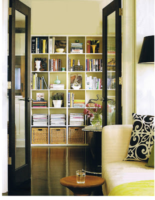
Canadian House & Home, April 2007 - The condo's Den, Photographed by Michael Graydon.  


After the renovation work was completed it took almost another 2 years for us to finish furnishing the condo.  Early in January of 2007, Canadian House & Home arrived for a photo shoot of our little condo reno and the photos and story were published in the Aril 2007 issue.  In addition to that issue, the kitchen was also featured on the cover of CH&H's special edition Kitchen's 2007 issue, the condo reappeared again in a small feature in their special edition Condos & Lofts 2008 issue, and again in the current CH&H special edition Condos & Lofts 2009.  


Above and below are some of the photos of the condo as published in the April 2007 feature.  The photo of the den was one of my favorites because aside from the kitchen the cozy den was my favorite spot in the condo and where we spent most of our time.   Except for one small pale blue vase, the small yellow vase and a teeny white vase, everything seen on the shelving was our own and displayed as it looked before the photo shoot.  I loved the cube style shelving (expedit from Ikea) which was perfect for displaying our books in stacks but I really loved standing the books up to show off the artwork on the covers and then mixing in my vintage ceramics among them.   When we had dinner parties I used to put votive candles on every other shelf and it became this wall of twinkling candles.  There was lots of room to neatly house my piles of magazines and the baskets across the bottom concealed samples and supplies for my office.   
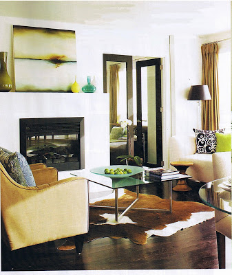


Canadian House & Home, April 2007 - The condo's Living Room area, photography by Michael Graydon.


Canadian House & Home, April 2007 - The condo's kitchen, photography by Michael Graydon.


Canadian House & Home, April 2007 - The master bedroom, photographed by Michael Graydon.

Canadian House & Home, April 2007 - The condo's office nook, photography by Michael Graydon.


Canadian House & Home, April 2007 - The condo's master bath vanity top, photography by Michael Graydon.


Canadian House & Home, April 2007 - The condo's laundry closet, photography by Michael Graydon.

Canadian House & Home KITCHENS 2007 - Cover, photography by Michael Graydon.
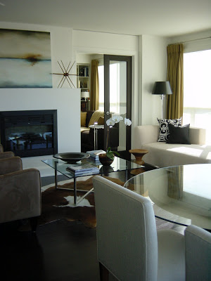
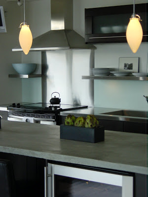
Anyone who knows me, knows I'm not personally a fan of pastels or bright colours, not in my wardrobe or in my home, so I wasn't the happiest of campers when I saw all the pastel and citrusy coloured accessories the editor and stylist brought in for the shoot.  In turn, I could see they were disappointed that all my sheets, towels and dishes were plain white and... that I refused to give in to them when it came to the pastel pink kitchen aid mixer.  I realize those colourful touches were brought in to make the space look more 'spring' like, and that it did, but I have to say I couldn't wait to put everything back the way I normally live with it. It was an interesting experience to see my own space styled and photographed thru someone else's eyes - and despite the anxiety I had about all that colour, I think the end result was beautiful.  How could it not be with Michael Graydon behind the lense!!  

In comparison, below are some of my own photos of the condo, taken in the months or days before the CH&H photo shoot and how it normally looked on a day to day basis (well, excluding the dishes on the dining table!).


Photo Credits:
First 7 photos by Michael Graydon for CH&H  
Last 4 photos - Carol Reed