A Three-toned Kitchen Concept & Progress
The kitchen in the Copper Barn residence is in an open concept space that includes a living area with fireplace and a large dining area. Located on the second level of the barn building, there’s also a walk-out to an elevated deck and two dormer window nooks where we incorporated built-in bench seats.
The ‘before’ plan was a blank slate for the most part, there were electrical and plumbing rough-ins already in place but there was flexibility in being able to move those to suit the proposed kitchen design. Here’s a look at the final floor plan of the kitchen layout and one of the elevations.
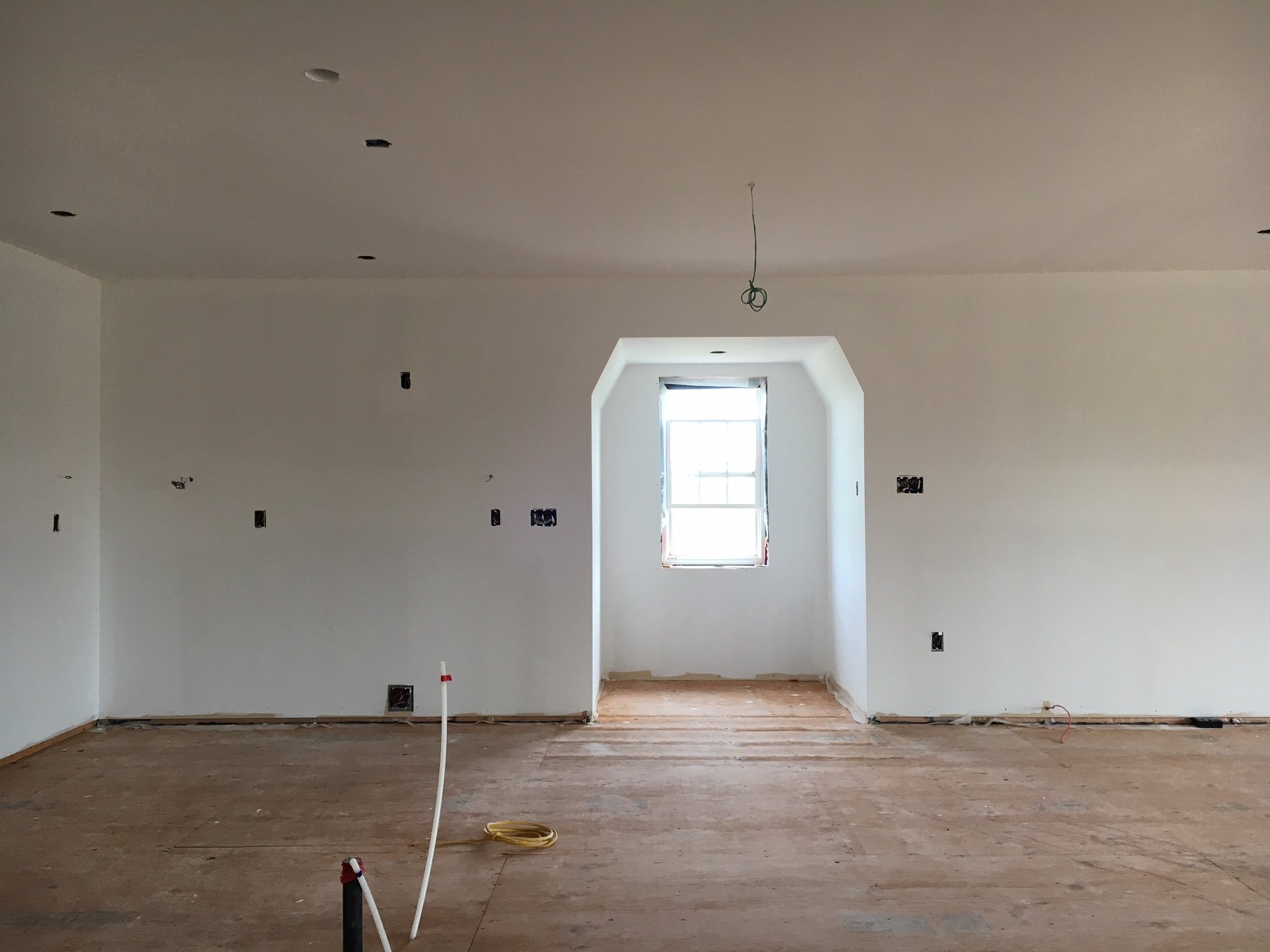
Here’s a look at the ‘before’ space when we started back in August 2022.
The first thing you might notice is the ceiling - I thought this was a barn you might ask yourself, where’s the high ceiling and rafters? Well it definitely is a barn, and on working farmland complete with a copper gambrel roof on the exterior, but on the interior of this second floor residence - it’s a regular flat ceiling with attic space above. To inject some barn character into the expansive ceiling area, we added wood ceiling beams throughout. Here’s a look at the materials and fixtures we proposed for the new kitchen….
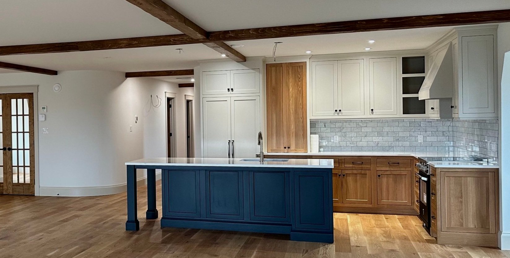
The final selections didn’t stray too much from this initial concept, the pendants will be antique brass instead of the bronze finish shown as the clients weren’t keen on adding more black (unlike me who was very keen but also quite happy with antique brass as the alternate). I’d originally proposed the island to be built in wood but that was unanimously vetoed in favour of a painted finish - not as durable as wood but the homeowners really wanted it not to be wood although they really liked the wood. So, ultimately the solution was a three-tone kitchen, including wood cabinets and the island in an almost black paint, it has a dark green/blue undertone that shifts throughout the day and different types of light.
Except for the range all the appliances are panelled or concealed. A matte black induction range brings a touch of industrial style and provides super safe and energy efficient high heat elements. The smooth top is extra surface space when the range top’s not being used. (not the greatest photos - portable construction lights in use and crew working)
We’re waiting on the brass knob kit for the range which will replace the 5 stainless steel knobs and the brackets of the oven handle, this will tie in with the brass faucet and hardware on the island, and the brass on the pendant lights.
Here’s a pulled back view of the freshly installed, and clean kitchen before the pendant lights, stools and accessories arrive. I always love to document a kitchen at this stage because this is when it most resembles the design drawings - its the bones of the kitchen.
This view also captures the hallway to the bedrooms and the mirrored french closet doors on the other side of the hall and which face the dining area. The entry to the hallway is flanked by large curved corners that existed before I joined the project, they proved a bit challenging to work with in the kitchen layout and I ended up overlapping the curve to get a longer run of kitchen cabinetry - the installers from TNC kitchen did a beautiful job of scribing the fridge panel to the curved wall, not easy!
The hallway is awaiting wall sconces and picture lights, the wiring for one is visible immediately on the left inside the hall, this is for an antique brass picture light for a large art piece.
Overall its not a huge kitchen but all of the cabinets are outfitted with organizers to maximize the storage and access. Pull-outs, roll-outs, vertical dividers for trays and sheets, spice rack, utensil organizers, magic corner - its got it all.
Being within a large open space there were a couple of aesthetic design decisions that we went back and forth on, one being the colour of the island, the other was whether to add glass doors to the countertop cabinet to the right of the fridge. In the end we opted not to as this was decided to be used for food items rather than dish ware. I also felt there was going to be a lot of open shelves and display in the room already without adding more in the kitchen. The wall to the right of the kitchen window nook has a 10’ long custom bookcase, with open shelving to fill up. Plus a wall on the dining room side will have a large glass display cabinet. We kept the display element in the kitchen to a minimum in lieu of all this.
We had custom cushions and pillows made for the bench seat in the window nook, the nook will also get a small bistro table and chair and an adjustable arm wall light. We chose a tonal plaid for the seat cushion in a performance fabric. The colour is similar to a medium wash denim with some lighter blue, brown and white lines, the pattern is simply timeless and classic.
I designed a custom bookcase unit for the adjacent living area, also awaiting wall sconces (and contents!). To the right not in view is a corner stone fireplace, to the left is the kitchen window nook again (and an unfortunate placement of a baseboard heater, required by code as back up to the main heat source) but we think its possible to relocate it if the owners prefer it moved.
That’s a wrap on the Copper Barn kitchen install - we’re looking forward to seeing the space in the new year with all the light fixtures hung and the furniture moved in.
Photo’s 5, 6 and 8: Building Blocs Home Improvements (Thank you!)
Kitchen cabinets and built-ins by: TNC Kitchens


