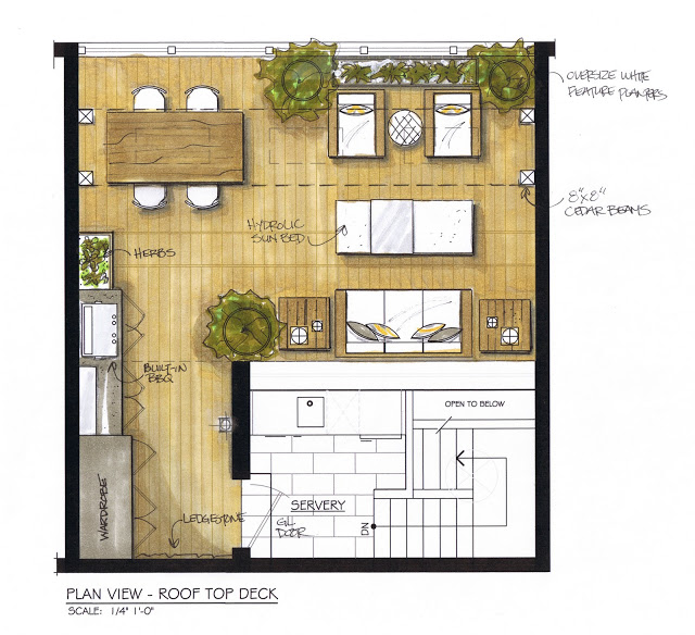
Earlier this summer a favorite client of mine decided to embark on a rooftop deck renovation,,,,which presented me with the opporunity to collaborate on this little project with one of Toronto's most sought after landscape designers, Terry Ryan of Cubic Yard Design. Terry's impressive porfolio is full of sophisticated contemporary exteriors - which was exactly what we were after for this urban oasis in the sky. After one successful design meeting together, Terry turned out a design plan that incorporated everything we had envisioned and beyond. He was immediately given the go-ahead and within the following week my client and I had ordered all the furniture, lighting, bbq and planters. Now we just had to wait for Terry and his team to do all the work ; )
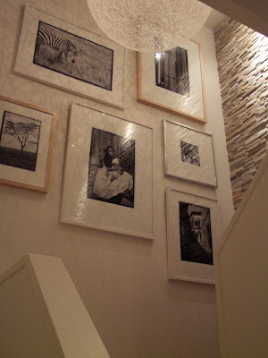
To give you a better visual of where this cool new rooftop deck is being built, remember this gallery wall installation I posted about several months ago here,,,well its located on this landing that leads up to the third level in this condo and out to............ a spacious deck. You can see this staircase in the plan view at the top of this post. The condo itself was a complete gut and reno I designed almost 2 years ago, everything was completely rebuilt and upgraded before my clients moved-in, except for the large 3rd floor deck (a big job!).
The clients own travel photos are newly displayed on the tall staircase wall that you leads you up to the third level of the unit.
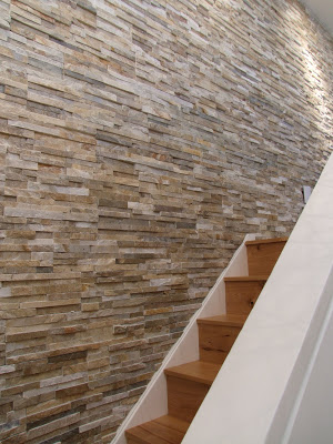
The tall long staricase wall is clad in thin ledgestone veneer, it suits the strong horizontal lines of the 70's architecture of the building. The stair treads and risers were all custom made from antique reclaimed ash which is the main flooring throughout the condo. On the far right out of view of this shot, at the end of the stone wall is a framed glass door that leads out to the deck.
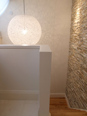
The view at the top of the 3rd floor looking down to the landing before the gallery wall was hung. Directly to the left and not pictured is a run of lower white cabinetry with stainless steel counter and integrated sink complete with wine fridge, all ready and waiting to serve guests on the rooftop. Above the cabinetry its all window, overlooking the deck.
And THIS is a glimpse at all the new elements that we're using to create this chic outdoor living space that will await you at the top of these stairs....
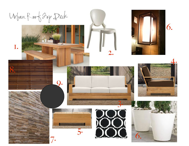
1. ) Teak dining table by DWR. 2.) Queen dining chairs by Tusche Seating 3.) Belvedere teak sofa from Restoration Hardware 4.) Belvedere lounge chair (fabric not as shown) by Restoration Hardware 5.) Belevedere teak end tables by RH 6.) Oversize planters by DWR 7.) Thin stone veneer ledgestone wall cladding by Ciot. 8.) Custom horizontal cedar cladding and planter boxes by Cubic Yard Design 9.) Painted built-in cabinetry by Cubic Yard Design.
But the key to this design plan is the single chaise lounge also part of the Belvedere collection from R.H. One of the many requirements for the space was to include not only lounge seating, dining, storage, outdoor cooking, herb garden and planters,,,,it also had to have room for a sunbed. Terry had the genious idea of positioning this chaise lounge to function as a multipurpose coffee table/ottoman AND sunbed. The chaise is designed with the same base as the sofa and lounge chairs, when in the fully reclined position, its perfect height for a coffee table. Here's a look at in the upright position..
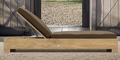
It's beautifully designed with a hydrolic lift mechanism for super easy operation...the homeowner can simply raise the backrest whenever she wants to bask in the sun (completely covered in SPF of course).
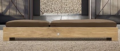
Back in the fully reclined position it makes the perfect ottoman,,,,,and located right where you see the seam in the cushions will be placed a custom 'cuff' style stainless steel tray that will slide on over top of the cushion concealing this seam and offering a solid surface to place food and drinks. Brilliant!!!!
While the homeowner has been away at her cottage for most of the summer and while I was on my East Coast vacation,,,Terry and his crew have been sweating away (literally!) and the entire deck will be ready for its inaugural cocktail party in less than 2 weeks. I stopped by today to check in on the progress,,,,
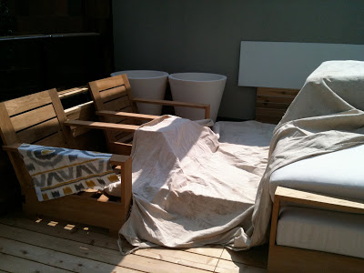
Visits like this are like 10 Christmas's all at once, even though it was about 120 degrees today! So exciting to see all the new stuff together. The furniture has been on site for a few weeks and I've been busy sourcing some fun fabrics for extra toss cushions.
Once all the finishing details are complete I'll be sure to post some before and after photos, show you all of my favorite features and tell you about all the special design details Terry used. There was a rather large obstacle to be dealt with (huge overhead concrete beam) thats been transformed into a beautiful architectural feature. Its really going to be quite a special space when its all done and I can't wait to experience it in person.


