Upload: November 7, 2010


Oh yes, Autumn is definintely my most favorite time of the year....but unfortunately as you can see the lack of blog posts is result of this love affair I have with the fall season and all its distractions - the changing colours,,,the incredible harvest of food, wine and birthday celebrations to enjoy.  Selfishly, I've opted for drives in the country, dinner parties with friends or an afternoon of making soups instead of blogging. : ) Not that I've had much leisure time to indulge in all of this fall fair,,,,,because I've been working 7 days a week, it seems impossible sometimes to find that work/life balance.  My Iphone's been burning thru its battery life every day as I photograph all the items I've been recording for various projects so I think I'm waaaay overdue for an Upload post!  This upload contains a selection images dumped off my phone over the past 6 or 8 weeks, I've eliminated a few hundred of the pics I had taken of tile and plumbing fixtures to spare you the repetitiveness (yes, I've been designing a lot of bathrooms and kitchens lately!).  Below are a few highlights such as,,,,,great finds at the big box stores,,,,whats new in the world of tile,,,,,and a sneak peaks into a couple of special parties.....


Bringing the outdoors in, this outdoor light fixture was a steal and a great choice for a modern rustic bathroom I was redesigning in a chink log cabin, the homeowners liked it so much they bought enough to use in all 3 washrooms.  Light fixture from Union Lighting.  


I make a point to regularly check out what's available in the big box stores like Home Depot, Lowes and Rona.  Often I can find the same or similar items to what I've seen in specialty showrooms - so don't ever exclude the big box stores if you're trying to create a designer look,  its not where you buy it but how you use it.  Sometimes I find things I havn't seen anywhere else and the bonus is the items are low priced and in-stock.  Check out these great finds, which all happen to be stainless.......


This simple rectangular stainless steel mirror is a favorite of mine, it would work perfectly in any of the bathrooms I'm redesigning in the modern rustic log home.  Its only $64 at Home Depot but Lowes has a similar version too.


I selected this rectangular mosaic stainless steel tile from Lowes for a client's laundry room backsplash.


This is a great oversize single stainless steel sink by Elkay that's perfect for small kitchens, it maximizes counterspace and its tight radius corners give you a chef style sink that accommodates large pots and pans.  Available at Home Depot and only $329.


Ohhh I love when a custom sewing order is ready - these custom pillows were made for a client using a gorgeous collection fabrics designed by Tom Felicia for Kravet.


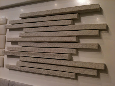
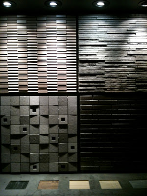
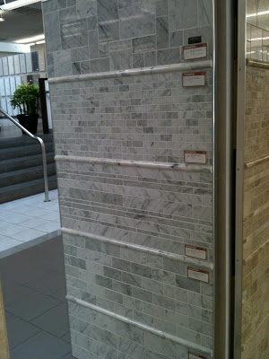
There's not much that beats the beauty of natural stone tile, but...I have to admit its truly amazing what's being done these days with porcelain tile - the effects being created with texture, graphics, metalics and lazer cutting technology make these man made tiles not only hard to resist but hard to identify next to the real thing.


This one had me fooled,,,when I first saw this I thought it was a natural split face quartz tile, but its actually a porcelain.  Its super thin long lines and variation in thickness create a stunning textural surface.


This is a perfect example of why I think lighting is the most important aspect of any well designed space, you can see the effect the accent lighting has on the tiled surfaces above.  Without the lighting the texture of the tile would be completely lost, have no relevance.  The tile shown in the top right is the same tile shown in the previous photo (above) but in the black version.


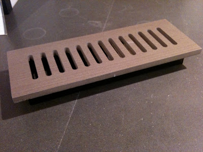
You can even have floor vents custom cut from your floor tile.


Always a must stop,,,the flower shops at Avenue Rd and Davenport didn't disappoint on Thanksgiving weekend....


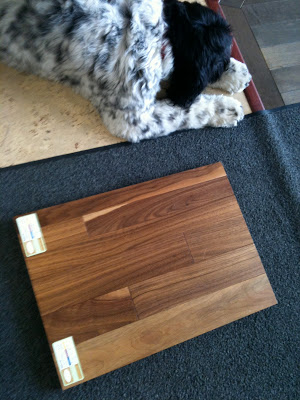
This is Max,,he's the showroom greeter and he totally approved the solid walnut hardwood I selected for the 70's bungalow redesign. : )  Its 3-1/4" wide, prefinished with a low sheen cashmere clear coat which makes it look like its been waxed - super elegant.  When I specify wood floors I always chose natural woods (no stain) with an ultra low-lustre finish,,,,to me the beauty of wood floors is the natural character of the wood itself.


One of the best deals out there is this selection of cararra tiles by Olympia Tile,,a timeless classic, they offer a great selection of sizes and all but one of these are less than $10 s.f.  Olympia supplies many retailers too so you can also find some of these at your local big box building centre or tile retailer.


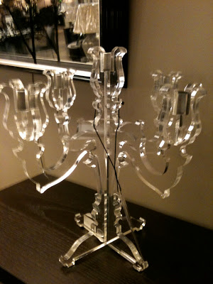
A modern candelabra I'm contemplating for a client...


I think I love fall planters more than summertime ones,,,,this one proves that a hit of black always makes anything better!


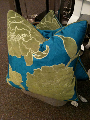
I often stop and take note when I come across ready-made pillows, I think they represent one of the 'best buys' you can make.  Not only can a couple of these instantly transform the look of a room, buying them ready-made can literally save you hundreds of dollars and loads of time.   These feather filled silk pillows with velvet appliques were less than $60 each, if you've ever had custom pillows made, you'll understand what a great deal this is!!!  To have even a basic single fabric pillow made thru a designer will cost you in the hundreds of dollars....


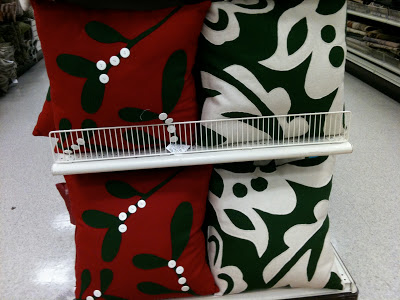
Of course I was completely crazy for these felt pillows I came across at Home Sense - only $29.99, they had such an amazing hand-made quality about them and they were so modern at the same time.  If only red wasn't such a bossy colour..... : /


These green version were gorgeous too!


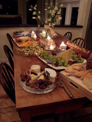
My client Gail hosted a wonderful Kitchen 'Kick-off' party where she invited the entire design and construction team along with all her friends to celebrate the completion of her new kitchen and family room.  It was such an amazing night - her friends were blown away at the transformation and Gail, well, she was in her element!!


As a home chef, Gail was in her glory cooking up a feast in her new kitchen and entertaining over 50 guests.....


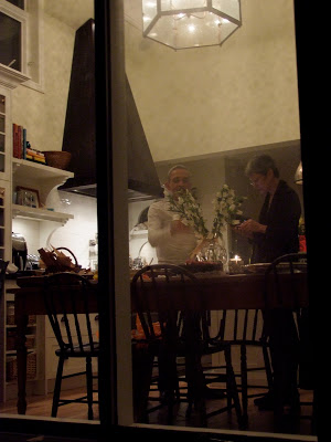
This is a peak into the kitchen from the back deck during the late hours of the party,,,,I'll save the real 'after' photos for another post in the new year.  From now until then I know I won't have a chance to get any alone time with that kitchen, is party central now!!


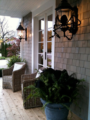
Last week I had a chance to visit the Princess Margaret Show Home design by Linda Reeves and the team at Canadian House & Home.  The house was all decked out for Halloween,,,,,


There was an East Coast style to the architecture of the house which is hard not to love,,,,,although I took a lot of photos throughout the house, for now I'll just share a glimpse with you of three of my favorite rooms in the house.  The house will be featured in the magazine in the new year (probably the April issue) so I'll hold back the rest of my pics until after their own photos have been published. 


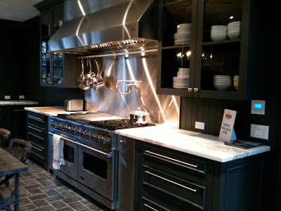
I know some visitors were not too fond of the all dark grey kitchen,,,but I LOVED it.  The counters in particular were my absolute favorite element of the entire house.   I inquired about the finish but there was some uncertainty, I think they were 'leathered' calaccatta marble but I'm investigating further.....


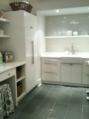
The laundry room was HUGE,,,,,this shot represents only half of it,,,imagine the image above completely mirrored and that's the size of the entire room.  The counter at the opposite end of the room housed the washer and dryer as opposed to the sink seen at this end.  This laundry room (despite its size) actually reminded me a lot of the laundry room I designed for my Victorian row house renovation where I used the same floor tile paired with white beadboard panelling on the walls....


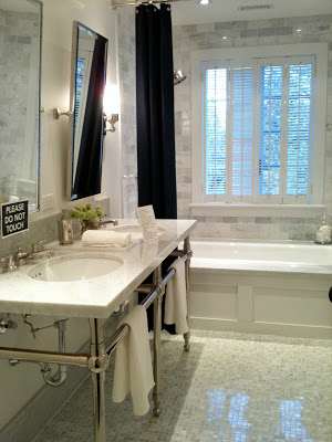
This shared, 2nd floor hall bathroom of the show home has all the classic elements I love!  


A girlfriend and I both have birthdays in October so another friend hosted a birthday dinner party for a group of the girls,,,,,we hung out around her island and laughed and drank and ate,,,while she cooked the most incredible meal for us....


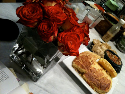
Homemade roasted eggplant salsa and cornbread...


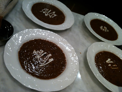
We started with the most incredible black bean soup....(still waiting for the recipe!!) and then.... I stopped taking photos,,,ha ha.  Oh boy, it was a good time!!  I am so blessed to have such amazing girl friends, as I always say, to cook for someone is an expression of love!


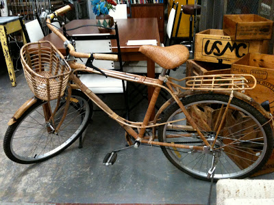
A bamboo bike at a vintage store...


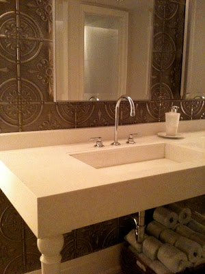
If you ever have a chance to visit this restaurant you'll see a great example of modern farmhouse interior style at Oliver & Bonacini's restaurant in Oakville.  The washrooms were especially gorgeous with the tin panelled walls and modern white sink consoles.  The entire washroom was a simple combination of white, cararra marble, and tin panelled feature wall with polished chrome hardware.


I'm off to New York City this week where I'll be meeting up and staying with Vancouver Designer/Artist Michelle Morelan from A schematic Life blog.  We have plans to tour the Kips Bay Show house and visit Moma among a loooong list of other designer destinations,,,,,,, not to mention we have dinner plans with Patricia of PVE Design next Saturday night (so excited to meet her!).  I don't plan on not having any time to blog during this trip (I'm not even bringing my laptop!) but you can follow my twitter updates for news on what Michelle and I are up to in NYC.


New Project: A 70's Bungalow Redesign


I received a call from a wonderful couple waaay back in the late spring, they were interested in hiring me to oversee a complete redesign of an old bungalow they had just purchased in the west end of Toronto.   They were downsizing from a large family home and envisioned this bungalow as being their new empty-nester modern 'condo' but without actually having to move into a condo building.  A bungalow would give them the benefit of some outdoor garden space but they wouldn't have to endure the inconvenience of elevators, underground parking and adjoining neighbours.....(I can totally relate!).

This new house would offer them 2400 s.f. of spacious living all on one level, including 3 bathrooms, a laundry room and 2 fireplaces.  The bungalow was built in the late 60's or early 70's and has those distinct low horizontal lines often symbolic of that era, and I loved that about it.  These lines would lend themselves beautifully to a modern redesign in a simple contemporary style.  It was evident immediately that we both shared a similar enthusiasm for the redesign of this house,,,and about a month later I was officially on board, about 2 months later and summer vacations out of the way,,, the 'marathon' design planning got underway - its been a whirlwind!

Here's a look at the floor plan when they purchased the house.


The kitchen had already been removed (by Habitat for Humanity) by the time I began preparing the drawings, hence this plan only shows the old sink location.


There was a large additon on the back of the house which was once an old porch but now enclosed, however, these are never insulated well (if at all) and often lack proper footings or foundation.  They had no idea what to do with this space so their initial plan was to just keep it as a 2 or 3 season room.  Considering its adjacency to the kitchen it didn't make sense to me to have this as a seasonal room, imagine closing off this room for 3 or 4 months a year, dedicating an entire wall of the kitchen to this closed off room.  I knew it either had to go completely or,,,they'd have to invest a lot of money to upgrade it.  Its usually faster and easier to tear down and rebuild these make-shift add-ons then fix them,,and for minimal difference in cost.

Now here's a look at a proposed plan they had come up with before they decided to purchase the house.   These are the plans they brought to me when we first met and explained that this is what they had in mind but they were still very open to new ideas, or 'tweeking'.  I was happy to hear that! : )


This plan was drawn up for the homeowners with the assistance of the real estate agent's office.  The thing that I didn't love about this proposed layout was the open concept at the front door with its half wall and column.  I'm not a fan of completely open concept, I like 'rooms' and I particularly like a bit of a separation at the front entry to provide a weather barrier and privacy.  Whether its your pizza delivery guy or dinner guests,,,its nice to have a zone where they can enter without being on full view, centre stage.   So my approach was to ignore this plan completely and begin my own space planning process.  Sometimes small changes to a layout can make a huge difference, other times its just not enough of an improvement to realize all of the homeowners requirements or the full potential of the space.

Here's a look at what I proposed,,although I explored dozens of options this is one of the final two layouts I presented to the homeowners which I thought offerred the best solutions.  There was  another version of this plan with a different Master Bedroom layout incorporating a walk-in closet dressing area connected to the ensuite.  I liked the idea of having separation for the closet and dressing area but the homeowners preferred this version below and were totally cool with having wardrobe closets open concept to the bedroom area.


I have to say my clients were a bit blown away when they saw the layouts (in a good way) - they hadn't envisioned relocating the laundry room but for me it was key to making this house work and I saw it immediately when I looked at the plans for the first time.  The no1 thing that bothered me about the original house layout was the laundry room location.  In the new proposed layout I created a laundry room with direct access into the garage, acting as a mudroom slash laundry room.  This puts the laundry room close to where all the laundry is generated and the new interior door to the garage gives them convenient access to recycle/waste bins without having to go outside.  On every project I work on, these bins have become such a major challenge do deal with, there's so many fo them, they're huge, they have to be wheeled to the curb every week and/or two weeks but you also need to access them on almost a daily basis.

In addition to a new laundry/mud room this proposed layout now offered an enclosed front entry vestibule where you could leave wet or mucky boots and umbrellas,,and then proceed into the long and spacious symmetrical hallway with a doulbe set of closets to hang your coat and drop your bag(s).  Opposite the closets would be a symmetrical, deep framed opening centered on the large living room fireplace, which I can tell you is going to be a spectacular, stunning modern fireplace,,,,,,,,of some sort,,,,,that's one of the final details I'm working on. ; )  The Den will be 'his' home office and has its own walk-in closet with file storage but will also house their server, wireless internet equipment,,,and home theatre/audio electronics.  Both homeowners required a home office so the Guest Bedroom will function primarily as a library/office for 'her' and accommodate ocassional overnight visitors (there also a full bedroom and 3 piece bathroom in the basement).  The kitchen is now open to what will be the new family room which will be bright and spacious and perfect for entertaining.  I'll post more about the kitchen design later!

The furniture configurations on the plans are completely preliminary at this stage and are meant only to give us direction in placement of lighting and electrical, but even this will be planned so there is flexibility in furniture placement.

The first and most important phase of the re-design was coming up with this new layout - from here I would develop the interior construction budget and then proceed to develop the design details for the kitchen, baths, fireplaces and all other other construction details and finishes.  But already, at this point just having achieved a floor plan that so drastically improves the function and flow of the space - the design process has already exceeded my clients expectations.  To me, I think the most critical and valuable part of the design process is creating a great floor plan.  If the overall plan isn't well thought out, if it functions poorly or lacks flow then it doesn't matter how 'pretty' you make it, the redesign won't be a successful one.

Construction is now well underway and I'm busy wrapping up the last final design details with the homeowners so stay tuned for periodic updates on the transformation of this 70's gem.

One Fall Day


There's no other month that represents so many of my favorite things like the month of October, its even the month I was born so I've always felt that October and I were made for each other!  It's a month that truly stimulates all the senses and can make you feel so invigorated, it celebrates the best of mother nature and triggers our nesting instincts.  In my part of the world, October means warm sunny days, sweaters, boots, wood fires, harvest dinners, wine tastings, pumpkin pies, apple crisp, butternut squash soup, country drives,,,,, and all around you, being surrounded by the most spectacular explosion of colour you can imagine.  Once it arrives, I never want the month to end. : )

People travel from all parts of the world to experience the fall colours of North America but those of us who live here are priviledged to enjoy this natural phenomenom every year right outside our own windows. October wouldn't be complete without at least one drive into the countryside to soak in all the fall colours,,,and maybe come home with a pumkin or two.  On thanksgiving weekend we woke to the most perfect indian summer day you could ever wish for so I grabbed my camera and we took a short drive west of Toronto to the Niagra Escarpement area.  Because its been a warm fall season the holiday weekend this year wasn't quite the peak timing for colour but still, the 'leaf lookers' were out in droves and there was plenty of scenic beauty to take in even though we weren't seeing fall in all its glory just yet. 

Here's a glimpse at some of the images I captured that afternoon both on our drive in the country and from right outside our window at home.  Enjoy!


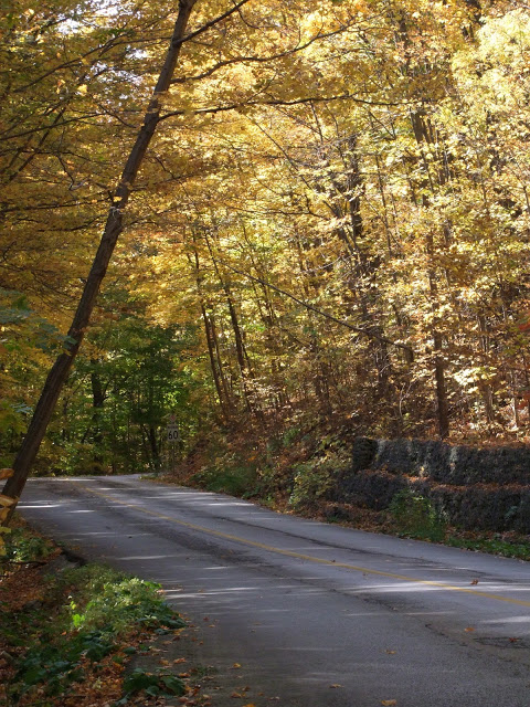
We drove and walked for hours thru picturesque roads like this one...


The yellows were luminous against the clear blue sky....


The leaves glowed in the sunlight, it was breathtaking....


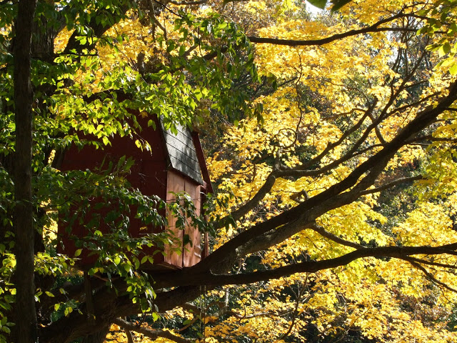
A red Tree House in a forest of golden yellow...


There was bright orange.....


And spicy reds...


And still a lot of green....


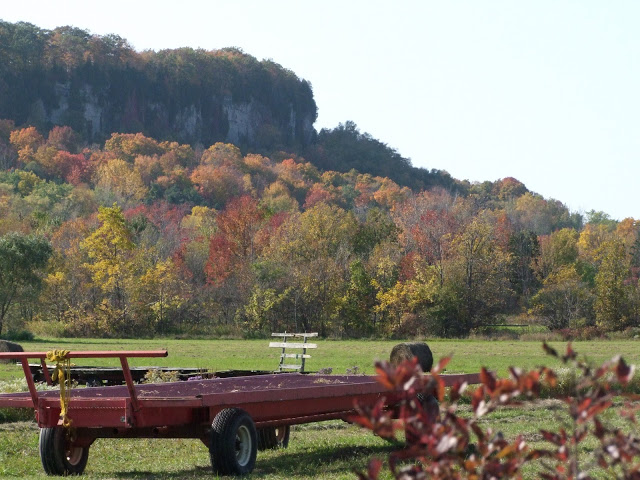
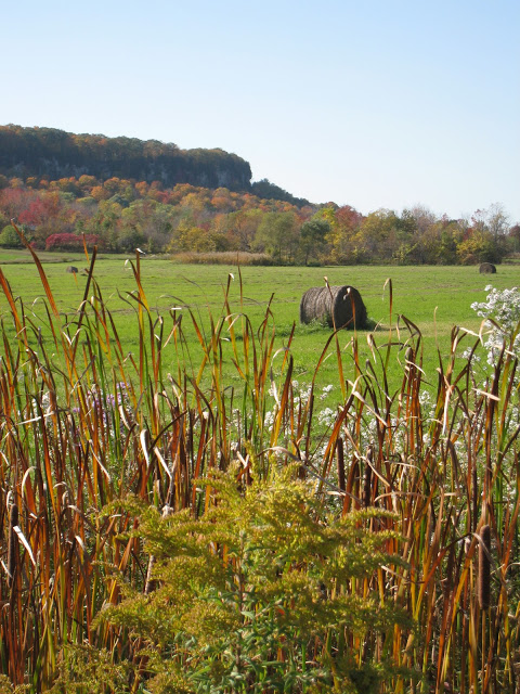
The Niagara escarpment made a colourful backdrop to this farmers field.


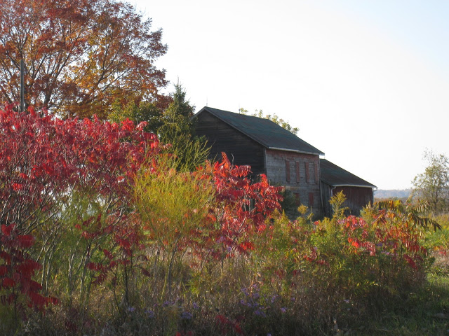
I especially love the contrast of the colours against the weathered grey barns...


I was captivated by the rows in the corn fields along the side of the road, the texture and the colour especially,,,I caught a glimpse of this perspective for a split second when we drove by and had to turn back to get some photos (ok, i took about a 100) ; )


But you don't have to drive to the country to see all this beauty, back at home in the city up in my 2nd floor studio surround by windows, the view to the lake was framed with bright red maple leafs...


And in every other direction you looked the trees were literally glowing...


It was amazing to just sit on the sunny deck and stare at the colours...


And finally one last shot before the sun went down on this perfect October day.....