Through The Garden Gate


Every June the Toronto Botanical Gardens organizes a public tour of private residential gardens, the tour is called Through The Garden Gate.  Each year a different neighborhood is selected and tickets holders have the opportunity to wander thru dozens of beautifully designed outdoor spaces.  Some are professionally designed, but not all, some are just the glorious results of enthusiastic gardeners and proud homeowners.  In the past the tour has always taken place on Father's Day weekend, except for this year,,,,,this year they moved the tour up one week and, because of this switcheroo, I totally missed it this year. : (

I know alot of you might roll your eyes and think oh *boring*,  garden tour,,,,that sounds about as exciting as bird watching - but honestly, its fantastic I promise you!  You know what its like to drive down a street that you love and gaze at all the beautiful houses, you always have a favorite or two,,,,and how thrilling it is to actually get a glimpse of the inside thru a window.  Its like that but waaay better - they invite you in!!   And I can tell you,,,you could never imagine the spectacular settings privately hidden away behind their garden gates.  This is a rare opportunity to wander thru the private backyard properties of homes in some of the city's most covetted neighborhoods - its an incredible way to spend an afternoon and you'll walk away with loads of inspiration for your own outdoor space no matter how big or small it may be.  Some homeowners even welcome you to take a peek indoors too.  The participants take so much pride in their home, (it shows!) they are thoroughly excited and eager to show it off.

The first time I went on the garden tour it was in the trendy neighborhood of Riverdale in Toronto's east end.  Characterized by its charming century homes and lush street lined streets....the tour left such an impression on me I still dream about the beautiful outdoor spaces I saw that day.  I was stunned at the lush settings that secretly existed behind these gates.  Here's a look at some of my favorite details.


I wish I could find my notes from the tour, this century home has been featured in publications but I don't have the deets.  Its pretty easy to fall in love with this house just from the curb, but the backyard is to die for!!!


My favorite backyard of all was this one, it was almost impossible to believe you were in the middle of the city it was so dense with greenery, it really was like an oasis.  There was no grass, just stone pathways and gorgeous plant beds amongs humongous old trees.  The bbq and dining area seen above were on one side of the back yard and on the other...


was this lagoon like pool - it was so natural looking with the rock waterfall and stone perimeter.  There was an upper lounge area, a hot tub at the top of a rock waterfall and a pool house/cabana.  I literally did not want to leave this backyard and could barely, barely contain myself from jumping in.


Look closely, this is a brilliant detail.   Both little decks are cantilievered off the house, this means the windows aren't buried beneath a closed in deck. 


Decks don't always have to made from wood......(but you should always have a guardrail!)


My next favorite backyard, this classic city yard that's long and narrow, but with this pool and cabana it was pure luxury.  I loved, loved, loved it.  And if you think the pool took up all the backyard space.....


it didn't....there were two upper level decks and... a patio area to the left of this image.  This has me wanting a long narrow backyard.


Not one of the tour participants but I loved this steel front door, light fixture, mailbox, door bell.  Beautifully done.


I loved the modern simplicity of this light fixture and house number combo.


These houses weren't participating in the tour but I would have awarded them top prize for curb appeal.  This is simply perfect.  The fact that this is a semi-detached is house is incredible.  Imagine two homeowners in total agreement and unity on the front entrance design of their attached houses. An impossibly rare venture.  Everything about this is perfection to me, the colour, the symmetry, the house numbers, the door matts, discreet screen doors, the antique brass hardware, the potted globes. The entire composition is a wonderful modern approach to a century home. Impressive.


Stepping into this yard was like being instantly transported to Muskoka.


Pea gravel driveway : )


Black mulch.  I love how green foilage and flowers look with black.  A very sophisticated look perfect for chic urban gardens.


Alternative to fence boards, Asian inspired fencing and garden.


Layering texture and colour.


As far as decking and fencing goes,,,,,nothing beat this place!  The fencing and shade structure details were simply stunning.  (Also see top photo of rolling door)


Beautifully designed joinery details.


Screen detail along one side of the deck.


Built-in bbq and counters.


Lovely : )


View from the bbq area, the structure design is amazing.  I particularly loved the colour of all the fencing and decking, it was semi-opaque grey stain.  Some areas darker than others.


Fence detail...


close up detail of the fence and stain.  Even the fasteners are specifically placed.


Beautiful stone and pea pea gravel walkway


Moving on to another garden,,,,interesting glass screens.


Unfortunately the garden gates are already CLOSED for this year but I hope you enjoyed my photo tour from the past.   I'm sorry I missed the event last weekend and that I didn't anticipate getting this post up a couple of weeks ago so you could have had the chance to go too if you hadn't heard of it already.  Its an annual event so anyone in the Toronto area should mark your calendars for next year to be sure you don't miss it.  We're really planning our exterior spaces much like our interior rooms so it really is a treat to peek in on these outdoor living environments, its so much more than just gardening.  Outside of Toronto, if you ever have the opportunity to attend any local garden tour I highly recommend it, it will overwhelm you with inspiration.  


All Photos:  Carol Reed

Alexander McQueen: Savage Beauty


One of the highlights of my trip to NYC last week was my first visit to the Metropolitan Museum of Modern Art, and their feature exhibition Alexander McQueen, Savage Beauty

Curated by Andrew Bolton, I was so impressed - it was one of the most beautifully displayed exhibits I've ever seen.  There was so much to see the exhibit was spread out thru several rooms, even moving constantly thru the space, just taking time to read the brief text, it took more than an hour to see it all.  My two favorite collections were the Romantic Mind and Romantic Nationalism rooms.

The Romantic Mind, photo from metmuseum.org
I loved these pieces because unlike many of the more theatrical, highly conceptual pieces these were everyday wearable pieces (stunning pieces mind you), most were donated from the closets of McQueen's private clients.  These pieces were accompanied by a memorable quote and I can't recall the exact wording but it was something like his goal was to design clothes that would make a woman look and feel powerful and make others fear them - an interesting statement when you consider this is the design house who designed the royal wedding dress we saw last month.


Romantic Nationalism, photo from metmuseum.org
I thought these pieces were both regal and fairy tale like, steeped in historicism but cut with very modern silhouettes.......they transcend time.


As an exhibit the collections are a wonderful example of how expressive fashion can be as an art form, and I don't think most people view fashion as art.  The designer had more than just aesthetic concepts to his work,,,,his designs made statements, conveying messages which were often deep, dark, complex ideas.  

Alexander McQueen's precision tailoring skills were brilliantly paired with his creative use of unstructured drapery and dressmaking techniques.  As a designer, I especially loved this and think that his work is a great testament to how artists/designers can only achieve their highest level of creativity (success) when they've mastered the technical aspects of their craft.  I've always been a firm believer in that philosophy,,,,,yes its possible you may be 'born' with creative genes/energy but learning how to apply that creativity to a chosen craft and be able to master it confidently (or revolutionize it) can only come from training, apprenticing, and experience.  

To see the depth of his talent thru this exhibit you can't help but leave feeling sadness over such a tragic loss of life, and perplexed at how someone so talented and successful could have possibly been so tormented.

If you're in NYC between now and August 7th, I highly recommend the show, but be warned there can be a 45 min or longer wait.  If you can't make it in person,,the link I've provided above and below has fantastic images and narrative.


There's a book available as well which looks incredible, I had a chance to flip thru it in the Museum shop, its a large book with fantastic photos.  I didn't purchase it while it was there because it was simply too heavy for me to carry around for the rest of the day - I'm going to order one online.


Top Photo:  Carol Reed
All other Photos:

Garden Inspiration


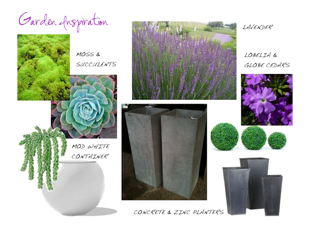
At this time of year most of us are busy reviving our gardens and our exterior spaces, setting the scene for outdoor lounging and entertaining.  Or at least we should be,,,I havn't actually done a thing with our outdoor spaces or the garden yet, they've been sadly neglected while I've been soaking up inspiration in NYC (seriously, have not even been to the garden centre once).  I had a chance to visit the Kips Bay Showhouse last Thursday and with gardening on my mind I was struck by the backyard landscaping and the planter arrangements on the upper terraces.  I absolutely love creating planter arrangements, for me its like a mini landscape design project with instant gratification.  Before I hit the garden centre I do like to have some conceptual idea for my planters, the image above is loosely what I have in mind - largely inspired by what I saw last week and my love for lavender.   Whatever design direction you want to take outside there's unlimited options when it comes to containers and planting species - your planters can literally set the mood your after thru the style, colour pallette, scale and textures incorporated.  I'm going for organic and flowy paired with modern geometric shapes and a colour scheme of greens and purple.
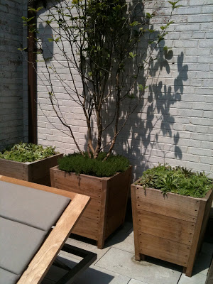
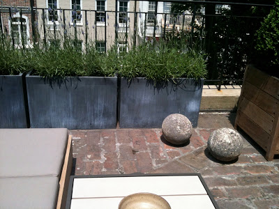


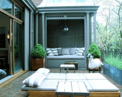
Both of the fourth floor terraces of the Kips Bay showhouse were designed by Robert Stillen and Gunn Landscape Artchitects and were punctuated with modern plantings in a minimal style.  
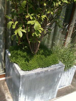
These planters above were just outside the lounge space by Brad Ford, a pair of these flanked either side of the terrace doors.  I loved the vibrant green moss around the base of the tree (I think its a type of  lilac tree) and my favorite is the lavender in the smaller planter next to it.  The scent is heavenly as you go in and out the door and the long wispy stems have such an organic, flowy look to them.  I've always wanted to have lavender plantings and this year I think I'm goint to give it a try!


This trio of planters dressed up the painted brick wall in a niche behind some loungers. The low growing succulents are all about texture and planted in a pair of simple weathered wood boxes they created a modern composition.


On the other side of the fourth floor was a second terrace just outside the lounge designed by Robert Stillen. This time the weathered wood planters were filled with geometric boxwood  and another row of low wide zinc planters were filled with lavender (not the greatest photo).


Terrace design by Robert Stillen and Gunn Landscape Architects


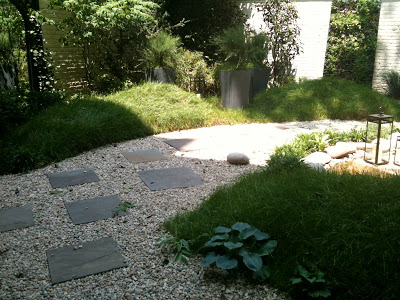
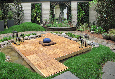
Back on the ground floor I was fascinated with the mounds of molded earth in the backyard.  They were covered in long wispy grass which reminded me of the rolling grassy hills along the beaches of the east coast.  With large planters and lanterns set right in the long 'rolling' grass it really created a natural looking setting.


A large mirror on the centre of the back wall created the illusion of another room beyond, the mirror was flanked with large live wall panels planted with herbs and lettuces.  Despite the fact the wispy rolling grass reminds me of the east coast, the garden design was inspired by the Chinese wallpaper in the adjacent Dining Room.  The garden is titled Wu Wei which means 'going with the flow'.  Backyard design by Greener by Design.


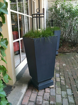
I loved the simplicity of these planters and how practical they would be in locations that are challenging to maintain flowers.  What could be simpler than topping a container with a large lantern set in a bed of wispy grass.  


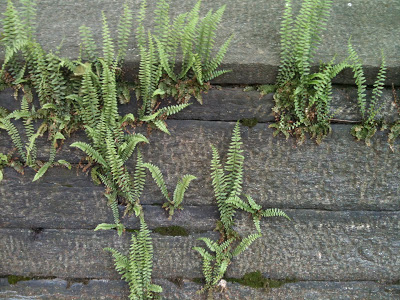
Live walls are one of the latest things in gardening this year but the photo above is a great example of a natural live wall I spotted in Central Park.  The old stone walls throughout the park had these ferns growing up out of them and I thought the effect was just so beautiful!  I don't think I'll be attempting any version of a live wall at my home this year but its definitely something I'll keep in mind for future hardscaping.


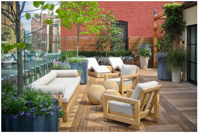
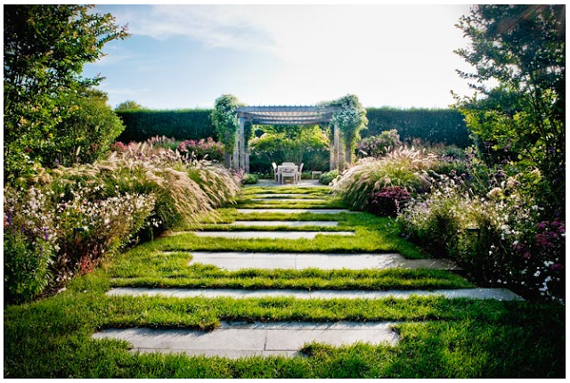
If like me you're still looking for some outdoor garden inspiration you must check out some more work by Gunn Landscape Architects for some stunning city terraces and lush country gardens.  These are some of the most gorgeous outdoor settings I've ever seen, from modern and chic to traditional and lush.

Upper West Side Terrace by Gunn Landscape Architects

Bridgehampton garden by Gunn Landscape Architects