To.pi.ary


I've had an affection for topiaries for as long as I can remember, going way back to before I ever went to design school.  I remember making them out of moss or dried roses for my own bedroom when I was just a teenager (ok, so maybe I spent a little too much time in my room!?).  I think its the sparseness and their sculptural quality that I'm drawn to, very much the same reasons I'm drawn to potted orchids - simple but ornamental.  Looking back at past projects I notice that I've used topiaries on almost every job, from traditional to modern spaces.  They're an artistic form of nature that I find timelessly appealing.

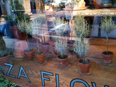
Last year at this time I was in NYC and I remember being captivated by a shop window that was full of topiaires. I stood there gazing (drooling) as if they were designer shoes or handbags,,,,,,for what seem like ages, wanting so badly to take a few home with me!  


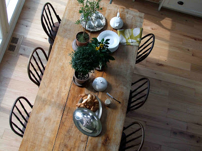
Rosemary topiaries are one of my favorites, beautiful and edible!


On a recent photoshooot I used a couple of mismatched ones to style my clients kitchen table.  At the time, I had to scour the city trying to find them (why is you can NEVER find what you need when you want it!!??) - all I kept thinking of was the little shop in NYC that had been overflowing with them...


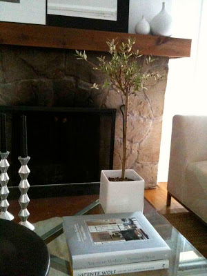
I love the look of this one, its wild shaped top paired with a modern cube pot.  This one currently sits on my own coffee table, a nice change from the fresh orchid I usually have here.


My current favorite pot for topiaries are these taupe coloured clay pots from Home Depot. I'm simply crazy for this colour which i find so much more chic looking than typical terracotta colour.


**Edit**


I couldn't do a post on topiaries without including this space by one of my favorite designers Vicente Wolf.  I simply love everything about this grouping, especially those chairs.


It feels good to be back on the blog again - its been a while!!  So much to blog about soo little time,,,,I'm looking forward to updating all that's been happening here soon......


All Photos:  Carol Reed

Thankful!


A lake side cottage, brilliant fall colours, clear blue skies and summer like temperatures.  An absolute picture perfect setting for celebrating a harvest style thanksgiving feast with family and friends.   Every fall at this time I declare that its my favorite time of year and this year was no exception, well, actually the weather, the setting, the company - it was all truly EXCEPTIONAL.   I was up north at my brother's cottage where we had invited a group of other family and friends on the lake to join us for a Thanksgiving dinner.  I was in charge of setting the table (actually nobody really had a choice, I called dibs on it weeks ago!!!) and I was thrilled to do it because often at my own home, this is the part of a holiday dinner that I usually run out of time to do.  But not this weekend, this was a leisurely day, dinner was pre-planned and well organized ahead of time so we were able to enjoy the company and the gorgeous warm summer like day. 


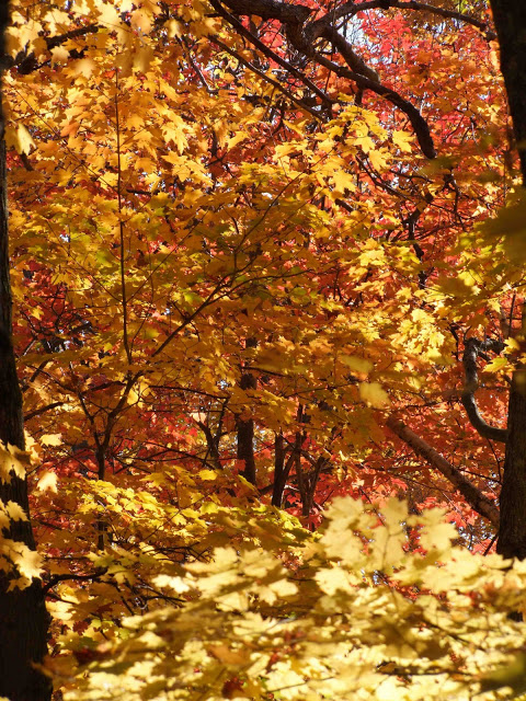
The sunlight illuminating the brilliant orange, red and gold leaves was the effect I wanted to create in a tablescape.

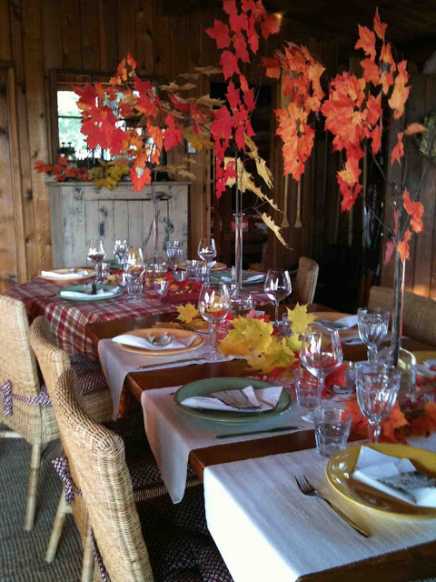
I had no idea how exactly I was going to set the table, I had no plan except that I would use whatever I could find on-hand both inside and outside the cottage.   We started by rearranging the furniture and setting up a long table down the centre of the cottage in front of the fireplace.   A mix of mismatched table cloths, runners, plates and stemware all seemed to work together with the fall colours.   Now the essentials were in place it was time to add some drama - my niece and I headed outside and collected a bundle of blazing red maple leaf branches and another bundle of golden yellow ones.  I placed three tall beaker style vases down the centre of the table and filled them with the long branches, we layered all the smaller off-cuts directly on the table itself scattering them down the middle from end to end. 


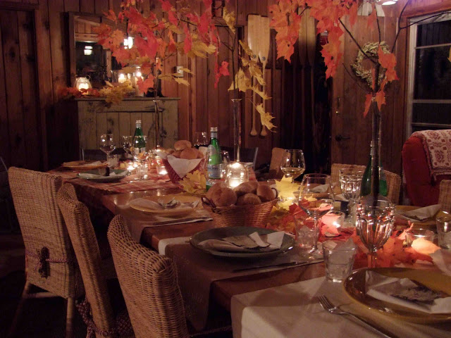
We gathered small pieces of birch bark and used them as place cards by writing names on them with an orange marker and setting one on each plate.  Lastly we scattered about a dozen votive candles down the table and set larger candle lanterns around the cottage.  The entire setting, including gathering the branches took less than an hour.


The effect was simply beautiful and dramatic, the tall branches created a brilliant canopy of leaves...


When seated at the table the colourful leaves glowed over our heads and all around the votive candles.  


We enjoyed the day outside, and had drinks and appy's on the deck overlooking the lake.  The sun was just setting as we headed inside.....from one spectacular showcase of colour...


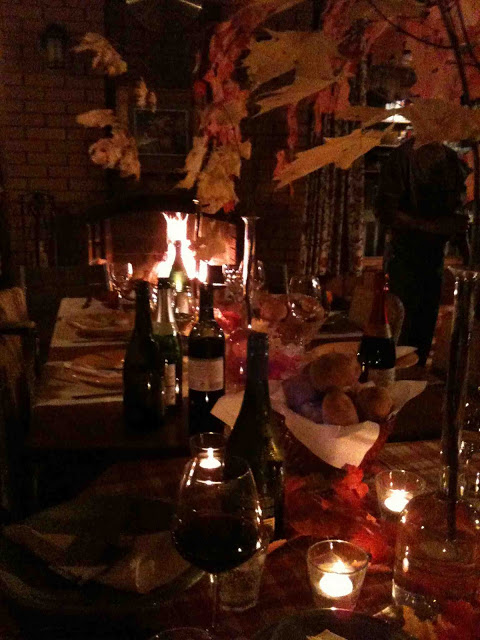
To another.


Even though the weather was summer-like, we lit a fire in the fireplace, just for the ambience...


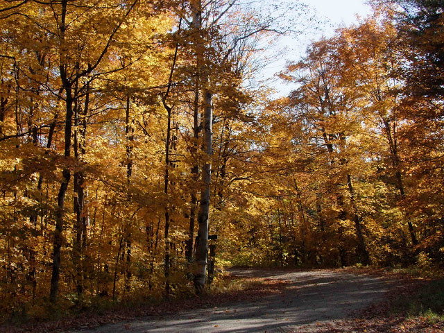
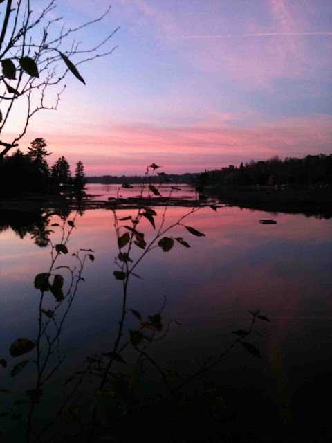
The drive home was full of breathtaking views likes this, we took the long scenic route home and soaked it all in.  In case I havn't said it enough times this weekend, its my favorite time of year!


HAPPY THANKSGIVING!


All Photos:  Carol Reed
70's Bungalow: Makes A Modern Impression


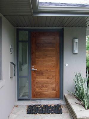
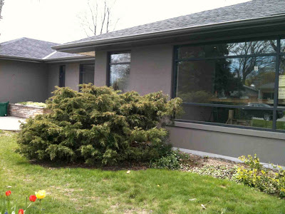
70's Bungalow with new front facade and door (new landscaping still to come!)

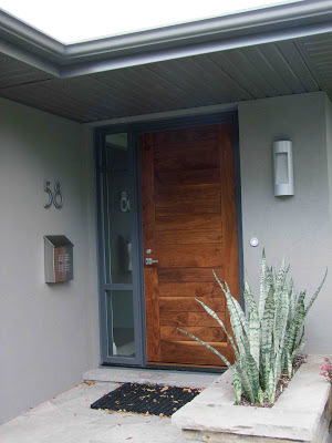
As you approach this door,,,,you can almost hear it say "Welcome! Let me introduce you to my stylish homeowners who will so graciously invite you into my warm modern interior......please come in...".   Its a far cry from what this front door used to say....


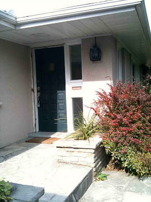
"Come in if you dare".  Front Door before.

When I began working on the 70's Bungalow project over a year ago I immediately saw such huge potential for the exterior.  What I disliked about the exterior of the house was its horrid fleshy peach coloured stucco (that's an understatement!) and its white vinyl slider windows. What I loved most about the exterior of this house were its lines, it had great long horizontal lines.  Everything about these lines screamed modern to me, they were just wanting to be heard.


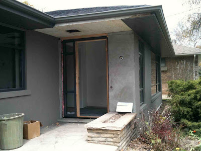
To begin the transformation of the dated exterior the chunky traditional plaster mouldings were removed from around all the windows.  Next a new roof, and windows were installed.  Then new black aluminum windows were custom designed with an asymmetrical mullion detail. I had the front door and sidelite reversed (from the original positions) so the handle side of the front door wasn't up against the adjacent wall.  New lighting locations were roughed-in and finally a new dark grey stucco was applied to the entire exterior and the new eaves and soffits were fit into place.


The new look is monochromatic and distinctly contemporary.  I chose a black shingle for the roof and a dark warm grey not only for the facade of the house but for the eaves and the soffits too, I wanted these elements to blend in with the body of the house rather than be in contrast.  Not chosing white tones for the aluminum work created this monochromatic effect and emphasizes the expanse and volume of the house, not breaking it up with contrasting trim.   What I envisioned as the highlight of the exterior would be the front door.  All of this sophisticated grey and black was the perfect setting....


For a beautiful, solid, natural wood door.  The wood tones are a striking feature against the grey exterior and gives a strong presence to the entry.  Because the door location is a bit unconventional in that it doesn't face the street, (its positioned sideways/perpendicular to the street), it could easily disappear and become very nondistinct.  But I didn't want that - I like a house to have a definitive front entry that's distinguishable and also sets the tone for the interior beyond, even if its understated.  I talked the homeowners out of both a glass door and a painted door option.  I wanted to make sure this new door was in no way mistaken for a window or have the less important look of a side door.  Designing a new custom front door wasn't part of my original scope of work but as we discussed all the design details for the windows with the contractor the door design was created on the spot.  Oh how I love to hear the words "we can make anything you want, just tell us what you'd like".  So I did, and.....they did.  To finish it off on a truly collaborative note, the homeowners selected the new light fixture and mailbox. I approved.


After waiting months and months for the new door to be delivered - the homeowners and I unanimously declared it was worth the wait!  (the colours are a little off in the photo above).  Next year they'll begin the landscaping redesign which will include new stonework for the front entry area and a  new cladding treatment for the stone planters.  So please ignore all the landscaping (or lack of) in these photos as the grounds have remained unchanged to this date.   As for the interior, all construction work has finished up and we are currently working on all the window coverings and artwork.


Previous posts on this project:


All Photos:  Carol Reed