The Kitchen Sink


Most of my projects involve entire whole home renovations where I specify everything for the interior buildout from the bricks in, right down to the kitchen sink.  Most of my clients fall into two categories, they have their hearts set on a large single sink or they don't have an opinion about a kitchen sink at all, usually because they don't cook.  My own personal preference (from many years of experience) is a single wide deep sink.  I enjoy cooking and I cook a lot, typically 6 nights of the week you'll find me cooking in the kitchen.  Of all the dozens and dozens of kitchens I've designed over the past 6 or 7 years I've rarely specified anything other than a single bowl kitchen sink, either farmstyle or undermount, they've almost all been one large sink.

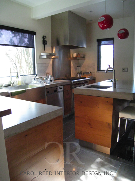
The kitchen shown above is in a client's house I designed in 2007, it features an apron front stainless steel sink, concrete counters and custom cabinetry made from reclaimed barnboards.  (This is a candid photo I took one day years ago while there for a meeting.  It seems like a lifetime ago, this was before Iphone's existed,,,,and before I blogged or tweeted.)

In many situations I find double bowl sinks impractical, overall they require a larger cabinet size, they eat up a lot of counter space, and the divider in the middle is permanent - you simply don't have the option of soaking large pans or oversize cookware.  With a single bowl sink,,,,they're typically not as wide as a standard double bowl sink but I love that you have the flexibility of soaking large items whenever you want.  You can still use it to wash small or delicate things as you normally would.   A lot of people struggle with this concept, how do you wash and rinse in one large sink?  Well, when it comes to washing, I typically take the largest bowl or pot that needs washing, rinse it out, fill it with hot soapy water and use it to wash everything else in.  I keep a small dish strainer inside one side of the sink for rinsing and drying.  Occassionally I use the counter for drying items, but usually I can contain it all in the sink.  The top photo is a perfect example,,,,when I arrived at my client's house that afternoon she was soaking some large baking pans in the sink, so you can see her dish rack on the counter while she was putting these things away - typically the rack sits inside her sink.  This isn't a dish rack specifically made for her sink, but they are available.


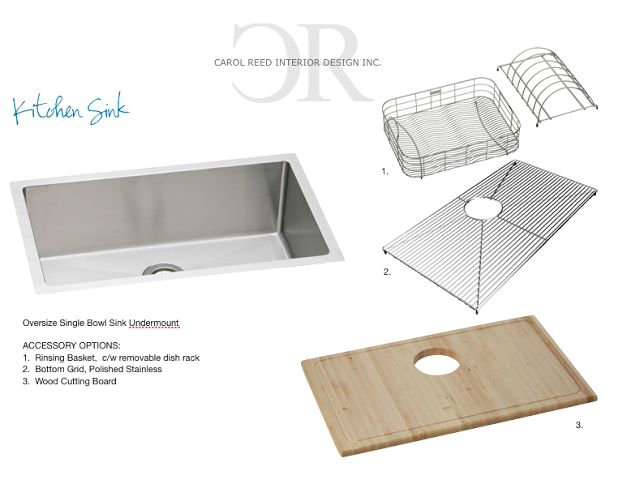
When I specify sinks I like to also order accessories specifically for that sink.  If I'm having the sink custom made, I'll find a series that is compatible with my custom size as close as possible.  The selections above are just a sampling of the variety of options to chose from.


Double bowl sinks or sink and a half, usually require a 36" wide sink cabinet.  Many times I'm working with limited space and a 36" sink cabinet just isn't practical, I'd rather go with a smaller sink cabinet and have that extra 6" or so for a bank of drawers beside the sink, ie; an 18"set of drawers vs a 12".  I'm not a fan or irregular shaped sinks with funky curves or angles, I like them clean lined and simple.   It can be challenging to find simple double sinks to fit a 27-30"cabinet which is another reason I often use a single.  You can easily find large single bowl sinks from 18" to 24"wide, and if you really search you may find a 27".  When I want the largest single sink I can possibly fit in my sink cabinet, I have them custom made.  I've had stainless steel sinks custom made for most kitchens I've designed, this allows me to maximize the sink to whatever size I want and ensure it works with the cabinet I've specified.  (I don't recommend this for DIY'ers.)

If you're shopping for or considering a single bowl sink for your own kitchen here are some great tips to keep in mind:

  • know the exact inside dimensions of your cabinet not just the outside dimensions
  • refer to the actual sink size not just the overall size which includes the mounting rim
  • the lower the guage stainless steel the thicker and sturdier the steel, 16g is stronger than 18g.  18 is standard, 16 is even better, avoid 20g for a kitchen sink.
  • keep drain location in mind if you're also using a garburator, anything other than centre may impede your garbutor/drain hookup inside your cabinet
  • the tighter the radius the more of a 'pro' look you will get but the almost square corners can require more attention to cleaning
  • the smallest radius for the corners of a stainless steel sink is called "Zero Radius"
  • a 5/8" radius will still give you that rectangular look and ease of cleaning
  • go for 9" or 10" deep sink for pro style function
  • its key to utilize sink accessories to maximize the efficiency of a single sink, use bottom grids, dish drainers, dish racks and integrated cutting boards to optimize the sink interior
  • a side spray or pulldown spray faucet is great for using the large sink to wash small dogs or large vases
  • make sure when determining your sink's location for the countertop cutout that you leave adquate counter space behind the sink for your faucet and faucet handle clearance.


Its always a major milestone for me when the kitchen sink finally gets installed on a project, its the moment the space becomes a *functioning* kitchen and indicates final completion is just days away, not months!  Currently on my project board, I have an upcoming single kitchen sink install in the NYC project, and we were measuring down to the 1/8" of an inch for that one!  For another out of town project I've just drawn up the details for a stainless custom sink and a half configuration,,,,,ready to be sent off to the fabricators.   The anticipation of both these installs has me excited to see these sinks in their newly finished homes very soon!!


All photos and room design:   Carol Reed


Its Reveal Time: A Home Office


Style at Home March 2012,  Photo: Donna Griffith

This home office was part of a whole home renovation project I designed and project managed back in 2008-09 for my sister-in-law Kara.  It seems like an eternity ago since the construction was completed and she moved in, but its taken a couple of years to turn it into a 'home' with furnishings and artwork. While the entire home, including a gorgeous rooftop deck, were photographed by Style at Home Magazine last year for upcoming issues, I was so thrilled to open up the current issue and see her home office featured in the Organizing Workspaces story "Hard at Work". 

The office occupies one of the 3 bedrooms in a multi-level, mid-town condo and was chosen as the office over the other spare bedroom for its eastern exposure with bright  morning sunlight - she's an early bird! I added a new frosted glass panel door to the room so when she has out of town guests (frequent occurance) she can close the office door for privacy and sunlight can still filter into the hallway.


Style at Home March 2012, Photo: Donna Griffith


The antique ash barnboard floors and hide carpet are a nod to Kara's past, having grown-up on a farm she has a strong affection for all things country - a photo of her childhood prize winning pig has a special place on her desktop, complete with ribbon!  I prefer modern furniture or contemporary spaces when paired with a little bit of rustic or 'country' element, and this room does just that.  The random width floor boards were finished on site and received a low sheen clear coat to showcase the wood's natural character with all its knots, nail holes and bug tracks.  With a wall of shelving fitted with woven storage boxes, a full height filing cabinet and double closet with essential organizers (not seen in photos) so the office provides loads of storage and an expansive work surface for the high volume of paper work that's handled here. 

Its no co-incidence the office is filled with lots of orange accents, its one of the corporate colours of the company Kara works for so she's has been using orange for work related accessories for over 10 years.  Its a colour I've always associated with her  - she always has something on her or in her bag that's orange.


Thank you Margot, Jessica, Donna and the rest of the Style at Home team for your beautiful work on this feature!  I am a devoted fan of the magazine and I'm honoured that you chose to include this space on your pages.

: )


A few more After Photos..

Below are a few more after photos not from the magazine shoot but from my portfolio files that give you a glimpses of some other details in the office.

On the wall opposite the desk, a row of modern wall clocks have their orange hands set to the various time zones of family and friends around the world, including one for Kara's Muskoka cottage, permanently set to 'bar's open'.   She's a whiz at board games, this metal ledge holds letters from a vintage family scrabble set which spell out the city name for each clock.


One of my favorite items in the room is Kara's very first childhood desk - it occupies a special place in the corner beside her 'adult desk' and I've used it to stack magazines and hold book bags.   I love the visual tale of these two desks side by side,,,its a testament to the power of learning and dreaming big.  They truly represent the past and present of this successful woman's journey of accomplishments.


Artwork by:  Alanna Cavanagh

I have admired the whimsical illustrations of Toronto artist Alanna Cavanagh for some time, so I was really excited when one day Kara sent me photos of several pieces she had brought home from a gallery to try and decide which to buy and where it could go.  I thought their vintage inspired take on typography and fashion were a perfect fit for her office.  I loved each one of them, and so did Kara which made the decision easy - she kept them all.  That was a couple of years ago, and today I can tell you she loves these pieces as much now (if not more) as the day she brought them home.   


I'm looking forward to seeing the rest of this home on the pages of Style at Home coming up soon!!


NYC Reno: The Family Plan


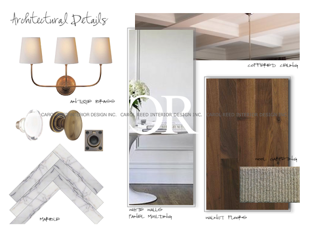
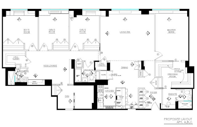
I started working on this renovation project in New York City last June, the scope of work was extensive as it involved converting 3 adjoining apartments into one single family residence. (Check out some of the before photos and my introduction of this project here.)  At the very onset of a project I usually formulate a vision for the bones of the space very quickly.  In this case, my clients who are parents to three young kids were in synch with this vision, represented in the collage above.   Timeless elements like natural wood and marble, fresh white walls with panel molding for classic character, fixtures with clean simple lines and vintage patina - would become the backdrop for this family's busy city life in the Upper East Side for the next 20 years or more.  It reflects their affection for tradition but will exude a young and modern edge, just like them!

The 'Before' Plan


The existing three apartments had tiny enclosed kitchens and equally small bathrooms.  The biggest challenge in redesigning this space, aside from ALL the structural elements that couldnt' be moved, were the rules of the building.  It seemed the more layouts we came up with, the more the rules changed.  No problem.  I can design around anything - I was coming up with new layouts as fast as they were coming up with more rules.  : ) After weeks of marathon space planning the conclusion was -  NO kitchen or bathroom could extend beyond their existing footprint, NO plumbing drains or appliance locations could be moved, AND no additional bathrooms could be added.  Uh huh.  Did you look at the existing plan?  Soooo, Carol, good luck getting that dream kitchen into a closet, scrap the luxurious Master ensuite with double vanity, and forget about the convenient new powder room off the foyer.  : /  Discouraged yet?  My clients were.

I"m not gonna lie,,,the decisions from the Board were crushing to the homeowners.  As more and more restrictions were placed on them, they doubted whether this space could ever come close to suiting their needs no matter how extensively it was renovated.  Thoughts of scrapping the entire reno entered their minds,,,,,, until they found this plan in their inbox. 


The Proposed Plan


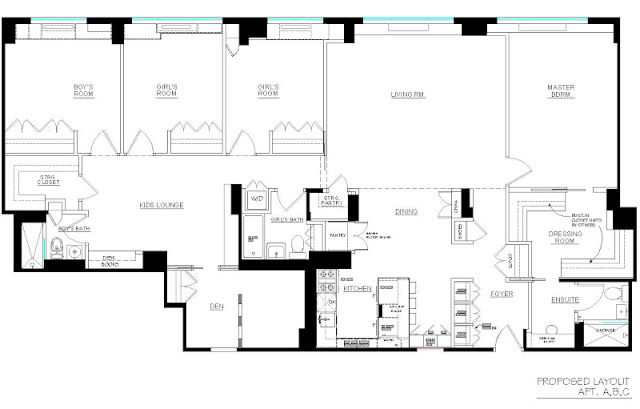
At first glance this plan may not look super impressive, but this really was a triumphant success. We have a 'spacious' open concept kitchen!!! A decision was made early on that the kitchen in the middle Apt. B would be the new kitchen, and the main entry would be thru Apt. C, this allowed for a split bedroom plan.  All good, except the kitchen in Apt. B had a column in the middle of it and no where to put a fridge if we took down the walls.  (It was so space challenged the existing kitchen only had an 18"wide dishwasher.)  

Two key elements allowed this plan to happen,,,,,,,#1 we were permitted to move the washer/dryer out of the kitchen to a closet within the footprint of the main bathroom, and #2, even more crucial - under counter refrigeration!!! I've been using under counter refrigeration for about 10 years and it's been the 'hidden' key to many successful kitchen redesigns.  I was able to place 3 fridge drawers and 1 freezer drawer in the peninsula, equivelant to a standard fridge.  All plumbing and appliances remained within the footprint of the original kitchen = Board approved!  The compromise as you can see, the column is still there and it falls right in the middle of the peninsula - but that's one small compromise in exchange for this expanded family style kitchen.

When my clients received this plan the single sentence response I received by email was "you are my hero"!  An exaggeration, a wee bit ; ) yes, but I was thrilled they liked it.  They loved it.  For me it was so satisfying to know I was able to help turn this space into everything they had hoped it could be instead of it becoming their biggest disappointment.  That's the value of design.    


Custom Details & Elevations


This plan indicates where all the custom built-ins and custom details will be located and identifies all the new interior doors.  Well planned built-ins and well appointed doors will take advantage of every square inch and integrate awkwardly placed obstacles into useable space. 

What I love most about this new layout;  the open concept kitchen lets mom interact with the kids and benefits from the natural daylight, the dining table can extend into the living room when needed, the master gets a luxuriously large dressing room and the kids have a separate lounge area, in fact the entire kids 'wing' can be closed off from the main living areas whenever the parents chose.  To make the most of a tiny master ensuite I created a spacious vanity area outside of the bathroom which will be finished in the same materials as the bathroom so it all reads as one larger space.  There's a lot of great features packed into this 2200 sf home.  A 4+ bdrm, 3 bath plan - in manhattan,,pretty sweet.


Preliminary Furniture Plan


This is how this new family apartment will be used.  To help clients visualize if the proposed layout will meet their particular requirements I draw up a general furniture plan so they can see if that king size bed will fit or how many dinner guests they'll be able to seat.  The furniture is generic and except for sizes, the pieces are not specific unless the homeowners have existing items that must be used.  Otherise I create a generic layout like this which then becomes the basis for the electrical and lighting location plans.

Each of the kids rooms will have built-in desks with storage and the Den will do double duty as a home office and guest bedroom, we'll be creating some open niches and shelves into the dividing wall in the Den but unfortunately it can't be moved. 

 All of the Interior Design plans were completed last September and construction started on site about 4 weeks ago.  Currently I'm finalizing the paint and wallpaper specs (yes there will be some colour and pattern!) and dealing with the daily issues and changes that come up.  That's the nature of a renovation,,,,expect the design plans to go thru a round of changes after demolition is completed.


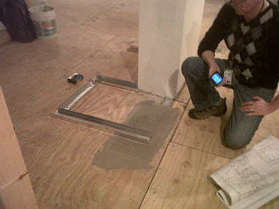
Like the change to this small hall closet that apparantly will be even smaller due to the unexpected size of the column. yikes.  That's the contractor, with a set of my drawings, explaining to the homeowner why this framing is not jiving with my plans...  


I'll take you thru the design plans for the kitchen and the individual bathrooms in future posts. 


All images, drawings and photos are the property of Carol Reed Interior Design Inc. and may not be reproduced.