In Conversation: By Ivan Meade


Photo by:  Mark Burstyn

One of the best surprises I've had recently was when I received a request from Ivan Meade to be interviewed for his In Conversation series, I was incredibly flattered and honoured to say the least.  Ivan is the founder and principal of the multi-disciplinary firm Meade Design Group based in Victoria BC. He's an Interior Designer, a Graphic Designer, has his own personal line of namesake art and accessories and in 2014 launched his first fabric collection. Not only is he one of the most multi-talented creatives I know, he's also a savvy business man who always seems to be at the forefront of the latest technology.  Within an industry that's steeped in old school ways (pencil and tissue, notebooks and sketch pads) his firm is leading the way for the interior design industry when it comes to online branding and communications - from interactive websites, e-books, e-classes, to social media platforms, Meade Design is setting the benchmark for how it should be done.

I remember when I first joined blogger in 2009, Ivan was the very first blog in my blog roll that I followed, when I later joined twitter Ivan was the first twitter account I followed,,,and the same when I joined Instagram, Facebook, and most recently Houzz,,,,, each and every social media platform I eventually joined, Ivan was already there with an established following and setting a perfect example of how to do it well.  In return, Ivan's always so supportive in being one of the firsts to follow back and always takes the time to leave a thoughtful comment, retweet, or 'like' a post.

In addition to keeping his firm's various SM sites up to date, Ivan publishes an online magazine called LifeMstyle, a newer version of his original blog.  LifeMstyle is geared at providing resources and inspriation for both the design industry and the public - a community for design lovers as Ivan puts it. Its here where he publishes his In Conversation series, a collection of interviews he has done with Designers from around the world. I've been a huge fan of this series for years and have enjoyed getting to know so many Designers that I would never have known of otherwise and its been a thrill to learn more about some of the high profile designers who I’ have admired since the beginning of my career - he’s interviewed them all!  These interviews are so good, I truly wish this was a TV series.

I have such great admiration for Ivan’s work, his passion for design and his ambition to create a sense of community among design professionals. I want to take this opportunity to thank Ivan personally for inviting me to participate in this series. I am beyond flattered that he showed interest in my work. Most of all, I think its incredibly generous of him to use his own time and his own website to showcase other Designers in such an insightful way, you can add 'a very gifted writer' to his list of talents.


E-Book, In Conversation Vol.1 is a collection of some of Ivan's favourite interviews

If you havn’t already, I high recommend you visit LifeMStyle and check out this amazing series of interviews that Ivan has written over the years, now including his very latest In Conversation interview with me (honestly reading it made me blush)!  The article has reminded me its really time for me to get a new portrait and I need to redeem myself as an avid blogger. ; )   On his website you'll also find an impressive compilation of some his favourite interviews which have recently been formatted into an E-book (see above), the quality of this book is absolutely stunning.

Thank you again Ivan, I can't wait to meet you in person one day soon!


Images:   www.meadedesigngroup.com


The Australia Project - The Evolution of a Space Plan

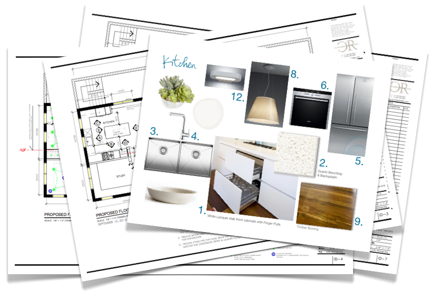
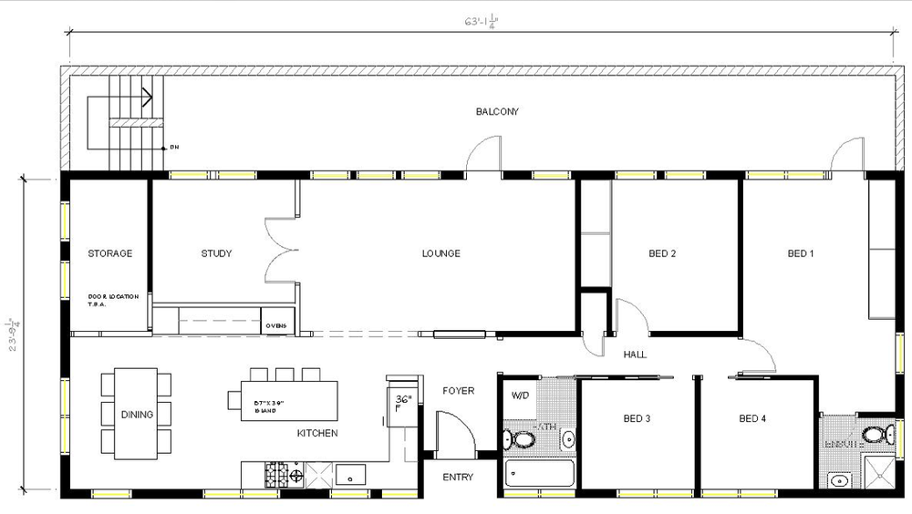
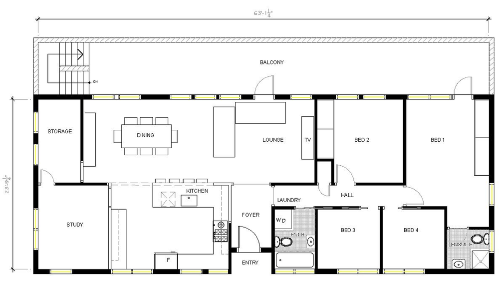
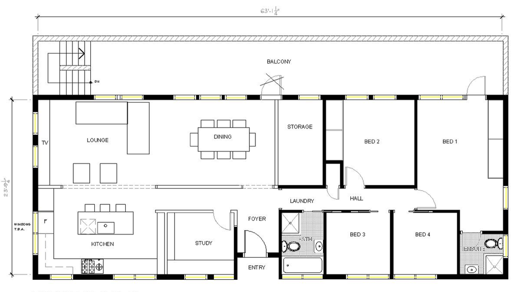
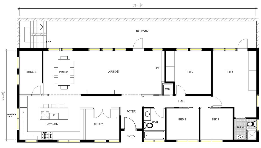
Design Plans and Kitchen Concept for the Australia Project, by Carol Reed Interior Design

While its not out of the ordinary

for me to travel a few hours drive to a clients weekend retreat or summer cottage, or even have the opportunity to fly back and forth to work on a project in Manhattan… being asked to design a whole home renovation on the other side of the world is not a request I get every day.  In addition to my full-service projects I've always oferred a selection of limited e-design services for homeowners across North America but I limit this type of consulting to single rooms only.  Last year I made an exception when I took on the whole home re-design of a residence in Australia, as a hybrid full-scope/e-design.

One of the homeowners whom I knew from Toronto is an expat now living in North South Wales, Australia.  She’s a newlywed (married an Aussie!) they're first time homeowners of an older style bungalow in need of a modern overhaul. They both travel a great deal for work so embarking on a home renovation would require the ability to do much of the consulting virtually - and this is where I came.  We knew each other when she lived in Toronto and she has been in some homes that I had designed, there was the comfort level of working with someone from home, and knowing I had experience in long distance projects.  They reached out and a couple of skype meetings later we began the process of re-designing their forever home.

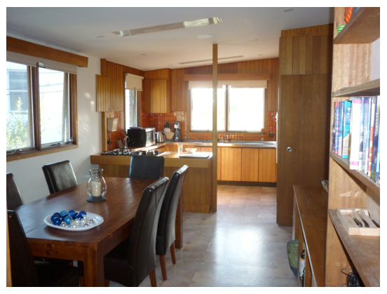
Kitchen and Dining Before.

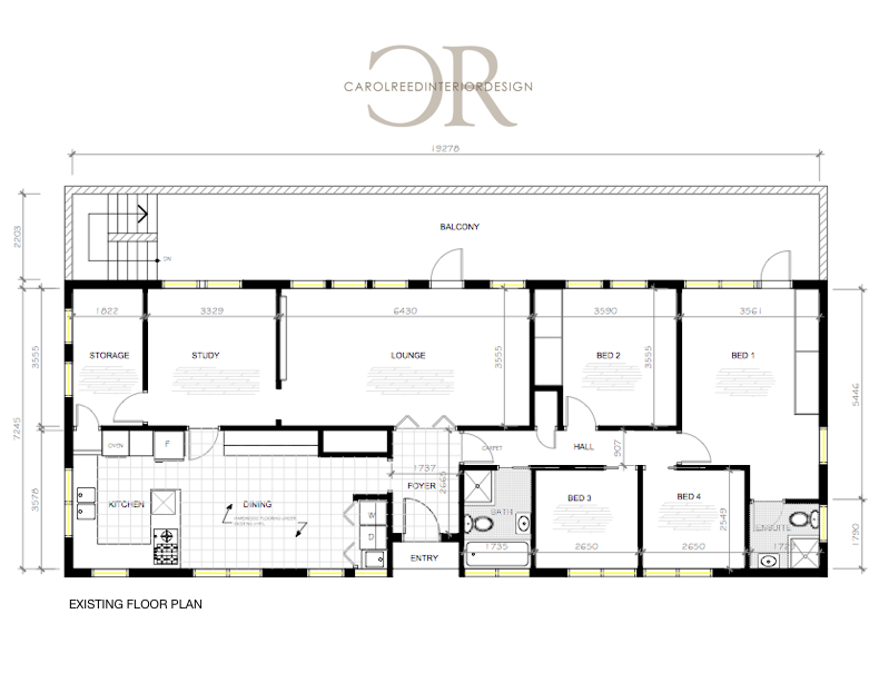
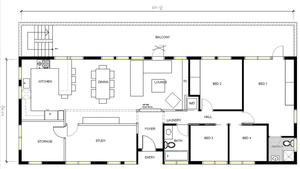
Before we could delve into new finish materials, design details or furniture, we had to start with reworking the floor plan.  Here’s a look at the floor plan I started with. Its single storey, with no basement, and an attached garage (to the left side of the house), the back of the house and balcony overlook a beautiful green conservation area.  The windows across the front and sides of the house are partial height, the windows across the back extend to the floor.  Lengthways from one end of the house to the other, the ceiling slopes up to a centre peak.

The house was very divided with lots of interior doors and there is no basement or attic space.  The main objective was to update all the fixtures and finishes as well as create a more open concept  living, dining, cooking space. A dedicated storage room had to remain as well as a home office large enough to accommodate two workspaces.  Lastly a new master suite was on the must have list.  As for finishes, they wanted sleek, modern, all white, and natural wood floors with the addition of colourful artwork and accessories.  

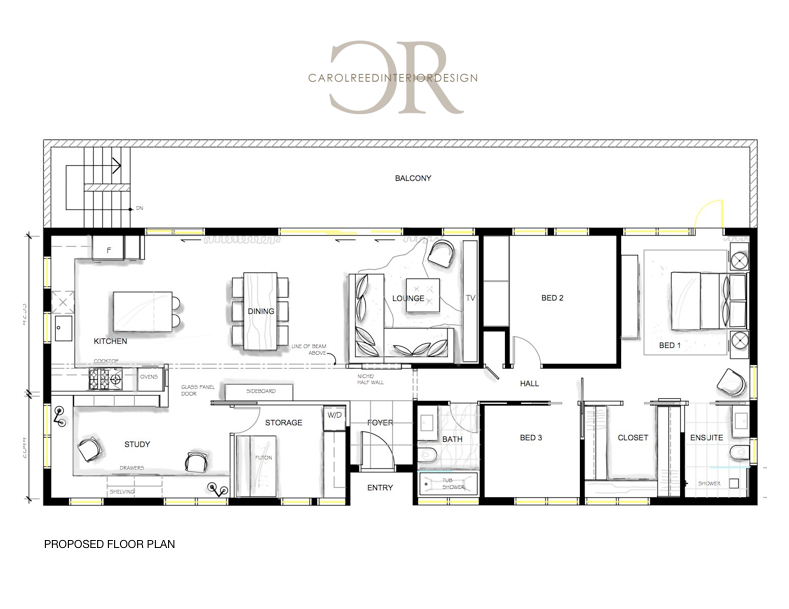
When I first reviewed the plan and the exterior photos, my instinct was to move the kitchen and dining areas to the back part of the house so they could enjoy the view and direct indoor/outdoor access.  Below is a look at the final layout we arrived at….

The new plan provides them with a long open concept great room, with slope cathedral ceiling and views overlooking the conservation area.  New retractable doors will allow them to have an expansive opening to the exterior and new sliding doors directly off the kitchen so they can access the bar-b.   The den has ample room for both of them, an oversize sliding glass pocket door allows them to close it off when they have company.   The laundry is combined with the storage room and will have a futon for overflow guests who need a place to crash (beyond the two spare bedrooms).   The main hall bath gains a vanity with storage and a tub shower combo, the master ensuite gets a sleek walkin shower with trough drain and floating vanity and the 4th bedroom was converted into a maser walk-in closet.

I know from experience often the first reaction people have when they see floor plan is to critique it, and often wonder "why is that so big, or why is that so small" or think "what if we move this here and that there?".  I think that's natural and expected, especially if you weren't part of the planning process in getting from a to b.  Its the reason I don't ever present a client with just one layout - because even if they love it, they'll wonder if they are overlooking any other possibilities. There are some Designers who believe its best to present one solution only, but this method never served well for me despite how confident I might be with any given plan, I believe clients have expectations of being offered choices.  I like to present only the best options and let them be involved in making choices from there.  There is never just one way to slice up a space and the possibilities can vary greatly in budget and personal preference.  Below is a glimpse of where I started reviewing layouts with them and where we ended up at the final new layout. 

_ _ _

The first concepts were based on their idea of moving the laundry out of the kitchen and into the main hall bathroom (stacked units) in lieu of the existing shower stall.  Besides the obvious disadvantages to this placement, it had some benefits worth considering.  (At this point we weren't exploring the master bedroom changes until the living areas were determined.)

This concept was the least amount of change, but still offered lots of improvement with a new centre island kitchen opened up to the living room.  Initially this was the extent of the renovation they had envisioned before contacting me - a new kitchen with a bigger opening to the living room.

Some more walls came down in this layout to further open up the kitchen, dining and living rooms and get more exposure to exterior views and light.

Next even more walls came down.  Sections of the centre wall needed to remain as its the main supporting wall.  Although not noted in this sketch the laundry would again be in the bathroom. What was lacking at this point was a larger home office (Study) and the laundry situation was still being debated.

The next three concepts explored the idea of placing a stacked washer dryer to replace the hallway linen closet, allowing us to add a larger vanity with storage into the main hall bathroom with the tub/shower combo. 

This one was getting there but the main concern was still the Study was too small, and ideally I wanted to explore the idea of putting the kitchen along the back of the house instead of the storage room….

This was getting really close to where we finally ended up but the need for a larger laundry area was being realized. 

And this was the

almost

final layout.  The laundry was combined with the storage room, and also a futon for the occasional overflow of guests. When we began the space planning the intent was that all the windows and exterior doors in the house were being replaced and the exterior re-clad in a new finish.  We intended to work with all the existing window locations as is but the homeowners were also investigating if they could increase the amount of windows across the back living room wall.  But because of the bush fire hazards in their area, their local by-laws (and property insurance) restricted them from changing their window configurations/sizes at all.  Which meant this kitchen plan, requiring modifying a window to work with the fridge,,,was out.    

So one more round of tweaks led to this final layout below (also shown earlier in the post)…...  

 The final kitchen layout ended up being a U shape with centre island.  After the engineer's review, we had to also incorporate a supporting stud wall immediately to the left of the sliding doors beside the fridge so this area got squeezed a bit smaller.  This new plan gives them one large living and entertaining space with cathedral ceiling, direct access to the balcony and wonderful views.  The double office has lots of natural light, and its wide entrance flows off the main room, and their bathrooms and closet space were upsized and enhanced. 

So I hope you enjoyed this peek into the space planning process and how we arrive at any particular final floor plan with a client.  Taking the client thru this process assures them they have made the best possible decisions and they move forward with confidence, even if the scope of the renovation doubled (!).   Following this space planning we developed the details for the kitchen and baths and selected all the new interior finish materials and fixtures compiled into a set of working drawings (which involved working in metric and learning some new jargon!).  I''ll share more of the design concepts in another post.

 G'day ; )

All drawings and images by:  Carol Reed Interior Design Inc.

Alterations: Seaport Holiday Shopping


Gingerbread display in shop window, Lunenburg, NS

Clearly you can tell by the date of my last post,  I'm a Designer not a blogger!  Its hard to believe its been 2 months since I've been back with any updates.  "Alterations" is a fitting theme for this post.  My attempts to write a post always fall to the bottom of my to do list, especially this past year as my personal time has been consumed by our house "alterations".  At this point our alterations don't look nearly as beautiful as this gingerbread house - I love the symmetry and simplicity of this and I'm dying over that bric-brac detail!  On the technical side, I'll be making "Alterations" to the blog and transferring all the content over to a new site in the new year so part of me has been postponing (or procrastinating) any updates until that's done.  I'm desperately in need of a simpler platform for blogging, hopefully the technical changes will allow me to write posts faster and more frequently.  In the meantime, Christmas will come and go before that happens.

I'm always get captivated by the holiday spirit and the natural beauty of the season.  So although I have a back log of projects to post about I'm feeling more in a holiday mode than work mode right now and I can't resist sharing a little holiday spirit while I have the chance....
 

Storefront window boxes adorned with pine boughs and berries.

We're spending the holidays on the East Coast this year and last weekend we went into Lunenburg for a bit of shopping and lunch.  There is no town more charming than the seaport town of Lunenburg (a UNESCO heritage site)  known for its colourful heritage buildings that are tiered up high overlooking the picturesque harbour.  Its not a place that sees many tourists in the winter so I thought I'd share some images of the town all dressed up for the holidays!


The sign taped to the door says, "Merry Christmas we are sold out of scallops".  Not surprising since they are known to be the best scallops in the world.  The back of this building overlooks their fleet docked along the waterfront. Their bright red and white shingled buildings are iconic landmarks of the harbour.


I'm not one for organza bows but I liked the placement of the sprig of berries which gives this wreath a modern vibe.


The Lunenburg Furniture Company. No holiday decor but the red door on its own is pretty festive.


Not only my favorite shop in Lunenburg but one of my favorite buildings too.  This distillery is located in a former blacksmith shop, the late 19th century building is one of the towns most noted landmarks, and has been carefully restored to maintain its original character.  Ironworks Distillery.  (Unfortunately this daytime photo doesn't depict the festive lights in the windows.)


I'll admit this is a favorite place of mine, for the product and the interior.  130 year old timber and beams.  Hand crafted spirits made from local ingredients and distilled on site in a copper still.   The smell of a wood fire…


The still is quite a sight and occupies a prominent corner of the retail shop.  Standing next right to it you can taste sample and purchase some holiday cheer.  Also, their bottles, labels and packaging are so beautifully designed.


With this much colour, you don't need to anything more than greenery and white lights!


The beautiful, Pentper General Shop.  The grey on grey gives this heritage building a contemporary vibe. (sorry for the reflection which obscured the gorgeous pinecone wreath.)  Pentper.
 The shop was closed when I stopped by the other day, this image is from a previous year... a peek at the heritage-meets-modern simplicity inside The Pentper. 


If the buildings aren't brightly coloured, they are high contrast black and white.

Hope you enjoyed this photo tour of some holiday style in Lunenburg!


 All Photos:  Carol Reed