My Top 10 Cottage Make-Over Tips

CarolReedDesign-Cottage-Makeover-Tips.jpg

From the West coast to the East Coast, I think most Canadian’s would agree the ultimate summer past-time is cottaging! That being true, one might say the second favourite past-time is searching for that ultimate summer cottage to call your own, but often the reality of what’s available or affordable can look more daunting than dreamy.   In honour of Canada Day I’ve compiled my top 10 favourite ways to update and transform a dated, dysfunctional drab cottage interior into your dream retreat, without the need to take a sledgehammer to it. Focus on quality materials from affordable sources for high style and function.

1. TAME THE WOOD:

Wood on wood on wood, furnished with more wood,,,is simply too much wood. Everything in wood just looks like a sea of brown (or orange).  If you love wood and want it to be a feature,,,,,then you must paint some of it out, this will in turn will highlight the natural unpainted wood so it can be appreciated for all its beauty, not drowned out.

2. CLEAN SWEEP:

Remove wall to wall vinyls and broadloom and replace with light to medium coloured character grade wood planks or natural stone slate tile (available in every imaginable size). These super affordable but high quality natural materials will be durable, forgiving, easy to clean and age well. When ultra low maintenance, budget, and practicality is the priority check out wood or stone look LVF (luxury vinyl flooring) or porcelain tiles that mimick stone or wood. Layer natural fibre area carpets and flat weave kilims for luxurious comfort and coziness.

3. UN-OBSTRUCT THE VIEWS:

Strip the windows of fussy ruffled fabric or boxy valances and heavy dark coloured blinds. Replace with fully retractable simple rollup blinds, shades or swing open shutters.  There are loads of inexpensive ready-made options that can even be cut to size in-store. My go-to’s are matchstick and bamboo blinds or cotton roman shades, mounted above the windows. Alternately or additionally use cotton or linen drapery panels on a dark metal or wood rod with rings that fully stack back to reveal the outdoors but can easily draw closed for privacy.

4.  COUNTER POINTS:

Many old cottages have plastic laminate, tile or plywood counters that are chipped and stained or dated in colour.  A new solid wood counter will add instant quality and substance. Custom made ones can vary greatly in price point depending on species, joinery and edge details but you can also find ready-made and easy to install solid wood countertop material at Ikea and most building supply stores. Perfectly suitable and charming for kitchens and bathrooms. Alternately a pre-formed laminate counter-top from the building centre, in white is a super inexpensive way to instantly freshen and brighten those surfaces.

5.  SINKS:

A simple sink swap out can add more function and style, replacing a small kitchen sink with a larger size will make clean up a breeze (or hide the mess til later), or swapping to a smaller size can net you more precious counter space.  Adding a second sink makes the kitchen doubly functional for two cooks or family gatherings.  In bathrooms, replacing a stained or retro coloured sink with a new vessel or drop in style is an affordable, easy install even onto an existing counter - no custom fabrication required!

6.  FAUCETS & HARDWARE:  

A new faucet and cabinet knobs are an instant style update to kitchens and bathrooms and interior doors.  Look for styles that will enhance your cottage character and evoke vintage, shaker, or rustic charm, in dark or aged metal finishes. Large gooseneck spouts, industrial pulldown sprays, classic bridge style or convenient single levers with high arc spouts. Splurge on fixtures made with solid brass cartridges and you won’t be replacing these anytime soon. 

7. APPLIANCES:

Replacing older mis-matched appliances is not only an aesthetic upgrade but the newer models are more multi-functional, energy efficient and space saving.

8. LIGHT IT UP:

Replace generic looking lighting with simple vintage or rustic style fixtures to enhance your cottage character and create a cohesive style.   Evoke rustic or coastal charm by selecting fixtures with aged or painted metals. (Black metal or oil rubbed bronze are my favourite!). You can add wall sconces, pendants and swing arm task lights without hiring an electrician - just use plug-in style fixtures that can be mounted to walls or suspended from ceilings wherever you need more light (which will be mostly everywhere!) and create ambience, all you need is an outlet nearby. Book shelfs, step lights, wall art, under kitchen cabinets,,,with LED lighting there is almost no where you can’t install lighting, even wirelessly.

9. SHELF IT:

Shelves are the easiest and most affordable solution for adding storage without the cost of built-ins. Install wall mounted shelving and brackets or ready to assemble shelves to not only organize but add purpose and function to any under utilized or cluttered area. Wanna amp up the style factor, use reclaimed wood, vintage metal brackets or wood corbels to create shelving that’s also a one-of-a-kind statement piece.

10. PAINT IT:

If you want a relaxing, calming, serene space that lets the outdoors be the main attraction,,,then paint over any loud, bold, intense hues on the walls in a light neutral palette that will compliment your view of the great outdoors and not detract from it. In small cottages, keep the walls and trim tone on tone for low contrast. Transform cabinetry with paint - an accent colour will highlight good quality wood kitchen and bathroom cabinets and make an instant style statement, or, simply neutralize lesser quality or unattractive cabinetry by painting them out.

11. PANEL IT:

I couldn’t stop at 10 without including my final and favourite way to add instant character and durability to walls and or ceilings - add panel moulding, v-groove, shiplap or beadboard panelling to walls, ceiling, islands, or backs of cabinets.  When painted with an enamel paint its also a great inexpensive alternative to tiling around bathroom or kitchen sinks and provides a sturdy backing for installing hooks and shelves (see tip no.9!). 

To see how I applied all of these strategies in this family cottage make-over check out the links below for individual before & afters:

Cottage Master Ensuite

Kitchen Progress

The Guest Bathroom Progress

The Guest Bathroom Before and After

The Boathouse Bathroom Before and After

The Boathouse Before and After

Photos By:  Carol Reed

My Kitchen Reno Progress: The Antique Wood Floor

In the early stages

of my kitchen reno we discovered the original wood floor boards (the same as we uncovered and refinished throughout the front part and 2nd floor of the house) were not going to  be salvageable.  Sadly, after scraping off the current top layer of vinyl we discovered the plywood sheeting that was installed over the original floor boards was screwed down with a million screws all spaced randomly closely together. Each attempt to remove a screw resulted in the heads being stripped or breaking off.  There’s only one way to remove a subfloor like this and its not easy - its backbreaking tedious work requiring a skill saw to partially cut thru the boards and then pry up the wood in bits and pieces while also cutting the screws off. Its a slow process and after all that prying and removing of screws the floor boards underneath would suffer a lot of damage. It would result in a lot more time, a lot more work, a lot more money to end up with not so great boards.   My heart and mind were set on having the same antique wood boards continuous throughout the house but the time and effort needed to uncover and then restore the kitchen boards wasn’t practical and didn’t make sense to pursue. I needed to come up with another solution, and fast, since we had just demolished the old kitchen.

The original floors in the rest of the house after being stripped of paint, ready for finishing.

I knew without a doubt I wanted wood floors in the kitchen as the house did originally. Trying to find new wood to install right next to the antique floors in the rest of the house wasn’t appealing to me, at all. Distressing new wood to make it look like old, also wasn’t appealing to me (besides the last thing I needed is another project). The entire point of the kitchen floor is I had never given it a second thought, there was no over thinking or contemplating choices,,,they would just be wood as you would expect them to be in a house of this age.  Nothing imported, nothing decorative, in other words not over designed,  I would just be peeling back the layers to restore some original character - or so I thought.  Turns out I needed to another layer not peel away.  : /  Fortunately in Nova Scotia there are a lot of re-sellers of antique wood flooring as well as suppliers for salvaged architectural wood products.  One of my concerns was that we didn’t know what species our original floors are and it’s important to me they be the same.   Up until this point no one had been able to identify the species, hemlock?, pine?, ash? all we knew is it was local.

After a bit of research I found a supplier who demolishes dilapitated historical houses, piece by piece, salvaging and re-selling the components. A few of the houses recently dismantled looked to be of the same age, size and character of our house. I sent off some pictures of our floor boards and they easily identified them for me as red spruce from approx 1875.  Lucky for me they had several batches of salvaged boards that matched, this would be my perfect solution.  Unfortunately for me it was early February and we would need to wait a month or two before we could search thru their inventory which wasn't accessible until the snow melted.

The antique boards I selected.

On Easter weekend we finally made the trip to pick up the wood.  I was thrilled to find a batch of smooth, previously walked-on, unpainted flooring boards, which meant they would be fairly easy to refinish as they wouldn't need to be planed or grinded down.  And, the fact the boards came out of a house on the South Shore was also perfectly fitting.   What wasn't perfectly fitting was that the boards were so long (some were over 16' long) we had to cut them down to less than 11' in order to fit in the trailer, this meant we wouldn't be able to do single continuous boards across the width of the kitchen, like the rest of the house, but it was a small compromise I was happy to work with.  On the spot I calculated the best lengths to cut so the seams would be under the cabinets or in inconspicuous places, and counted off the quantity of boards we needed as they were loaded up - using a piece of bark for a make-shift note pad.

Since the boards are all planks and not tongue and groove, they were face nailed in place, they're also random width, rarely two boards the same size.  I did a dry layout in key areas to make sure the best boards were used in the most visible open areas and placed the cut boards so the joints were staggered and as discreet as possible.  The task of trying to align two cut pieces so the widths and colouration matched was a challenge, in hindsight we should have marked each piece of a cut board at the time it was cut so we could pair them up easily.  Once the 'art directing' of the layout was done,,,I took a jet plane out of there while all the dusty and noisy work happened, first sanding and then nailing - 6" nails, each one pounded in by hand.  It was a long and noisy installation.

Newly laid old boards, sanded and ready for finish coat.

I returned a week or so later to find the floor completely laid and ready for its finish coat, it was wonderfully smooth and felt amazing underfoot.  I was happy to see that so much of the patina remained after the sanding, they had a subtle greyness to them and beautiful blackened crevices.

The newly laid antique kitchen flooring viewed from the back sun room (family room).

Where the kitchen and the addition on the back of the house meet there was already a 3/4" transition in flooring height and now with the new installation of the kitchen floor that transition got even larger but we made the best of it by sloping a threshold between the two rooms.  

The newly top coated floor and a peek of the other finishes going in the room. 

Next up I'll post about the cabinets and the other details in the room.  Here's a little sneak peek of some of the finishes with the floor.  The cabinets are painted in a colour  inspired by vintage crockery….

Check out the previous post for the first look at the kitchen reno, the before and after floor plans.

All photos:   Carol Reed

My East Coast House: Kitchen Before & After Plans

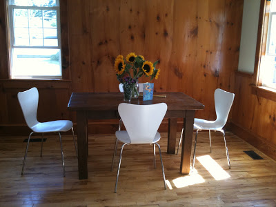
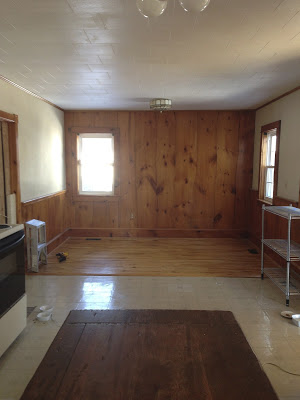
Before - the dining area of the old kitchen

The Kitchen in my new old house

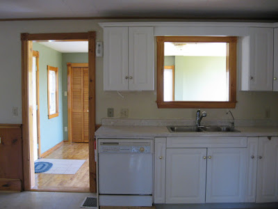
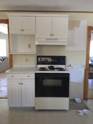
on the East Coast is the second last room in the house to be renovated, today its near completion except for a ceiling light fixture and some furniture for the eating area. Renovating this kitchen was a long and painful process that has taken more than a year to complete thus far. This is what the kitchen looked like when we bought the house and how it remained until the ktichen reno started last year. (Dining area seen above, kitchen area below)

The kitchen was ugly to say the least. It came with no appliances other than an old electric stove. The exhaust hood was not vented nor recirculating (thus useless), the dishwasher didn’t work, the water was not drinkable and the sink leaked out the bottom of the cabinet when the faucet was turned on. The plastic coating on the cabinets was peeling off in large sections held in place in some spots with shipping tape. The floor was covered in peel and stick vinyl tiles which were broken in places and mis-matched patched in others. The ceiling like the rest of the main floor was acoustical tile, complete with stains. 

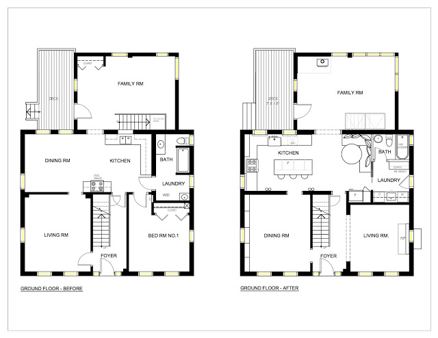
Before & After Floor Plans

When we purchased the house I had re-designed the kitchen as part of an overall master plan that we would implement in 2 phases. The kitchen would be in the second phase about a year after phase 1. Over the course of that year while the second floor and front part of the house were being renovated I continued to re-think the new kitchen. The biggest challenge is the space itself, I really hated the old placement of it in the centre of the house.  Like most old houses the kitchen had so many doorways it was like being in a hallway.  One thing I knew for certain is I wanted to flip the kitchen to the other side of the room so it would be on an exterior wall with windows.  

My first kitchen design plan involved moving windows and adding double french doors to the deck and incorporating a wood stove. More than a year later, far behind schedule and already over budget before phase 2 started,,,,,the priority became to re-work the kitchen without changing any of the window locations or putting in new patio doors. There were a lot of unexpected but necessary ‘blow-outs” in phase one so minimizing the work and costs for phase two was critical but I was ok with that because i felt ‘the simpler the better’ approach suited my vision for the kitchen anyway.   A week before the new wood stove was to be delivered I decided to have it installed in the back sun room (family room) which would make that room useable all year and still provide heat for the kitchen.  Without the wood stove in the kitchen I was left with ample room for a seating area which currently is planned as a built-in banquette. 

Looking at the rest of the ground floor, the other change I made was creating separate dining and living rooms.  I intentionally wanted to keep individual rooms, having lived in an open concept space once before I definitely prefer not having my living or dining room open to the kitchen, however, I do love an eat-in kitchen and open concept family rooms.  I intentionally didn't build any cabinetry on the wall between the kitchen and dining room so that it could easily be opened up should any future owner want an open concept.  As it is the separate dining room maintains the flexibility of becoming an office, or a bedroom if not used for dining.  Figuring out what to do with the existing laundry and bathroom was key in determining my new kitchen layout.  In the end moving the laundry or bathroom was not an option for many reasons besides budget, so those rooms will stay where they are and will be the next room(s) to be renovated after the kitchen.

The old combined laundry and bathroom will be divided into separate rooms, the laundry room will get a new exterior glass door to what will be a patio on the sunny west lawn of the house with views over a meadow to the beach beyond.  The washer and dryer will be under counter and behind a fabric skirt, with a sink and wall cabinets this area will also function as a servery/pantry which will be convenient between the kitchen and patio area (future screened in porch).  Being able to come directly into the laundry and bathroom from the yard is also a great bonus feature when you have more than an acre of lawn to mow each week - tick control means stripping down and showering after yard work.  : /

The family room at the back is a single story addition to the original house, its concrete foundation has no insulation and even with ducted heating in the space it was an extremely cold room, unbearable in winter.  The new wood stove keeps it toasty warm and was the best addition ever because this is not only the biggest room in the house but it also has the best views and the most sunlight - now its useable all year long.  

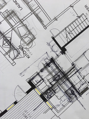
Despite the numerous kitchen layouts I came up with none of them were ideally what I wanted and it became a very frustrating cycle of trying to decide which layout I hated the least rather than loved the most. Very. frustrating.  I have piles of scrapped plans like this one.

I'm happy with the plan I decided on and know that a new layout wasn't worth making drastic or extensive changes for.  I struggled with the fridge placement the most, debating over putting it to the right of the dishwasher but I just didn't want the large bulkiness of a fridge blocking the openness of the kitchen directly as you entered it.  The back door is the main in/out entrance where everyone enters the house (no one uses the front door here).  The compromise was to put the fridge away from the cooking/prep area but add under counter fridge drawers to the island.  

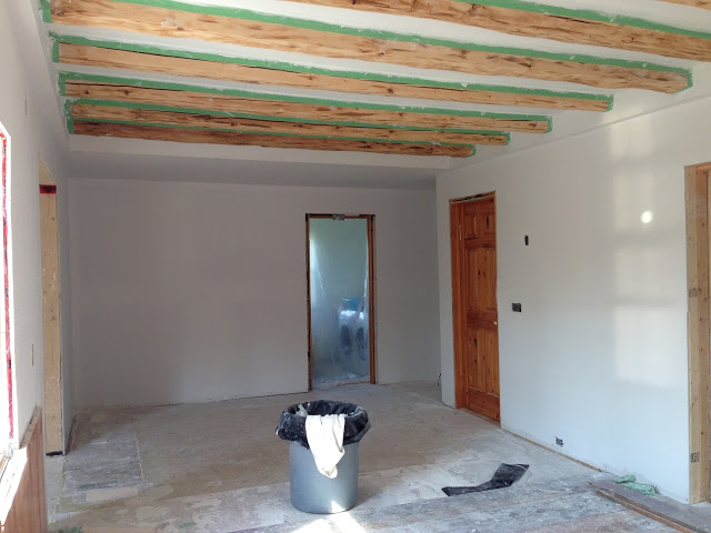
With those agonizing decisions over with we moved forward in clearing out the old kitchen and putting in all new finishes.  The ceiling, like the dining and living room had the original wood beams which we  uncovered from under layers of tile and plaster.  The floor is another story which I'll post about next…...

Kitchen reno progress.

The kitchen really is the heart of the home,  I have to say that renovating this one has given me a new perspective on renovating and the reality of what is truly necessary, what matters and what doesn't matter, what brings you joy in its day to day use.  A make-shift kitchen with no running water and no large appliances for months on end while endlessly waiting for trades to show up (like waiting 3 months for the electrician and 6 weeks for a plumber) was enough to make me never want to renovate again, ever. At least this house. ; ) But it also was truly revealing in many ways.  For the most part, when we were here we ate as well as we did with a full functioning kitchen, and even had lots of house guests and visitors - I just had to shop very selectively and plan meals more creatively.  Having survived all of that, I'll confess I'm finding the new kitchen to have an excessive amount of space compared to what I'd become use to, but for now that's one problem I'll happily enjoy living with.

For more post on my East Coast house Reno progress:

Dining Room Before & After

Staircase Before & After

Framing Pressed Leaves

All Photos & Drawings by:   Carol Reed