Comforts of Home: With A Good Book and on-line Shopping

One of the most relaxing and comforting places in the world to me is at home in my own bed.  I find it a pure luxury to spend a chilly Saturday or Sunday lounging the morning away in bed with a good coffee, my laptop or a great design book with a purring cat curled up at my feet.   Our home is in a rural coastal area on acreage and we can walk our own property and the beach behind us any day of the year without ever seeing another person, so isolation is naturally part of our everyday life and part of the beauty of living in a rural setting.  I’m also an introvert by nature so staying away from large crowds or social gatherings is not a challenge for me since I normally avoid those situations regularly. So while self-isolation is not something that would be a hardship for us personally, at this time I sympathize with all those who are confined to small spaces, separated from family, cut off from support services or have no choice but to interact with the public in carrying on with work.  Without a doubt the current events and fears of contagious disease will surely make us all cherish how much our homes and relationships nurture and support us. 

Room Design and photo by: Carol Reed Interior Design Inc.

Room Design and photo by: Carol Reed Interior Design Inc.

This weekend at home I’m continuing to devour Tom Scheerer’s newest book, More Decorating, which features several of his own homes.  From cover to cover its full of timelessly beautiful spaces that have such a relaxed ease to them but are so masterfully done that they exude a sophisticated, confident taste and effortless style all at the same time.  I’m inherently drawn to his aesthetic which is never pretentious looking perhaps because he’s never afraid to mix high and low or incorporate utilitarian items, found objects or kitchy keepsakes with artful prominence.  I’m sure i wouldn’t be the only one who could happily isolate for days or weeks on end in any one of these spaces - and that’s what home should feel like.

Photo of a page in Tom Scheerer’s Book, More Decorating. Room Design by: Tom Sheerer.

Photo of a page in Tom Scheerer’s Book, More Decorating. Room Design by: Tom Sheerer.

All of this time spent lounging in bed this morning reminds me that I still need to decide on a couple of light fixtures for our bedroom which have been on my to-do list for about 7 years. The room as it is, is so inviting and serene to me (especially when the windows are open to the ocean breezes and sound of the surf) that the bare bulb and cover plates haven’t bothered me enough to make it a priority. It truly is like the 'cobbler’s kid’s around here,,,there are more bare bulbs than I can to confess (!) I rarely have time to spend on my own home projects. So looking up, I”m setting my sights on finishing this and some other things on my home organizing and decor to-do list - next up, some on-line shopping!

Room Design and photo by: Carol Reed Interior Design Inc.

Room Design and photo by: Carol Reed Interior Design Inc.

Its a great time for everyone to appreciate and enjoy the comforts of home (or tackle some small project around the house that will feel so good to get done) and if you can, get out and explore some wide open spaces, fresh air, and the ever inspiring beauty of nature. We’re heading out for a long beach walk and to soak up some of this glorious sunshine!

Displaying Collections: Blue & White Plates

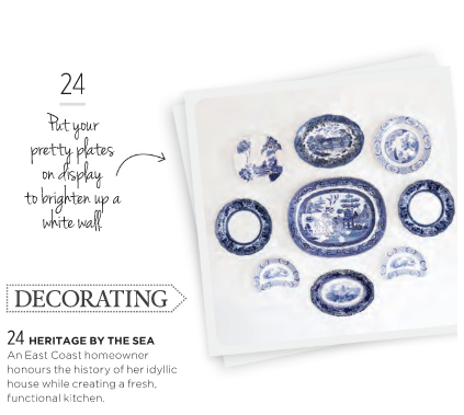
This past fall our Dutch Colonial Kitchen renovation project was featured in the October Style at Home magazine (photographed for the magazine a year earlier.) One of the more decorative features of the space that I haven’t shared was a collection of vintage blue and white plates displayed on the wall. The collage was created using a variety of pieces that both the homeowner and myself had found at various antique shops and auctions around Nova Scotia including the South Shore, Shelburne and Yarmouth.

Photography by Janet Kimber, for Style at Home Magazine.

Photography by Janet Kimber, for Style at Home Magazine.

We installed them on an expanse of wall that spanned between two doorways, directly opposite the kitchen island and they create a beautiful backdrop to the deep navy and white kitchen scheme. The plates are complimented by the historic mouldings and original wood beam ceiling of this heritage home which were restored during the kitchen reno.

CarolReedDesign-DutchColonialKitchen-BlueandWhitePlates-2.jpg
As seen in Style at Home Magazine, October 2019.

As seen in Style at Home Magazine, October 2019.

I’ll upload a digital copy of the full feature in the coming weeks, but you can link to the magazines website feature of the story here, which showcases some of the images from the issue.

View the feature on the Style at Home Website, titled “Heritage by The Sea”, here.

See previous post on this project here.


Town Home Transformation: Before & After Plans

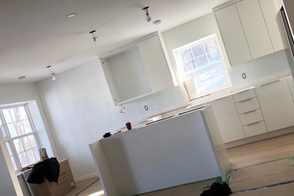
Town Home Tranformation - Kitchen In progress

Town Home Tranformation - Kitchen In progress

THE BEFORE PLAN

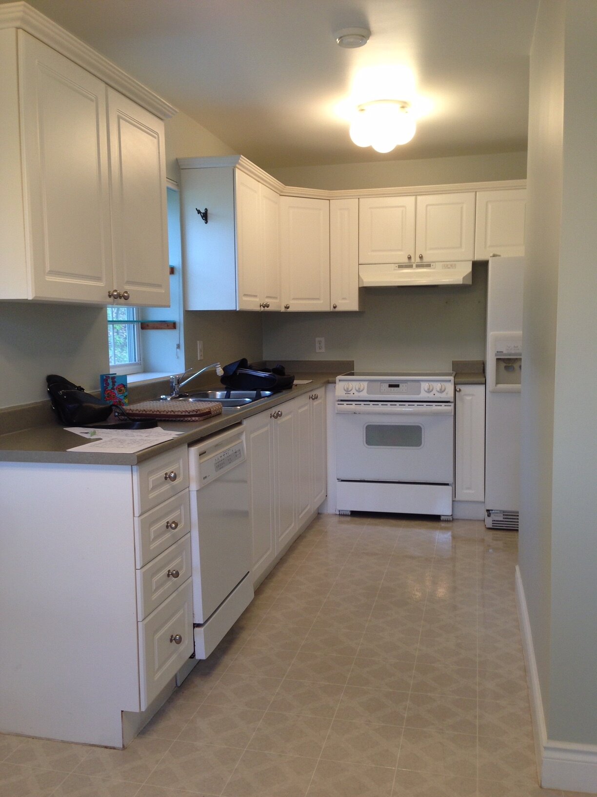
The original floor plan of this single level town home didn’t have the open concept layout my empty nester clients were used to or desired, it also had some functional layout issues like the awkward spacing of the kitchen appliances and the ensuite/closet doors.

With a little bit of demo, some thoughtful tweaks to the plan, and all new finishes we set out to give this home a complete transformation that was all about editing and paring down to create a modern, minimal, white back drop to a collection of artwork, books and the owners favourite classic modern furniture pieces.

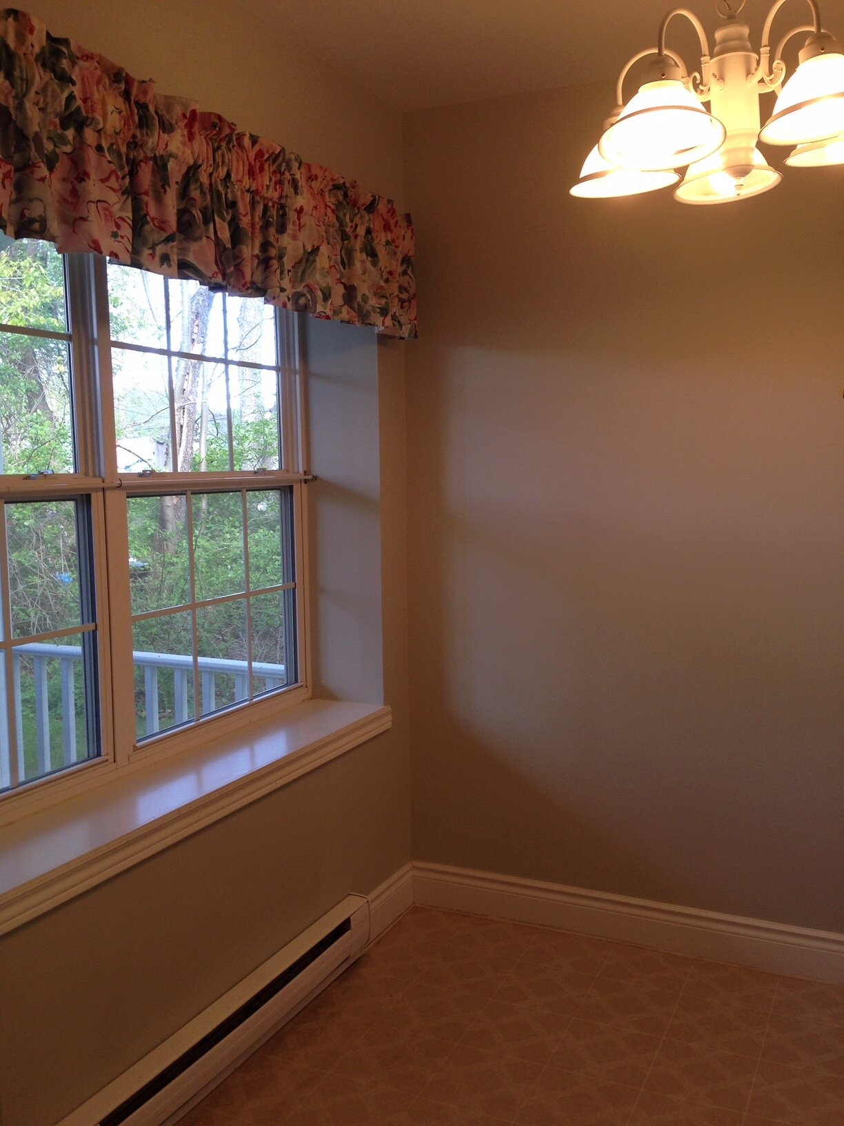
The kitchen window nook area (left) and kitchen (the back of the front hall closet is seen on the right). Cosmetic updates were planned for the entire condo; vinyl sheet flooring, wall to wall broadloom, dark wall paint, chintz window treatments, colonial light fixtures and colonial doors and trim work would all be replaced.

AFTER FLOOR PLAN - Design by: Carol Reed Interior Design Inc.

AFTER FLOOR PLAN - Design by: Carol Reed Interior Design Inc.

THE AFTER PLAN

New Layout: We removed the walls separating the dining and living area from each other and the hallway and removed the closet separating the kitchen from the hallway - resulting in an open concept Living, Dining and Kitchen space. A kitchen island was added and a desk floating from wall to wall in front of the large window. Counter seating at the island and an extendable table in the dining room would meet their needs for day to day and entertaining. A wall of builtin bookshelves would house their book and album collections and the long wall provides a large expanse of wall space for the homeowners art collection.

Tweeks: The bathrooms will receive cosmetic updates only, new floor tiles, floating vanities, large mirrors and more lighting. I’m not a fan of ensuites that are accessed through a closet particularly when the closet storage is not behind doors as was the case here. We removed the closet door, added flanking custom built-in his and her’s wardrobe units with a combination of drawers and hang rods, all neatly concealed behind cabinet doors. This greatly improved both the passage into the ensuite and the amount of storage.

The ensuite door which was awkwardly blocking off the toilet nook was changed to a pocket door to improve the flow. With the toilet no longer blocked off by the door swing the space is visually expanded and freed of the intrusive door swing.

In the Laundry Room new front loading laundry appliances would facilitate a countertop for folding, and wall cabinets above would add concealed storage and a hang rod. To make up for the lost front hall closet, the long wall inside the laundry room will be outfitted with hooks, an upper shelf and boot/shoe racks.

Progress at the Townhouse transformation. | www.carolreeddesign.com

Progress at the Townhouse transformation. | www.carolreeddesign.com

Progess - Mahone Bay Townhouse transformation. View from the Living/Dining area into the kitchen.www.carolreeddesign.com

Progess - Mahone Bay Townhouse transformation. View from the Living/Dining area into the kitchen.

www.carolreeddesign.com

MahoneBay- PIN- Before & After Plans.png

I’m looking forward to seeing the finishing details of the construction phase come to completion and the next phase of furnishing and styling get underway.