E-Design Kitchen Floor Plan: Mountain Cabin

One of the best parts about working on E-Design projects is the opportunity to create concepts for homes in a range of different styles and regions across North America from urban to country from coastal to mountain, the varied requirements can be a refreshing change from the typical projects I would otherwise work on locally. This E-Design client reached out to me for help creating a new kitchen floor plan for her mountain cabin located in Northern California. She was preparing to embark on a total overhaul of the dated kitchen and had a big wish list but was struggling to figure out how to configure it all in the existing space.

The cabin is used as a getaway for total relaxation and outdoor recreation with groups of friends and family who would come and stay for the weekend. At the cabin the kitchen is the centre of action all weekend long, cooking and eating, wine tastings, enjoying music and board games late into the night. So the existing kitchen just wasn’t living up to be the functional and inviting hub of the home she wanted it to be.

The wish list for the new kitchen was pretty clear; a big kitchen sink, an island or counter for hanging out, exposure to the fireplace, open concept to the dining and or lounge seating, lots of counter space, open shelving, more storage, chef style appliances, a mix of materials, a furniture like cabinet, upgrade the patio doors and of course, showcase the scenic views.

Here’s a look at some inspiration images she collected on her Pinterest boards.

Carol Reed E-Design Cabin Kitchen Layout Inspo.png

The existing kitchen had two amazing features going for it, a wood burning stove (fp) and exceptional views, a prime feature of the cabin’s locale. The kitchen was situated along two exterior walls with the best panoramas, and had a walk-out to the wrap around deck.

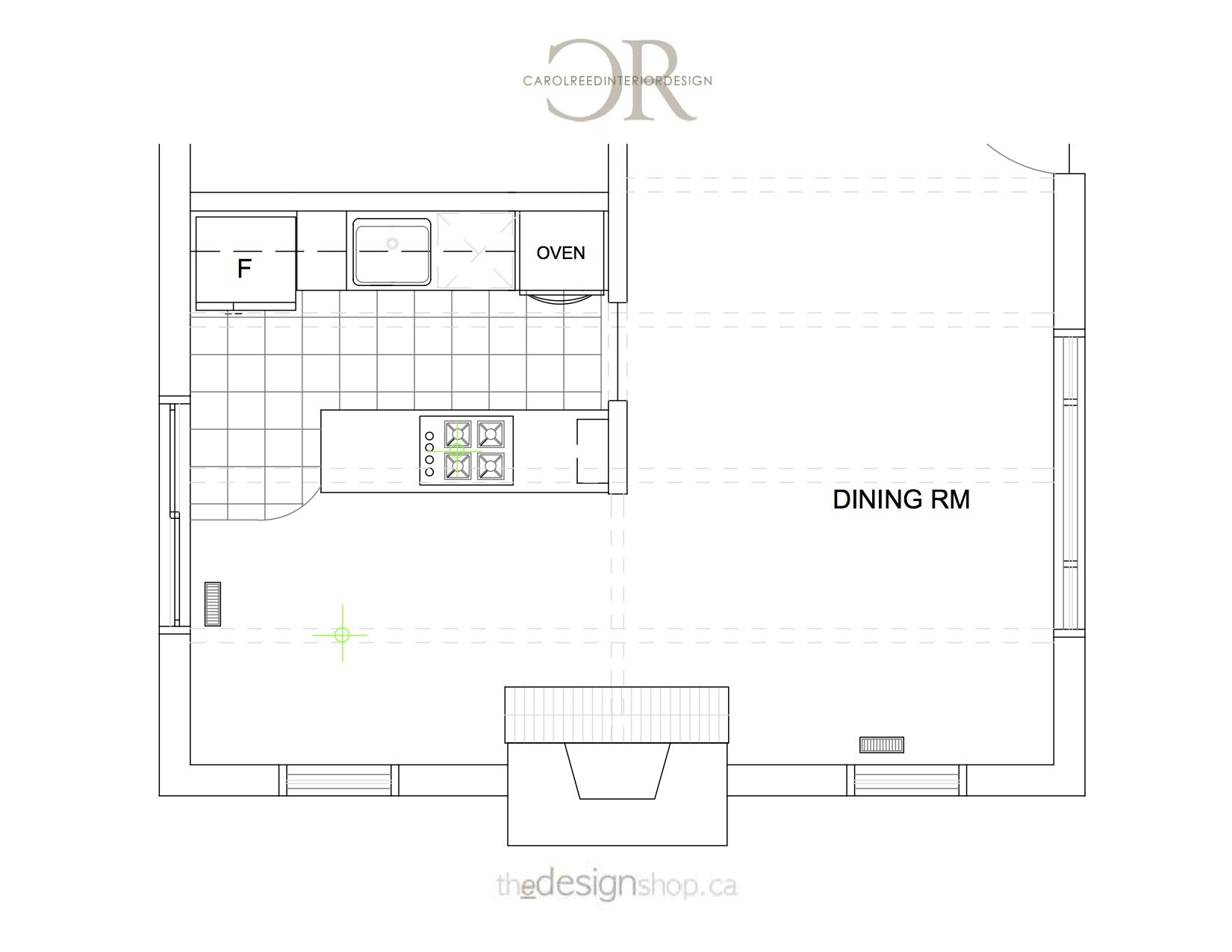
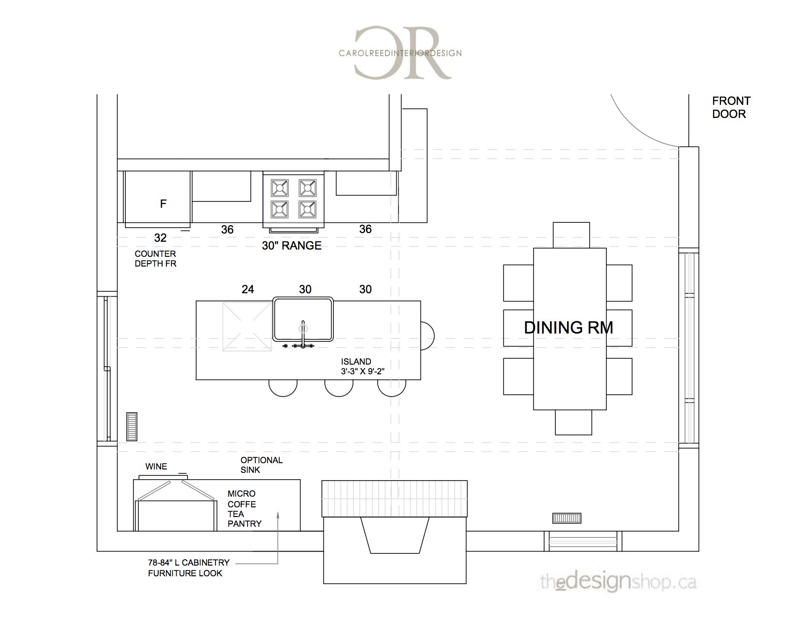
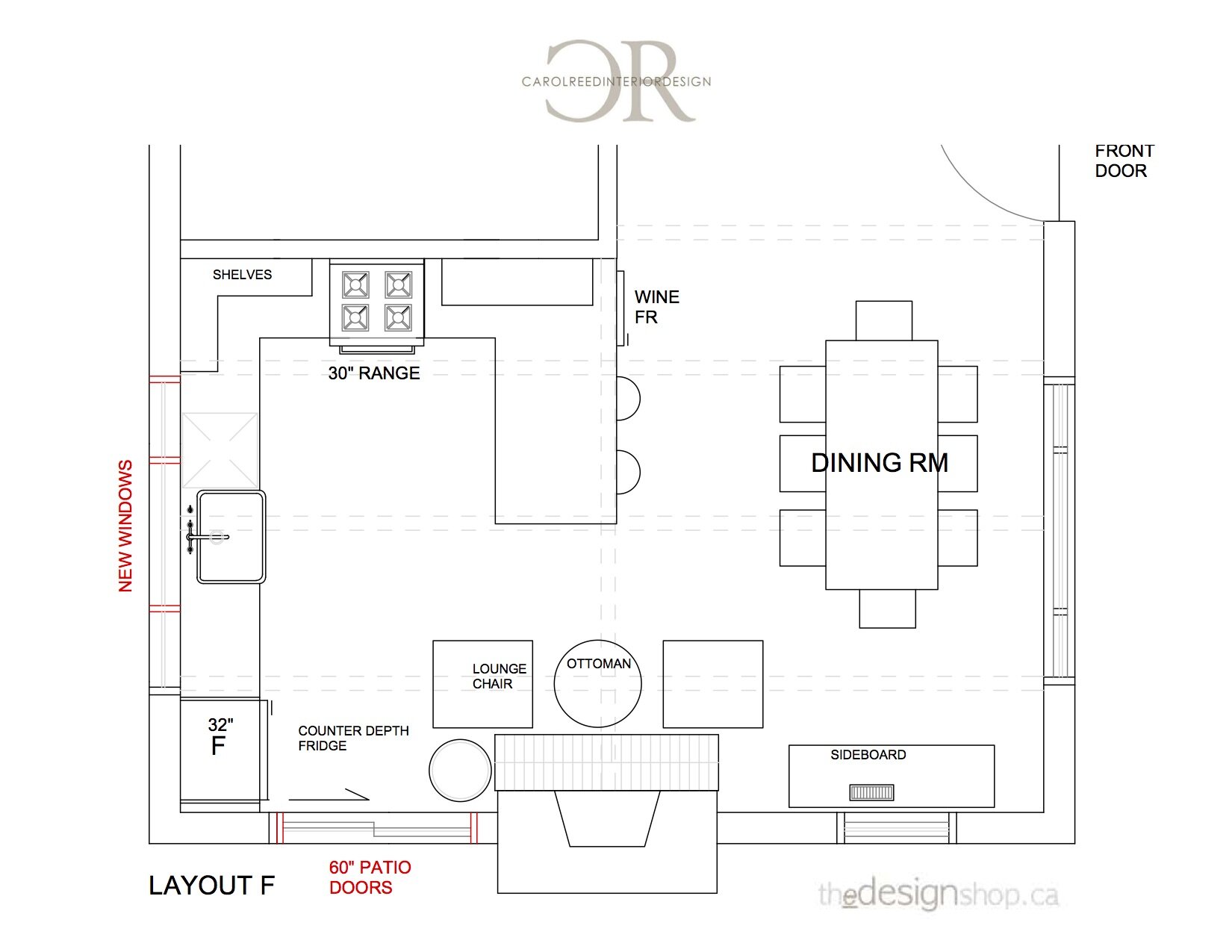
Below is a slide of the Before Floor Plan, and the second slide is a layout that reflects what the homeowner had in mind, which was a basic island layout, or variations of this with different appliances/sink positions.

I always find its most productive to first review/assess the client’s initial idea which makes its clearer for them to see, to scale, what the shortcomings of that concept might be, so as not to waste time getting hung-up on trying to make it work if there’s a better alternative. I didn’t feel this was the best solution for her needs and intended to explore a different direction all together. What I especially didn’t like about this concept was that it eliminated a window,,, but I understand the rationale behind that idea and the need for more wall space.

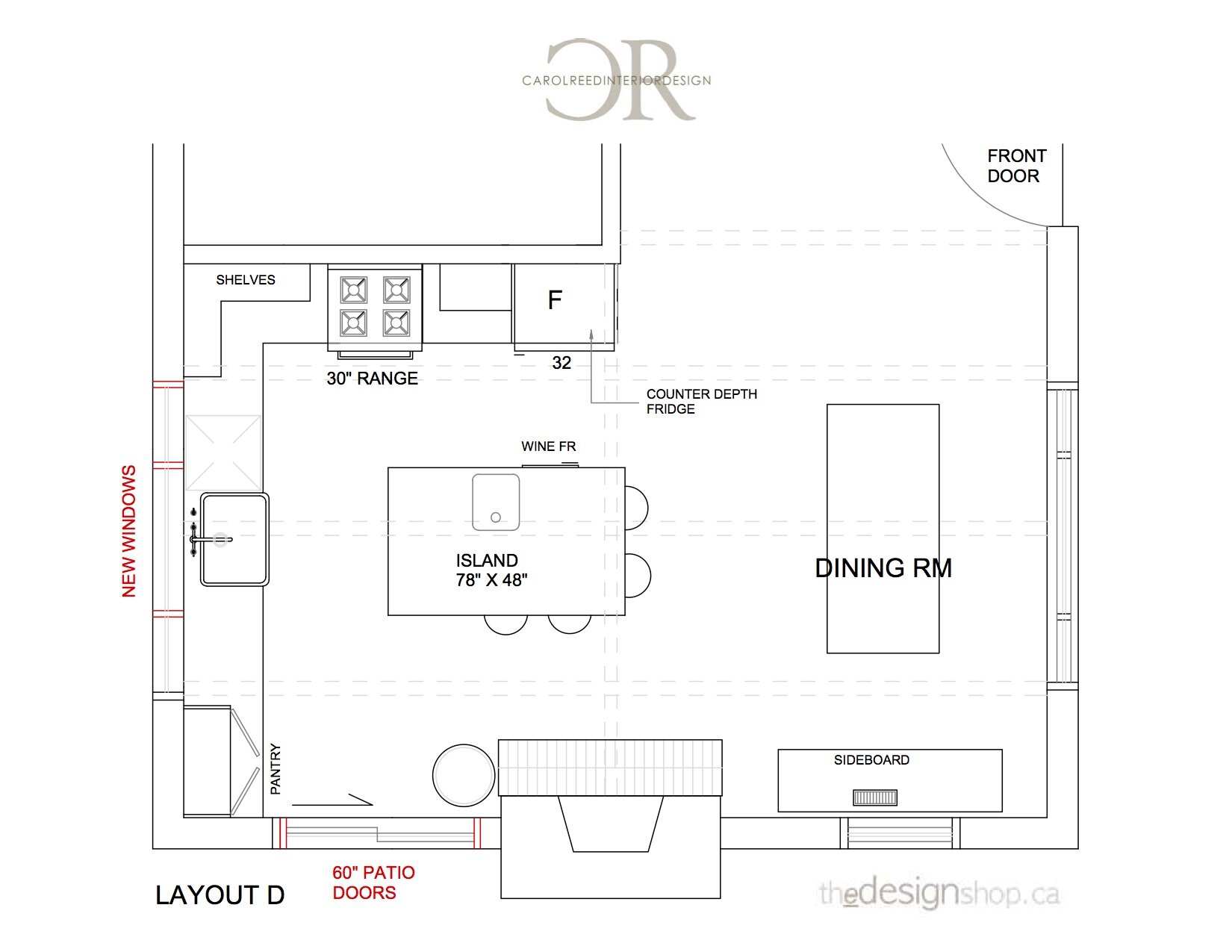
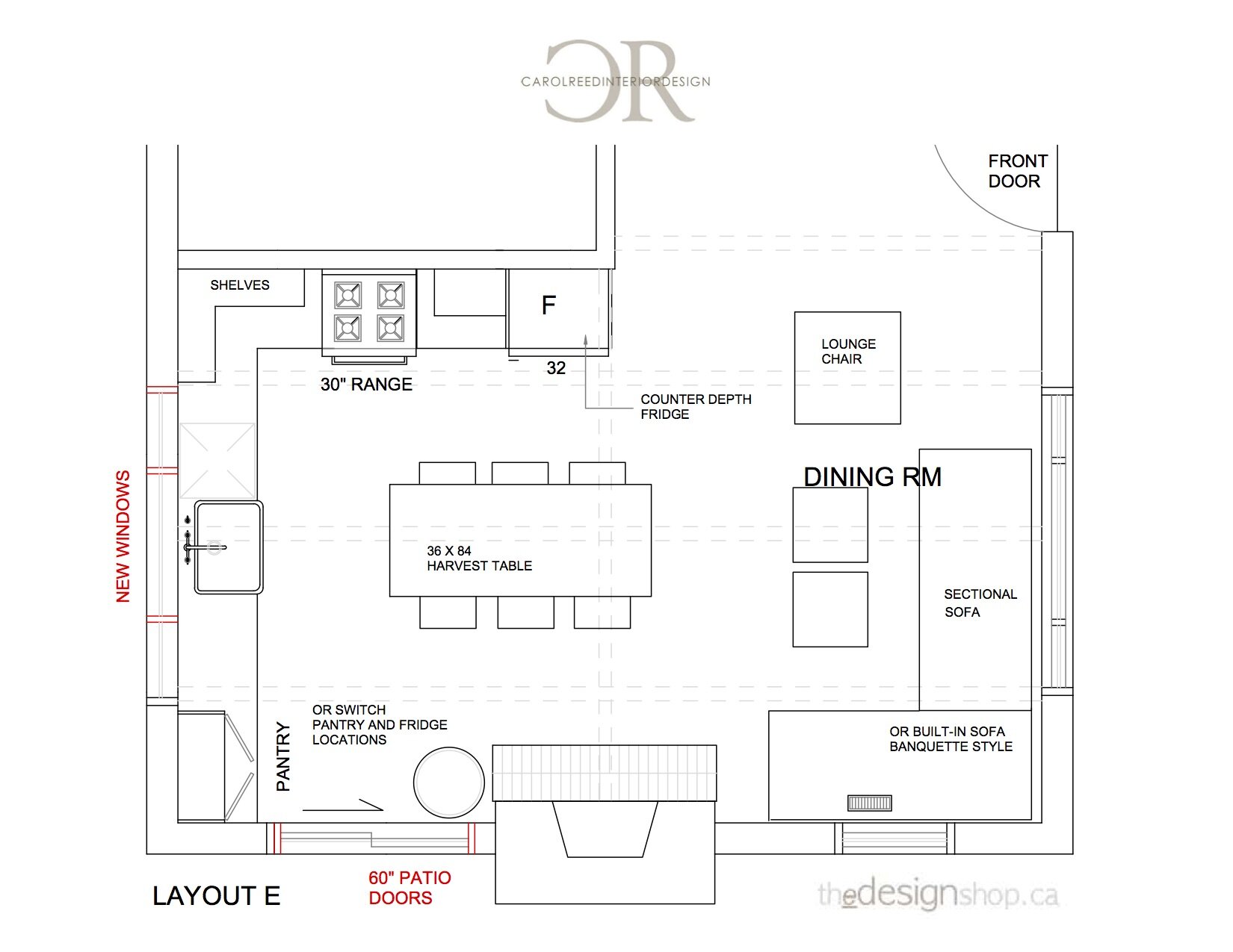
Instead of eliminating a window I wanted to increase the windows if I could. It was also clear to me the patio doors were the obstacle that was prohibiting a better layout and more counter space. Since the deck wrapped around the corner of the kitchen, I saw great potential in moving those patio doors, in fact, great potential! Below are a few preliminary block plans of this concept, you can see how suddenly, the possibilities were looking interesting!

The magic of relocating the patio doors is that it freed up the long kitchen wall and allows for an expansive uninterrupted “L” configuration of counters and cabinets (super efficient) but also, by swapping the patio doors with a large window it means the sink and prep areas could directly overlook the prime views. I proposed the window be made as large as possible and strive to align them with the ceiling beams. The new patio doors (sliding or swing t.b.d.) would then be off to the side of the main deck area, adjacent to the bbq and would no longer impose on the seating arrangement in front of the current patio doors. Win win. Further, they could mirror those patio doors on the opposite side of the fireplace and have a second walkout to the deck from the dining area and enhance that indoor/outdoor vibe, although its precious wall space for furniture, so alternately a similar effect would be to install a new larger window for symmetry.

Based on this concept I developed 3 variations that spoke to her wish list; a centre island option, a centre table option, and a peninsula option - and she was super excited about each of them. After reviewing the window and door modifications with her contractor it was unanimously agreed that moving the patio doors would work well, although the decision was to keep the new window the same width as the old patio doors to lower costs. By happen-stance during this same time the homeowner also came across a vintage butcher block table and bought it in hopes it could work in the new layout. And so it did - final plan done! The vintage work table will really give her that one unique furniture piece she was wanting to incorporate.

Here’s a look at the final ‘After’ layout compared to the ‘Before’.

Carol Reed E-Design Cabin Kitchen Layout Before & After.png

With almost no change to the footprint of the original kitchen the impact of the window and door changes in addition to enhancing the ceiling beams, will make this a really dramatic transformation. Its a good example of how much your window and door placements can be detrimental or beneficial to a space - so never overlook the opportunity to change them during a renovation.

If you need help with a challenging floor plan, check our E-Design services on thedesignshop.ca

For more peeks at full-service and e-service design projects you can follow us on Instagram @carolreeddesign

You can also find us on PINTEREST and FACEBOOK!

Coastal Estate - Foyer Hall

A FOYER HALL FOR THE BIRDS

Continuing the ‘catch-up’ tour of our rural Coastal Estate project from a couple of years ago we’re sharing a peak of the foyer hall in the main house. The space was is a huge thoroughfare on the ground floor centred between the front entry vestibule, the main living areas and the master suite, not to mention the staircase to upper and lower levels. As an expansive empty space with terracotta tile floor it was bit of an echo chamber and not very welcoming. Like the other rooms, we were tasked with furnishing it in relatively short time frame and in an elegant but relaxed country style.

Foyer Hall Table with antique crocks, Room Design & photo by: Carol Reed Interior Design Inc.

Foyer Hall Table with antique crocks, Room Design & photo by: Carol Reed Interior Design Inc.

To maintain flow, the space didn’t require a lot of furnishings and the main goal was to not dedicate a large chunk of the overall furniture budget to this area but still it needed to look inviting and not empty and stark The key pieces we planned on sourcing initially were a centre hall table, a bench, an arm chair or two, lighting and some wall art since there were a couple of large expanses of blank wall space. There was an oddly placed column right in the middle of the foyer which definitely compromised the ideal placement of a centre table but we worked around it, literally, and made the best of it.

Foyer with centre hall table and vintage bird print gallery. Room Design and Photo by: Carol Reed Interior Design Inc.

Foyer with centre hall table and vintage bird print gallery. Room Design and Photo by: Carol Reed Interior Design Inc.

I found a vintage oak pedestal table at a second hand shop and had it reconditioned. It came with 2 leaves should they ever want to expand it for a party or whatever, it expands to a large oval. The intent of the table was for it to be a place to display various treasures picked up on nature walks through their wooded trails and along the shoreline, and of course for seasonal branches or flowers foraged from the property.

Foyer Hall Table with antique crocks and vintage bird illustration book. Room Design and Photo by: Carol Reed Interior Design Inc.

Foyer Hall Table with antique crocks and vintage bird illustration book. Room Design and Photo by: Carol Reed Interior Design Inc.

There was a large expanse of wall behind the table which needed some art. Due to the sheer size I envisioned a collection of something hung gallery style to fill up the wall. Going In this direction with wall art would continue on a concept I had already begun. In the living room we did a collection of framed botanicals (ferns), in a guest bedroom we did a series of Atlantic fish prints, and so here I decide to look for a series related to birds. The homeowners are huge nature lovers with a fascination and love for all creatures including birds, in fact the property is within a bird sanctuary. Since they’re from Europe and the overarching concept for the house’s decor was to reflect local craft, culture and history, so since there were always binoculars on the window sill here,,,I decided the foyer needed a Nova Scotia bird gallery.

I began my search where I always do, at vintage and antique shops because of course, vintage is always better. ; ) My research led me to a book by Robie W. Tufts which is a compilation of illustrations of native Nova Scotia birds, there are 41 plates in total. Each plate is numbered with a descriptive legend of each species depicted. I hunted down a dealer near Peggy’s Cove that had two copies and bought them both, one was in good condition and the second was missing the dust jacket.

Mock-Up of framed vintage bird prints. Design by Carol Reed Interior Design Inc.

Mock-Up of framed vintage bird prints. Design by Carol Reed Interior Design Inc.

I selected 12 plates from the book and created a mock-up of how I proposed to frame them up, this initial concept included dark black/green mats and thin medium wood frames. The homeowners opted for the second choice of doing grey matts and then we found a dozen ready made weathered oak frames in stock and away we went, carefully removing 12 plates from the book and having them framed.

Foyer Hall Table with antique crocks, vintage bird book, shed antler and foraged branches. Room Design and Photo by: Carol Reed Interior Design Inc.

Foyer Hall Table with antique crocks, vintage bird book, shed antler and foraged branches. Room Design and Photo by: Carol Reed Interior Design Inc.

The ‘donor’ book is on the bookshelf in their library and the full in-tact version is kept on the table so if you’re looking at the bird prints its handy to reference the book on the table to read about the bird, or quickly lookup a bird spotted on a walk or out the window. I think out of the entire house this one installation is my personal favourite because although its decorative its relevance to the property and Nova Scotia is so fitting. When their kids and grands visited form the Netherlands this was a big hit, not only is it a beautiful display, its fun and educational!
Foyer Hall table with antique crocks, foraged flowers and bird prints. Room Design and Photo by: Carol Reed Interior Design Inc.

Foyer Hall table with antique crocks, foraged flowers and bird prints. Room Design and Photo by: Carol Reed Interior Design Inc.

Foraged branches and wild flowers in an antique crock, a shed antler from an vintage shop.

Antique ladder back chair. Room Design and Photo by: Carol Reed Interior Design Inc.

Antique ladder back chair. Room Design and Photo by: Carol Reed Interior Design Inc.

This very very old antique shaker rocking chair sourced in Halifax (and surprisingly comfortable) sits beside a window overlooking the treed property - a pair of binoculars normally sit on the window ledge for bird or wildlife sightings….

Foyer Hall Table with Antique Crocks. Room Design and Photo by: Carol Reed Interior Design Inc.

Foyer Hall Table with Antique Crocks. Room Design and Photo by: Carol Reed Interior Design Inc.

New lantern style wall sconces were installed and they flank a pair of french doors into the living room. Early in the project I started collecting antique crocks and jugs for accessories and so various groupings are displayed in the kitchen, on the living room mantle and also on the foyer table. (I’m properly obsessed with the glaze and colour of crockery and have my own growing collection at home.)

Foyer Hall Bench, Room Design & Photo by Carol Reed Interior Design Inc.

Foyer Hall Bench, Room Design & Photo by Carol Reed Interior Design Inc.

Opposite the bird gallery wall and on the other side of the centre table is a bench that sits just inside the entry vestibule. Here we’ve placed an antique church pew bench - this took months to find but eventually we decided on this one from a dealer in Chester for its simple design and the size was just right. A rustic mirror and iron hooks with a collection of hats finish off this corner. No coastal house entryway is complete without a selection of Hats at the ready not just for decor - you always always need a hat in these parts so we put together a small collection to get them started.

Foyer Hall Table, Room Design and Photo by Carol Reed Interior Design Inc.

Foyer Hall Table, Room Design and Photo by Carol Reed Interior Design Inc.

Foyer Hall Table Top by Carol Reed Interior Design Inc.

Foyer Hall Table Top by Carol Reed Interior Design Inc.

On subsequent visits the table top is displaying a small rock collection…

Foyer Hall Design & Photo by: Carol Reed Interior Design Inc.

Foyer Hall Design & Photo by: Carol Reed Interior Design Inc.

This bench area is a handy spot to display hats and beach bags and for the owners or their house guests to grab one as they head out. Eventually the idea is to just keep adding hooks all around the mirror as the collection grows. Disclaimer, the mounted antlers are vintage and just one of about half a dozen I picked-up from a dealer, this pair was used for the photo shoot only while installing the hooks but the homeowners are not proponents of hunting and the property is home to a LOT of deer, so these didn’t stay! But we were still on the ‘hunt’ for wood or metal antler shaped hooks.

Staying Home

Staying Home and Finding Simple Joys

Its been about six weeks since we’ve been under Stay at Home orders although personally we’d already been doing it for several weeks before it was mandated - so it seems like so much longer. Since we normally work from home this hasn’t had a huge impact on our day to day lives during the week. Over 15 years ago I structured my business to include remote and long distance services via E-design so on that front it seems we were ahead of the curve as so many designers are having to make that shift now. For local projects we’ve transitioned to working remotely as much as possible and structuring any site visits safely - everyone is just making great efforts to ensure homeowners aren’t stranded indefinitely with half finished construction during this time of sheltering.

CarolReedDesign-StayingHome-BeachWalk-1.JPG

Knowing that staying home is the best way to contain the spread we have zero complaints, and honestly as an introvert and home body, i’m quite content. The weekends are when we feel we really need to get out of the house, so to say we feel fortunate to have vast landscape to walk right outside our door is an understatement but it is after all one of the reasons we chose to live in a rural coastal area - the solitude and natural beauty. Its been a huge loss to the community that the local public beaches have been closed all because a few (or hundreds) senseless people gathering in large groups in parks and beaches (in Halifax area) ruined this privilege for everyone - when people need it the most.

CarolReedDesign-StayingHome-BeachWalk-2.JPG

We can head out our door and walk along the shoreline at the back of our property, wandering for an hour or two, or just perch on the rocks and watch the waves crash. I’m usually taking pictures and collecting shells or rocks. Everyday, every visit the palette changes with the weather, moody days like this one are the best for taking photos. The pics (above and below) are elevated views, we’re on a plateau above the dunes looking out over the beach to the ocean, but you can’t actually see the beach directly below.

CarolReedDesign-StayingHome-BeachWalk-5.JPG
CarolReedDesign-StayingHome-BeachWalk-4JPG

Above is a view across to the long beach, In the next week we’ll shift our focus to our potager garden and spend as much time in it as we can in hopes to get things growing sooner this year, the days of eating from our own garden again can’t come soon enough!

CarolReedDesign-StayingHome-BeachWalk-3.JPG

At home we typically cook a lot, practically all our meals are home made every day, so even going out to restaurants or take-out isn’t something that we’ve missed too much but its definitely getting to that point! Just one of us is doing all the shopping (and its not me!) and we’ve reduced the number of trips to the grocery to once every two weeks. We’ve been pretty diligent about just making do with what we have on hand rather than running out to pick-up items that were forgotten or we ran out of. I haven’t been into a store in almost 2 months now., which means I’ve had to up my meal planning and grocery list game. Trying to stay out of the grocery store means we’re making a lot of things we would normally buy and googling a lot of recipe substitutes!

CarolReedDesign-StayingHome-HomemadeTortillas.JPG

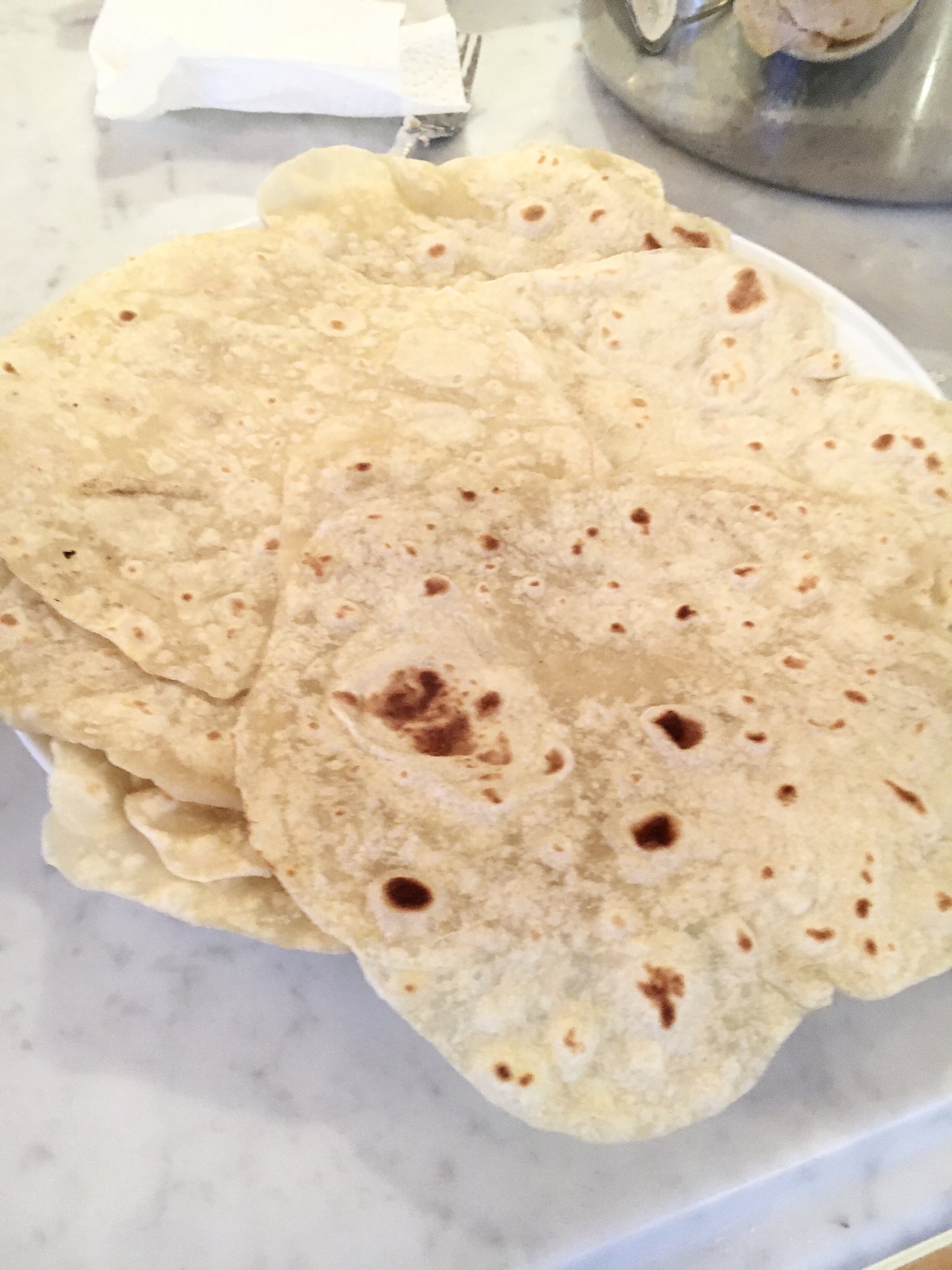
I made flour tortillas for the first time, which only require a few basic ingredients and are simple to make. Not as simple and quick as every recipe would lead you to believe (! plan ahead!), but still pretty easy. Next time I’ll have to master the art of making them round. If you google you’ll find hundreds of recipes which are all pretty similar. There’s so many uses for these its worth the bit of time to make them.

CarolReedDesign-StayingHome-Orzo.JPG

This chicken orzo recipe has been a new favourite and on repeat (by request) since February, in fact I made it again last night. Its a one pot recipe that has all the comforting taste of chicken soup and all the carby satisfaction of pasta. A few basic ingredients and it makes enough for several meals. You don’t even need home-made stock, I use a knorr instant mix which I always keep in the panty. The recipe is from one of my fave online sources The Modern Proper, link here.

CarolReedDesign-StayingHome-Baking.JPG

We’ve done more than our usual share of baking too. Here’s a new twist on an old recipe that I bake almost every weekend. It started with plans to make banana bread (no bananas) which changed to pumpkin bread which hit a snag half way thru because the frozen pumpkin puree I was about to use looked ‘off’. On a whim I decided to substitute with sweet potato, which when it was steamed and pureed looked just like the pumpkin. Well the results were ah-mazing!! Its now our new preferred version of the recipe and is also on repeat. Here’s a link to the Pumpkin Bread recipe from Sally’s Baking Addiction I’ve been using for a few years, use pumpkin or sweet potato - baker’s choice.

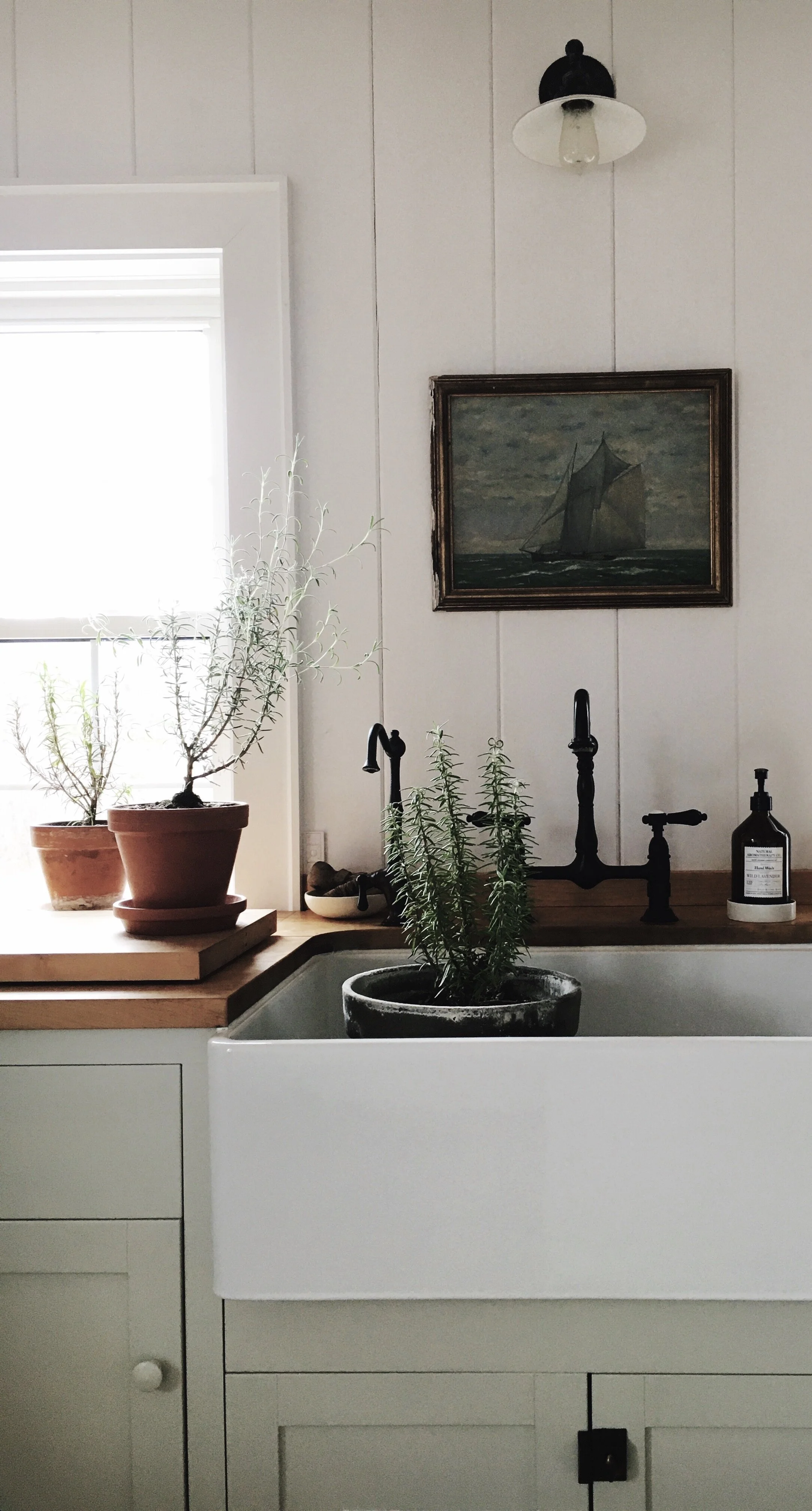
One thing that has become a must for me during the cold weather months is house plants. I’ve come to appreciate (be addicted to) how much life and energy plants bring to a space, not to mention they add colour, texture and form and… i’m slightly obsessed with terracotta pots. There are times of the year the inside of our place resembles a green house, which only makes me want to build one! Although I killed a variety of new plants over the winter we thankfully have great success with ferns, and this year for the first time we successfully overwintered several rosemary plants from the garden .

CarolReedDesign-StayingHome-KitchenSink-Pottedherbs.jpg

These are the survivors, (several others didn’t make it) I know it doesn’t look like a lot but these make us so happy because its the first time any of the rosemary plants lived through the winter. We didn’t do anything different so we have no idea why they made it this but that’s just the mystery of gardening and plants - we roll with it and keep experimenting.

In addition to the potted plants there’s rarely a time when i don’t have some seasonal flowers or branches in the house. Its such an in-between time of year with not much to forage but I was craving blooms so i brought in some quince branches to force. I’d never tried forcing these before but it couldn’t have been easier.

CarolReedDesign-StayingHome-ForcingQuince.JPG

Here’s some of the cut branches at day 2 of being inside.

CarolReedDesign-StayHome-Quince1.JPG

These branches (above and below) were at day 9 of being inside.

CarolReedDesign-StayHome-TubQuince.JPG

I had enough branches to keep a few in the kitchen over easter and another couple of branches in our upstairs bathroom. It really heightened the sense of spring arriving as you could see the buds opening up more each day, an uplifting little reminder - brighter beautiful days are ahead.

CarolReedDesign-StayHome-TubQuince4.JPG

So here they are 19 days after cutting and these blooms stayed fresh for another week at least. That’s a lot of joy from a few free branches. On the East Coast we’re probably still at least a month away from anything blooming outside. If you’re looking for a way to thank a special person or a Mom in your life, now is a great time to give it a try and create a your own ‘forced’ bouquet.

HOW TO FORCE BRANCHES: Cut branch stems about 2 or 3’ long and with visible buds on them, run the cut ends under water and trim another inch off, put in warm water in a tall sturdy vase or vessel,,,,,,and,,,wait. Replace the water every 3 days, keep them in a warm spot but out of direct sunlight. In about a week you’ll see the buds starting to open (this could take longer depending how far along in the season the branch was cut). In about 2 weeks they’ll be blooming and will last another week or so. If you have a crabapple or magnolia tree, forsythia or quince bush in your yard - go and cut a few branches to bring inside!!!! I promise they’ll bring so much spring beauty into your home and you can watch them transition from bud to bloom. A treat for everyone in the house or a special gift for Mom.

While we’re on the topic of free things, here are a couple of free downloads I’ve enjoyed on my Ipad and thought I’d share:

Kindle Reader App: If you’re an avid reader and running out of books to read, but have never read digital books before, nows the time. You don’t have to have a Kindle, you don’t have to leave home, no delivery service required, no sharing (non contact) with others involved. Go here, download the free kindle reader app all you need is an Amazon account (also free) and you’re ready to buy and read any digital book. Bonus, they cost a lot less than traditional print copies. (Not an affiliate ad or promo, just a new to me find that I wanted to share).

House & Home: Did you know H&H are offering the digital copy of the current May issue for free! On your Iphone or Ipad go to the App store and upload the H&H app. Once you’ve uploaded the app, select The May issue and it loads on your device for free. (Sorry Android users I only see an App for Apple users. ) Thank you Linda Reeves and the team at H&H for this gesture. P.S. The french garden of Design duo Les Ensembliers in this issue is an absolute dream garden! Check out a video tour here.

House & Garden UK: They’re also offering a free download of the current May issue. Just download the House & Garden UK app onto your device from Google Play or the App Store, then click the red “download” box under the May 2020 issue and Enjoy. The issue features the newly redone Restormel Castle, the country home of the Duke and Duchess of Cornwall (Prince Charles & Camilla). Or visit H&G website for the story, More here.

Lastly I wanted to express condolences to all those in Colchester County and elsewhere who who lost loved ones or were effected by last weeks mass shooting. Colchester is one of my favourite antiquing destinations so I’ve visited the area many times. I wrote this blog post well over a week ago, before it happened and simply have been overwhelmed with sadness all week. It was a shock for so many in NS to face the reality that in a place renown for its peaceful simple living, and even in the most remote rural small towns you are not safe from the spread of a deadly virus or the potential deadly effects of mental illness gone un-checked.

The virtual tribute that aired on Friday night was incredibly moving and it will be difficult for Nova Scotians to move forward without this having a lasting impact but no doubt those effected will be stronger from all the support that’s been shared. One of the most beautiful and saddest performances I’ve ever seen was Natalie McMaster’s duet with the young victim and fiddler, Emily Tuck. Anyone who has followed me for a while knows how infatuated I am with Cape Breton and particularly the local celtic music. There’s something about the sound of a fiddle that I find so moving, it instantly lifts my spirits or brings a tear to my eye. If you missed it here’s the cbc link of the performance.

Wishing you well, from our home to yours.

Take care. Stay Safe. Stay Home.

C

xo