Kitchen: Project Northwest Cove

The Kitchen design

Designing a new kitchen was the priority for the Northwest Cove renovation (introduced in previous post) and although it would be a gentle renovation in terms of construction work the goal was to redesign the space with all new cabinetry, counters and appliances while maintaining the footprint of the room including window and door locations and existing flooring. The new cabinetry and appliances would bring a more contemporary aesthetic and significantly improve the function and storage capacity.

Here’s a look at what the kitchen looked like before and in plan view.

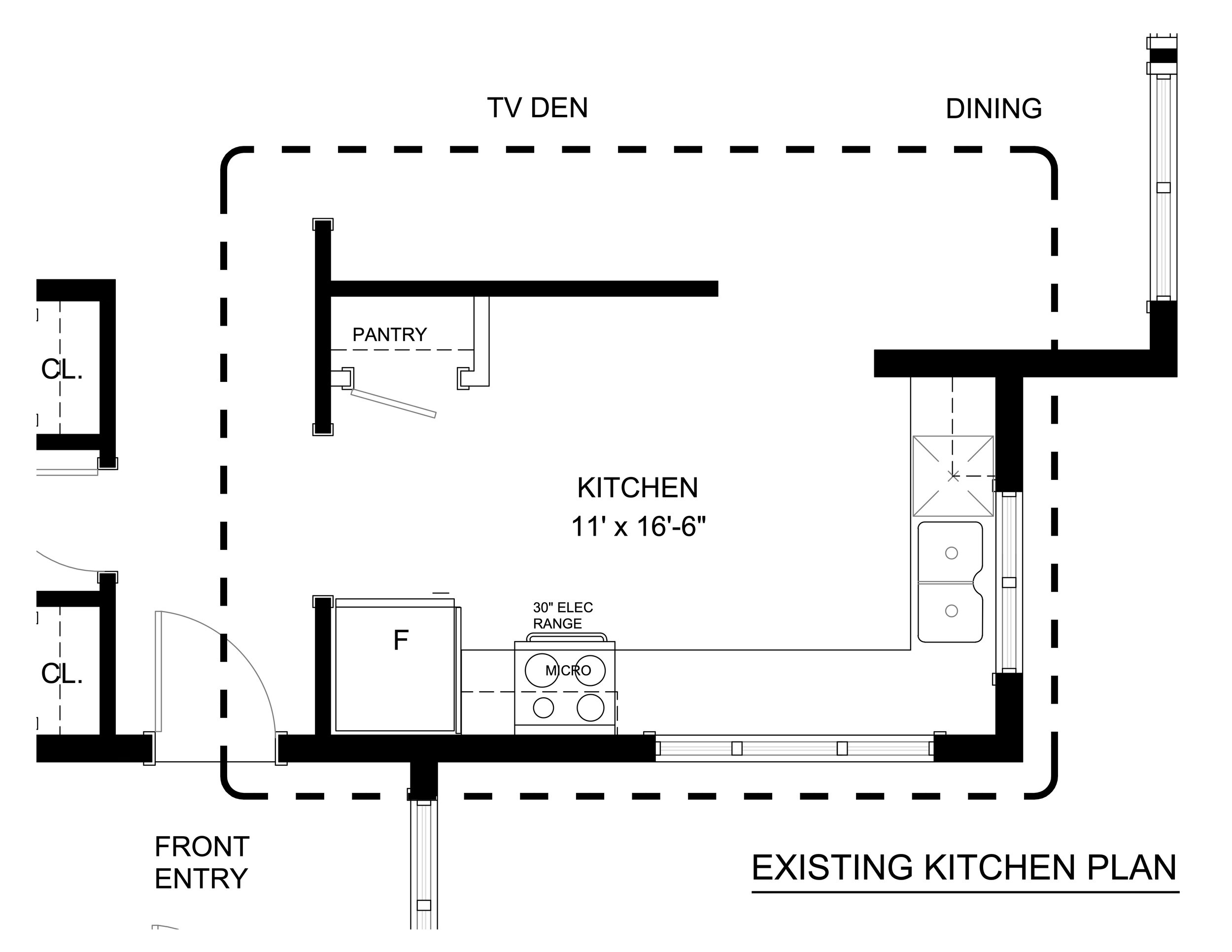
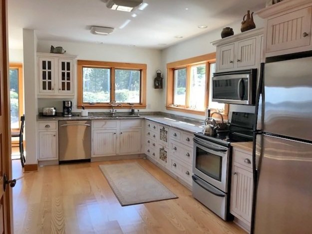
The existing layout was efficient for the most part with loads of counter space but it was lacking in storage mainly because there wasn’t a lot of wall space. Opposite the L-shaped cabinetry was a pantry closet and a blank wall that wasn’t being utilized aside from a small mobile kitchen cart. Being in a rural location, food storage is a top requirement when trips to the market or grocer are much less frequent and less convenient. Opening up this wall to the TV Den and Dining Area on the other side wasn’t on the wish list but this was considered for potential future appeal. Removing all or part of the partition wall could have given them a kitchen island or peninsula but at the same time, it would reduce kitchen storage and eliminate a wall of floor to ceiling shelving in the den. It made more sense for their lifestyle and the layout of the adjoining rooms to keep the wall. We would however remove the awkward closet and replace it with wall to wall cabinetry including a countertop area and double wall ovens.

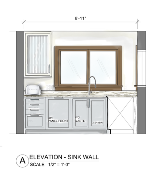
Kitchen - Proposed Floor Plan

LAYOUT

The new layout features extra deep counters, wall cabinets to the ceiling and base cabinets with full extension drawers for effortless access, along with; pull-out recycling cabinet, a dedicated area for pantry goods and beverage station, concealed storage for countertop appliances, stacked double wall ovens, an induction cooktop a counter depth fridge and a hood canopy with built in exhaust. Alternately a second oven and/or the fridge could have gone on the pantry wall, allowing for a pantry tower or more counter space to the right of the cooktop. After lengthy discussion about where the ovens would go and if the fridge should move to the pantry wall, this wining layout suited their cooking style and needs best.

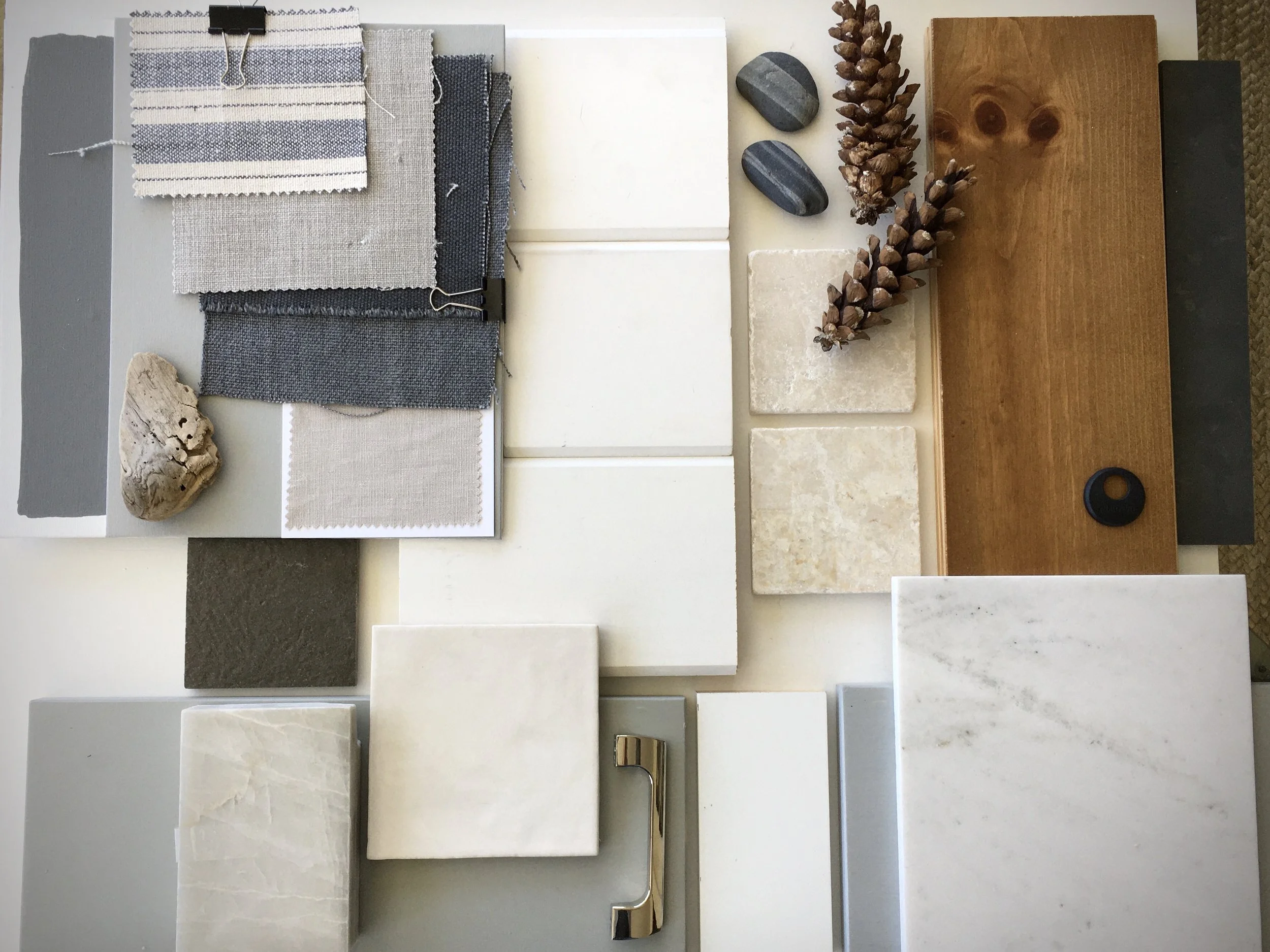
With the natural setting and stunning views being the main feature of the home, the palette for the new kitchen was natural and organic to be harmonious with the tones of the exterior views. A light smokey grey/blue for the base cabinets paired with quartzite stone, white walls and uppers accented with open wood shelving and reeded glass evoked the rippled water, stormy skies, rocky terrain and forest setting that envelope the home.

APPLIANCE FEATURES

The type of appliances selected add a modern aesthetic and enhanced function with features the old kitchen didn’t have such as; an oversize workstation sink with integrated accessories, pro style high arc faucet, a smooth induction cooktop for continuous uninterrupted countertop, custom hood with concealed direct vent exhaust, counter depth fridge with bottom freezer, panelled dishwasher, and a full size second oven with both microwave and convection settings.

The cabinetry, appliances and fixture selections were contemporary and unfussy, and would provided the needed change from the traditional cottagey style the existing kitchen presented. The extra long modern linear pendant is unexpected yet a super practical form of task light over the main prep area (where there are no wall cabinets for under cabinet lights) and becomes a statement feature among the otherwise very simple design elements.

Most of their daily countertop appliances are concealed behind countertop storage cabinets and extra consideration was given to the ones that were to remain exposed to ensure they were great looking as well as great performing. Make the effort to chose countertop appliances (even if it means a splurge) that are so well designed you enjoy looking at them and they enhance the overall look of the space rather than detract from it.

Here’s a peak at the install in progress. The owners opted for linear pulls on the cabinet instead of edge pulls and they added some more reeded glass doors to the pantry area, which were yet to be delivered.

The space was always bright but now the introduction of the cool blue/grey cabinets and clean neutral white balances all the warm wood and act as a beautiful compliment to the wood floors and trim which makes the space fresh and crisp - and the wood comes to life.

This kitchen redesign is a great example of how minimal renovation work doesn’t mean minimal choices or minimal impact with kitchen upgrades. Even though the room layout itself wasn’t changing (aside from the closet removal) there are still countless possibilities for new cabinetry and appliance configurations to suit varied and different personal preferences. This is the ultimate benefit in custom planning your own kitchen - not just choosing the types of storage and appliances but the size and placement of them too. The result is the ultimate kitchen space tailored to your everyday needs but also flexible for those less frequent uses too.

Stay tuned for a round-up of my reco’s and suggestions for how to add the finishing touches to this kitchen with stylish useful accessories and small appliances to make it all sing.

For more updates on this project and other progress on current client projects, follow us on Instagram and sign-up for our Subscriber’s Edition of the blog down below.

Project Northwest Cove

We kicked off this project in the Spring of 2022. The home is ocean front situated on a wooded and rocky shoreline with expansive views over St.Margaret’s Bay. It was designed by the late renown architect Keith Graham and is about 15 years old. Despite the age of the house the kitchen and bathrooms seemed dated beyond their years and decidedly not consistent with the architectural style of the home. The extent of involvement by an Architect on the interior of a house can vary greatly from client to client, its not uncommon for the build-out of the kitchen and bathrooms to be left in the hands of the owners, which seemed to be the case with this home. As a result you could see a disconnect in the aesthetic where the architects vision stopped and the homeowners took over.

As new owners of the home, our clients were completely attracted to the style of the home and of course its stunning locale, but weren’t attracted to the kitchens and bathrooms which neither reflected their personal style nor the style of the house - both were more contemporary than what was installed at the time. Additionally they didn’t want to forge ahead and embark on renovating these spaces without some expert help - to ensure the integrity of the home’s design was maintained. And so that’s when they reached out to us for help in designing the updates that would be sensitive to the architecture, the surroundings and also reflect their tastes - they had an impressive collection of contemporary art, an affection for mid-century modern furniture, and a love for natural and organic elements.

the consultation

We began with an initial consultation in the home where together we discussed and touched a palette of materials, textures and colours that were in harmony with the rugged ocean front setting and contemporary architecture. No design planning or sourcing had begun at this point, but a clear vision for the interior updates emerged from this first meeting, our design evolved from this palette of materials put together during that session.

One of the major dilemmas presented was they intended to keep the wood floor but what should they do with all the wood trim, the entire house was trimmed out in brown wood , every single bit of millwork including the window frames was wood. Normally not a fan of this look, them nor I, I assessed the options and was convinced the best solution was to embrace it and work with it - keep ALL the wood.

Above is a peak at the wood throughout the house, plus a lot of wood windows. There was also a much too traditional vibe going on with the light fixtures and hardware so that all should go too to achieve a more modern aesthetic.

The starting point I proposed was to get rid of the very yellow-based wall colour and give the entire interior a fresh coat of a clean neutral white (which brings life to the wood, and allows the space to breathe vs the smothering effect of yellow on yellow) and the new kitchen and bath cabinetry would be wood or a grey/blue and white.

My philosophy when working with a lot of wood in a modern space is to only pair the wood with either more of the same wood (yes add more! of it for a monolithic effect) or, keep all the other builtin elements in neutral white, greys or blacks.

Here’s a look at some spaces that I reviewed with the clients to illustrate the concept of how beautiful all wood trim could look in a more modern style they desired. The first 4 images by Mazen Studios were in fact the pivotal source of inspiration for this project as these spaces had similar elements to our project like the same river stone fireplace, same windows and railing, and …our clients owned some similar furniture. (sources for the remainder of the images are unknown).

the inspiration

With the clients fully on board in keeping the wood we began developing the concepts for the new kitchen and bathrooms. I’ll share the kitchen design and other bathrooms in a future post but here’s a peak at the concept for a small ensuite in a guest bedroom

Aside from all the wood trim we also had to work with the existing tile floors in each of the bathrooms due to the under floor heating system. I love terracotta tile for their organic quality and timeless character and these tiles though not terracotta evoked that look. My philosophy again when working with a colour or material you don’t love but can’t change, is don’t pair it with colour - neutralize it by pairing it with tones of blacks and whites to give it a fresh look.

ensuite design concept

A few key pieces give the room a subtle nautical vibe; the brass cage light, a brass gallery rail wall shelf and of course some stripes and simple hooks. These are easy updates to add to any bathroom without renovating, here’s some links to these sources or similar.

  1. Brass Cage Light

  2. Brass Gallery Rail Kit (Straight sections only). We used a custom source but this is a the only ready-made option I came across that ships to Canada.

  3. Modern Wall Hook for towels

  4. One of my favourite Turkish Towels and perfect for guest rooms!

The project is well under way and nearing completion, here’s an after and before progress photo of the guest ensuite……

progress

While there was at least 6 months wait before construction started the owner took on a few cosmetic updates in the meantime. Although all of the common areas of the interior are white we opted for a deep dark black/greenish-blue colour in two areas, one of them being in the entry vestibule where a large art piece hangs. To highlight the piece the clients added a rechargeable battery art light which is high on impact but requires no invasive drywall or electrical work. I think these wireless lights are fantastic and I’m eager to use one somewhere in my own home or on other project.

This particular light currently only comes in silver or black (a bronze finish will be available soon) but if you want a different finish you could spray paint it brass or white. What I like about this one is the small back plate, it also has two light levels, detaches by magnet from the wall plate, plugs into a USB port to charge, the shade tilts and the arm is telescopic. Thanks to my clients for sharing this find with me. Source link below.

5. Rechargeable Art Light (in Silver)

6. Rechargeable Art Light (in Black)

More to come on this beautiful coastal home and its fresh updates.

One Thing Every Room Needs

House & Home Feature:

A Q&A feature in H&H this past January asked Designers what’s the one thing they think every room needs, I instantly knew what my response would be as I have at least one piece in every room and continue to collect and add more throughout my home.

Even in contemporary design, in fact even more so, adding something that references the past adds instant character to a space and lends to the story and experiences of the building itself or the people who live there. I especially love the mix of old and modern, its the juxtaposition with new that makes the old look fresh and current - this can even be the case with different eras of antiques, like a saarinen tulip table and chippendale chairs. When working on modern architectural projects I particularly love the contrast of an aged element or antique piece in an all new and minimal space which can elevates the piece to a feature like artwork or sculpture

Carol Reed Interior Design | Photo by: Janet Kimber

In case you missed it the feature is now online and you can check out all the other designer’s responses on the H&H website here.