Bathroom Makeover

Cottage Ensuite: Before & After


Cottage Ensuite - After  |  Carol Reed Interior Design

This client's cottage in Kawartha, Ontario, underwent a complete facelift that included updating 5 bathrooms a kitchen, a bar and a kitchenette.  (You can check out links to previous before and afters of this cottage at the end of this post).  One of the biggest issues to address when planning the updates was that not only did the bathroom finishes look dated, but the style of the bathrooms looked more suited to a suburban house rather than a lakeside cottage.  Dated or not there was a lot of quality there in custom built-ins and solid materials.  No question it was built with every comfort of an all season urban home, as its located in a premium area of high-end cottages.  The main objective in this 'gentle' reno was to work with what was there but infuse a more modern cottage style - while retaining a high quality level of finishes.  I felt this could be accomplished through a series of strategic changes as opposed to gutting everything and starting from scratch. 

For the master ensuite I recommended leaving the walk-in glass shower untouched except for replacing the faucet set from polished brass to brushed nickel and I also recommended leaving all the floor tile which was a neutral taupe ceramic.  This then put the focus of the facelift on the feature wall, a large double vanity that was the centre of attention when you entered the room.  We would also remove the wallpaper and all the wall mounted polished brass accessories leaving us with a very neutral base to work with and allow most of the budget to be directed where it would have the most impact.

Ensuite Vanity - Before
The Before:  The existing long double vanity was superb custom quality and was in excellent condition.  It sported a peachy/tan corian countertop, oval sinks, polished brass faucets (although it doesn't look brass in the photo, all the fixtures in the room were brass), painted knobs, a frameless wall to wall mirror and a dropped bulkhead with recessed pot lights. The vanity was made from solid woods, the framed cabinetry had inset flush door fronts with a bead detail and raised moulding.  There was loads of storage and counter space and each end of the vanity had countertop mounted cabinets that extended all the way to the ceiling - the only negative was it was all very dated looking and lacked that cottage style  the new owners were looking for.


This is what I envisioned for the new finishes and fixtures, keeping in mind everything had to be readily available from the small local town nearby or available for quick delivery from an out of town source.


Cottage Ensuite - Finishes & Fixtures Concept  |  Carol Reed Interior Design

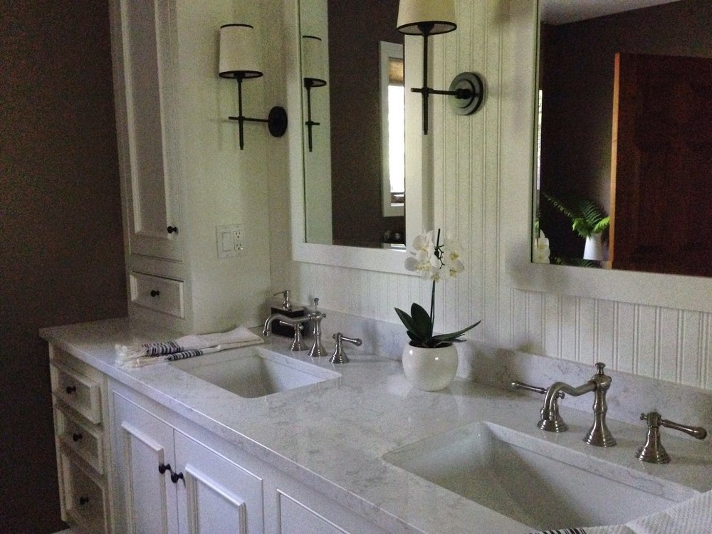
The starting point for the fixture replacements was the hardware.  The pine doors throughout the cottage were all updated with new distressed bronze lever handles that gave them a modern country look.  Continuing with this aesthetic, I introduced new bronze knobs and wall sconces to add contrast and vintage charm to the vanity wall.  For the plumbing fixtures we looked to the shower set first - because we were only replacing the trim not the rough-ins we had to work within the same mfg's product line in order for the new trim to be compatible.  The finish options were chrome or satin nickel, easy choice, the darker 'patina' of the satin nickel is a much better pairing with the bronze so satin nickel it was in a classic bridge style faucet and gooseneck shower head.

Ensuite Vanity - After
The After:  The entire vanity was refreshed with a new coat of paint in a crisp warm white, new low maintenance cararra look engineered quartz counters, new rectangular undermount sinks add a contemporary vibe, satin nickel bridge style faucets add a vintage country vibe as do the oil rubbed bronze hardware which also adds a sharp graphic contrast and ties in with the oil rubbed bronze lever handles on all the existing interior doors.  Other key updates to the vanity wall included; removing the bulkhead with pot lights, replacing the sheet mirror with a pair of framed mirrors above each sink,  installing a crown moulding and breadboard wallpaper on the wall between the upper cabinets and flanking the mirrors with new bronze wall sconces with parchment shades. Painting out the mirror frame, the beadboard paper and the crown moulding the same as the vanity unified the wall and cabinetry to read as one continuous built-in.


Ensuite Vanity - After
On this visit last Spring I was there to do a final walk-thru and make a list of recommended accessories and finishing touches, what would really finish off this room would be a graphic black and cream geometric patterned area carpet and a large woven towel hamper.  (Those should now be in place for this coming season. ) I'd also like to see a more rustic cache pot or planter with something less formal than orchids so we will work on that….


Ensuite - Before
The wallpaper and brass towel rods were removed and all the trim work was painted in the same white paint as the vanity.  


Ensuite Vanity - After

The walls received a new coat of paint in a dark brown/grey, similar but lighter shades of this found in the tile.  This dark colour really anchors the room and it neutralizes the pre-existing wall and floor tiles in a way that a light colour on the wall wouldn't have done.   The earthy colour also added a natural organic tone to the space and really accentuated the painted woodwork and all its charm.


Projects like this can be much more exciting to work on in ways that designing from scratch or all  new aren't, also evident in the way people are so drawn to Before & After story's.  Its literally a transformation before your eyes, making something out of nothing per say.  Taking a space that is uninspiring and working with it rather than ripping it all out - this is when vision and seeing potential really comes in to play and when the true value and power of design is realized.

For more Before and Afters of this cottage reno check out the following links below for older posts:


All Photos by:   Carol Reed


Before & After: Cottage Guest Bath


At the risk of overloading my blog with traditional cottage style interiors I'm going to catch up on posting some before and after pics of the Stony Lake cottage project before the end of this summer.  I completed the cottage last year...and returned this spring to get some updated photos, but there are a lot of rooms!  You can check out my first post on the project here.  Most of the reno work involved the kitchens and bathrooms.  The cottage is relatively large and has 5 bathrooms in total.  You can see the boathouse bathroom before and after here,,,and today I'm posting the first of two bathrooms in the main cottage that I'd like to share.  The objective for all the bathrooms was to update the finishes and fixtures and keep the demolition and new construction to a minimum.  All the new materials and fittings would have to be readily available from the local building supply store (and nothing custom, nothing special order).   In addition to 2 ensuites the cottage has 2 hallway baths that are shared by several guest bedrooms. This before and after is the larger of the two hall bathrooms.

Bathroom Before
This hall bathroom's finishes and fixtures were dated but the vanity was excellent quality and in perfect condition - it would stay as would the entire walk-in shower except for new chrome trim pieces to replace polished brass.

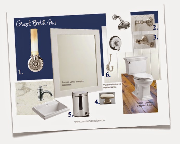
The very first thing I set my sights on replacing was the floor and wall tile outside of the shower.  With its tan tile and peach paint and beige corian counter, it was looking a bit 80's suburban and not very Kawartha's lakefront cottage.  Because the wall tile in the shower was less prominent and in excellent condition, I opted to keep the shower as is and splurge on updating the vanity area.  Below is a concept board of all the new selections.  


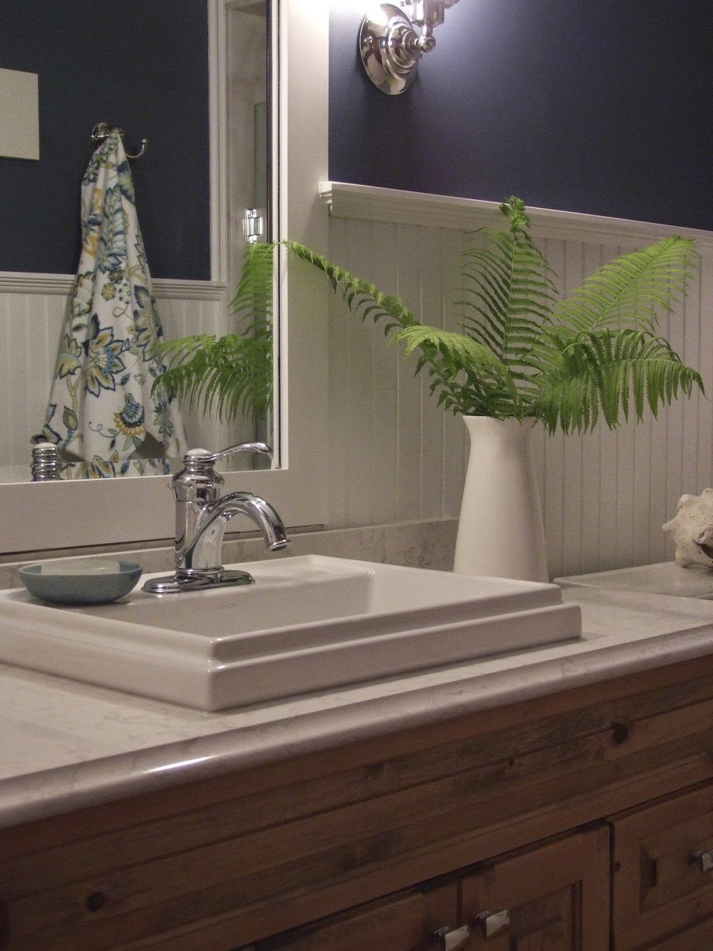
In addition to new wide plank pine flooring (also throughout the cottage), the bathroom makeover included new wainscotting, mirror, lighting, toilet, sink, faucets, accessories and a new quartz countertop.  Switching out all the polished brass fittings for chrome was an obvious update and pairing the chrome with white beadboard wainscotting and deep navy blue paint would amp up the nautical cottage charm. 


I drew up the details for a new wainscotting and mirror treatment from stock materials which the contractor made all on site.  I chose a new drop in style sink because its a simpler install and a bit of cost savings versus an undermount, the rim profile adds to casual cottage vibe as does the new vintage style single lever chrome faucet (the shower received the same new chrome trim pieces).  Rectangular chrome knobs give the vanity a fresh update.  I found a set of flower print towels at the HomeSense in Peterborough which were perfect for this room as well as the yellow and white bathroom on the other side of the cottage.


A pair of vintage industrial style chrome scones from Restoration Hardware flank the mirror and illuminate the room in a soft complimentary glow.  Excuse the bad photo they were incredibly hard to photograph as the room has no natural daylight so they needed to be on.


All that's left on the to do list for this room is to find a couple of framed prints for the wall above the toilet, i'm on the hunt for either a pair of vintage nautical charts or fern botanicals.  : )
But nonetheless i'm told its been a busy space this summer accommodating a steady stream of my client's family and friends.  


Note: Please excuse the inconsistency of the colour in the above photos, the original files aren't like this,  the images only appear this way once uploaded into blogger and I havn't been able to figure out how to correct it or come up with a work around - never had this problem before.  The true colour of the wood vanity and flooring is somewhere between the light and dark versions above.


All photos and room design:  Carol Reed


Boathouse Bathroom: Before & After


Happy Canada Day! Its a perfect day to share a before and after of a clients red & white cottage bathroom.  This boathouse bathroom evokes a classic canadian cottage style and what's even more dreamy about it is the sound of the waves lapping against the docks below you.

Last year I completed a whole Cottage renovation for a client that involved updating the main cottage and boathouse to incorporate all new finishes and fixtures but without doing extensive construction. I find these type of projects incredibly enjoyable because its so exciting to explore the potential of the existing space and see the dramatic improvements that can result by making a series of simple but thoughtful changes.  By simple I don’t mean the modifications didn’t still require a lot of time, effort, and co-ordination but they were simple in that they didn’t require new construction or complicated modifications.  I made a visit to the cottage a few weeks ago to check on the status before this season got underway.

Boathouse Bathroom Before

The entire interior of the boathouse (which is only used seasonally) was knotty pine, with exception of the floor which was carpeted in the living areas and tiled in the bathroom.  The biggest change I made was that every bit of exposed natural wood on the interior was painted white, and then we added new but reclaimed wide plank engineered pine on the floor.  Essentially I took all the wood away from the walls and ceilings and put it on the floor.  This effectively doubled the brightness of the interior, emphasized its dramatic vaulted ceilings and painting the wood panelling created interesting tone on tone texture.  The best part was the lake view and exterior landscape became the focal point. The white paint transformed the boathouse interior to a fresh, bright, summery oasis.

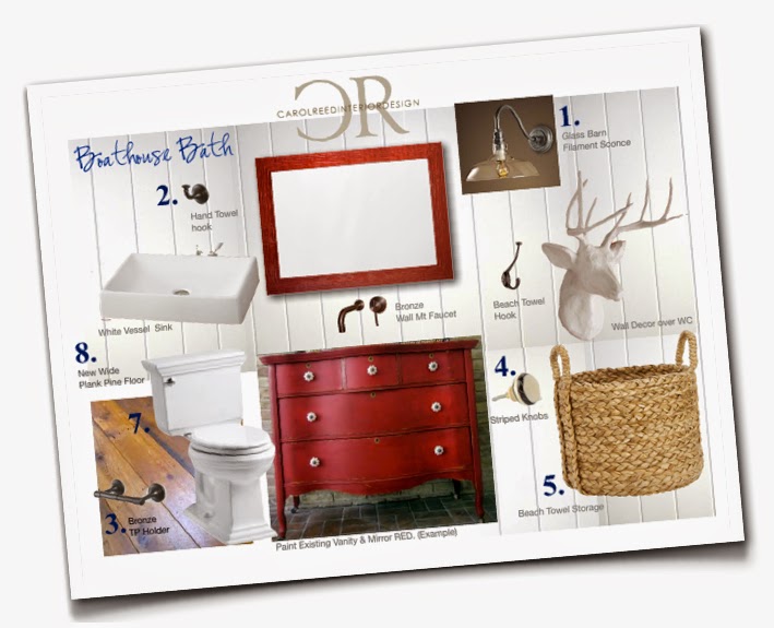
The boathouse bathroom is a good size with interesting ceiling lines but was dated with respect to its fixtures and accessories and the ceramic floor a bit too suburban looking.  Everything about the vanity was perfect though, it was excellent quality and was hand built from solid wood with lots of storage and was in perfect condition, that and the mirror were definitely keepers.  I even loved the natural pine countertop and wanted to preserve it because i think its an excellent choice for this application it’s not the place for expensive marble or quartz.  I saw loads of potential for this space merely with paint and new fixtures.  A main criteria for selecting new items was we had a very short timeline to complete all the changes so everything needed to be readily available and/or deliverable to cottage country.  Below is a rough concept I put together for the owners and they quickly agreed with all the proposed changes...

New proposed finishes, Carol Reed Interior Design.


The vanity and the existing mirror would simply be updated with a red paint and some new striped ceramic knobs.  New engineered plank fooring replaced the tile and was in the same tones as the existing wood countertop.  The key to retaining the wood countertop was replacing the old drop-in sink with a vessel style sink that would fit over the old sink cutout.  I decided to mix in some more contemporary fixtures with the otherwise very traditional space but keeping the metal finishes in a dark bronze gives them a more relaxed nostalgic look.  A gooseneck barn light fixture with filament style bulb gives the bathroom a modern rustic vibe.

Boathouse Bathroom - After

In the end we opted for a countertop mounted faucet in lieu of the wall mounted (from the same series) for an easier install.  A simple hook for a hand towel (I’m obsessed with turkish towels ones and stock up on them whenever I find them!) its rope fringe and blue stripes evoke a nautical vibe, an oversize seagrass basket and more wall hooks on the opposite wall (not yet installed) store large beach towels.


Boathouse Bathroom Vanity - After.


My visit to the cottage last month was my first since all the major installations were completed in the boathouse last summer so its was a thrill to see the progress.  I took note of some final details that still need to be addressed, one of them includes installing new knobs on the vanity, I'm in love with the white ones I found with a stripe around the rim which i think will be the perfect finishing touch.  Lastly I think the floor needs a fun colourful indoor/outdoor rug for in front of the vanity.  But so far the transformation of this lakeside loo as been a dramatic improvement - I think its now bursting with character and style!


Happy Canada Day!


All Photos and Room Design by:  Carol Reed