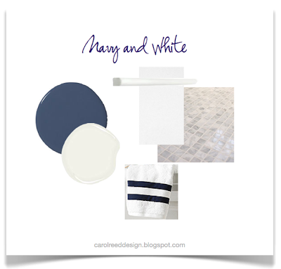
navy and white

Before & After: Cottage Guest Bath


At the risk of overloading my blog with traditional cottage style interiors I'm going to catch up on posting some before and after pics of the Stony Lake cottage project before the end of this summer.  I completed the cottage last year...and returned this spring to get some updated photos, but there are a lot of rooms!  You can check out my first post on the project here.  Most of the reno work involved the kitchens and bathrooms.  The cottage is relatively large and has 5 bathrooms in total.  You can see the boathouse bathroom before and after here,,,and today I'm posting the first of two bathrooms in the main cottage that I'd like to share.  The objective for all the bathrooms was to update the finishes and fixtures and keep the demolition and new construction to a minimum.  All the new materials and fittings would have to be readily available from the local building supply store (and nothing custom, nothing special order).   In addition to 2 ensuites the cottage has 2 hallway baths that are shared by several guest bedrooms. This before and after is the larger of the two hall bathrooms.

Bathroom Before
This hall bathroom's finishes and fixtures were dated but the vanity was excellent quality and in perfect condition - it would stay as would the entire walk-in shower except for new chrome trim pieces to replace polished brass.

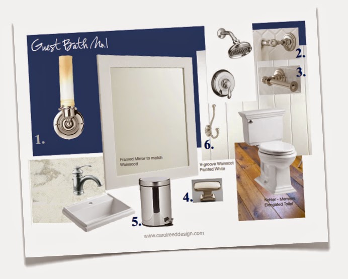
The very first thing I set my sights on replacing was the floor and wall tile outside of the shower.  With its tan tile and peach paint and beige corian counter, it was looking a bit 80's suburban and not very Kawartha's lakefront cottage.  Because the wall tile in the shower was less prominent and in excellent condition, I opted to keep the shower as is and splurge on updating the vanity area.  Below is a concept board of all the new selections.  


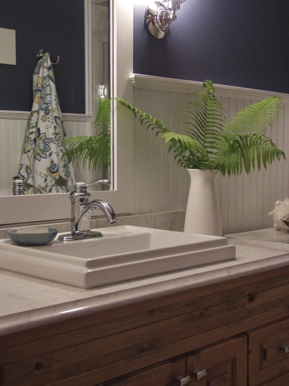
In addition to new wide plank pine flooring (also throughout the cottage), the bathroom makeover included new wainscotting, mirror, lighting, toilet, sink, faucets, accessories and a new quartz countertop.  Switching out all the polished brass fittings for chrome was an obvious update and pairing the chrome with white beadboard wainscotting and deep navy blue paint would amp up the nautical cottage charm. 


I drew up the details for a new wainscotting and mirror treatment from stock materials which the contractor made all on site.  I chose a new drop in style sink because its a simpler install and a bit of cost savings versus an undermount, the rim profile adds to casual cottage vibe as does the new vintage style single lever chrome faucet (the shower received the same new chrome trim pieces).  Rectangular chrome knobs give the vanity a fresh update.  I found a set of flower print towels at the HomeSense in Peterborough which were perfect for this room as well as the yellow and white bathroom on the other side of the cottage.


A pair of vintage industrial style chrome scones from Restoration Hardware flank the mirror and illuminate the room in a soft complimentary glow.  Excuse the bad photo they were incredibly hard to photograph as the room has no natural daylight so they needed to be on.


All that's left on the to do list for this room is to find a couple of framed prints for the wall above the toilet, i'm on the hunt for either a pair of vintage nautical charts or fern botanicals.  : )
But nonetheless i'm told its been a busy space this summer accommodating a steady stream of my client's family and friends.  


Note: Please excuse the inconsistency of the colour in the above photos, the original files aren't like this,  the images only appear this way once uploaded into blogger and I havn't been able to figure out how to correct it or come up with a work around - never had this problem before.  The true colour of the wood vanity and flooring is somewhere between the light and dark versions above.


All photos and room design:  Carol Reed


NYC Reno: Progress & Boy's Bath


The past couple of months construction on the NYC family reno project has been moving along at a rapid pace.  I've painstakingly overseen the precise placement of plumbing and electrical rough-ins, in some cases we were scrutinizing 1/4 inches.   More recently, over the past two weeks I've overseen the stone tiles being sorted thru, picked-out and installed.  The paint samples are about to go up,,,,kitchen cabinetry is being installed and very quickly, very suddenly it all seems like the entire home is coming together all at once.  Its visible, tangible progress for the clients when all the 'beauty' starts appearing, a major turning point in this long process.

There are 3 bathrooms in this "3 apartments into 1" conversion, however, the tiny footprint of each of the original bathrooms had to remain as is.  These compact size bathrooms consumed an unimaginable amount of time in planning out the details to the precise inch.  On top of that, sourcing vanity/console options that are no larger than 18" and trying to maximize storage when recessing niches or cabinets into the wall space was limited - it was a challenge!

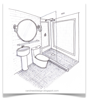
The most challenging of them all for me was the Boy's bathroom.  It's original layout had a tub/shower unit which we would replace with a walkin shower.  What you can't really see clearly in these concept sketches is that the room has quite a few jogs, including a dropped bulkhead in the shower not depicted in here at all.  The clients desire was to do this bathroom in all ceramics or porcelain tile. Not usually my preference especially when the cost of the ceramics or porcelains can be equal to the cost of a marble.  I recommended we do a marble mosaic floor tile paired with a simple ceramic on the walls.  Just that bit of marble would add a luxe edge along with texture and pattern.  I'm not a fan of decorative tile borders and inlays or using a multitude of various tiles in a bathroom for the sake of adding some 'wow'.....an approach I find just too decorative and trendy.  I think the tile should provide the basic bones to the space, evoke the vibe you are going for and add a sense of long lasting quality.  If using a ceramic, I go for timeless white or colour block an entire wall in an accent colour. If you use a natural stone, the statement is simply in the stone itself, no enhancing needed, leave the decorating to the towels, accessories and artwork.  A common exception I make is the use of a contrasting band or pencil liner.


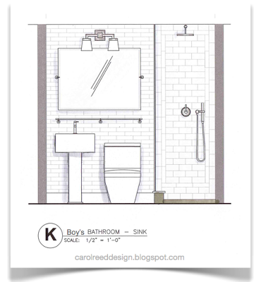
The sketches shown in this post were really really preliminary and done at the concept stage waaay back in August of 2011.  (For this post I've stripped them of dimensions and notes.)  The intent of these was to illustrate to the client how we could use a basic and classic ceramic tile shape but still add some detail.  We considered doing a combination of a dark blue vintage style (handformed, crackle finish) 2" x 8" floor to ceiling wall tile behind the sink and toilet, then tiling the shower walls in white field tile with frame borders in the same blue tile.  Even though they had told me they didn't want 'subway' tiles, they really loved this. (variation of this above and below)


There is a jog in the wall where the shower glass screen is so this provides a natural transition spot to change to a different wall tile inside the shower. A small carrara marble mosaic floor tile is continued thru to the shower floor, the shower sill would be carrara slab, on the wall not visible is a recessed soap niche also made of carrara slab and outside the shower is a full height small storage closet. Completing the space is contemporary plumbing fixtures and vintage style lighting.


One of the most common apprehensions clients have is floor to ceiling wall tile.  I personally don't understand the resistance, especially in a bathroom -  and true to that these homeowners were uncertain about taking the tile all the way to ceiling behind the sink so the final decision was half height.  


Months later when all the final specs and detailed design drawing were completed I can tell you the final design is not like ANY of these concepts!!!  ; )  You'll have to visit again to see sneak peaks of the installation.  You'll see we ended up with a modified version of this last sketch above, except we're going with a different type of sink all together and we're using Select White Thassos marble on the walls. ( The sink and toilet will also be in the reverse location.)


This young boy's bathroom will exude the fresh classic crispness of navy and white. Whatever walls are not clad in white tile, will be coated in a deep navy paint. All the polished chrome will sparkle against it and the white will look extra fresh.  What I love most about this foundation is that navy is such a 'neutral' you can chose from a myriad of accent colours for your accessories be it yellow, purple, green or red.


Check out the full back story and before photo  here.
See the before and after floor plans 
and my concept for the architectural details here.


All Drawings by:  Carol Reed Design