Favorite Toilet

I’ve specified a lot of toilets over the years and my hands down favorite for the past 3 years has been the dual flush Aquia Toilet by Toto.  (I’ve specifed so many of these, i know that i can fit 3 of them in the back of my car!)  Nothing beats its combination of sleek skirted design, high efficiency and price.  


Priced as low at $379, plus seat, the next best candidate for a stylish looking efficient toilet is easily in the $800 and up range.  So if you’re replacing multiple toilets and style or budget is a concern, this is my top choice every time.  The skirted design conceals the trapway and anchor bolts, giving it a sleek contemporary look and making this super easy to clean.  I’ve always hated the way conventional toilets look with the porcelain base contoured to the shape of the trapway, always a pain for cleaning and they just look unattractive. 


Despite the fact it can look intimidating as it appears right out of the box, the Toto Aquia is easier to install than it looks. I’ve witnessed homeowners who’ve never installed a toilet before, assemble and install one of these in less than an hour and additional units in only 15 minutes, commenting that its really a simple, ingenious design.
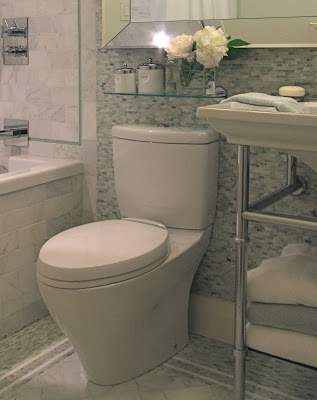


Its a high profile (30”h), 2 piece toilet with elongated bowl and flush controls on the top of the tank, so the only downside to this particular model is because of its height, its not suitable for applications when your vanity countertop continues over the back of the toilet unless your vanity is in the 36"h range.  Otherwise, you can check out the low profile Carolina model with a similar skirted design. 


THINGS TO CONSIDER BEFORE PURCHASING A TOILET..... 


If you’re replacing a toilet, check the rough-in dimension of your existing toilet.  Most toilets are made for 12” rough-in installation but often in condo’s the rough-in location is only 10” and can't be easily changed with a concrete subfloor.  They do make extenders which can be used on some models to adjust the rough-in, but not all.  Make sure the model you chose is compatible.


If you don’t currently have wall tile or wainscotting behind the toilet and you plan on adding this, take that into consideration when measuring the rough-in.  You should always allow for space between the back of the toilet tank and the wall.


Elongated or rounded front?   Elongated bowls have an 18-1/2” seat depth,,,rounded fronts have approx. 16” deep seats.  The overall depth of the toilet will vary from 26 - 28” for rounded fronts and 29” to 31” for elongated bowls.   In standard size washrooms or large washrooms there’s no reason to go with a rounded front, or as i call them ‘stubbies’, I always think its inappropriate to use compact stubby toilets in large washrooms, i see this a lot and think what’s the point?  It just looks skimpy when you use a space saving toilet in a room with ample space.  Go for comfort and get a regular size bowl.   Use the rounded fronts only when space is limited and every square inch is needed.


How much space do you need for a toilet?  You should always allow 30” min. clear width, or 15” from the centre of the toilet to adjacent walls or cabinetry.  And ideally you should try to have a least 24-30” of clear space in front of the toilet, in small spaces 24” is livable, and in really tight quarters you can get away with as little as 18” which is the minimum distance allowed by code. 


TOILET ACCESSORY MUST HAVES......


The self closing seat is a must, especially in households with men and children!  Men, love this feature, but beware, once they get used to this,,,they’ll be slamming down toilet seats wherever they go, expecting them all to gently and silently self-close.   


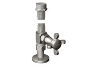
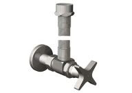
Designer shut-off valves.  Soon as your plumber is finished complaining about having to install a fancy Toto toilet,,,,make sure to tell him you want one of these too. ; )  And while you're at it, you can't have a designer shut-off valve without some some nice stainless steel supply flextube.   These little details are something I always specify, its the perfect finishing touch that will take your brand new bathroom up a notch.  Most plumbing supply showrooms don’t stock these so allow 2 weeks for delivery.  The ones below are by Rubinet, available in a contemporary and traditional cross style and various metal finishes.


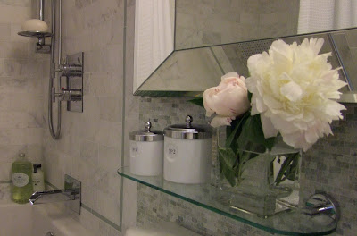
Bathroom photos above by:  Carol Reed

June Peonies....


I had such a busy June that i barely had time to stop and smell the peonies, my absolute favorite flower.


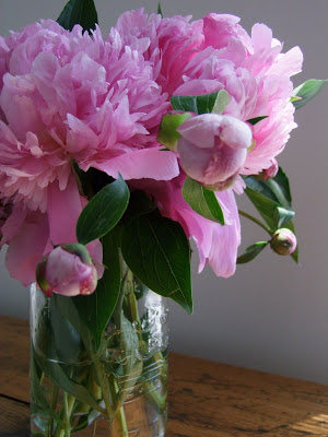
Our peony bushes seemed to burst into bloom all in one day.  Unfortunately i wasn’t home much and wish i could have enjoyed them more.   June is my second favorite month of the year because i can fill the house with fresh peonies from my own garden.  But i make sure to grab a camera and capture the beauty before picking them.    Picking up the camera and spending one or two minutes taking photos in the garden (or flowers from the flower shop) is one of the least expensive ways to create instant, original art.  I order prints on-line which is much less expensive than buying my own photo paper and colour ink cartridges, and they’re ready next day on photo paper, canvas, greeting cards or post cards.   The image above will look stunning mounted in a simple white, black or silver frame,,,or transfered onto an oversized canvas.  I’ve got mutiple shots so if I want to hang a series, i’ve got lots of options in black & white or colour.  I’m still deciding what to do with this one......


I fill the house with flowers and greenery, all year long.  I tend to use a lot of branches and oversized leaves because they’re dramatic, organic, inexpensive and last a long time and nothing could be simpler to arrange.  I have a collection of vases in all shapes and sizes,  which allows me to create tall upright arrangements, low tight arrangements or full bouquets that burst out in all directions.   


After taking a few photos,  I pulled out an assortment of vases and filled the house with peonies.  


On a side table in the living room.


In a vintage mason jar in the foyer.  Nothing beats the simple beauty of peonies in a mason jar.  This particular jar is vintage 1944, and i love that embossed on the front is a crown and the words made in Canada.  Sometimes i remove all the leaves from the stems,,,,sometimes,,I don’t!


On the fireplace mantle, a single bloom in a low profile rectangular vase.  What could be simpler?  It think its a modern way to display a very traditional looking flower. 


These branches of greenery are off of a vine-like weed that grows like crazy in our backyard.


In an Alvar Aalto crystal vase, on the meeting table in my studio.


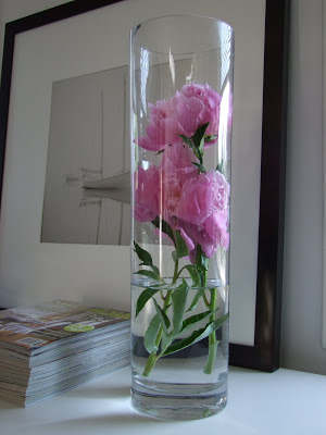
And nothing is more dramatic than blooms or leaves in a tall cylindrical vase, this one is about 20” tall and sitting on the credenza in my studio. 


After filling the house with peonies, there were loads more still in the garden......so I took some to a clients last week where i was doing a photo shoot and used them in the bedrooms and one of the bathrooms.   (More on that project in future posts)... 

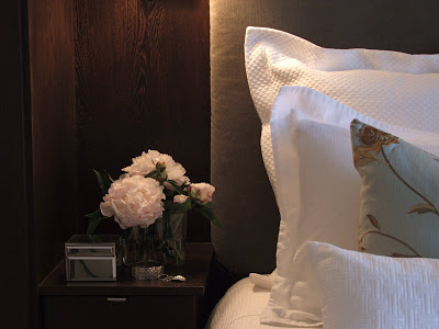
A sneak peak of the master bedroom in recently completed project...


A sneak peak of the guest bathroom.


And this room wasnt’ even part of the photo shoot but I couldn’t resist putting some peonies in the room anyway.


In a matter of 2 weeks they’ve come and gone, but I’ll have photos to enjoy all year long.   Now I’m really looking forward to the hydrangeas.......   


My Condo Renovation

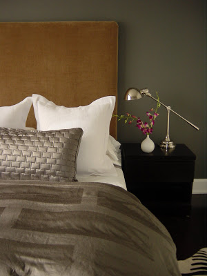
Master Bedroom


The first time I had an opportunity to design a home for myself was about 6 years ago. My boyfriend and I were buying our first place together and we decided to look for something we could renovate and redesign to our own specs. We found a 1980's condo on the waterfront with panoramic lake views and just 10 minutes to downtown, in original condition and ready for a complete gut. It wasn't my dream home, nor did I even design it in a style that reflects what I would want in my dream home, but it was somewhere we only intended on living for 2 or 3 years (which turned into 4). I designed it in a style that I felt suited the condo and would be appealing to buyers when it came time to sell. Although these photos are a good example of my work, they don't necessarily reflect my true personal style. I despise condo living (i need outdoor space), have a passion for simple country antiques, vintage finds and traditional architectural detailing. So buying this condo also meant we had to rent a storage unit across the street to store our oversized rustic pieces and my ever growing collection of 'great finds'.


New Open Concept Kitchen

The existing kitchen was a completely enclosed tiny U shape room, we knocked down all the walls opening it up to the lake views. The new 9 foot long island had a poured on-site concrete counter top and the back counter was stainless steel with an integrated oversize single sink. The backsplash was back painted glass that just glowed a watery blue/green colour.

Living Area

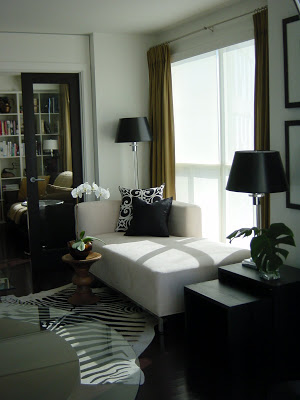
The open concept living and dining area had floor to ceiling windows and almost no wall space. The furniture was kept low to not obstruct the view. The draperies added vertical dimension and texture to the space and helped warm up the expanse of bare windows at night.

Dining Area

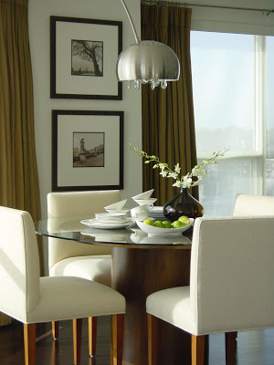
During the day the condo was flooded with direct sunlight so in additon to lined drapery panels, I had Hunter Douglas solar shades installed on all the windows. This helped control the temperature and protect fabrics and wood from fading. (The photo above was taken at about 10 in the morning.) It wasn't possible to install a junction box in the concrete ceiling to hang a light fixture over the dining table so i opted for a high arched floor lamp. It also swiveled so it offerred us the added bonus of being able to swing it over the coffee table in the living room if we wanted. I custom designed the dining chairs and the dining table was a freebie, a cast-off '80's meeting table from my old office, headed for the dumpster but i thought it had great lines and I loved the walnut veneer. I hauled it home just in time for our first Christmas dinner in our newly reno'd condo. I added a larger glass top to it and it comfortably seats 6, we've squeezed 8. I can't tell you how many inquiries I've had about this table and offers to purchase it. In fact its the most standard plain office meeting table there is, the style is commonly referred to as a drum table but i've always admired it for its simple lines. It pairs well with all chair styles, i often use the modern Bruno chairs or Eames side chairs with this style table.

Living/Dining Room Evening Shot
A view of the living and dining area at night, my favorite time. Large expanses of window with water views become large black walls at night, without the drapery panels the windows would look very cold and bare especially in winter.

The Views.....


The condo had floor to ceiling windows that wrapped around the perimeter of the unit, and faced south overlooking the lake and marina below. To the far right we could see the corner of one other building, which happens to be what I think is one of the most beautiful condo buildings in the city and provided a stunning architectural view.


The purchase and closing was quick, giving me only about 3 weeks to complete the design drawings and co-ordinate the start of constuction. Demolition was extensive, we removed absolutely everything, including the stippled ceilings, taking the entire unit back to the bare concrete. In a matter of a few weeks I had designed everything including 2 washrooms with custom vanities, the new open concept kitchen with custom shelving, counters and backsplash and even custom doors, casings and baseboards throughout. The entire renovation took 4 months to complete....... but the furnishing of the unit took another 2 years!

In upcoming posts I'll show more before and afters photos along with some of my design sketches and also write about what it was like having the condo featured in Canadian House & Home!


All photos above by Carol Reed