July Sourcebook:

This was one of several pieces of original art I purchased with a client this month.  Found at Art Interiors, Solitude by Rita Vindedzis, 12 x 48.


When I go out sourcing products and furniture for client projects, I always carry 4 things with me; a notebook, a tape measurer, a digital camera and my blackberry (soon to be 3 things when I get a new phone with integrated camera!).  


In my notebook I’ll staple samples of paint or fabrics for reference along with a list of what I need to source complete with sketches, dimensions or room layouts.  When I’m sourcing I make notes on every item i photograph, aside from the size and price etc.,,,I note whether its comfortable, sturdy, heavy, light etc... or if I’ve seen the same item at another store.  Typically I go thru one of these notebooks a month for miscellaneous projects, and if I’m working on a whole house reno, I start a sourcebook just for that project.  When the notebook is full, I keep it on file as I reference back to them quite often.  I know I could streamline this and do it all electronically,,,,but an old fashioned notebook and pencil is what I prefer for sketching quickly and attaching samples, besides the fact, if your battery on your blackberry or iphone constantly needs charging, then its back to the notebook.  It may not be a perfect system,,,but it works for me.  


Of course not all the options I’ve sourced over the month actually make the cut.  So here’s a peek into just some of the winning picks (non-custom) that I’ve specified or purchased this month,,,,,,these are things my clients have purchased, things that I’ve purchased for clients and things i’ve purchased for my own use.


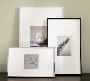
Ready made frames.  I've purchased so many of these Thin Metal Frames the last couple of months for client's bathrooms, I don't think Pottery Barn has any left in stock in Toronto.  I love the wide white mats and the simple modern profile, I think the polished metal version works so well in a bathroom with traditional or contemporary plumbing fixtures.   A custom looking framed image for half the price.


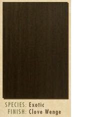
Flush slab vanity drawers in Wenge wood veneer with clove stain.


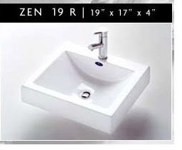
Zen rectangular vessel sink by Neptune.


Cararra hexagon mosaic tile for floors in a bathroom because the shape is classic, the look is timeless, a great mix with contemporary plumbing fixtures.


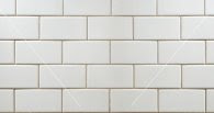
Hand made ceramic subway tiles for bathroom walls, specified on several projects (I love the hand made quality vs the mass produced if the budget allows). Because they're timeless and classic and are a beautiful compliment to other marbles and stones.


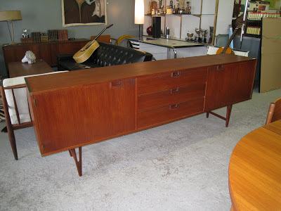
A vintage teak sideboard.  This danish beauty measures over seven feet long, has gorgeous legs, antique brass corners and the drawers are the exact perfect fit for CD cases!  Simply stunning and one of my all-time favorite finds, this one's from Queen West Antiques in Toronto.


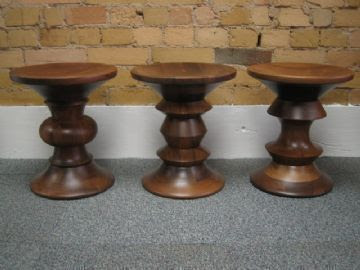
Eames Stool (left), what can I say, these are little works of art that you can use as a side table or foot stool.  This one was found at Studio Pazo in Toronto. 
Mixed media on wood under resin.  "To become" 12 x 48.
Mixd media on wood under resin.  "Secret" 48 x 60.

A client and I commissioned some original art work by artist Murray Duncan.  Samples of his work are shown above and his work is exhibited in his furniture store Hardware as well as at Parts Gallery in Toronto.  Murray does the most incredible work using mixed media under resin on wood, they have a deep high gloss finish that unfortunately just doesn't translate well in these photos.  He also does panels like these on credenza and armoire doors that are sold at his store. Totally unique & GORGEOUS!


White ceramic bird bud vase.  I spotted this at L'Atelier in Toronto and just had to buy it.  It was a perfect little finishing touch to some shelving in a clients office. (visualize this without the granny flowers.....sorry i didn't have a pic of my own.)


Woven storage boxes and magazine butlers for a home office, from West Elm.


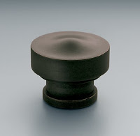
Hardware for a bathroom vanity, Strand knob by Restoration Hardware.

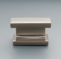
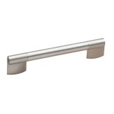
Door and Drawer pulls for a kitchen island.  Contemporary pull by Richelieu.


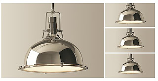
Pair of pendant lights for over a new kitchen island.  Harmon pendant by Restoration Hardware.


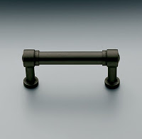
Existing kitchen cabinets get new paint, BM Vapour, new hardware, Grafton pulls and knobs in oil rubbed bronze from Restoration Hardware and new Misty cararra Caesarstone counters.  This new look will give a young family of 5 a modern-traditional kitchen that will serve them beautifully for many years to come.

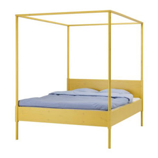
I've saved the best for last.....the Hemnes 4 Poster Bed by Ikea.  This bed has made it on so many top 10 lists, its become famous among design bloggers and shelter mags, its simply great value and great style.  Any other four poster bed on the market is easily 4 times the price of this one.  This spring the Hemnes bed was discontinued and by end of June Ikea had sold off their remaining inventory (at about 50% off).   But I didn't let that deter me, they call it a self-serve warehouse for a reason,,,,if everyone in the store tells you there's none left in stock, go and search the warehouse yourself to make sure.  I often find their computerized inventory is off by 2.  In this case, I went searching and much to the surprise of the staff, I managed to find not one but two Hemnes queen size beds sitting on a bottom rack with no tags.  And the best part is, when they did a price check, it was only $69!!!!!!.  Needless to say I headed for the checkout before she even finished asking me if I wanted it,,,,,all i could think of was "start the car!!".  What a steal!  And no, I don't have anywhere to put the bed right now (i've added it to my growing collection in the basement), but that's besides the point, this was a great find and one day I know I"ll find the perfect room for it.  In the meantime, I've already starting dreaming of the possibilities...... 


Dealing with Obstacles


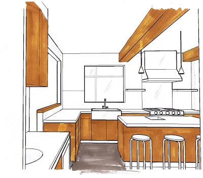
A rough 3D sketch helps clients decide how to deal with unexpected changes

Despite how much preplanning and investigation is done prior to embarking on a renovation, you don't really get a true picture of the extent of new work required until after the demolition phase.  Often after the demo you'll discover structural or mechanical elements that need to be worked around or beefed up.   Quick decisions have to be made on how to deal with these obstacles without adversly effecting the design, the budget or the schedule,  but it can be difficult for clients to visualize how the proposed changes will look.   The quickest way to help them make their decisions is by showing them photos of similar situations or in many cases, I quickly draw up a rough 3D sketch to illustrate a point. 

In this case, I was working with a client on a kitchen renovation and after the demolition it was determined more support was required for the floor above and new beams needed to be added across the kitchen ceiling.   We didn't have much flexibility in where they could be placed which meant they weren't necessarily going to be equally spaced or centered within the room.  There was no space above the ceiling to install these and the homeowners didn't want to lower the entire ceiling, so,,,, since the beams were going to be visible, we had to decide how to finish them.  

My clients wanted to clad them in antique wood (as the new kitchen cabinets were being custom made from antique hemlock) to create a beamed wood ceiling effect, but I was recommending we just drywall them and paint them out white.  The house itself is a century home but the interior has been renovated in a very pared back modern style with lots of vintage mid-century modern furniture.  The house throughout is white with old wood floors.  The new kitchen design was what i would call a modern-industrial style, a combination of wood, concrete and stainless steel with simple clean lines.   

My suggestion on how to treat the new beams was to just ignore them.  The best way to not draw attention to something - is to make it blend in.  They weren't completely convinced and thought it might be a good opportunity to add more interest to the kitchen by making the beams a feature.    So I did these sketches to illustrate how the contrast of the wood on the ceiling would look.


The view from the hallway as you enter the kitchen.

As these sketches illustrate, cladding the beams in wood does two things - it creates high contrast with the white ceiling, and visually it brings the ceiling down.    In my opinion, this detracts from the impact of the understated, cabinetry free wall we had intentionally planned.


View  from the Dining Room

The view from the dining room is a good example of how the wood beams make the ceiling appear lower.  Often people will angst over obstacles like this and worry and stress about how to deal with it, and its easy to waste a lot of time and effort trying to recreate the wheel in attempts to disguise it or over-design it.  

When I'm faced with these obstacles, I deal with them in one of two ways:
 1. Make a feature out of it.  Only do this if you can integrate this into the overall design so it looks like it was always planned to be there, it should enhance the rooms design concept not detract from it.  The size, the placement, the way its finished should not look out of place with all the other elements in the room.
2. Understate it, make it blend in, make it disappear.  It may not be perfect, but it is holding the roof up,, providing you heat or  supplying you with water so its better than not having it at all!  If you look closely at magazine photos in your piles of inspiration rooms, you can spot obstacles treated like this in most rooms if you look for them, but because the room is so fabulous you never even notice it. 

On this project the final decision was made to understate the beams by painting them out the same as the ceiling.  As I promised them, in the end, when the kitchen was all complete they would blend in, become unaware of them and wonder why they were ever concerned about them in the first place.  I'll post more drawings and photos of this incredible kitchen reno in future posts...


Dining - Inside Out

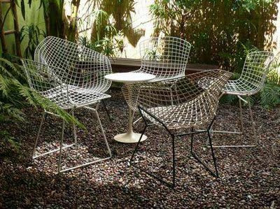
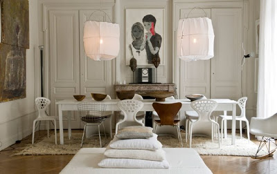
Update July 20th:  I was sourcing some dining chairs for a client today and came across a couple of stunning chairs that are perfect for indoor and outdoor use and they're pretty reasonably priced, so I just had to include them with the post below ! (Room above: Hand Interior Design).
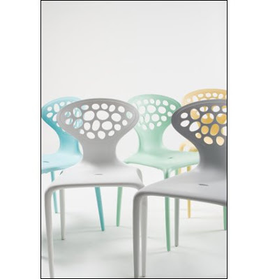

Web Chair $120
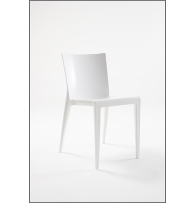

Stilt Chair $175
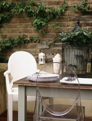


This will be my last post on outdoor furniture for the season, considering the weather’s been so lousy this summer we have yet to dine outdoors even once this summer.  But if we get lucky enough to enjoy a warm summer evening dining al fresco, then this is how I would make it more magical...


TAKE COVER.  For outdoor dining, I prefer a covered porch or awning rather than an umbrella, the post in the middle drives me crazy.  But i think my favorite summer product this season is Ikea’s Dyning Gazebo canopy, offerred in either a rectangular or trianglur shape.  You can string up one or two or three of these between trees or posts to create a dreamy canopy effect that looks like boat sails......  Great for irregular shaped spaces, and situations where awnings and permanent roof structures are not an option.  This is ingenious and a steal at $29.  
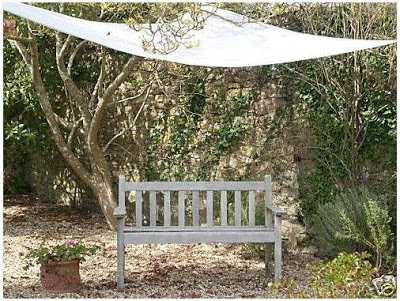


AVOID MATCHING suites of furniture.  Most people seem to have grasped the concept of not buying suites of dining room and bedroom furniture like our parents did, but somehow this concept hasn’t translated to our outdoor rooms yet.  Even though there is more of a selection than ever before, when it comes to outdoor furniture (most of it more expensive than our indoor pieces),,,,,I always seem to see entire backyards or decks furnished with matching sofas, coffee tables, dining tables, chairs, bar carts and side tables all from the same collection.  I know its usually less expensive to buy the entire set, but they will sell these pieces individually too so perhaps its a case of people rushing to furnish their outdoor spaces so they can just get busy enjoying them?
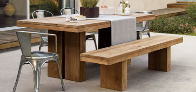


BRING THE INDOORS OUT. Whether its indoor dining or outdoor dining, chairs are always a big investment, because you need multiples.  Four, six or eight.  So why buy chairs that are only suitable for outdoors?  Stretch your patio budget by only buying 2 or 4 outdoor chairs, or one long bench, or,,,,,if you’re really tight on space and dollars, skip the outdoor chairs altogether and think multipurpose.   If you purchase chairs for your deck or balcony and they look like patio furniture then you minimize the amount of use they’ll get (I don’t think it ever looks appropriate to use them indoors, even in a pinch) and you’ll have to find dedicated storage space for them in the off season.   But taking your indoor chairs outside,,,somehow always looks decadent.
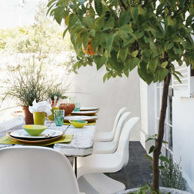


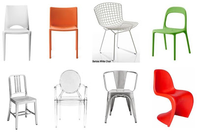
Today there are a variety great looking chairs that are suitable for both indoors and out (see photo collage at bottom of post) but you won't find these in outdoor section.   Initially you might have only ever considered these for indoor use, but surprisingly not only will all of these chairs look stunning in your kitchen, home office or dining room, they’re all suitable for outdoor use too!  And as a bonus, they all stack for easier storage if needed.   These are modern, clean lined and would mix well when paired up with chairs of any other style making them super practical. So if you buy a few extras, you’ll be prepared for extra dinner guests at anytime of the year and your mix of chairs will look stylish and chic as opposed to mismatched and makeshift.



EASY TO FIND.  These chairs are available in shops 12 months of the year which means you’ll never have to scour the city mid-way thru summer looking for some stylish outdoor seating.  If you’ve ever shopped for outdoor furniture after the May long weekend, you know how frustrating it can be to find anything.  But what do you do if its your first place, or your first backyard, its mid-way thru June and you’ve got guests coming for a bbq!?  You may not even have dining room furniture yet let alone patio furniture.  Investing in 2 or 4 of these chairs will give you the flexibility to use them inside or out.
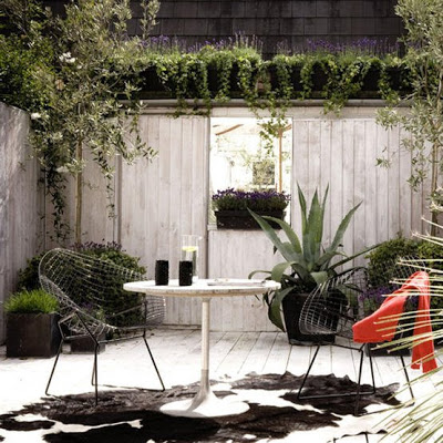


I'm partial to these chairs paired with old rustic wood tables, especially trestle style, or chunky teak tables.  If you're outdoor dining space is well protected and you have a place to store a table in the off season, you can get away with almost any inexpensive table or create one using workhorses and plywood or an old slab door, then layer it with table cloths.    

Photos:  Living Etc., ebay, DWR, Living Etc. (3), Apartment Therapy, Chairs clockwise left to right, top; Alonzo Chair DWR $44 (sale),  Air Chair DWR $98 (sale), White Bertoia Side Chair DWR $450, Ikea Urban Chair $50, Navy Chair DWR $415, Ghost Chair DWR $400, Marais Arm Chair DWR $135 (sale), Panton Chair DWR $250