Victorian House Tour - Powell & Bonnell


I had the pleasure of being invited to tour an open house this week of a beautiful victorian semi-detached house in Toronto.  I'm fortunate enough to work with one of the best real estate agent's in the city, Kara Reed, who also just happens to be.......my sister-in-law of the past 20 years.  (You may recognize her from HGTV's Sarah's House I, and Sarah's House II).  Kara had the pleasure of listing this 1890's victorian house on mls this week and is preparing for a public open house this weekend, more info here.  Knowing that I'm in house hunting mode myself and knowing my love and appreciation for great interiors of all styles, she insisted this was a must see for me -and I'm glad she did.

The house was designed by the award winning Toronto interior design firm, Powell & Bonnell during an extensive renovation of the house back in early 2000's.  What's  unique about this house is its one of the few (if not only) traditional, victorian style home this team have designed.  If you're familiar with Powell & Bonnell's work, you likely conjur up images of clean, dynamic contemporary spaces when you think of their projects, however, a quick browse thru their portfolio reveals a diverse range of projects from clean and contemporary to modern rustic.  I've always believed that the best designers have diverse portfolios and can apply their design philosophy to a range of styles and I can definitely see this diversity throughout their past projects.  You can check out their on-line portfolio here

Before the renovations began in early 2000's the house had been open plan and void of any original architectural detail and character.    All of the walls that had previously been taken down and all of the mouldings and details that had been stripped away were painstakingly re-created from top to bottom.  Today the house is a beautiful example of a traditional victorian home who's original character and architectural detailing has been well considered and thoughtfully brought back to life.

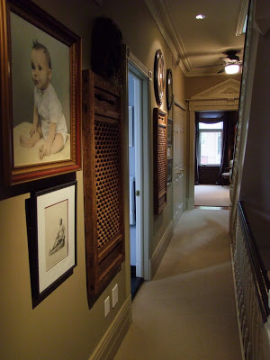
One of my favorite things about the house was the collection of artwork throughout and the manner in which it was displayed - it's masterfully done.  You'll see in the photos to follow that every room and hallway has beautifully arranged groupings of artwork and objects in all shapes and sizes.


Living Room Vignette

Living Room


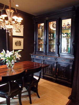
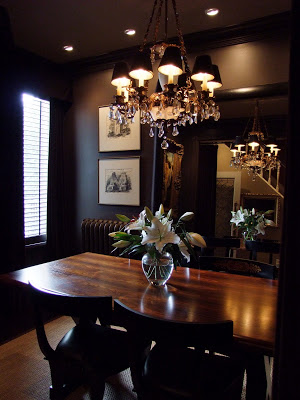
Dining Room
The dining room measures only about  12'w x 9' deep but its grand and impressive.  The combination of the dark wall colour and the large mirror add depth and create a dramatic, inviting space.  It was simply stunning.


This is Kara in the hallway outside the dining room as she was pointing out the dining room's velvet parlour draperies that would have been an original detail in a house of this era. 

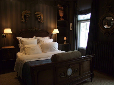
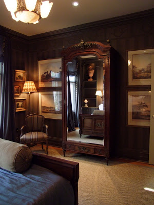
The master bedroom was striking and handsome with its dark walls, antique furniture and sisal carpet.  The variety of light sources and use of mirror again make this room both sparkle and glow, creating an ambience that's so inviting and intimate.


The tone on tone stripe effect on the bedroom walls was actually so subtle that I didn't even notice it until looking at the photos afterwards.

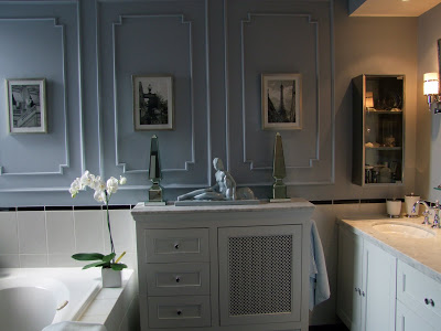
The main bath had some clever built-in storage around the radiator.  There's nothing over the top in this room but there's a great sense of balance.  You can see that the surface applied panel moulding, its repitition and the symmetrical display on top of the cabinet give this room a classical look.  The gorgeous soft blue colour combined with all the white and polished chrome just takes your breath away when you walk in the room but yet the bathroom's tile and fittings are just very simple and timeless.


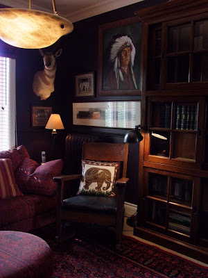
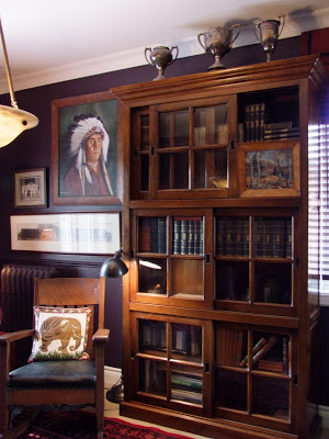
The Den

The second floor den was again, dark, inviting and intimate with a wonderful eclectic collection of pieces displayed on the walls and cabinets.  Despite that most of the rooms in this house would be considered small spaces, the use of large scale furniture and dark colours make it feel luxurious and grand.  The key to this,,,,,, is the great use of lighting.


Second floor hallway


Main floor bathroom, again the use of simple white, pale blue/grey and silver metal gives you that refreshing sense of a nostalgic old world spa.

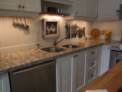
The kitchen was simple and classic with its beadboard backsplash and butcher block topped centre island.

Again a wonderful integration of storage with the rad cover.  The use of metal apothocary style cabinetry and carts were used again here which I also saw in both bathrooms, this cabinet appeared to be vintage but the two small wall-hung ones in the bathrooms were newer. 


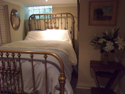
Basement bedroom.  
This was an irregularly shaped small room but I love the fact that despite that, they went for maximum comfort by using a full size bed - its cozy and luxurious looking even though its placed in this tiny nook.  The attention to the way the bed is dressed and accessorized would make any guest feel important and special.


I could notice from the reaction of those who were touring the house while I was there that the traditional style and detailing of this home was really resonating with all of them as they were were drawn into one room after another,,,,,,,,and not wanting to leave!   I have no doubt this house is going to attract a lot of attention this weekend......


All photos:   Carol Reed

Goodbye Summer....

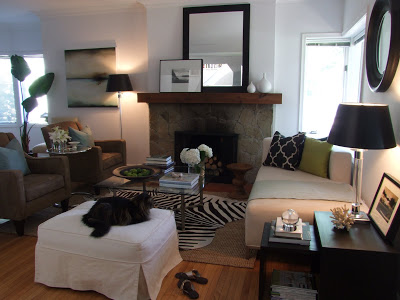
My Living Room, August 2009

As of 5:18pm today, summer was officially over and tomorrow will be our first full day of fall.


This means in the coming days I’ll be making some small changes around the house to make it feel more cozy and seasonal, in fact I started last weekend.  Just subtle changes,,,like putting away some of the summery feeling accessories.  Below are some shots of the way the living room looked mostly towards the end of summer - I’m always changing up things even throughout a season.  Simple things like changing the covers on the toss pillows to a watery blue/grey,,,switching out the coffee table books to more summery ones in both colour and subject,,,,adding summer flowers, light weight throws, sea shells and hurricane lanterns.  Even though we live in the city, we also live by the lake so the house lends itself to a casual lakeside feel, our furniture isn’t so much that look,,,,but I think just a few touches were enough to create that mood.


This is a rental house that we moved into during the summer of 07 immediately after selling our condo.  Like most rentals, the house was not in the best of shape, it was pretty nasty in fact,,,(the exterior still is!) but a good cleaning and a fresh coat of white paint throughout the interior did wonders.     Even though we had all of these things when we moved in,,,,,the placement of the artwork and smaller accessories took some time to fall into place.  But overall, I love how our existing furniture from the condo seem to just fit right and at the same time,,take on an entirely new look in this space.   I didn't care that we were only going to be living here for a year or two,,,I was determined to make the place looked like we had always lived there and to make it comfortable and welcoming, and without buying anything new for it.  It was a great excercise in 'making the most of what you've got'.
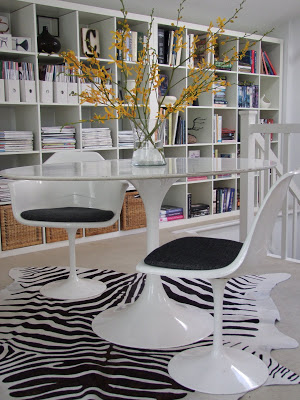


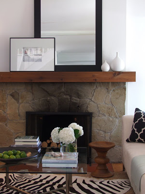
The house had two features that i fell in love with immediately (aside from its location),,,,a wood burning stone fireplace in the living room, and a large 2nd floor loft space with cathedral ceilings, loads of natural daylight and a walkout to a second floor deck - the perfect home studio.   I knew instantly that i would fill one complete wall of the loft with Ikea expedite shelving.  I had some of these in our condo (which we built-in) and couldn’t imagine living without them, and coincidentally the height of the units fit perfectly in this loft space on the low side of the sloped ceiling, like it was meant to be.

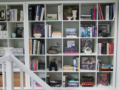
Reference Library in my loft studio


Ikea's Expedit shelving, wall to wall


I'm not fond of corner windows but I grew to really like this one, its placement gave us great views of the lake and it has a big deep sill that makes a perfect spot for the cat to perch and he spend a lot of time there.  The landlords horizontal blinds are pretty unattractive but I keep them up most of the time so they really weren't an issue and besides there are just way too many windows in this house for me to start changing the window coverings! 


This was our last summer in the house as we’re currently searching for a permanent home that we hope to find sometime in the next few months.  But in the meantime its still home for now and I’ll continue to feather my nest here until its time to pack.  I can’t say i’m going to miss summer, because I LOVE fall,,,,and the changes that will come with it, but I’m really going to miss this fireplace, my wonderful lightfilled and spacious loft studio and the sound of the waves lapping against the shore......


All Photos:  Carol Reed

the design shop


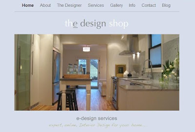
My e-design website - thedesignshop.ca

As a designer I receive a lot of inquiries from homeowners regarding my services, all are very enthusiastic about their home improvement plans and have gathered loads of designer inspiration rooms, eagerly hoping that with the help of an interior designer they can bring their vision to reality.   Unfortunately, the reality for many of those who inquire is that the cost of hiring a designer on a full-service basis is just not feasible for them.  Generally I find most people have misconceptions or just no real concept at all regarding design fees, and that’s totally understandable - and its also a topic for another post entirely because I have a lot to say about that!


I’m a passionate advocate for good design,,,in all aspects of life.  I don’t believe it should only be accessible for the wealthy because I don’t believe that good design is about expensive things, how much something costs or has anything to do with how pretty something is.  In fact, I believe that when it comes to investing money in our homes or our business, we can’t afford not to utilize the advice of design experts, especially with small precious budgets.


For those homeowners who can’t manage to hire a designer on a full-service scale I’ve always offered them the opportunity to work with me on a virtual consultation basis for a few hours of time, enough to provide them with some critical and valuable design direction and ensure they’re not going to make any costly mistakes.  Thru the convenience of internet and digital photography all this information can be shared by email and is what’s key to making these consultation services affordable.   The hours and hours of meeting time, travel time, and project management time is eliminated and I can focus entirely on the planning and design issues,,,,leaving the leg work for the homeowners to take on - with lots of guidelines and direction of course!


Do I need to see a home in person or meet an individual in person to visualize their space or understand their needs, or style, or to give them design advice?  No!  In fact for many years I’ve designed spaces entirely from paper information because the building didn’t even exist yet, or the building was located in a different city or province or country.  As long as I have all the relevant information, dimensions, site photos etc., that’s all i need to start planning - architects and designers work this way all the time.  Personal information regarding needs and style preferences can all be obtained by asking the proper questions, thru detailed surveys and questionnaires,,,,whether in person or online, the answers are the same.  


I launched my first Interior Design website in 2004 and also created a complete concept for an on-line design website, but didn’t proceed with it at that time.  I posted a  notice on my website saying that ‘On-Line Design” was coming soon and I had even secured a separate domain name for it.  Despite the fact I was already working with clients this way, I never did get around to launching that site,,,,,,,,,until this year.   This past winter I thought the timing was better than ever to offer value based services and my new e-design website the design shop was created and then launched in June.


I’m proud to say that I think this is by far the most professional, comprehensive web-site devoted to e-design services I’ve come across on the web and I think the value is simply incomparable. There’s a complete menu of ‘prix fix’ services and if you don’t see a service that suits your needs just drop us a line and we’ll put one together for you - its literally a one stop shop for design advice.  


Imagine your personal designer, a click away!   I hope you check it out and let the possibilities inspire you...


www.thedesignshop.ca