Brian's Condo - Guest Bedroom


Its been a crazy week of deliveries and installations at Brian's condo and with today, February 1st, being our deadline we are about 90% complete, and I'm happy to say we also seem to be reasonably on-budget.  A few pieces of artwork to be hung, small accessories and finding the right nightables are left on the 'to do' list.

One of the areas of the condo that we deligated the least amount of the budget to was the second bedroom.  Brian's intent was for this to be used as a home office space for occasional business related work but mainly for personal use and home finances etc.   A small file cabinet and printer would be stored in the closet directly beside the desk.  In addition to a desk area he would need to accommodate an overnight guest every once in a while but he didn't want to dedicate the space for a bed so we opted for a sofa bed which would allow him to enjoy the room on a day to day basis with a comfy sofa for reading.  The room is quite irregularly shaped so there wasn't too many options on where the desk or sofa bed could go.

The first image above is the design concept for the room which illustrates all the key pieces I sourced.  I opted for a simple work horse style desk with metal frame legs and glass top - this keeps the space open looking and definitely is keeping in style with our "vintage-modern with a touch of industrial" look.  I chose the black nickel saw horse desk from West Elm, the price was right and it was in stock!  

The next big 'splurge' for the room was for a desk chair.  I actually had found a sled base chrome and leather chair at a consignment shop for just $100 but Brian really wanted a chair that swivelled.  I was a bit torn on this one with the budget,,,,my own opion of desk chairs is that you might as well either go - super cheap $29.99,,,,or go for the best which are super expensive.  Everything else seems to fall in the 400-700 dollar range, they look better than the 29.99 cheapies but aren't that much better in quality, in my opinion.  During my 10+ years of experience in commercial design I've spec'd thousands of contract quality desk chairs and know them all.  At the retail level, what you mainly see in the home furnishing shops are knock offs and I'd just rather get the real thing - it will last you forever.   Having said all that, I did happen to stumble across a rather sweet deal on a floor model of one of those knock-off versions that made the decision for us - cash'n carry,,,I took it with me. 

Since Brian is starting from scratch he doesn't have a collection of artwork nor do we have room in the budget for Picasso's,,,,,,so the next best thing to original art is your own photography.  Brian had some old photos from past travels and I took the negatives to Elevator Digital where Kevin truly worked some digital magic on them.  He scanned the neg's at super high resolution, cleaned up the digital images and made large b&w prints for me which I put into ready made frames.  Certainly this isn't a cheap process as these are really the best quality images we could get from old negatives but its an affordable and personalized solution to starting a collection.  Below are low res scans of what we started with, a photo of the Grand Canyon taken from a helicopter and a photo taken at Pebble Beach golf course.  


Above is a mock-up I sent Kevin of what I wanted to do with the photos.  I like that both the images had similarities, a horizon with winding roads amongst peaks and valleys and I think they translated well to black & white - I picked them up on Saturday and I absolutely love the way they turned out!!


The last key item was the sofa bed - it was kind of a no-brainer to go with the Ikea Ektorp model, we splurged on the sofa in the living room so we had to 'save' on this one.  The style and size would work and the slipcovers make it versatile and practical for him.  Best of all,,,,its in stock and ready for delivery.   Over the past couple of weeks the rest of the room has been filled in with some great vintage finds and  some handsome window coverings - this spare room is really turning into one of my favorite spaces.  Here's a sneak peak at what it looked like yesterday when the window coverings were being installed.....


For before photos, floor plan and previous posts on Brian's Condo project:


Brian's Condo - Front Entry


With only a week or so left til 'Move-in Day' at the bachelor pad,,,things have been progressing quickly and I've been sourcing and purchasing furnishings, bedding and lighting non-stop from morning til night (not to mention I'm simultaneously furnishing another entire house from top to bottom with a move-in date just a week after Brian!!).  All of the major pieces have been delivered to the condo and this coming week and thru next weekend we'll be installing new light fixtures, faucets, hanging artwork, shelves, hooks and getting the small accessories in place.

One of the most awkward spaces in the condo is an area just inside the entry, its a wide alcove area that I think was most likely intended for a home office nook.  Its right inside the entry area, past a set of mirror sliding closet doors, leading into the main living space.  Since Brian didn't want his home office located here (his desk will be in the 2nd bedroom) we had this extra space to deal with and a small furniture budget to boot.  Its a great amount of space for extra storage but that wasn't a priority in this situation as there's a spare bedroom and really Brian hasn't accumulated a bunch of stuff, he's starting from scratch.  It certainly would be a great spot for a library but Brian doesn't have much to fill the shelves at this point so we were planning a small library of shelving in the second bedroom where his desk would be.  So what to do with this area that you see immediately upon entering???

Inside the entry he needs a drop zone, a place to drop his keys, his briefcase, a shopping bag etc.  I'm not a fan of console tables as I think they take up space but don't give you any storage, you can't sit on them and they're not too handy for dropping all your bags on - I prefer a bench for this, which does double duty for you or your guests putting their shoes on.  Above the bench I thought we could add a 'console' shelf or two and start a small gallery of artwork and photos that Brian can build on over the years.  I was thinking of not just a picture ledge but a 'console' shelf wide enough to hold a tray or bowl for keys and mail,,,a vase,,,and other decorative objects.  This would provide a nice visual display upon entering the condo and is also the direct sightline Brian will have directly opposite his bedroom door - the first thing he'll see every morning, so it has to make him smile!


I sketched up two variations of this concept, one with asymmetrical shelves and one with 2 different size shelves justified to the right.   I hoped to find a vintage mid-century modern style bench in teak or walnut that would sit against this long wall, below the shelves and art display.   We would start with ready-made frames and add some personal photos of Brians then some small accessories and objects.  After looking at the two sketches, Brian liked the first option with the asymmetrical layout so this is the direction we'll take this weekend when the shelves are installed.

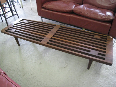
During one of my visits to Queen West Antiques right before the holidays, I walked in and immediately saw this incredible walnut slat bench - I gasped,,,,,yes, out loud (!) - as I knew this would be such a great piece for Brian.  I could hardly contain my excitement, this was going to be the very first purchase for the condo - It was in great condition and the price was right in our ballpark.  I love pieces like this, I go crazy for benches because they're so versatile.   This could be a coffee table, an end of bed bench,,,,a front entry bench,,,or just up against a wall or behind a sofa stacked with books, its the type of piece that can move with you from place to place and you can always find a spot for it.  It didn't take me long to seal the deal with Kate and voila, this was the very first item purchased for the condo!  It was the perfect starting point because it really represented what my approach would be for the rest of the furnishings,,,it was affordable, great quality, beautifully designed, clean lined, and versatile.


The only downside to the bench was that it was slightly lower than I would have preferred, so I'm having a nice thick cushion seat made for one side of it out of a tweedy grey woven fabric,,in a box style with button tufting.  This will make one side of it the perfect seating height and the other side great for dropping bags or purses.  I had the pleasure of storing this beauty in my front hall for a few weeks and I got quite attached to it - I'm missing it now so much that I really wish I could have kept it.


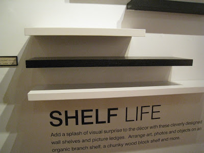
I'm picking up the wall shelves tomorrow and I'm still torn between the dark wood or going with white, right now I'm leaning towards the white as the photo frames will be a combination of black and wood and I'm not sure about the black espresso colour with the walnut bench.  I may end up buying both and making this decision on site.

For previous posts about this condo project, including floor plan click below:

A New Project - Brian's Condo
Brian's Condo - Dining Rm Update


Sketches and Photos:   Carol Reed