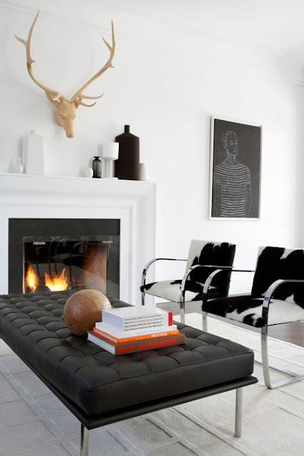
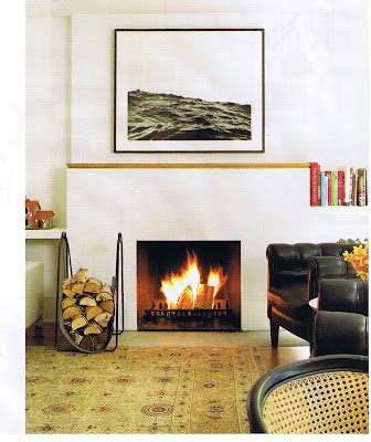
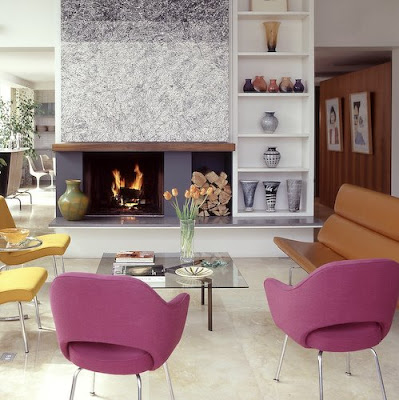
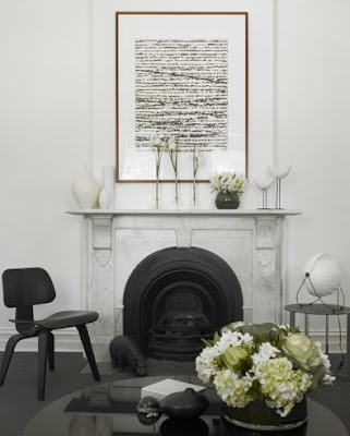
One of the most common requests I receive from clients, second to kitchens, is to redesign an outdated fireplace (or to add a brand new one). Just like any other architectural detail of a home, (staircases, doors, mouldings etc) fireplaces create character in an interior. In well designed interiors, architectural elements like fireplaces and staircases should look like they 'belong' to the house, the style and character of the exterior structure of the home should be in sync with the interior architectural elements. By in sync, I mean they should have the same character or....
thoughtfully and
intentionally different so as to create a juxtaposition of style (not just randomly different).
Hands down my absolute number one favorite architectural feature in a home is an open wood burning fireplace. There's nothing more appealing to me than the way a fireplace anchors a room or the warmth and ambience that's created from a crackling wood fire.
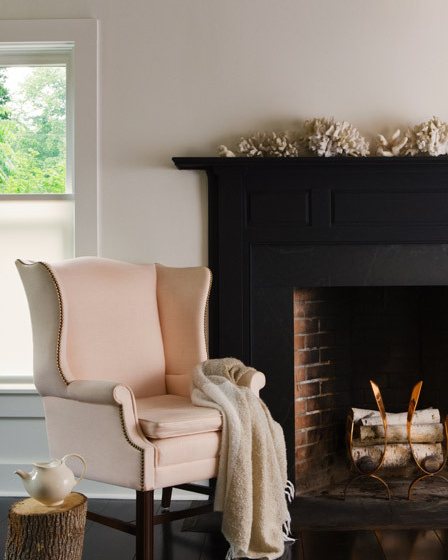
This is my idea of a perfect fireplace. I love the simplicity of the space, the high contrast of the black mantle against the white walls, and the Eva Zeisel tea pot is definitely calling my name (I covet anything EZ).
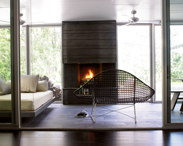
Contrary to the notion that wood burning logs are only for 'traditional' spaces, this contemporary fireplace design illustrates how even the most modern loving trendsetters can bask in the glow of a crackling wood fire without hanging a fake looking flame on the wall.
In my experience with designing fireplaces for clients it seems most people associate the concept of wood burning logs or a mantle or a hearth as being 'not modern', but you can see from the images above and the ones below, this simply isn't the case. There are many ways to achieve a modern fire other than installing a linear gas burner in a wall. Here's a look at some other favorites and examples of what I consider modern fireplaces..
This wood burning fireplace is modern perfection.
The fireplace in Klaus Neinkamper's contemporary home as seen in
Canadian House & Home has a sparse simplicity to it.
Modern classic. Love everything about this fireplace.
I LOVE the contrast of an antique (heritage) fireplace with modern furniture and accessories.
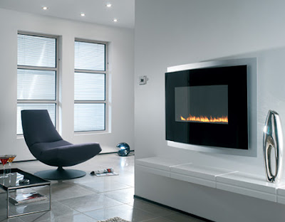
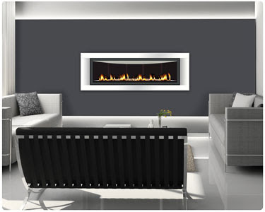
With all this in mind, you might understand why I find it so challenging to comply with the requests I receive for 'modern gas fireplaces'. Not just the occasional request,,,,literally every client I've had over the past 5 years has requested a modern log-less fireplace - you know the units that don't have a log set, just the linear flame amongst some river rocks or glass beads. I'll be as honest here as I am with each of my clients who've asked for one when I say I personally, honestly, really, really don't like them (hate is such a strong word). I don't think they have the character of wood burning fireplaces in any way, to me they simply look like flat screen tv's, but I think the biggest problem I have with them is they're so often, done so wrong. Just like flat screen tv's, people are struggling with how to integrate modern gas fires into their homes in a way that looks appropriate.

There's nothing appealing about this modern fireplace to me. A fireplace that looks like its floating on a wall always looks fake to me. Its the character of a fireplace that I love, and this has none.
Again, I'm personally not drawn to this concept, you have to consider when the unit is turned off what are you left looking at? I'd rather have a great piece of art on that wall and some candles on the table. This just leaves me cold.
I explain my point of view to clients and even though I show them other modern gas options that look more like classic wood burning fireplaces...I simply fail to convince them to change their minds on this issue. Just like men are dead set on having their jumbo size flat panel tv's and there's no talking them out of it,,,,many couples seem to be dead-set on having these ultra modern flame-only fireplaces. First time homeowners, move-up homeowners or empty nesters, everybody wants them. Regardless of the type of house they live in or the style of their decor, they all want them and I lose the battle every time. Ultimately, I surrender and 'Tim Gunn' it best I can.
There are many manufacturers making log-less gas fireplace units but frankly I don't find them very attractive, in fact most look rather cheesy to me. I wonder why those who are opposed to fake logs seem to be ok with fake driftwood or fake lava rocks (?). There are exceptions, one of the originators of the contemporary flame-only fireplace, and my favorite is
Spark Fires, they have a truly clean face design with less visible trim than other mfg's and the media is optional. So through the images below I thought I'd share some examples of what I think are well designed modern log-less fireplaces and why I think they've "made it work".

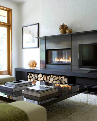
This is entire fireplace surround is beautifully designed. I like that this surround and hearth looks authentic in that I could see this same design appropriate for a wood burning scenario too. I love the rustic element of the wood logs even though its purely for display, its been built-in and looks like an artistic composition of wood vs gas flame. You can see in this photo how much the gas unit looks like a TV, especially if it was turned off. Because of this, I like the fact that the TV is not built in, its on a stand like an object or accessory on the hearth rather than it being integrated into the surround like the fireplace. The dark colour keeps everything low contrast so the tv and the fireplace box are less of a visual distraction and the focus of attention is on the flame.
Architect: Hacin & Associates Photographer: Michael Stavaridis
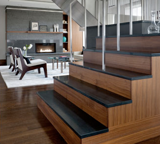
A beautifully designed space. You can see how the fireplace and the stairs are designed with the same materials and quality of detail, they reflect the architectural style of the house. I love how the fireplace is fully integrated into the structure and built with the same integrity as a wood burning hearth would be, giving it an authentic feel. Nothing about this says 'fake fireplace' or 'after thought'.
Design:Rafael Novoa Interior Design Photography: Alba Photo Studio
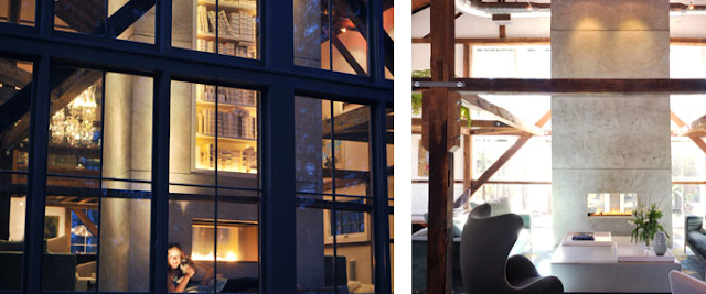
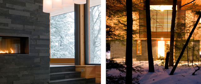
This stunning home is a modern barn conversion. The rustic elements of the barns stone walls and timber beams are paired against contemporary furnishings, the sleek use of industrial materials like concrete and steel for the structures perfectly compliment the modern rustic architecture.
Altius Architecture Inc. Photography: Patrick Burke, Tony round
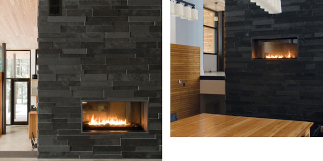
Another beautiful example of how
the fireplace is completely integrated with the architecture and you can see how the contemporary exterior style translates thru the interior. The rock media used in the base of the fireplace suits the local.
Architect: Kevin White
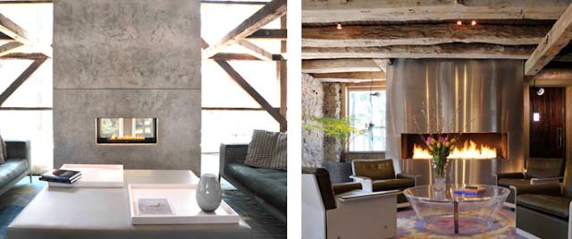
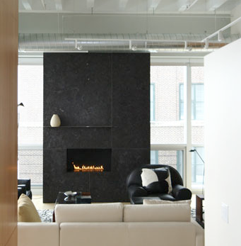
Beautiful composition.
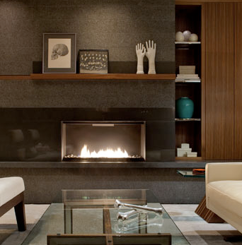
These fire units are so abstract that composition is very important. The structure should be interesting enough (have character) to hold its own even when the fire is off. The entire fireplace wall looks very much part of the architecture like a true masonry fireplace would be. This same design could translate to wood burning, the absence of the logs is consistent with the simple exposed elements of the loft interior.
Design: Frank Roop Photography: Eric Roth
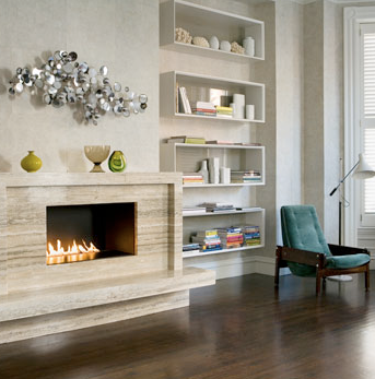
In what is probably a more traditionally built home,
this modernized fireplace has sleak clean lines constructed from slabs of vein cut travertine while still maintaining its 'traditional' mantle and hearth. A clean linear look that suits the classic modern furnishings, it successfully transitions traditional with modern.
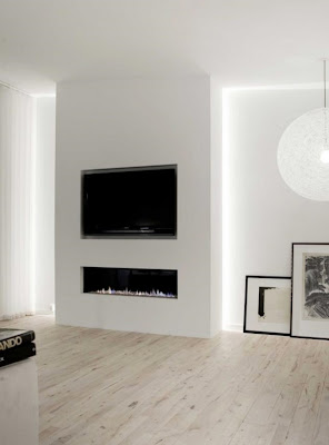
TV or no TV?
When you have a clean modern fireplace wall that is void of a mantle or surround, my advice is not to put a fireplace above it. Particularly with gas fireplaces, I find this type of installation ends up looking like an appliance wall (think double wall ovens in a kitchen!) and while they both may function perfectly, aesthetically it has zero appeal. It can easily look like you're roasting your tv over a flame like a rotiserie chicken. I personally don't mind a tv over a fireplace, sometimes its the only solution if you want both in the same room and I believe it can be done well. To my eye there needs to be a bit of separation between the two, so
if a TV is going above the fireplace, even a modern fireplace, I prefer for the fireplace unit to have a surround and a mantle so there's more distinction that its a fireplace not another appliance. A mantle will also help deflect the heat away from the TV screen.
So if you're still convinced you must have a modern gas fire or your existing one is looking tired and outdated - I'll be addressing some important planning issues that you need to be aware of when considering adding, modifying, updating or replacing a fireplace. There are a LOT of strict regulations and requirements to research and understand before you'll know what's feasible and what isn't.
Now with all this talk of fireplaces and the stunning winter wonderland view outside my window, I'm going to put some real logs in
my fieldstone fireplace, pour some tea into my Eva Zeisel tea cup and enjoy the simple luxury of a crackling fire. : )
Photo Credits:
1. Elle Decor - Met Home Nov '08
2. Michael Grimm - Photographer
3. Canadian House & Home, Nov.09,
4. Source unknown
5. Canadian House & Home
6. Source unknown
7. Mim Design, Australia
8. and 9. Unknown
10. James Tse - Photographer
11. thru 17. via www.sparkfires.com
12. Source unknown


