A Family Home Office


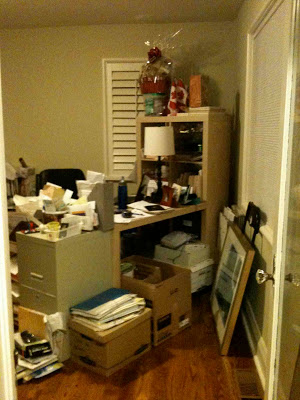
Many months ago just before the end of 2010, a past client of mine contacted me about finishing one of the remaining 'original' rooms in their otherwise fully renovated cape cod style house.  This room was the Library or Home Office and it occupies a very prominent space in the home at the front of the house directly off the front entry.   The parents are both successful professionals with their own practices/business and have two young girls.  This room needed to function as a home office for both parents and space where both girls could work on school projects with mom or dad.   It was a tall order!   Home offices have similar needs to address as kitchens,,,lots of worksurface, storage, organization, ergonomics, and the ability to accommodate equipment and work gadgets.   Here's a look at what one corner of the space currently looks like - its obvious that nothing is working here.
  

Existing space

The solution to a space like this is built-ins.  Built-in cabinetry that maximizes the vertical space available and accommodates specific types of storage needs.   I designed 3 walls of full height built-in cabinetry for this room to provide worksurfaces and accommodate lockable file storage, computer equipment, supplies, binders and a book collection.   To soften all this built-in cabinetry I decided to add a custom made free standing table desk, an area carpet and some patterned fabric to give the room a more relaxed homey look and make it feel less 'officey'.   All these months later, the cabinetry is now nearing completion, the custom table desk and fabric treatments are being made, and installation is scheduled for sometime in September.

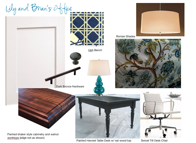
The concept board above is a look at some of the key pieces selected for the room early on in the planning process - in addition to these pieces an area carpet, upholstered arm chair, wall art and desk lamps will be sourced for the room over  the next few weeks.    Below is a floor plan of the proposed new layout with built-ins.


I presented at least 4 different layout options for them and this was the winning plan.  The table desk could easily accommodate mom and one or two of the girls working on a project.  There's additional knee space on the side return, loads of file storage, a wall of bookshelves, a separate area for printer/fax/copier, supplies and stereo equipment.  Dad has his own separate work space complete with a loads of upper cabinet space for all his paper work.


The room's two windows will get new fabric roman shades with a wide gros grain ribbon border (along the edge as opposed to inset as in the sketch above).  A custom upholstered stool will tuck under the knee space of the long wall of built-ins and can be pulled up to Mom's or Dad's desk when needed.


The fabrics for the roman shades and upholstered stool shown above right and the cabinetry finish is on the left.  The base of the table desk will be painted in a dark navy blue/green.


I first saw this fabric about a year ago, I photographed it and ordered a sample for future use.  Well it didn't take long for this project to come along and I knew instantly it would be a great fit for this space and suit the classic casual vibe of this client's home.  A pattern that's not too over the top flowery, it's very branchy and leafy and has the odd bird in there too.   The existing paint colour of the office is a pale warm yellow/green that's also found in this print.


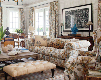
I was thrilled when I spotted this room in the July/August issue of Veranda Magazine with the same or similar fabric.  I love the impact it has when used on all the upholstery and drapery.  I'm not certain its the exact same fabric, the colour way is slightly different with a gold/tan background as opposed to the blue/grey background of the fabric I selected but its so similar its hard to tell the difference.  I also noticed that they brought in a hit of tourquoise in the accessories just as I did with the gourd lamps,,,and I think its a fun compliment to this fabric choice.


With the new school year fast approaching this new home office will be ready just in time to help this busy family tackle all their work and school projects with ease.   I'll post some after photos this coming fall and show you how it all comes together.  


Photos 1 thru 6:  Carol Reed
Photo 7:   Veranda Magazine


New Project: NYC Family Apartment


I can't even begin to describe how wonderful my newest client is and how excited I am to be designing her 'new' family home, a 4 bedroom, 4 bathroom apartment in the Upper East Side of Manhattan.  To say I'm 'excited' is an understatement actually,,,it is a privledge to have the opportunity to redesign a family home, its the ultimate for me - creating the partition layout, planning out the kitchen, designing the bathrooms,  determining how the spaces flow from one to the next, how the rooms relate to each other, how they'll be used and how the family will interact with each other and their guests.  Selecting all the materials and finishes, designing all the special details to reflect their personality and style is truly a joy for me and every moment, every step of the way I envision the family's day to day activities and even more so (!) I envision, down to the smallest detail, all the special time they will enjoy in their home with family and friends.  Enhancing the function of these mundane daily routines as well as all those special occassions informs every design solution and decision.

Although this is a first for me, designing a home located in NYC,,,the design process is really no different than any other.  The family requirements and needs are very much the same as any family and the space challenges are similar to those faced by anyone living in small urban homes.  Some might not call a 2200 sf apartment in NYC small,,,but for a family of 5, with no outdoor space, no basement, no garage and frequent out of town guests,,,,it can quiet easily feel small - every inch is precious.


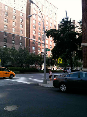
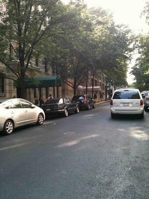
The street view


What is unique about this project is that the project involves combining 3 individual small apartments into one large apartment suitable for a young family of 5.  Of course being a high rise building there are the usual concrete floors and ceilings to deal with and the typical awkwardly placed obstacles like columns and plumbing stacks, intercom panels and such that can't be moved, these are expected and come with the territory.  I've never met a column or a vertical chase that I can't work around, in fact I ENJOY the challenge, they demand creative solutions.  In this building what's even more of a challenge is their strict wet over wet regulations, meaning you must keep all plumbing fixtures located in existing wet zones (ie; kitchens or baths must be installed over and within the footprint of another bathroom or kitchen only).  This makes it a bit challenging to expand the size of a bathroom or kitchen,,,imagine the existing bathrooms and kitchens designed for small 1 bedroom apartments are the size of closets so they obviously don't fit the needs of a larger family home.   But even that,,,,even that challenge I'm confident can somehow ingeniously be solved.  What's MORE of a challenge than all of the above, is actually getting your proposed plans approved by the Building Management.

Its been over 4 months since the homeowners made their first drawing submission to the board for approval, via an Architect, (long before i was on board) and many versions, concessions and submissions later,,,,they haven't made much progress.  The board hasn't approved what's been proposed to date so I'll be attempting to rework the plans and come up with some solutions that hopefully will meet with their approval,,,and are still functional, you know for a family of five as opposed to 3 bachelors.

To get this project started I flew to NYC just a couple of weeks ago to meet my new client for the first time and see the apartments in person.  We discussed her vision for the space, her style preferences and all of her family requirements and we were completely on the same page - a great place to start!  I had a good visual of the space already as I had a set of plans and had already done some space planning, primarily I wanted to see the space to verify dimensions and document the existing elements I'd need to work around.   The apartments are in a 1960's building and all three of the units are in fairly original condition with the exception of one unit that has some 1980's upgrades.  Yikes.  Kudos to my clients for being able to see the potential in these 3 separate units.  Without a doubt the location was the main selling feature - and its stellar, situated in the mid 80's between Park Ave. and Madison.  Below are some pics I took of the space.


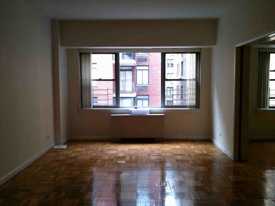
Windows are all along one side of the apartment(s) and this is the typical scenario.


The ceiling height is a nice 9' throughout most of the units.


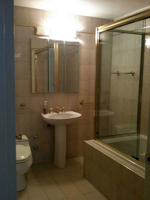
One of 4 bathrooms, this is the most updated of them all.  Despite how 'trendy' blush tones and brass are right now, this unquestionably screams 80's.


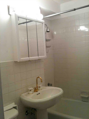
There is one other bathroom just like this and a fourth (master ensuite) that will be created in what was once a kitchen.


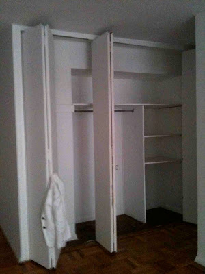
Bulkheads everywhere, this looks like a big closet until you open the doors.  This space under the bulkhead will actually become a desk in what will be the childrens play area.


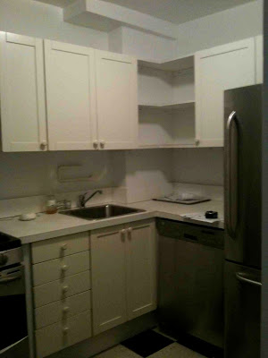
This is one of three kitchens, and it will be completely removed.


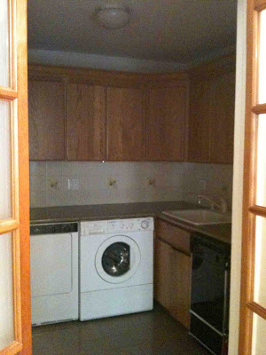
This existing kitchen will become the new kitchen, the intent is to open it up and expand it, however, the 'suggested' expansion plans are not going over so well with the Board.  : /


The biggest obstacle of all is this very large column which houses telephone cable and the electrical panel and it falls right smack dab in the middle of the proposed new kitchen.   Its not visible in the kitchen photo above, its on the direct left of the doorway.


When I look at these photos I can't help but feel overwhelmed with excitement about what an enormous transformation this will be.   To take an outdated and depressed space and turn it into a beautiful home full of life and love is a definite thrill for me.  I can't wait to show you the plans and the "New Traditional" design direction we're headed in.

At this point we're awaiting another pending decision from the Board which will determine whether the Architects proposed solutions to expand the kitchen area and master ensuite area are a go (waterproof membrane and exhaust issues), if not, I've prepared several alternate layouts that we'll fire right back at them.  If none of those plans meet with their approval, I'll need a magic wand.   


All Photos:  Carol Reed

Alexander McQueen: Savage Beauty


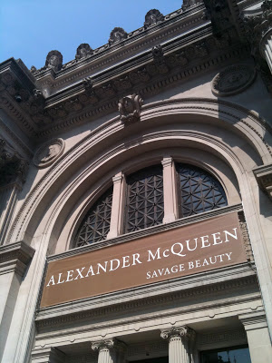
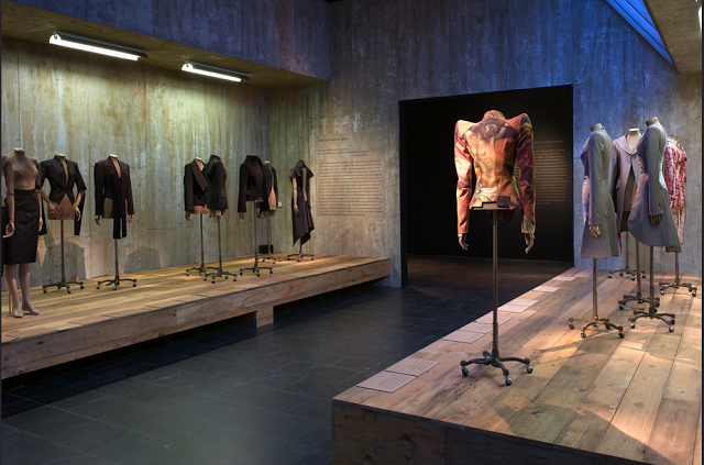
One of the highlights of my trip to NYC last week was my first visit to the Metropolitan Museum of Modern Art, and their feature exhibition Alexander McQueen, Savage Beauty

Curated by Andrew Bolton, I was so impressed - it was one of the most beautifully displayed exhibits I've ever seen.  There was so much to see the exhibit was spread out thru several rooms, even moving constantly thru the space, just taking time to read the brief text, it took more than an hour to see it all.  My two favorite collections were the Romantic Mind and Romantic Nationalism rooms.

The Romantic Mind, photo from metmuseum.org
I loved these pieces because unlike many of the more theatrical, highly conceptual pieces these were everyday wearable pieces (stunning pieces mind you), most were donated from the closets of McQueen's private clients.  These pieces were accompanied by a memorable quote and I can't recall the exact wording but it was something like his goal was to design clothes that would make a woman look and feel powerful and make others fear them - an interesting statement when you consider this is the design house who designed the royal wedding dress we saw last month.


Romantic Nationalism, photo from metmuseum.org
I thought these pieces were both regal and fairy tale like, steeped in historicism but cut with very modern silhouettes.......they transcend time.


As an exhibit the collections are a wonderful example of how expressive fashion can be as an art form, and I don't think most people view fashion as art.  The designer had more than just aesthetic concepts to his work,,,,his designs made statements, conveying messages which were often deep, dark, complex ideas.  

Alexander McQueen's precision tailoring skills were brilliantly paired with his creative use of unstructured drapery and dressmaking techniques.  As a designer, I especially loved this and think that his work is a great testament to how artists/designers can only achieve their highest level of creativity (success) when they've mastered the technical aspects of their craft.  I've always been a firm believer in that philosophy,,,,,yes its possible you may be 'born' with creative genes/energy but learning how to apply that creativity to a chosen craft and be able to master it confidently (or revolutionize it) can only come from training, apprenticing, and experience.  

To see the depth of his talent thru this exhibit you can't help but leave feeling sadness over such a tragic loss of life, and perplexed at how someone so talented and successful could have possibly been so tormented.

If you're in NYC between now and August 7th, I highly recommend the show, but be warned there can be a 45 min or longer wait.  If you can't make it in person,,the link I've provided above and below has fantastic images and narrative.


There's a book available as well which looks incredible, I had a chance to flip thru it in the Museum shop, its a large book with fantastic photos.  I didn't purchase it while it was there because it was simply too heavy for me to carry around for the rest of the day - I'm going to order one online.


Top Photo:  Carol Reed
All other Photos: