Before & After: Boathouse Facelift

Boathouse Kitchenette

As the first long weekend

of summer arrived I was wrapping up a 2 day long visit to a clients summer cottage in Stoney Lake, Ontario. The trip involved bringing up some small accessories and taking note of remaining items needed to finish off various rooms. I made a big effort to get some progress photos while I was there. One of the last spaces I snapped before I retured to Toronto was the boathouse - sooo as this summer's final long weekend has just come and gone, I thought i’d revisit where I was on the first summer long weekend.   How has the time gone by so quickly?

Boathouse Kitchenette - Before

The interior of the boat house is just one big square room with a bathroom in one corner and a kitchenette in the other.  The entire interior was clad in knotty pine, the floor was covered in broadloom, the lighting and fixtures were dated,,,but with its soaring vaulted ceilings and lake views it had great potential for a simple refreshing makeover.  Loads of white paint, new pine plank flooring and a few new but vintage style fixtures were all this charming boathouse needed.  Its one of the lighter renovations I've worked on because it was purely cosmetic but it was a dramatic one, thanks to the magic of paint.  It was an easy decision to paint over all the wood, but it was a big job!

Boathouse kitchenette - After

I have to admit I cringe every time I hear people say that paint is such an easy and inexpensive or "quick fix" solution.  It suppose it 

can 

be compared to gutting a room and rebuilding or, if say you're doing only walls and those walls are 8' tall and you're painting a light colour over a light colour and the walls are in good shape - sure, you can paint an average size room in couple of hours and do it yourself.  I've done a LOT of painting in my time and I see professional paint quotes on a regular basis to know that properly painting an entire house is neither cheap, quick, or easy especially when it comes to painting ceilings, trim work, railings, windows, doors, stairwells and tall vaulted ceilings.  Factor in patching and repairing damaged walls and covering up dark colours or knotty pine, and you have a major job on your hands.  If you don't do the proper prep work, it will be a expensive disaster.  If you're an ambitious DIY'er say goodbye to many months worth of weekends or, call in the professionals.  So while I would describe this as a simple makeover - it did take a small team of trades people to make it happen.

The boathouse whitification in progress

We left almost all of the wood in the main cottage unpainted so I had carte blanche to paint over as much of the knotty pine as I wanted to in the Boathouse, and I intended to paint it all except the countertops.  Since this boat house only gets used in the summer months I wanted to give it a bright and airy summery vibe.  The painters had their work cut out for them, but I was ecstatic to see the progress and its transformation to white taking place...the white paint on the wood planks creates a great texture as all the grooves become shadow lines - so you still have the wonderful effect of wood panelled walls and plank ceiling.

See, you can still tell its wood even though its white everywhere!

The boathouse kitchenette - After

Unfortunately I can't seem to find a before picture of just the kitchenette (see before photo above) but here you can see how utterly charming it is now with a fresh coat of paint. I added a new white sink, gooseneck faucet, globe pendants and a wall shelf (not yet installed). The wood counters were perfect just the way they were and are a really great feature against all the white cabinets. The new pine flooring compliments all the white, looks rustic and is obviously much more practical than broadloom. 

The furniture is almost complete, all the main pieces are in but some occassional pieces and accessories still needed to be moved in.  We briefly contemplated white slipcovers but didn't end up using them here, this one was headed for a reading nook in the main cottage.

The best part about the transfomation is that the all white interior does a standout job of highlighting the incredible lake views. As there’s no heat source or insulation, the boathouse will get closed up soon but the main cottage gets used right thru the fall.   This was a such a departure from my usual reno projects but I hope you enjoyed this little peek at what was such a fun space to re-imagine.  Coming up in the next posts I’ll share some peeks of the front hall, the kitchen makeover and the master ensuite.

The view from the dock

Check out the boathouse bathroom

before & after

.All Photos and room design by:  Carol Reed

Before & After: Cottage Guest Bath


At the risk of overloading my blog with traditional cottage style interiors I'm going to catch up on posting some before and after pics of the Stony Lake cottage project before the end of this summer.  I completed the cottage last year...and returned this spring to get some updated photos, but there are a lot of rooms!  You can check out my first post on the project here.  Most of the reno work involved the kitchens and bathrooms.  The cottage is relatively large and has 5 bathrooms in total.  You can see the boathouse bathroom before and after here,,,and today I'm posting the first of two bathrooms in the main cottage that I'd like to share.  The objective for all the bathrooms was to update the finishes and fixtures and keep the demolition and new construction to a minimum.  All the new materials and fittings would have to be readily available from the local building supply store (and nothing custom, nothing special order).   In addition to 2 ensuites the cottage has 2 hallway baths that are shared by several guest bedrooms. This before and after is the larger of the two hall bathrooms.

Bathroom Before
This hall bathroom's finishes and fixtures were dated but the vanity was excellent quality and in perfect condition - it would stay as would the entire walk-in shower except for new chrome trim pieces to replace polished brass.

The very first thing I set my sights on replacing was the floor and wall tile outside of the shower.  With its tan tile and peach paint and beige corian counter, it was looking a bit 80's suburban and not very Kawartha's lakefront cottage.  Because the wall tile in the shower was less prominent and in excellent condition, I opted to keep the shower as is and splurge on updating the vanity area.  Below is a concept board of all the new selections.  


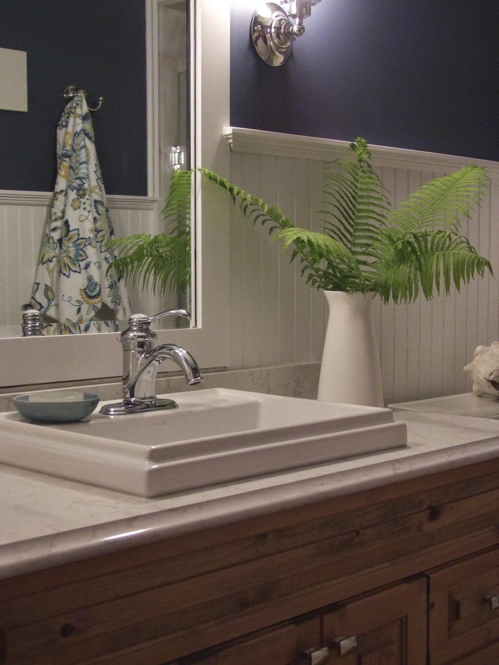
In addition to new wide plank pine flooring (also throughout the cottage), the bathroom makeover included new wainscotting, mirror, lighting, toilet, sink, faucets, accessories and a new quartz countertop.  Switching out all the polished brass fittings for chrome was an obvious update and pairing the chrome with white beadboard wainscotting and deep navy blue paint would amp up the nautical cottage charm. 


I drew up the details for a new wainscotting and mirror treatment from stock materials which the contractor made all on site.  I chose a new drop in style sink because its a simpler install and a bit of cost savings versus an undermount, the rim profile adds to casual cottage vibe as does the new vintage style single lever chrome faucet (the shower received the same new chrome trim pieces).  Rectangular chrome knobs give the vanity a fresh update.  I found a set of flower print towels at the HomeSense in Peterborough which were perfect for this room as well as the yellow and white bathroom on the other side of the cottage.


A pair of vintage industrial style chrome scones from Restoration Hardware flank the mirror and illuminate the room in a soft complimentary glow.  Excuse the bad photo they were incredibly hard to photograph as the room has no natural daylight so they needed to be on.


All that's left on the to do list for this room is to find a couple of framed prints for the wall above the toilet, i'm on the hunt for either a pair of vintage nautical charts or fern botanicals.  : )
But nonetheless i'm told its been a busy space this summer accommodating a steady stream of my client's family and friends.  


Note: Please excuse the inconsistency of the colour in the above photos, the original files aren't like this,  the images only appear this way once uploaded into blogger and I havn't been able to figure out how to correct it or come up with a work around - never had this problem before.  The true colour of the wood vanity and flooring is somewhere between the light and dark versions above.


All photos and room design:  Carol Reed


Picking A Paint Colour: Style at Home Designer Secrets


Thank you to Style at Home, I was thrilled to be participate in their special 100+ Designer Secrets colour issue, which hit the stands a while back.  I have to admit I had some difficulty getting my hands on a copy, the first one I had was left behind at a girfriends before I even cracked it open (and I never saw it again) then it took quite some time to find another copy on the East Coast.  Inside you’ll find some tips from myself and other paint aficionados on how to pick paint colours.  Its a a great topic, one of the major components of every project I work on is selecting all the paint finishes, usually for an entire house. So I thought this would be a great opportunity to elaborate beyond my tips included in the issue.  How and where to start when picking a paint colour?

Many designers will say that they pull the paint colour from a fabric, or select a paint based on the exposure of the room or chose colours from the homeowners wardrobe.  All common approaches when decorating an existing room.  But what if the space a) doesn’t have any significant fabric, or b) doesn’t have a window or c) the occupants vary in age, gender, and fashion taste.  Many times you can be in a position to have to pick a paint colour without having a significant fabric or persian rug to work with.  You can still lay the groundwork for a beautiful palette - if you chose the right neutrals you can layer in the colour later.

Because most of my client projects are renovations, often the paint colours for the entire interior have to be selected long before the homeowners and I have even contemplated new fabrics or area carpets or before they've accumulated an art collection.  Sometimes newly furnishing the space will follow a year or so after move in, sometimes only a few main rooms are decorated with the remaining to be completed over time.  Aside from those situations that are driven by time and budgets, there are many spaces in a house that often don’t ever have fabrics in them such as; bathrooms, kitchens, hallways, staircases or laundry rooms. The paint colour can spin off of a fabric story from adjacent rooms but that colour, primarily, has to relate to the hard surfaces.

Finish samples for a clients kitchen (paint top right).  The paint selections compliment the wood floor and cabinets, the marble backsplash and quartz countertop and stainless steel.

My process for selecting paint is always the same. It never starts with fabric.  The approach I take with paint is that its role is to enhance everything in the space (and the views outside) not distract from it.  First and foremost I take direction from the permanent surfaces and architectural details like wood, stone, tiles, metal, mouldings and in some cases broadloom. These are far more permanent than any fabric or wallpaper but are the foundation of the overall palette and have to be considered with every paint selected.  Secondly, I take into consideration the style and character of the home (Heritage or contemporary).  Lastly, the natural light and views - what is the setting, what is the view outside the windows. (The only exception to any of the above is kids rooms, its all about their favourite colour and making it work for both mom and child!).

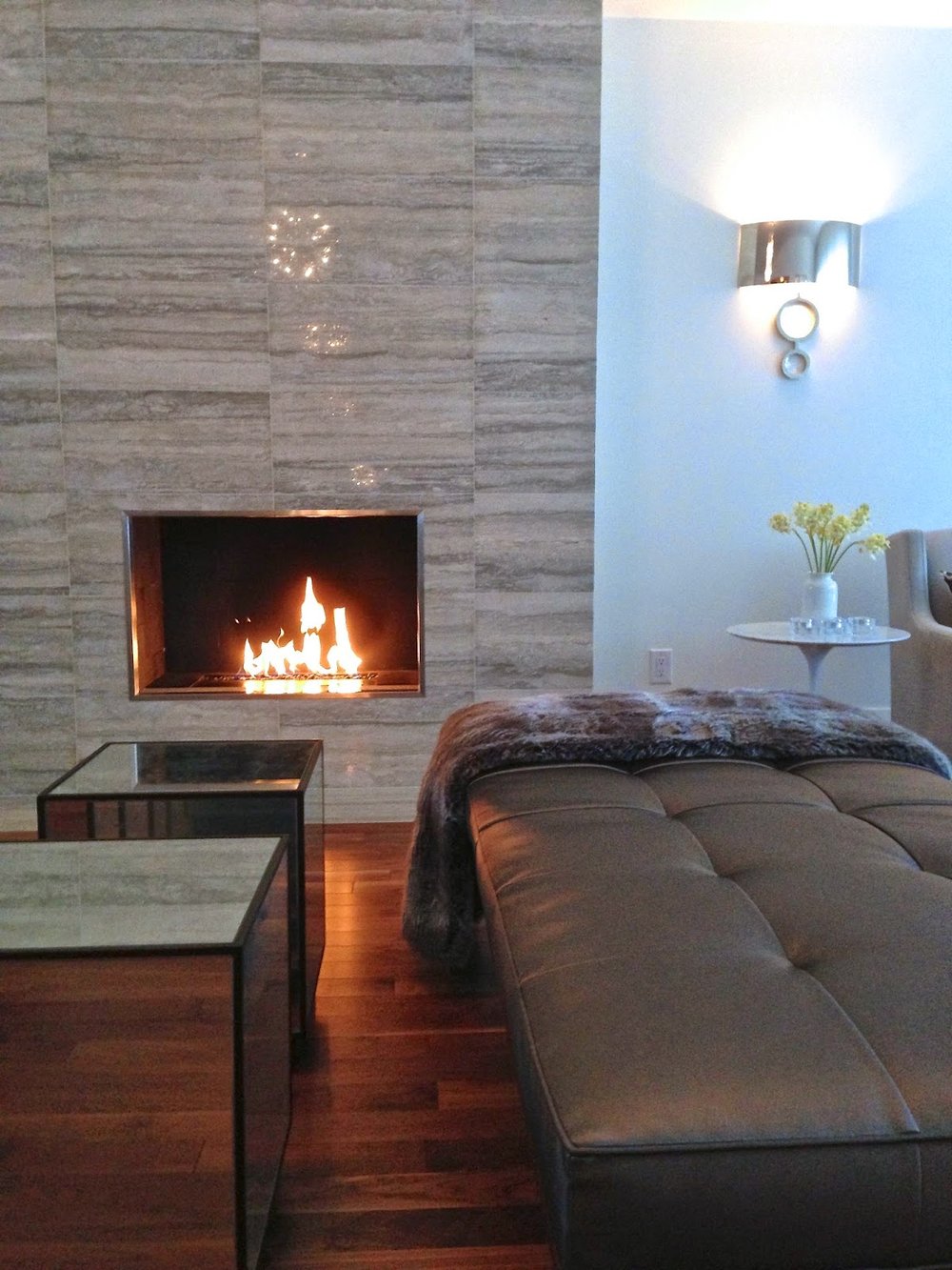
All the upholstery fabrics chosen for the living room in this contemporary home were pulled from the colours in the stone fireplace.  The travertine stone tile was also used in the entryway and a guest bathroom.

For 90% of the interiors I design, I could happily work from a paint deck of nothing but greys and when I say grey, my definition of grey covers a wide spectrum from warm to cool, from almost white to almost black , from clear to muddy and with undertones that can make them read green, blue, beige, purple or brown.  Light and airy, to dark and dramatic, its all there.  Its in this spectrum that I always find the perfect neutral that works beautifully with the finishes of the house as well as more vibrant colours that could be found in the garden, fabrics or the painting over the mantel.  For walls, when I'm not chosing white I'm always drawn to the mineral, sky and watery greys.  I am least drawn to anything with a red undertone or citrus colours because I don't think they pair favorabely with most natural wood tones (typically golden or reddish woods) they don’t compliment or contrast instead they can clash with these woods or suffocate the room in one note. (This is particularly the case in Canada where we use a lot of wood floors, wood cabinets, wood railings, and wood furniture.)  Contrary to this effect greyed neutrals do the complete opposite, to my eye grey makes all other colours and materials look better.  Grey is anything but dreary in fact I love how grey brings everything in a room to life - nothing enhances wood tones, complements colour and is crisper with white trim better than grey.  It has the ability to make anything paired with it look modern and sophisticated, and that's why it has been and will continue to be my go to palette for picking the perfect colour.

The natural walnut floors and various feature stones inspired the paint palette for throughout the home.  The paint palette was a range of off-whites and greys,  contrasted by black metal window frames.
You can never judge a grey by the paint chip alone,,,these chameleons only reveal their true beauty in context with the whole of the room. Sample, sample, sample.

Whether you like your spaces neutral or colourful you'll find loads of great colour tips and advice in this issue, including my best tip on picking the right paint colour and what paint combo i'm coveting now.   If you haven’t see it yet its on stands until August 31st.


All Photos and Design (Except Cover Photo):  Carol Reed Interior Design