DIY

Victorian Row House: A Designer Reno on A DIY Budget - Part 2


After Photo - partial view of dining room.


*Edit February 2015*
I've recently learned this former house of mine is currently for sale on MLS and also has been popping up on some other Toronto websites with links back to my blog posts here, citing that this is still my house and that i still live there.  Just to clarify - I no longer own or live in this house, I sold this house in December 2008.  I want to also mention that because of my blog posts here about my house renovation, that two years after selling it the new owners, (he was fresh out of law school) filed a claim against myself and the Home Inspector for mis-representing the property (after an earlier failed attempt at trying to get money from each of the Broker firms ).   After moving in to their very first home the young new lawyer and his  new wife were not happy with the lack of sound privacy the row house offerred and claimed the real estate listing failed to disclose what the sound levels were. (??).     To make  a two year long small claims court story short,,,,,in a settlement hearing a Judge basically said they didn't have a chance, not a chance of winning any type of settlement in court over this,  it wasn't a new build, it was a 100yr old+  row house and their expectations about what they were entitled to were completely unrealistic.  Caveat emptor.  It took two years of lawyers time to settle that.
*end of edit*


Visit here to read Part 1 of this Victorian Row House Renovation and see the plan views and more before pictures


"The Strategy"


Once my brother and I got over the excitement and shock of being the proud (or foolish?) owners of a completely broken, run-down, century old house we had to quickly figure out exactly what the scope of renovation work would be and determine what exactly the project budget would be.  The three things we did know was that EVERYTHING had to go, we had a small timeline and even smaller budget.


DIY
The key factor in both our timeline and our budget was that we would do as much of the work ourselves and hire out anything beyond our skill level or areas of expertise (electrician, plumber, tiler, kitchen installer, dry waller, wood floor installer).  Essentially, we would be DIY renovators for the next 5 months and share all the responsibilities as a team, I would oversee all the design planning, sourcing, purchasing, hiring of trades, scheduling of trades and obtaining all the building permits, stocking the fridge etc.,,,,and my brother, or "Six" as we call him (no.6, the baby of the family!) would be in charge of, well, doing everything we weren’t going to be hiring trades for and pretty much anything I asked him to do ; ).  Being both a homeowner and a cottage owner himself he was an experienced handyman who owned a large arsenal of power tools and was always looking for an excuse to put them to use (and any reason to buy more of them!)......



Six took this 'artistic' picture of his table saw??  His new best friend for the next 5 months.
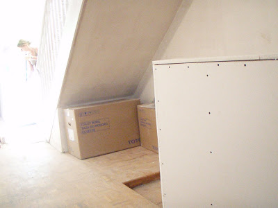


Keeping the site clean and organized was a never ending challenge.......among my other duties, I would be constantly sweeping for the next 5 months....

MAKE THE MOST OF WHAT YOU’VE GOT
Our goal for the renovation work was to make the most of the structure we had - to do no structural changes and do as little relocating of electrical and plumbing as possible.  The layout of the house was pretty great the way it was so we knew we weren’t going to need to build a lot of new walls and doorways etc., the objective was to improve and enhance the spaces by replacing and upgrading everything.  Install new modern bathrooms and kitchen and increase storage and efficiency wherever possible.  Click here to see the before and proposed plan views of the house.


Before pic of the open plan main floor.  View from the Living room thru the kitchen to the back of the house.  Beyond the kitchen is a family room with walkout to the backyard.
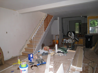

After the demo view from the living room to the kitchen and back of the house.  Primed walls, partially primed railing and skimmed ceilings, at this point the space looks 100x better to me already.  The intense yellow and gold walls were a MAJOR job to repaint needing 2 coats of primer to start and weeks of patching and repairing.


The Roof & Eaves:
The roof was only 2 years old so we had no plans to do any further roof work.  There was however a downspout terminating at one corner of the house which over the years resulted in lots of water penetration in the basement - we quickly and easily rectified this and the basement began to dry up immediately.  Our home inspector had told us this was the number one cause of wet basements.

Heating & Air Conditioning:
The house was outfitted with electric baseboard heaters and no air conditioning, not even window mounted units.  We planned to keep the baseboard heating system, (replace all the heaters with new) for many reasons.   Because the house was a row house it was long and narrow with few exposed exterior walls and the hydro records showed the bills were not very high.  Baseboard heaters mean you have no bulkheads or dropped ceilings throughout the house or basement, and as a result we loved the high clean ceilings this created.  Electric heat is 100% efficient, meaning all the electricity used is turned into heat, with FAG there can be up to 40% heat loss thru the ducting.  Electric heat is clean, there’s no forced air being blown thru the house which continually circulates dust and particles into the air so its great for those with allergies and respratory problems.  Baseboard heaters also allow you to control the heat on a per heater basis, turning down units in spaces that aren’t used.  If myself or future owners chose to, the electric heat could be effectively supplemented by adding a gas fireplace.  One small size gas fireplace unit could heat the main level of the house. 

The decision not to add an air conditioning was an easy one. With one end of the house facing east and one end facing west, outside each end of the house were huge mature trees that shed their leaves in the fall, this was optimal for cooling in summer and letting sunlight in during the winter months.  But mainly, I considered the fact that the house was over 100 years old and no one to date had added air conditioning,,,why should I assume it would be a problem when I hadn’t even lived in the house yet.  So I chose to leave this out of the scope of work.  Considering the house had no ducting, the air conditioning would need to be a wall mounted unit or portable, something I think myself or any future owner could add if they chose.


View of the backyard showing the deck, large tree and the detached garage.  The tree was huge spanning the full width of the backyard and taller than the house.  (photo was taken during a freak summer hail storm!)


Plumbing:
Aside from a poorly placed powder room in the basement, and the fact that most of the existing fixtures weren’t in working order, the plumbing system itself was in good shape and we would only need to do some minor reworking.  The drains and stacks had all been replaced in the 80’s with a.b.s. and the water tank was fairly new.

Windows & Doors:
We chose to allocate a huge part of our budget for new windows and exterior doors.  I felt this was well worth the investment, not only would it improve the appearance (the character) of the house both inside and out, but it would increase the energy efficiency, reduce the street noise and improve the air flow by selecting a window style with larger screen area.


Before view of the old Living Room window at front of house and existing front storm door.  I'm not a fan of storm doors on fronts of houses so I couldnt wait to see this one go.  The old kneewall was being framed out here to make a new full height wall which would create more of a visual and weather barrier from the front door.
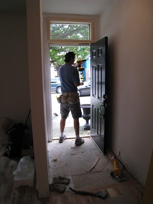


Six installing the new insulated front door, I went with a classic six panel door which I painted in a high gloss black paint.  I felt this suited the traditional victorian facade of the house and neighboring houses.


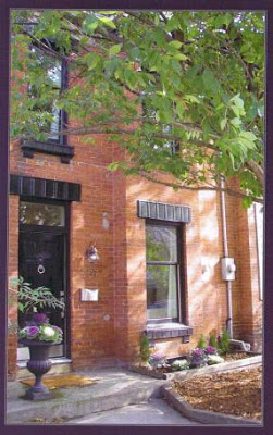
After front exterior, new double hung windows were installed and the exterior trim work was painted black.  The new windows were solid wood paint grade on the interior with aluminum clad exteriors in black.  For me, with an original brick victorian facade, vinyl windows just weren't an option.


CUSTOM DETAILS
In addtion to new windows and entry doors, all new baseboards, casings and interior doors were a must.  This is a simple and inexpensive way to dramatically upgrade the appearance and quality of the interior and make it look current and custom. Something many homeowners can do (and learn how to do) themselves.


Six cutting new window and door casing.

SMOOTH CEILINGS
Nothing make a house look better and more inviting than natural daylight and great views.  Our new windows would frame our treed views and I knew from the start we would eliminate all the stippled popcorn ceilings throughout the house.  Next to the windows this was one of our biggest budget items but I think it was worth every penny.  Smoothing all the ceilings instantly brings the house into a custom level quality, smooth, non-textured ceilings reflect more light and also make ceilings feel and look higher.  The look is clean and quality.


After demo, view of upper hallway with primed walls and newly skimmed ceilings.

The DESIGN STRATEGY
Goodbye neglected, rundown rooming house with the 1980’s builders reno.  This house was going to be transformed into a clean lined, stylish, contemporary urban space with a little touch of victorian charm.  Quality materials and fittings were a must, solid woods, stone, steel and glass, - no faux, no fake, no laminates, no standard builder grade,,,my goal was to achieve a high end look on a budget and set the ground work for further enhancement over the years to come.

The BUDGET
Our pre-closing budget of $60k was soon modified after getting possession of the house when we decided to splurge for new windows and entry doors as well as relocating the basement washroom.  We began the demo/reno with a budget of $72-75k for materials, supplies and hired trades.

The TIMELINE
Our timeline would be 4 to 5 months to complete the work and make it move-in ready which I knew was a reasonable amount of time for the work to be done properly and professionally.


More to come......check back for Part 3 of this Victorian Row House Renovation where I'll post the BEFORE's and AFTER's of the basement transformation.
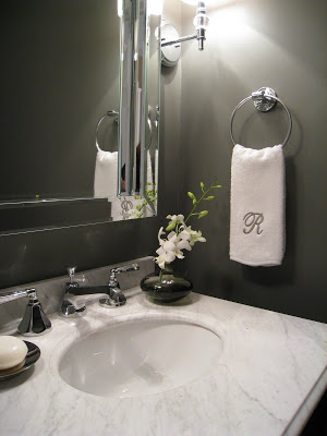


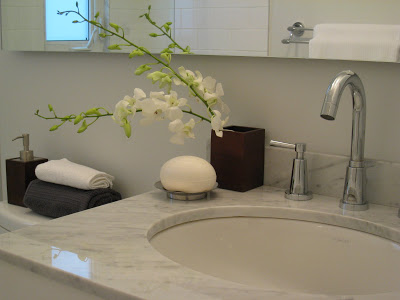
Sneak Peek - basement powder room 'after'.
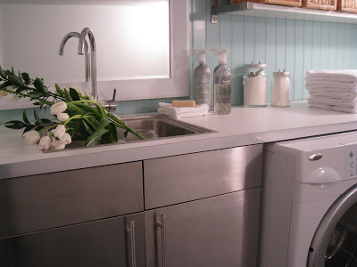


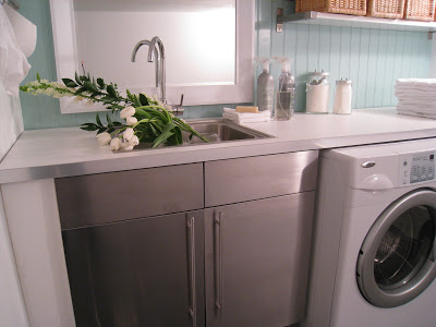
Sneak Peek - laundry room 'after'.


All Photos:   Carol Reed

Victorian Row House: A Designer Reno on a DIY Budget - Part 1


207 Logan Ave. The front exterior After.  


*Edit February 2015*
I've recently learned this former house of mine is currently for sale on MLS and also has been popping up on some other Toronto websites with links back to my blog posts here, citing that this is still my house and that i still live there.  Just to clarify - I no longer own or live in this house, I sold this house in December 2008.  I want to also mention that because of my blog posts here about my house renovation, that two years after selling it the new owners, (he was fresh out of law school) filed a claim against myself and the Home Inspector for mis-representing the property (after an earlier failed attempt at trying to get money from each of the Broker firms ).   After moving in to their very first home the young new lawyer and his  new wife were not happy with the lack of sound privacy the row house offerred and claimed the real estate listing failed to disclose what the sound levels were. (??).     To make  a two year long small claims court story short,,,,,in a settlement hearing a Judge basically said they didn't have a chance, not a chance of winning any type of settlement in court over this,  it wasn't a new build, it was a 100yr old+  row house and their expectations about what they were entitled to were completely unrealistic.  Caveat emptor.  It took two years of lawyers time to settle that.
*end of edit*


In March of '08 I was nearing the end of a major client reno (and living in our rental house), when my brother told me about a property for sale that he had just seen - it was in a hot up and coming Toronto neighborhood but was in dire need of a complete interior reno.  Since he was going to have some time on his hands for the next 5 to 6 months he suggested the idea of purchasing the property and reno'ing the house together as a joint project - he’s an excellent rough carpenter and very experienced handyman.  For him it was short-term work, for me it would offer me the opportunity to be my own client, design a renovation for myself......and have the option of moving into the house if I chose or sell it depending on how things went.

We bought the house pretty much on the spot, and in a bidding war with 3 other buyers.   The seller was an elderly gentleman who was quite sick and would be moving from this house into a hospice.  As much as I hated paying  over asking price for the house, it was gratifying to know that the funds from the sale were much needed and would be well used to provide for his care giving.

The house was a 1913 row house with a 1980's addition on the back, the house was surprisingly much larger than it appeared from the outside. It was a 3 bedroom, 3 washroom house with the added bonus of a family room off the kitchen, a finished basement with 8' ceilings, a fenced private yard with a large deck and a private 1-1/2 car garage.  Here’s a look of some of the before shots,,,,,,,and all I can say is that it looked better than it smelled.   This house was NASTY, with a capital P.....Ewwww. 


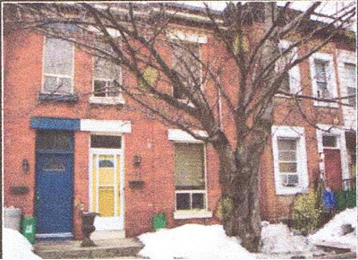
The front exterior before.  I instantly fell for the original 1913 brick facade and the huge old tree.  There were wonderful corbels across the top of the facade that aren't visible in this pic.  The bright yellow door was an indication of what we'd find on the inside....

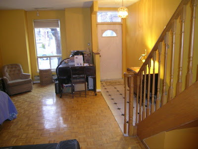
There wasn't a trace of victorian character inside  the house however, it had undergone a builders reno in the early 80's.  Someone must have found a deal on orange and yellow paint - it was everywhere!


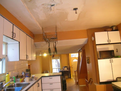
There was evidence of water damage everywhere, notice the kitchen ceiling.  A new roof had eventually been installed 2 years earlier but none of the prior water damage had been repaired.  The cabinets were barely hanging on the wall, they were rotted right thru the back.


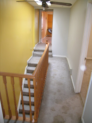
The upstairs hallway.  The smell was utterly foul, those are urine stains on the carpet and there was animal feces everywhere.  We were told the place had been used as a rooming house for many years.  I did like the skylight and all the natural daylight it brought to the stairwell and hallway.


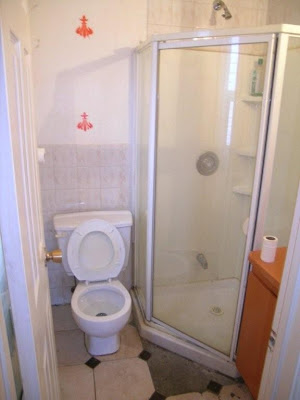
A tiny ensuite bathroom off the back bedroom on the second floor.  The only working toilet of 3 in the house.  The vanity cabinet was about 15" wide with the worlds smallest sink.  The stencils had been spray painted on the walls throughout the bedroom too.


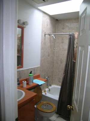
The main bathroom on the second floor.  Niether the toilet or tub were functional.  The black hole in the ceiling above the shower was rotted thru to the roof from the previous leaks.  I loved the amount of daylight from the skylight and surprisingly it was actually in good shape with no signs of leakage.


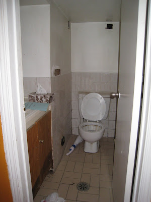
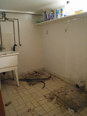
The basment had a 2 pc washroom, but the ceiling height was only 5'-11".  And when you flushed the toilet it just drained onto the floor (good thing there was a floor drain!) and you can see the black water line on the sink cabinet from a perpetually leaky sink.  

The laundry room beside the washroom was narrow and also only had six foot ceiling height.


Despite the extremely poor condition of the house I realized it had a lot of desirable features, tons of space and loads of potential.  Because this house would be a short term investment for me, the decision to buy was all about the house’s resale potential, and when it comes to affordable single family homes in the city, this house checked all the boxes:
  • location (10 min to downtown)
  • public transit on corner
  • 3 bedrooms
  • 3 bathrooms (2 on the second floor - rare!)
  • famiily room off kitchen
  • PARKING with Garage
  • victorian facade
  • thriving neighborhood ammennities, 1/2 block to starbucks, organic butcher, organic bakery, juice bar, cheese boutique, schools, and a slew of some of toronto’s best and hottest new restaurants and cafes.
  • 2 big beautiful mature old trees, one in the front, one in the back
  • with a finished basement, it offerred 1800 sf of living space

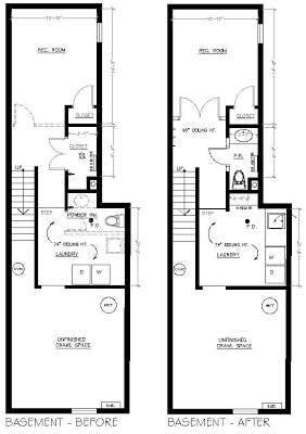
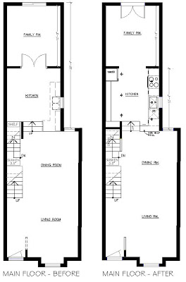
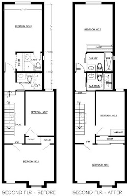
Here's a look at the floor plans for each level of the house with the existing 'Before' plan on the left and the proposed 'After' plan on the right.


The Basement

BEFORE:  The basement was finished but as you can see from the pictures above it was in rough shape. There were 3 distinct areas, you can see on the plan all the way up to the powder room there was a clear ceiling height of 8', which was amazing, but the washroom and laundry room only had 6' high ceilings. Beyond that was crawl space only.  There was also an oddly large closet at the bottom of the stairs complete with a light and baseboard heater. 

AFTER: I moved the washroom to where the large closet was (which I felt had been intended for a washroom originally).  Now we had a full size powder room with 8' ceiling.  The bottom of the stairs would become a mud-room area with a bench and coat hooks (as there was no coat closet on the main level) and the powder room would service guests on the main level when entertaining.  I relocated existing leaded  glass french doors from the old kitchen and installed them between the landing and the main area of the basement.  It added lots of character and made the space seem larger, grander.  This could serve as an office, a guest room or tv room with the ability to close-off the room if needed for privacy or noise control.  The laundry area was now spacious and I felt that a 6' ceiling height was still workable as many laundry rooms had low ceilings and were in unfinished dingy space - this would be a clean bright fully finished space with a long counter.


The Main Floor

BEFORE:  A half wall in the entry way, a delapitated kitchen with a set of doors between the kitchen and family room.  The kitchen was interesting because it was elevated, however, the traffice flow also went directly down the middle of the kitchen and there was a wall of baseboard heater on one side.  There was a beautiful view through to the backyard where there was another huge old tree.  

AFTER:  We decided not to get into any structural changes and left the walls between the existing kitchen and family room.  The new kitchen layout was designed to gain maximum storage by installing an entire wall of pantry units with toe kick heater underneath.  Also part of the plan for the kitchen was a freestanding island, not shown in these plans.  New single pane french doors were added that enhanced the view to the backyard.  A full height wall with a niche was added in the entry way, giving more privacy and weather shield when the doors were open - I considered enclosing it by building a vestibule with a second door but it would have required relocating and adding a light, a switch and a baseboard heater.  I opted not to do this at the time but built the wall to a dimension that could accommodate a second interior entry door in the future (it was actually a bit longer than shown on the plan above).


The Second Floor

BEFORE:  The layout was interesting as there were two levels and 2 washrooms which is rare in a house of this size in the city and the bedrooms were all good size.  Ensuite washrooms are always highly desirable and considered a premium feature.  Two skylights brought in lots of natural light but the tiny size of the ensuite bathroom and tiny closets were the weak points.

AFTER:  I reconfigured the ensuite bathroom in the back bedroom by essentially just mirroring the layout of the main bathroom but with a walk-in shower instead of a tub/shower, and relocating the closet (also larger) to the inside of the bedroom.  I made sure this back bedroom still accommodated a queen size bed, two night tables and a dresser which it did very comfortably.  I decided to double the size of the front bedroom closet by eliminating the tiny closet in the middle bedroom.  I envisioned the middle bedroom being used as a nursery or home office and concluded that a wardrobe unit or armoire and chest of drawers would provide adequate storage in lieu of the old closet.  Now the front bedroom had a closet more suited to the generous room proportions. 


Stay tuned for Part 2 on this Victorian Row House Reno,  I’ll take you thru the reno budget,,the strategy, and post lots more after pictures with an overview of each room, the design process and some of the cost saving details and products that were used.  Below is a sneak peek of the finished house....


Second Photo by TREB.
All other Photos by Carol Reed