The studio of photographer Mark Burstyn (Iphone photo by me).
Upon entering the loft I was crazy for this little vignette seen in the photo above. I rarely meet a vintage chair I don't love, and this one was no exception, its simple retro lines upholstered in robins egg blue made quite a statement paired with the framed b&w photo. The powder room was located to the right of the chair and the inside of the bathroom was painted this same cheery shade of blue, it just made you smile when you walked in. (Sorry I didn't take more pictures!)
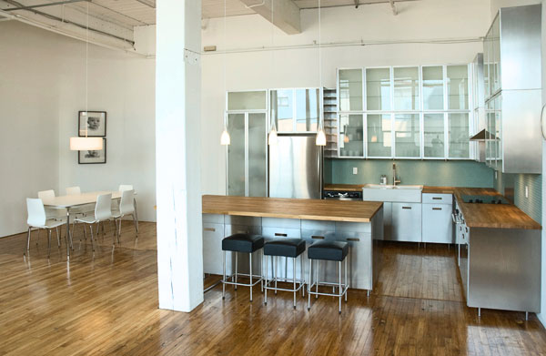
The studio's kitchen area.
I couldn't resist sharing this photo with you of the studio's kitchen and dining area - its a complete working kitchen with full size appliances and outfitted with all the necessities, Mark keeps it fully stocked with lots of goodies, you can't help but feel a little spoiled when you're there. : ) The kitchen is by Ikea, including the furniture but I thought it was a really good example of a non-customized Ikea kitchen,,there are no extra bells and whistles like custom fabricated counters or custom paint finishes or gables or brackets. The kitchen itself is spacious with a huge island, double height cabinets and loads of storage space. The lower cabs are stainless, the uppers are glass with aluminum trim, the countertops solid oak, (steel + wood + glass +white). The lighting was well planned with nothing overlooked, I can imagine how beautifully lit this would be in the evening. Its simple, utilitarian looking and super functional - it perfectly suits this raw loft space. Of course my favorite part of the entire kitchen,,,,,,are Mark's framed photographs.
I'm always repeating that it doesn't matter how expensive or inexpensive the things in your space are, that's not what defines good design or good taste. When you're in a well appointed space (every need has been though of) that's highly functional, pleasing to the eye and is filled with wonderful light, you feel a level of comfort and ease that's hard to depict in a photo. In other words your experience in the space is enhanced - I believe that's ultimately what everyone wants to achieve in their own homes.
If you're craving a dose of stylish inspiration this long weekend, pour yourself a cup of hot tea, and have a browse thru Mark's gorgeous portfolio here - I'm sure you'll recognize some of his work. Enjoy!
Chair Photo: Carol Reed
Kitchen Photo: Mark Burstyn


