Upload: May 31, 2010


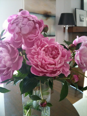
I take a lot of photos every day and I upload them onto my laptop 2 or 3 times a week, sometimes hundreds at a time.  Collectively these photos are a snap shot of where I've been, what I've been sourcing, what I've been working on, job site progress, what I find inspiring, things I love, and things that I find interesting and worth keeping on file for future reference.   Here's a small sampling of the latest images uploaded from my camera.  Starting with the photo above - freshly cut peonies from my garden, I'm surrounded by them as I type this and the scent is heavenly...... : )


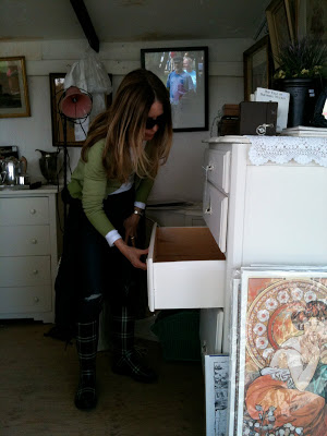
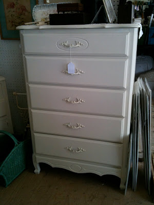
The month of May marks the beginning of the outdoor antique season, I made a trip to the Aberfoyle market a couple of Sundays ago in search of a painted dresser and a pair of night tables (for 2 different clients).  I arrived late in the afternoon so I only had time for some quick browsing but was lucky enough to hit the jackpot.  It didn't take long to spot this dresser and I scooped it up instantly, it was a STEAL.

The dresser is for the 70's sidesplit I recently furnished for a single mom and her daughter, it'll go in the guest bedroom, pictured below...


Oh, the ones I left behind, sadly these beauties didn't come home with me,,,,I really really really wanted them, they had the most incredible blackened brown patina and they were solid.  I have no place for them in particular but still I didn't want to pass them up, especially when they were only $15 ea.!!  $15!!!  If it wasn't for the fact I had zero room, not even an inch of space left in my car that day, these would be safely at home in my basement right now. : (


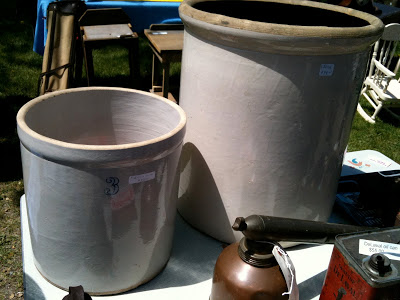
Trendspotting,,,,,,I couldn't help but notice these butter urns or crockery pots everywhere at the market,,,I mean everywhere.   I also spotted these in the latest Pottery Barn catalogue so it seems the vendors are taking their cues from the home decor industry.  I love the simple utilitarian form of them, the typography  and their oversized scale.  Today I would put a big huge bunch of fresh cut pink peonies in one of these.


I'm in the early stages of working on some design concepts for a rooftop deck which hopefully will be built this summer.  I've been checking out what's available in ready made cushions so that we can mix these with some custom made.  This chaise from West Elm was particularly interesting to me as it reclined completely flat becoming a bench, which makes it doubly useful for entertaining....


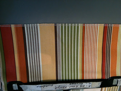
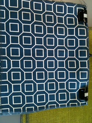
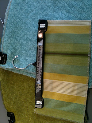
A trip to DFO to scout out their in-stock outdoor fabric selection,,,I just pulled out the ones that caught my eye and started mixing.  I love this large graphic floral and this graphic geometric together, they both had a modern feel.  The colour is actually a beautiful very orange/red but seems to read more red in my photos.


This stripe worked well with the large floral above, but I think i would use it sparingly in a candy stripe piping detail or for the sides around a box cushion.


I wasn't looking for navy at all but loved this combo, especially with some nice crisp white piping!


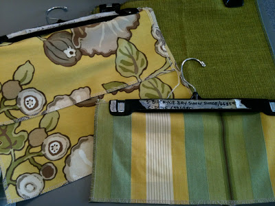
I think I would have liked this more if the yellow was more vibrant.  I think the tourqoise print below would make this trio more dynamic.  For outdoor fabrics, I prefer to stay away from too much green because I like all the green to come from the grass, trees and plantings.


Think I would nix the solid green here for the yellow floral above.  All in all,,,not a hugely successful trip as I was looking for more prints with tourquoise and more modern graphics in general, but definitely some possibilities.


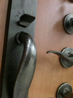
I was impressed with the distressed antique pewter finish on this Entry Set by Rona, part of the Rona Collection.


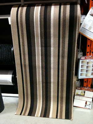
This striped runner at Home Depot had me thinking I needed to use this somewhere, and I wish they had more colour options.  How fun is this!


Trendspotting.......I took this photo simply because I'm seeing this buckle detail in many different places lately, on furniture, on vases,,,on handbags....... on pillows like this one at Pottery Barn.  Speaking of Pottery Barn....


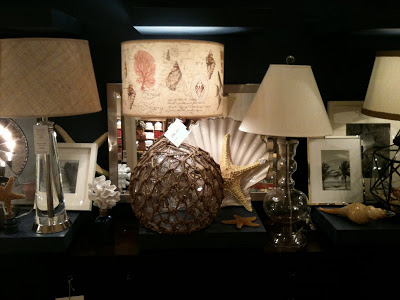
Dear Pottery Barn:  Your lamp shades are always too small for your lamps.  I've mentioned this to sales associates many times who reply "the merchandising manual says that table lamps always get medium size shades".  I don't care - to my eye they look oddly disproportionate.


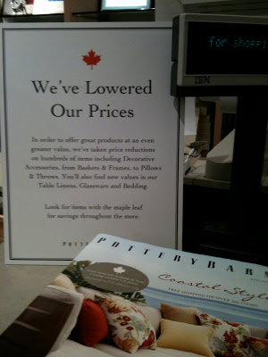
Dear Pottery Barn:  Last week when I was in the store to pick-up a bar stool that's been on back-order since January (yes, 5 months!), I noticed this sign beside the cash desk and was very excited.  I thought finally, you've been listening to all the complaining I've been doing and have actually brought your CDN prices more inline with your US pricing.  Then I noticed the fine print says to look for select products with a maple leaf to realize these savings.  Honestly, I looked around the entire store, twice, and didn't see a single item with the maple leaf??   Is this a trick?  Is my bar stool in yet.......


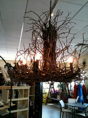
A lovely whimsical branch chandelier seen at Sheridan Nurseries....this needs a cottage, preferrably one with an all white board & batten interior.


All Photos:  Carol Reed


Gail's Kitchen Reno: Post #2 - Customizing Ikea


Gails' kitchen and family room renovation is a project of mine that's currently in the early stages of construction. I first posted about this kitchen and family room renovation a couple of weeks ago and if you missed it, you can go here to see all the before pictures and read all about the objectives for the redesign and the process behind developing the final proposed layout.  Here's another look at the new floor plan....


Its quite an extensive renovation with lots of new construction and reworking of plumbing and electrical so one of the ways to achieve everything on the wish list (quartz counters, high end appliances, all new floors, additional sinks, new fireplace etc. etc.) and stay within the clients conservative budget range is to use Ikea cabinets as the basis for the kitchen design.  In this post I won't bother going into all the reasons why this makes so much sense as I've written about all the reasons Why I love Ikea Kitchens here, and its for all those reasons why my client and I came to the decision to take this route for her new kitchen.   Also in that post you can find a list of my favorite ways to customize Ikea cabinets and give it a bespoke look - I'll be implementing all of those tricks in this installation too.   

When planning a kitchen based on Ikea cabinets I treat the base cabinetry like building blocks,,,or legos and configure them in any which way I need them.  There's really not too many limitations as they offer such a wide range of cabinet sizes and styles.  Since this kitchen will be more on the relaxed trad side than the modern side,,,,,I recommended the Tidaholm door style which is a simple shaker style door in natural oak.  As I've mentioned previously I prefer this door style over their other shaker door style the Adel, because the Tidaholm has a cleaner squared edge shaker profile and joinery corners.  Also its key, if you plan on painting the doors the oak doors take a new paint finish better than the Adel door style which is a synthetic polyester finish.  And for this project, we definitely intend on painting them!


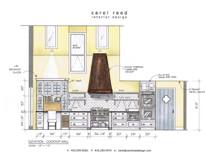
The Cooktop Wall:  Essentially this is the main wall in the kitchen which houses the rangetop, exhaust hood and wall ovens.  This was a major change from the old kitchen layout which had a cooktop poorly (and dangerously) located on a narrow island.  I always place ranges or cooktops against walls where ever possible and try to allow counter space on either side.  In this configuration we have lots of extra deep drawers which will accommodate pots, pans, small appliances, mixing bowls, cookware, as well as spices, seasonings and utensils and knives.  The open shelves will house most of the dishware with additional pieces in the glass fronted hutch.  The shelves will provides easy access for Gail (who is a chef) who's always cooking for a crowd.  I've incorporated a desk space for her laptop, cookbooks, messages, and household bills.  I'm on the lookout for an old antique wall hutch that we could use above her desk surface but its not something you can easily find on a deadline, so in this elevation I've illustrated the backup plan which will be new glass fronted wall cabinets with a blue accent colour painted on the inside.  The range hood canopy will be custom built and we're planning on cladding it in an antiqued distressed copper,,much more blackened in appearance than shiny new copper.  (sorry but the colours depicted in this renderring are not quite accurate, the walls will be a very soft fresh pale yellow, all the cabinetry a warm ivory white).


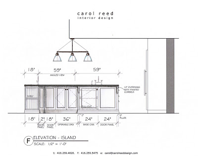
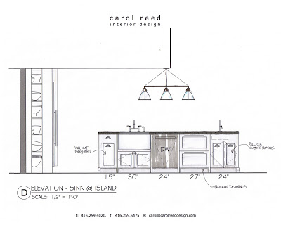
The Island:  The sink side of the island is of course directly opposite the cook wall and despite how large the island is, I still couldn't fit everything in that Gail ideally wanted, but we're as close as we could get.  They'll be a Shaw farmsink, a second prep sink (that was a must!) and a set of refridgerator drawers.  Its these fridge drawers that really make her prep zone and cooking zone work efficiently, she can keep all her dairy and veg here, where they'll be right at hand instead of in the large main fridge.  The biggest challenge about this island has been trying to light it, you can't help but notice it only has a ceiling over half of it! The ceiling goes from 8' in the kitchen area opening up to 20' in the breakfast nook area so its a bit a challenge.  The situation just became more challenging when last week we discovered a new beam would need to be dropped exactly where I've got the light fixture hanging........


The Island:  On one end of the island they'll be another set of wide deep drawers and the other three sides of the island will be clad in a combination of operable doors and fixed door panels all finished off with a baseboard treatment around the bottom instead of a toe kick.  On the seating side of the island I'll be supporting the overhang with some simple corbel style brackets and also adding a small bookshelf unit with beadboard backing.


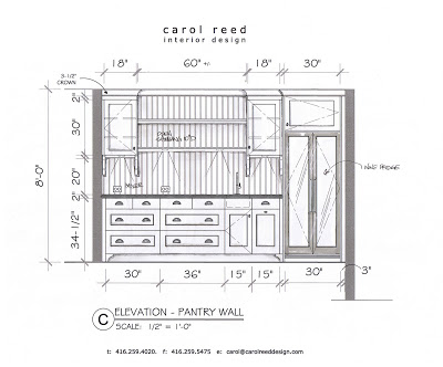
The Pantry & Bar:  Like the island, this section of cabinetry will be tricked out with additional trimwork to give it more of a furniture look, so in addition to the Ikea base cabinets the contractor will be installing beadboard back panel,,,corbel brackets and corner block details to the base, and built in recessed puck lighting.  I have to admit this elevation is a moving target right now,,,,its actually been changed several dozen times, probably 2 or 3 since this version was drawn.  The size of the wine fridge was the subject of many debates between my clients and my recommendation for a tall but narrow unit ultimately was vetoed for this double door style.  As for the cabinetry, Gail's been quite conflicted as to how much open vs. closed storage she can live with and I predict we'll be going back to one of the original pantry configurations I proposed which had more upper cabinets, less open shelving which will be more practical.   Right after this is posted I'll be working on one more variation of this wall.


Coming up next I'll share some images of the concept board for the space illustrating all the finishes and fixtures I've specified for the space along with some updated site photos.  

Next week I'll be writing a separate post outlining my tips and advice for painting your newly ordered Ikea cabinets based on the process I've used successfully.  I've had several people inquire about this so please know I havn't forgotten and I promise you'll see it next week.


All Images:  Carol Reed

From the Garden: Purple Irises


We have a few types of flowers  that grow in the yard on our property and I wait anxiously for each any every bloom, like a kid awaiting a trip to the candy store.  For me, nothing beats using fresh cut flowers or branches from my own garden throughout the house - its heaven (and they're free!!!).    The first to bloom were the daffodils and I enjoyed a few weeks of that vibrant bright yellow scattered around the house.   But next will be the tall regal looking Irises,,,,we have two huge patches and they look like they're about to bloom any day now.  They usually burst open just slightly ahead of our peonies.....my absolute favorite!  

What I love about the Irises is the colour, I'm really not a fan of purple when it comes to paint or fabrics or carpet but when I'm selecting fresh flowers for a room, second to white flowers purple is my next favorite, especially rich deep purples.  Purple blooms work so beautifully with browns and greys especially, and in light neutral spaces the purple not only adds a dark contrast but its also a less feminine hit of colour than pink so I like that its gender neutral burst of colour.


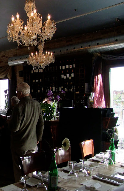
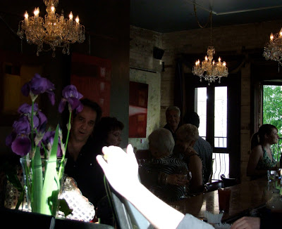
The above photos are pics I took of our Irises last year just as they bloomed and the timing couldn't have been better.  On June 3rd I was hosting a 25th wedding anniversary for my eldest brother and of course, I had to find an inexpensive way to deck the venue out with fresh flowers without breaking the budget - so I brought bundles of these fresh cut Irises and placed them in tall glass vases along the bar and in a few niches in the old brick walls.   They looked stunning, the effect was so dramatic.  Unfortunately I was so busy hosting that I didn't take many photos, but here's a couple that I found that show a glimpse of some of the flowers.  You can see a couple of the Iris arrangements on top of the bar along with some palm leaves......


For the tables, I had purchased a couple dozen cream coloured gerber daisies, they were in keeping with the theme of the invites which also had daisies on them but mainly I wanted to do a single bloom arrangement because I could do multiples of them for high impact and it wouldn't cost a fortune!  Here's where I had to get creative in an instant, when I called the restaurant earlier that day to see if they had bud vases I was told that they didn't - aaaggghhh.  I didn't have time to go and buy 20 vases so I asked them if they could set aside some empty bottles for me.  But when I arrived at the venue the recycling bins had been emptied earlier that day so there wasn't a lot of to chose from.  I managed to find 20 Perrier bottles (actually,,,,we only found 16 so we had to drink 4!) and then I added a gerber daisy and sprig of tall grass to each one and placed one bottle on every table.  This took about 10-15 minutes to do and it really gave the space a joyous summery feel, in fact, the staff all said they liked it so much they were going to start doing that for future bookings.  


A word of caution about brining these large variety Irises indoors though, if you do - be careful to keep an eye on them, remove them as soon as they start to wilt - once they start to expire the droppings from the flowers are like ink and will stain any surface they fall upon.    When I bring them inside my house, I place them in really tall cylindrical vases so they're completely encased in glass, this way anything that falls off stays in the vase.  Otherwise if using them for a table setting for a special occassion remember to remove them after the party!  Or,,,,for that hit of purple try other varieties like tulips or hydrangeas....

Its a cool an overcast rainy day today so I'm procrastinating the trip to the garden centre,,,,,I was hoping that the photos of last years flowers would inspire me to get out of the house and go get all the plantings I need to fill up my planters.   But its not working yet........I need sunshine.