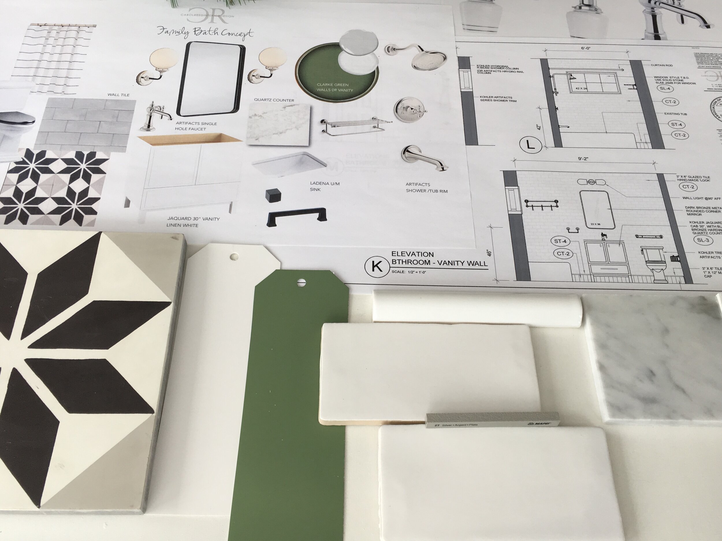
Christmas Greens! We’ve just wrapped up a set of design plans for January construction. The family bath for the Bedford family home is part of an extensive home reno and was inspired by the existing vintage, two sided alcove tub (with rounded corner) tha't’s definitely a keeper. And I continue to be smitten with #Kohler’s Artifacts series which has the perfect modern heritage vibe for this century house, so much so we’re also using this series for faucets in the kitchen.
Kitchen Design: Modern Chalet
Home Design Project: Contemporary New Build
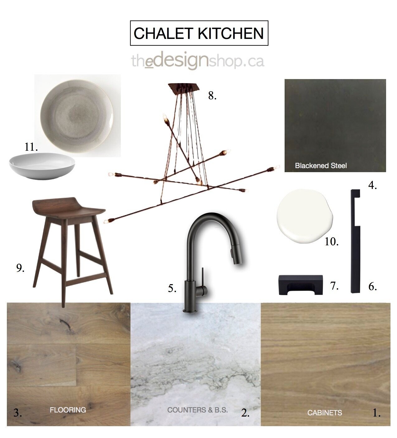
For my clients who I first worked with about 10 years earlier, this new custom-built house would be a major lifestyle change as they relocated from their city home to a rural small town popular for its boating, golfing and skiing. The project took over a year and half to complete from the time I came on board to move in. During that time I designed the interior from a base plan created by the architect, developing all the interior details including the kitchen and bathroom design, ceiling plan, lighting and staircase. I recently received some post move-in photo’s from the client and thought I’d share the kitchen design from concept to completion. Here’s a version of the kitchen concept for the finishes and fixtures.
The kitchen was custom made so I had the opportunity to design it completely from scratch. Here’s a look at what the preliminary kitchen plan from the Architect looked like when I came on board, and then the final kitchen design.
The kitchen is located in a great room and is open concept with a dining area and large living space all anchored by a floor to ceiling stone fireplace surrouned by floor to ceiling windows with tree top views. The kitchen is positioned on an inside corner but sits below a tall vaulted ceiling with clerestory windows that floods the space with light.
Kitchen Layout
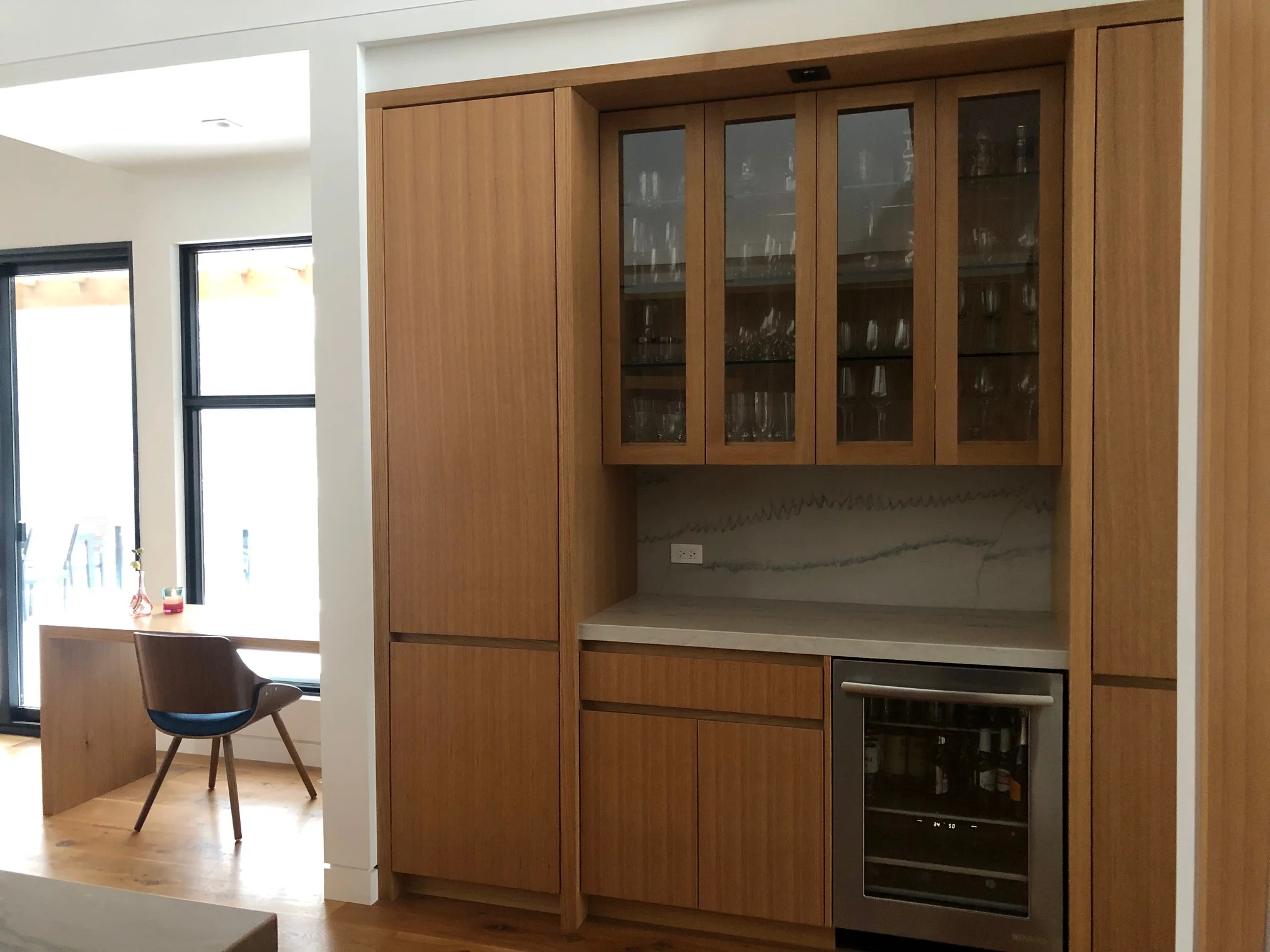
One of the biggest changes was to the pantry, we opted to add a counter in between two tall cabinets and include a wine fridge so the area can also be used as a servery. An additional tall pantry cabinet is adjacent to the range to keep daily essentials in reach. An oversize island provides ample prep space and seating on two sides.. The orientation of the main sink in the island allows the cook(s) of the house to be facing their guests and the scenic views while prepping or cleaning up. A secondary sink beside the range is convenient when two or more people are cooking and is super handy for filling and emptying pots.
The most unique aspect about this L-Shaped kitchen is the way the corner is designed, which was derived from centering the range between a pair of tall cabinetry columns, with one column being in the corner mirroring the column on the opposite side of the range. Because this was being custom built I was able to design the corner cabinetry to utilize all the corner space. Below the counter the full corner is accessed with a ‘magic corner’ unit which has a swivel pull-out function. At the counter the column becomes an appliance garage with a flip-up/retracting door and above that the upper cabinet space is divided into two compartments, one accessible through the adjacent wall cabinet and the other by a narrow pull-out.
Kitchen Details: Elevations
The range hood typically becomes a key design element in a kitchen as its a great opportunity to make a style statement by either underplaying it or highlighting it. A key feature of this concept was to create a sleek architectural millwork element out of the range wall to conceal the exhaust system so both it and the fridge are panelled for more of a furniture look. The hood canopy is integrated with upper cabinets , all at a flush, equal depth and to be faced with blackened steel to contrast the white oak and light stone. Continuing the stone slab counter up the wall to the underside of the hood enhances the sleek lines and showcases the organic veins and colours of the natural stone.
With the main sink located in the island it also houses the dishwasher, recycling bins, cleaning supplies, a microwave and container storage. A cantilevered deep overhang provides lots of knee space for counter seating and the extra wide counter means there’s lots of prep and clean up space without imposing on the seating areas.
The back of the island is only partially cantilevered with a full cabinet on one end (left) and knee space overhang extending to the right of it. An ultra modern sleek suspension pendant illuminates the island without detracting from the dynamic ceiling or clean lines of the kitchen cabinetry.
Kitchen Fixtures & finishes
After the floor plan was finalized I pulled together all the fixtures and finishes. The dominant finishes throughout the house were natural white plaster walls, white oak floors and black windows. The focus in the kitchen was to continue the light natural materials with more wood and stone accented by contrasting dark metal.
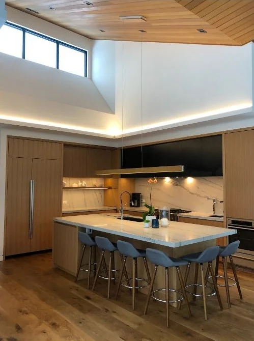
Here’s a view looking towards the kitchen (from the pantry side) shortly after move-in, sent to me by my clients ( they won’t typically need this many stool for daily use but they can easily seat up to six when they entertain) . A second oven was added and built into the column to the right of the range.
A glimpse of the pantry and servery area. To the left, a desk floats in front of the floor to ceiling windows beside the walk-out to the deck. Although these are not professional photos seeing the servery un-styled like this gives you an idea of just how simply and easily it can be accessorized for any occassion. A perfect place to show-off some seasonal foilage and florals or a local piece of pottery.
The vaulted ceiling was clad in cedar boards, it took weeks of sampling to get the stain colour right.
A huge thank you to wonderful clients for sharing the post move-in photos and for their dedication in implementing the design plans. Having worked on this project remotely its been incredibly exciting to see it all come together over the course of almost 2 years from concept plan to completed space.
Bedroom Design: Mixing Old & New
Mastering the Mix of Old & New: Furnishing A Rural Coastal Vacation Home
Recently I had the enormous job of furnishing and outfitting an entire residence from top to bottom for its new European owners who purchased the traditional shingle style house as their seasonal holiday home. Located in a remote coastal setting on the South Shore of Nova Scotia the 7 bedroom main house and guest quarters are situated overlooking the water surrounded by many acres of woodland. The project didn’t involve any renovation or remodelling work on my end, not even paint colours (!) my task of furnishing and outfitting the home mandated working with the existing spaces as is, and completing it all in as quickly as possible so it could be used by the family without prolonged delay. This post takes a peak into the Master Bedroom.
SOURCING & HUNTING
Furnishing a home in its entirety is both an extremely exciting and challenging task under normal circumstances, however when you factor in a rural location that’s a 4 hour drive to anything other than a Walmart or hardware store the logistical challenges suddenly dominate the process. Local sources are few and very far between in such a remote location so when the cost of delivery can often exceed the cost of an item, and where returns or exchanges just aren’t a feasible option, the job becomes an entirely different ‘sport’ than it would be in an urban area, one that requires a lot of endurance. Minimizing the amount of hours and distance spent driving, consolidating shipments and co-ordinating receiving at one locale (first leg of the journey) so deliveries could be made in bulk (the second leg of the journey) was a necessity, and easier said than done. (I should note this took place before the Ikea store opened in Halifax, so even “popping” in to Ikea (4 hour return trip) for go-to essentials wasn’t even an option).
I never like the concept of furnishing a room with all new everything, let alone a whole house. As with every space I design my approach for this project was to create a mix of old and new, contemporary and traditional. In this case with so much space to furnish, “old’ would play a key role in my strategy to meet timelines and budget, and source locally, while also delivering quality pieces with uniqueness and character. My clients were also determined that nothing need be custom or special order. Considering its setting and use, practicality and simple timeless style was the goal, while striving for an air of country elegance and maritime charm.
Here’s a look at some of the finds that made the room unique.
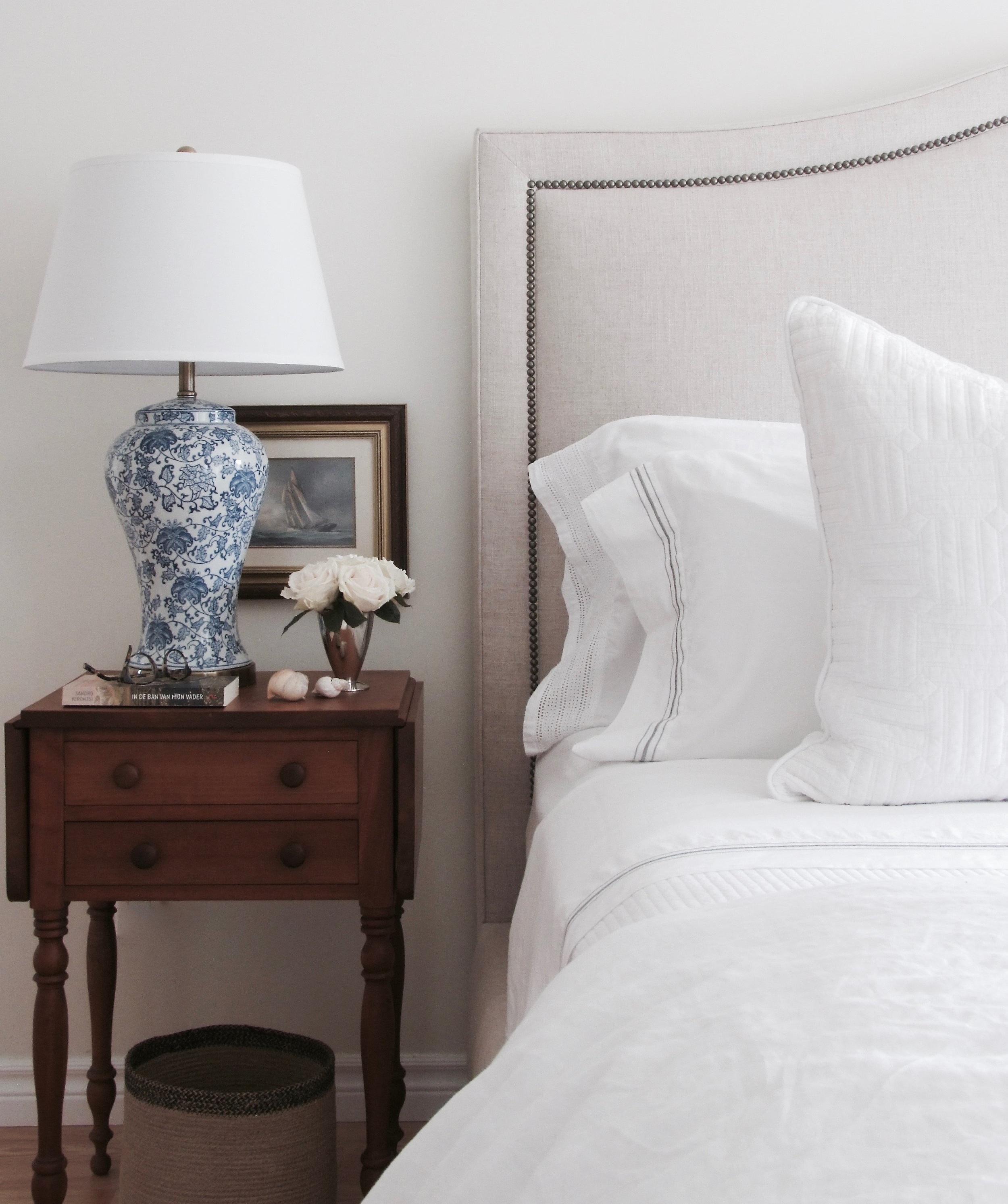
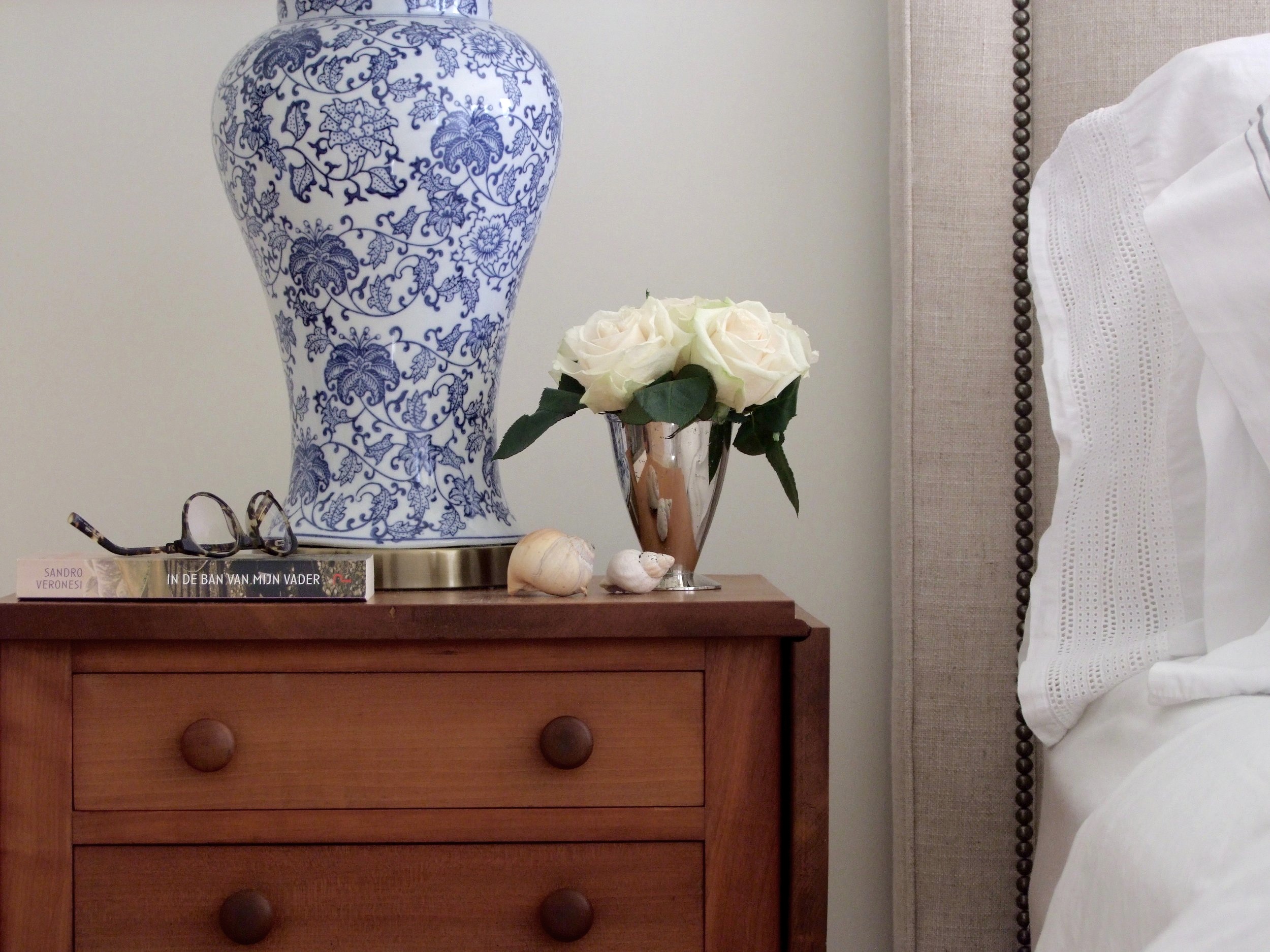
One of the first pieces I found for the room were a pair of late 19th century walnut side tables, with simple turned legs, flip tops and 2 drawers. I instantly though they’d be perfect bedside tables. At the time I found them they had a shiny eurathane coating on them in a darker stain so I had them stripped and left in their natural colour with an oil finish. The patina and of the wood is rich and warm, simply beautiful especially next to crisp white linens.
The next key piece I found was a stunning Nova Scotia antique pine dresser, again late 19th century, in perfect condition with a gorgeous patina. This Master bedroom has a large walk-in closet so having this chest of drawers in the bedroom would serve as a wonderful accent piece that could house bedding, or personal items and provide some surface space for watches, eye glasses etc.
With the key casegoods found I completed the rest of the space with new finds like the contemporary style slipcovered chair beside the dresser (above), bed, and a one of a kind wool area rug. I selected this hand-knotted wool Oushak style rug with a wonderful combination of muted greens, blue and terracotta on a light taupe background.
Although I outfitted the bed with white stone-washed linen the owners can easily mix it up and layer in coloured sheets, quilts or pillows from the palette of colours in the rug. I also planned the bedding from other bedrooms in the house so that any of it can be mixed and matched if desired.
I love to pair antique casegoods and tables with contemporary pieces especially upholstery, again, similar to the simple lines of the chair beside the dresser I selected a contemporary bed frame to sit between the antique bedside tables.
A view of the upholstered bed with the antique side tables and area rug during the installation of accessories (artwork & mirror hanging in progress). The bed is upholstered in an oatmeal coloured natural linen contrasted with with aged brass nail head detail and low block feet in a dark walnut. The texture of the linen and the dark metal detail give the bed a more relaxed informal vibe suited to the setting. The juxtaposition of the contemporary bed next to the antique tables is what gives these old pieces modern day style.
ACCESSORIES
From the onset of the project I was continually sourcing antique and vintage accessories, mirrors and wall art. Over the course of two seasons I amassed a large collection of various things in anticipation of adding finishing touches to all the rooms. After all the key pieces were installed in this room it was time to add the accessories and hang the wall art. It was important to me that not all the accessories be “new”, but for them to look like they’ve been collected over time.
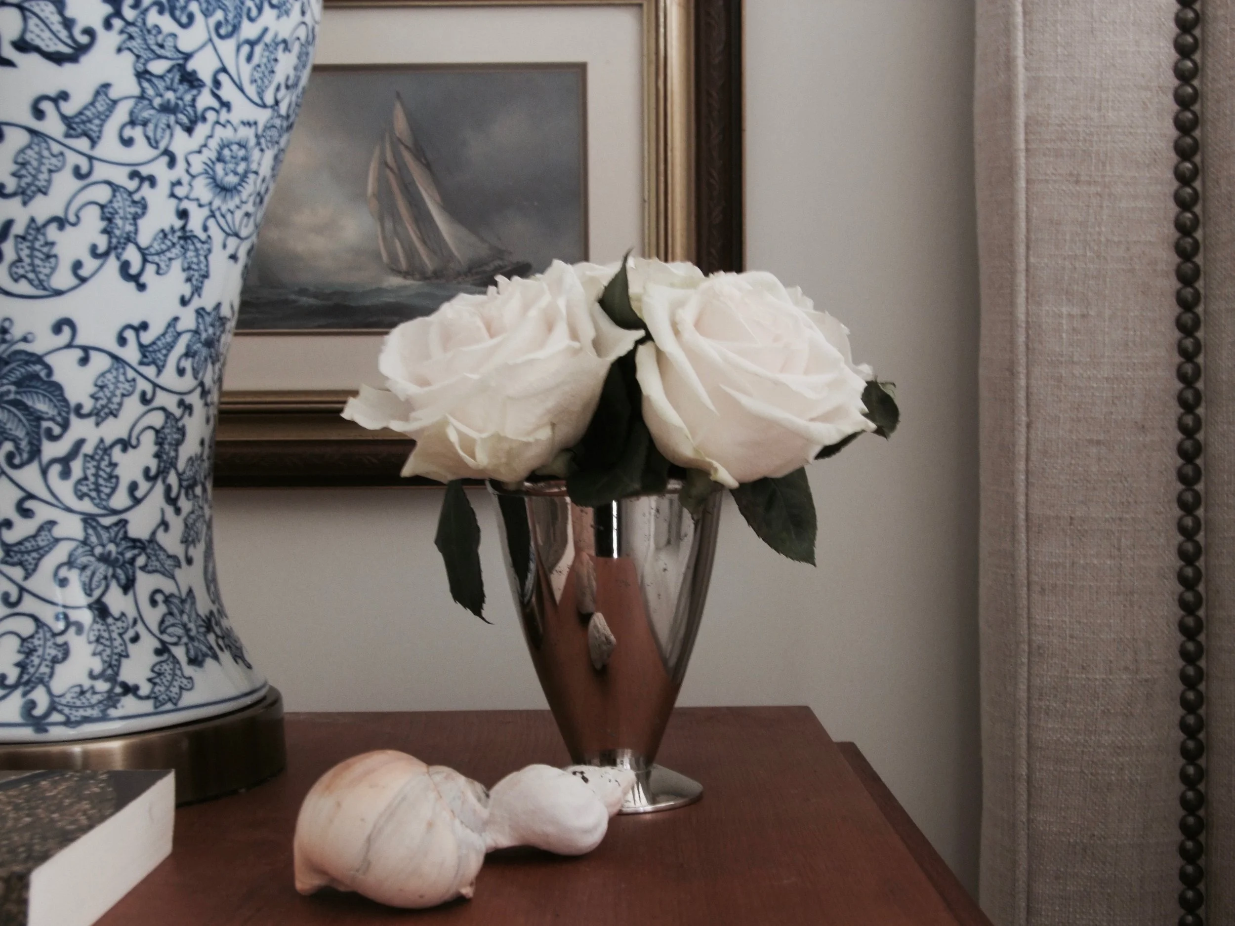
A favourite accessory I found was this framed vintage print of the Bluenose which couldn’t have been a more perfect accent for this room - the iconic schooner is a nod to Nova Scotia’s maritime history and the husband is a sailor and schooner owner himself. It’s a very subtle nautical touch without going all themey. The couple are also of Dutch heritage with their primary residence in Amsterdam and so inherently she has a deep fondness for blue & white porcelain. These classic blue & white foral lamps with antique brass base just seemed the perfect reflection of her taste and effortlessly just compliment everything else in the entire room. The sea shells I picked up on a nearby beach, which I’m sure are only the first of many found treasures that will make their way into the house. Its rare to come back from a hike or beach walk without a souvenir in hand.
When it came time to accessorize the room I had no intentional plan, I simply pulled from all the things I had been collecting over the months and placing them together seemed to work with a natural ease. Everything on the dresser, except the wicker tray and small blue porcelain bowl are vintage or antique including; an arch top mahogany framed mirror with original glass highlights the pine dresser, its flanked by a pair of vintage, professionally framed black and white photo’s of the Cape Breton coast, (found as is I love everything about them with their aged gold frames and blue/grey mattes) a framed print of blue/white birds on a branch (vintage), an antique small blue and white ming vase filled with grocery store roses - because none of the rose bushes I planted in my garden were not blooming : (, and an antique crock filled with wild flowers foraged from the side of the road.
During my hunting I purchased numerous single antique windsor chairs for the house and at various stages of the project they found their way into different spaces, this one lived beside the dresser before the slipcovered arm chair arrived but both pieces can be moved around in the room. Not shown on the one side of the room is a wing back chair and a small antique gate leg table and articulating floor lamp - piled with unhung artwork and pillows, at the time these photos were taken, hence there are none……
A final view of the other side of the bed with the bird print hung in place…
For this initial phase of furnishing the entire house, in short order, to get it functional and comfortable I’m beyond happy with the results. The groundwork is in place with room to add personal touches and grow collections as life unfolds in the house. In future, if I were taking it to the next level, I’d love to see panelling or wallpaper added to the walls along with mixing in some more textiles (accent pillows and drapery panels) perhaps from their native South Africa and Netherlands. As I alway say, a room is never done, only done for now. ; )